The Baroque Era (1600-1750): Colours and Architecture

Ornate Extravagance – Architecture
The Baroque Era is well known for its distinctly recognizable architectural style. It is derived from Mannerism and is characterized by unique features such as ornate finishings and stark use of contrast, notably created with lighting. The Baroque architectural style first made an appearance in Italy. It stemmed from the desire of those of higher class to exhibit importance, power, and an eye for beauty. The Baroque style was most used to create churches and grand mansions.

https://courses.lumenlearning.com/boundless-arthistory/chapter/architecture-of-the-baroque-period/
Dramatic use of light and shadow (Chiaroscuro) was not only used in paintings; it also made appearances within architecture. Vivid colours were used all throughout buildings, and highly detailed paintings adorned ceilings. The Baroque style of architecture was undoubtedly extravagant.
Between the elaborate decorations, sculptures, curved walls, arches, this era of architecture placed great focus on grandeur.
Paintings were blended into architecture to create illusionary effects. In fact, the interiors of Late Baroque era buildings were often created as a “shell” for frescoes to then be added. Architectural elements, such as vaulted ceiling and columns, would be built to create dynamism – or a sense of motion. Oftentimes, architectural elements would purposefully be left unfinished to create visual interest.

https://en.wikipedia.org/wiki/Baroque_architecture#:~:text=Baroque%20architecture%20is%20a%20highly,and%20gradually%20spread%20across%20Europe.
The Baroque era coincided with the rise of European colonialism – meaning that the Baroque style spread outside of Europe. Money made from colonialism helped fund some of the extravagant constructions of the time.

Dramatic Colours
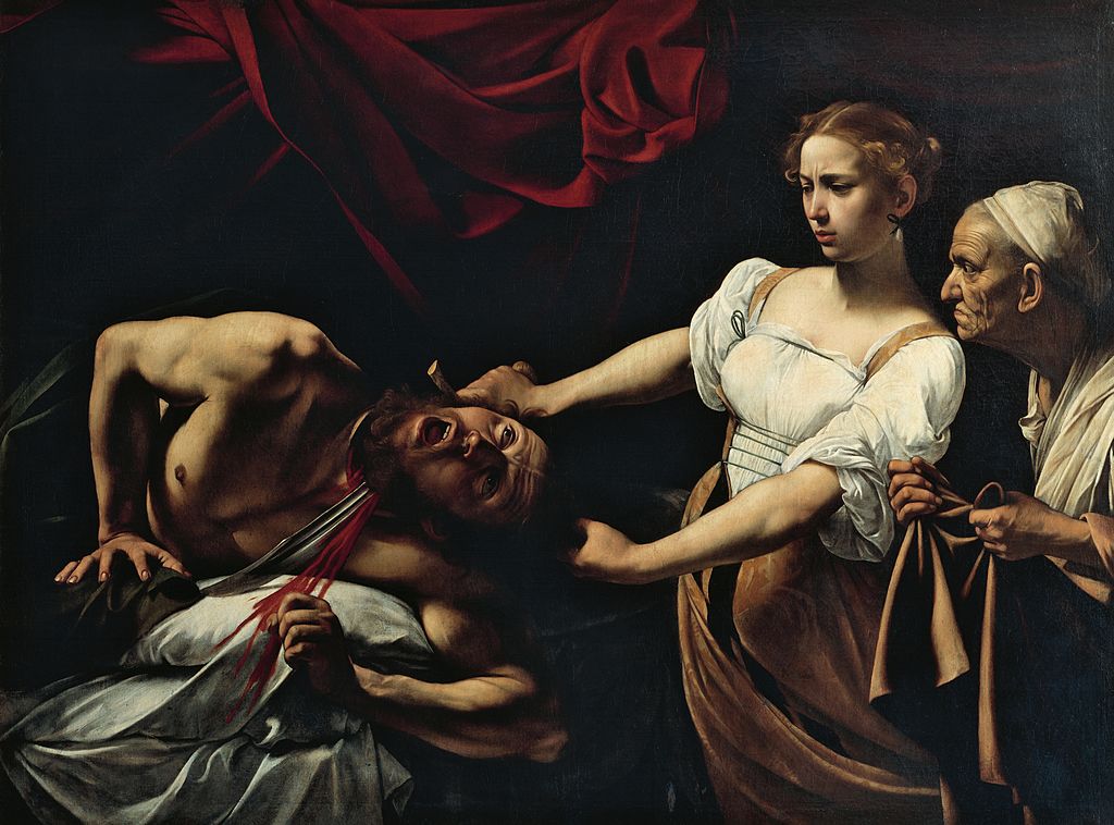
The Baroque era’s artwork is characterized by its theatrical scenes and great ornamentation. Artists of the Baroque Era would use vibrant, rich colour palettes: notably reds, greens, and blues in their work. Even when earth tones would be used, they still remained luminous. Dark backgrounds, Caravaggio’s signature style, would be employed to create contrast with figures in the foreground – always using the technique of Chiaroscuro.
https://www.biography.com/artist/caravaggio
The use of deep reds and greens with gold, alongside light and dark contrast, is a signature technique of the Baroque era artists. The artists’ masterful use of colour would flawlessly imitate textures such as velvet and silk. Colour was of such importance in the Baroque era that even draftsmen, whose work was normally monochromatic, would incorporate it into their work.

https://theculturetrip.com/europe/italy/articles/an-introduction-to-baroque-art-in-12-works/
Reflection
I find it interesting that common artistic traits were carried through all creative fields during the Baroque Era. It is fascinating how two-dimensional art blended together with architecture to create immersive masterpieces. I find it especially interesting that the use of Chiaroscuro was not only used in painting, but also in architecture; it’s a perfect example of life imitating art (which first imitated life – it’s a cycle.)
Bibliography
“Baroque Architecture.” Baroque Architecture – New World Encyclopedia, www.newworldencyclopedia.org/entry/Baroque_Architecture.
Ring, Jessica. “What Types of Brush Strokes & Colors Were Used in Romantic Art?” Our Pastimes, 10 Jan. 2019, ourpastimes.com/what-types-of-brush-strokes-colors-were-used-in-romantic-art-12537324.html.
Thomann, Lauren. “What Is Baroque Architecture?” The Spruce, www.thespruce.com/baroque-architecture-4797911.