Project rationale
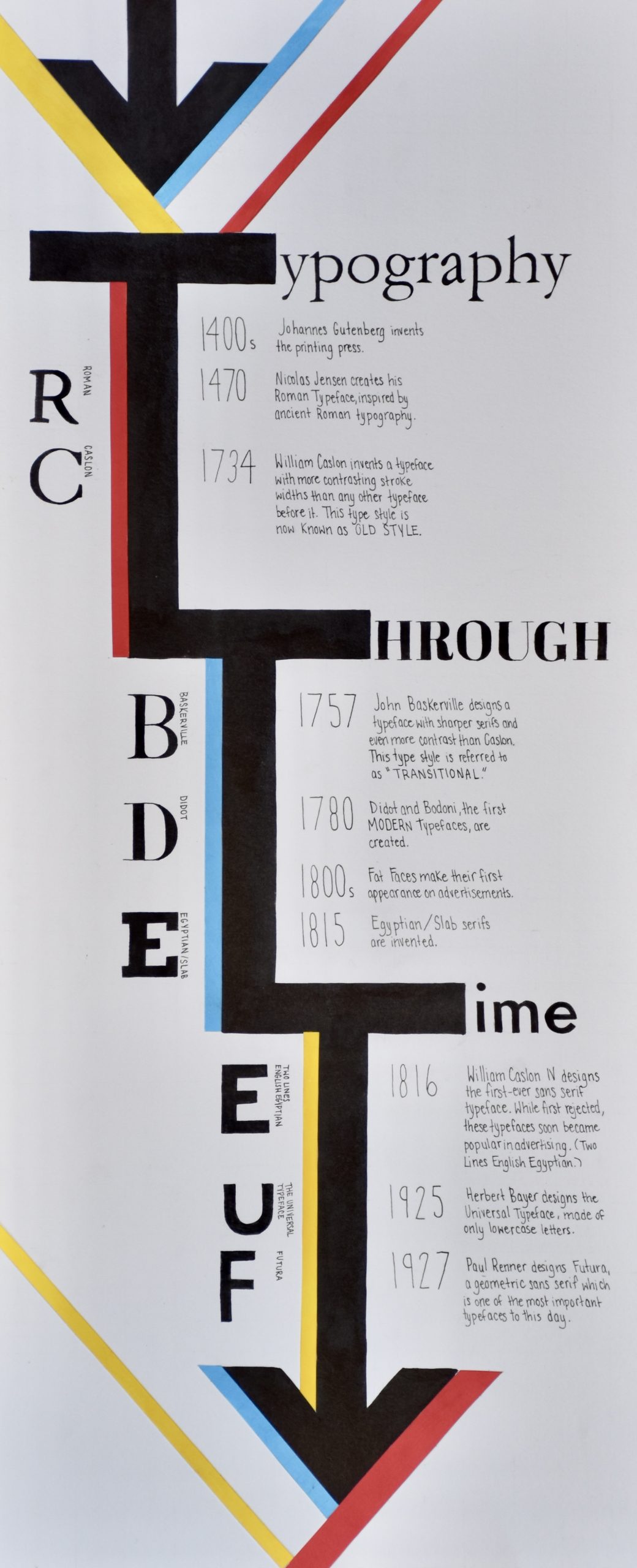
I decided to do a brief overview of the history of typography, which includes important typographic styles such as Transitional and Modern but also a few extra details on typefaces such as Fat Faces and Futura. I aimed to present the information in as simple a manner as possible, pretending that my audience knows nothing about type history and is just learning about it for the first time. I also included large letters in their corresponding typefaces to visually represent my information.
I chose to merge the typography with the shape of a timeline, turning the ‘T’s of the title into one large arrow. I kept the colour scheme simple as to not distract from the most important part of this poster: the delivery of the information. I made the decision to use different typefaces in my title to add visual interest while keeping it relevant to the project as I chose typefaces that chronologically follow the content in my infographic.
I wrote all the type by hand which was a painstaking and difficult process, as I had to be very meticulous to ensure my lines were as clean as possible, but I am happy with the end result. It was a fun challenge to try and imitate typefaces for the titles (which are Garamond, Abril Fatface, and Futura respectively) and the for letters on the left side.
I would give myself an 8/10 for this project. I am proud of my lettering and am happy with the overall design, but I could have added a few more facts. That being said, I didn’t want to cram too much information on the poster, that would make it look too crowded.
Sources used
https://www.toptal.com/designers/ui/typeface-history