Zine Rationale
I made my zine on Bauhaus typography. I focused on three main topics: what Bauhaus (typography) is and its characteristics, Herbert Bayer, and the Universal typeface.
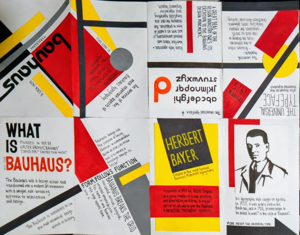
I found that coming up with the actual page layouts was the most challenging part of this project for me. At first, I didn’t have a clear idea of how I was going to go about putting all of the information on the pages and making it look good. After some thought, I settled on imitating Bauhaus style posters to create my page design as a way to make my zine more engaging. I used a simple colour scheme and geometric shapes that frequently appear in Bauhaus posters.
I found it fun to place my content at a diagonal and in different directions on the page, it’s something that I never would have thought of doing if I didn’t do research on Bauhaus typography. I quite enjoyed this project as it was interesting to learn all the details about my topic and then laying out information in a creative way. I liked that we got to pick our topics, and I also enjoyed the process (and challenge) of creating page layouts by hand.
I would give myself an 8/10 for this project. I am pretty happy with the way it turned out overall, although there is always room for improvement.