Design fundamentals
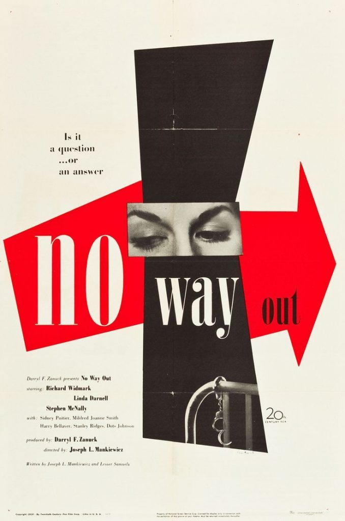
Paul Rand – No Way Out movie poster, 1950. This piece uses sharp, graphic shapes to catch the onlooker’s eye, combined with a simple yet bold colour scheme.
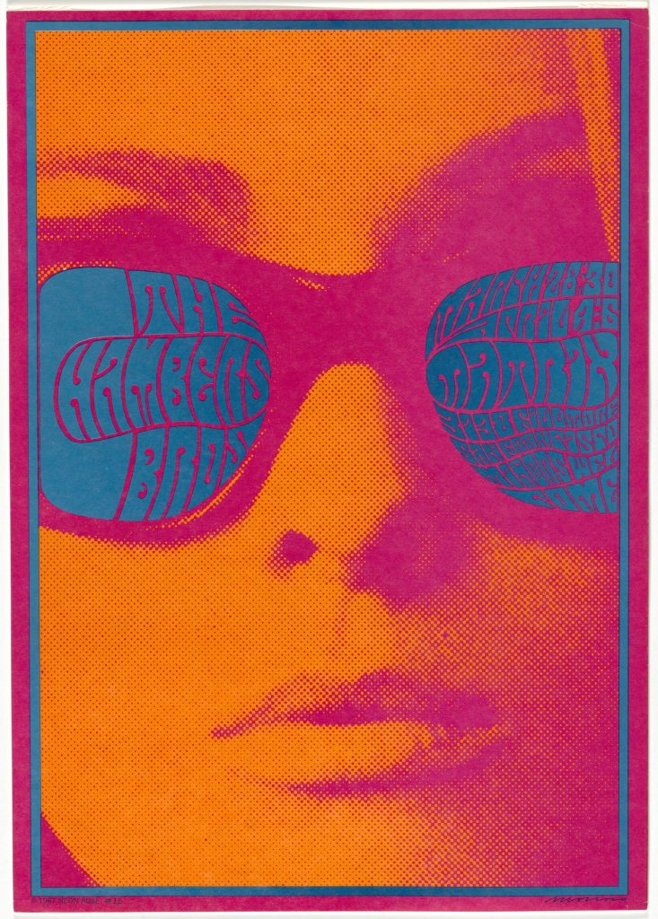
Victor Moscoso, The Chamber Bothers movie poster, 1967. Moscoso uses vivid, eye-catching complementary colours commonly attributed to much of the late 1960’s graphic design. Interest is added to the piece with the use of halftone dot texture.
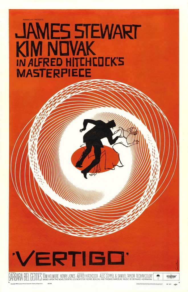
Saul Bass, poster for Alfred Hitchcock’s film Vertigo, 1958. Bass created a sense of dizziness, or vertigo, using circular directional lines forming a spiral. The figures at the centre of the piece are tilted at a diagonal, further reinforcing the falling sensation.