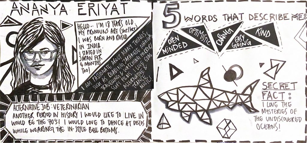
For this project, I used my most regularly used medium, black and grey markers. I also used black and white card paper that I cut out in different shapes and used in various areas in this spread. I generally love working with black and white moreover I felt there is no better way to represent my art style than using the colours I am most content with. The theme of my yearbook spread is monochrome and modernised. My spread style is inspired by a music video that portrays an alluring peek into a bleak dystopian future using only a monochromatic palette. ( I am also attaching the link to the music video below)
I only utilized grey tones in a few places, such as my self-portrait and the shark illustration, since I wanted the grey to convey that the living things on my yearbook spread seem to be three-dimensional.
Although my spread depicts a very dismal setting, I am quite the contrary!
When I see illustrations made with black markers, I admire how bold they are. I feel captivated by the white space and few black lines that form a shape or a character.
I’d give myself an 8/10 since I believe my overthinking has been unconsciously reflected on my yearbook spread by the overcrowding on the left side of the layout, making the right side feel relatively emptier. However, I believe that the consistent theme and clear distribution of information effectively describes my art style and personality.
This project took me a total of 5 hours of planning and execution.
(Music video Link: http://vimeo.com/181706731)
