Allan Fleming was only 30 years old when he was hired to create a new logo for CN. Despite this, the young Canadian designer had earned a name for himself with the bold, poetic nature of his designs.
Fleming, who was born in Toronto in 1929, took an unusual path to professional success. At the age of 16, he dropped out of art studies at Toronto’s Western Technical School to work as an apprentice designer at several Toronto firms. Then followed further learning opportunities in England, where he soaked up as much knowledge as he could from major individuals in the design field.
Allan Flemmming
After Returning to Canada, he joined the typographic company Cooper and Beatty Ltd. in 1957, where he was working until the CN opportunity presented itself.
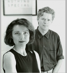
Rudy VanderLans is a Dutch graphic designer, photographer, and the co-founder of Emigre Fonts with his wife Zuzana Licko.
Rudy VanderLans and Zuzana Licko
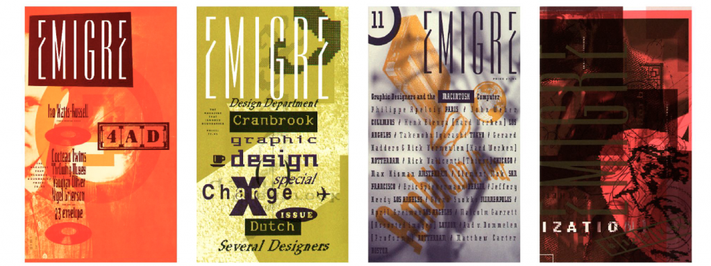
the original concept for Emigre has gone through quite a few changes. When Emigre started it was meant to be a magazine for emigrant artists and their experiences. It wasn’t a design magazine but a general arts magazine. The idea was to show the work of people who had the experiences of living and traveling in foreign countries, and the effect these experiences had on their creative work.
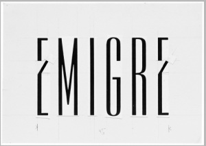
Emigre magazines
Emigre is both a magazine and a type design lab.Well, type design is the main business.. They develop, produce, license and distribute typefaces. And then, to challenge themselves creatively and intellectually, and to find ways to test and apply their fonts, they publish a magazine, release music, distribute design and artists books.
As a team, Emigre has been honored with numerous awards including the 1994 Chrysler Award for Innovation in Design, and the 1998 Charles Nypels Award for excellence in the field of typography. Emigre is also a recipient of the 1997 American Institute of Graphic Arts Gold Medal Award, its highest honors.
Willi Kunz was born in Switzerland (1943) and moved to America in 1970. In New York City, he found work at Ansapch, Grossman & Portugal, a corporate identity consultancy agency. His success in establishing a branding programme for the Merit fuel station franchise company helped establish his credentials, and he subsequently established an independent design studio that is still in operation today. Despite being steeped in the Swiss typographic style from an early age, he broke out from its more formal requirements and exposed himself to what he called “creative exploration.”
WIlli Kunz
Kunz was essential in introducing new ideas in Swiss typography and design to the United States.
Some of his works below demonstrate how He employed a more instinctive approach to structure and composition rather than the standard grids of the past.
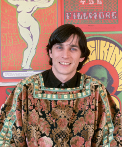
On July 15, 1937, Wes Wilson, the pioneer of the 1960s rock concert poster, was born in Sacramento, California. His interests as a child ranged from artistic hobbies to a strong appreciation of the beauty of nature. His post-secondary education echoed similar interests; he studied forestry and horticulture before settling on philosophy. Over the latter half of the 1960s, Wes had found tremendous inspiration in San Francisco’s avant-garde districts, and he quickly found himself creating fine art for the public. His approach, influenced by the Master of Art Nouveau, took what was known about promotional art and twisted it inside out. Letters that were nearly cryptic covered every available space, lines melted into lines, colours clashed… and the psychedelic poster was born.
Wes Wilson
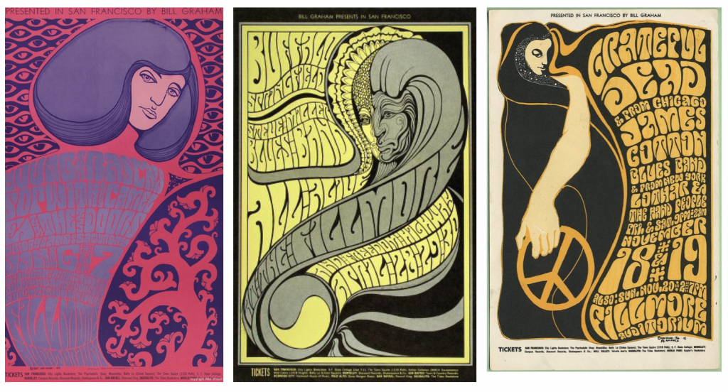
Bill Graham, the Fillmore Auditorium’s music organiser, commissioned the following concert posters from Wes Wilson between 1966 and 1968.
In only 14 months, he made 56 posters for Bill Graham, averaging one poster per week for the Fillmore.
These are some of my favourite posters from his Bill Graham posters collection.
BG-44 :1967 : featuring Young Rascals, BG-61 :1967 :featuring Buffalo Springfield, Steve Miller Blues Band, Freedom Highway and BG-38 : 1996 :featuring Grateful Dead, James Cotton Blues Band, Lothar & the Hand People
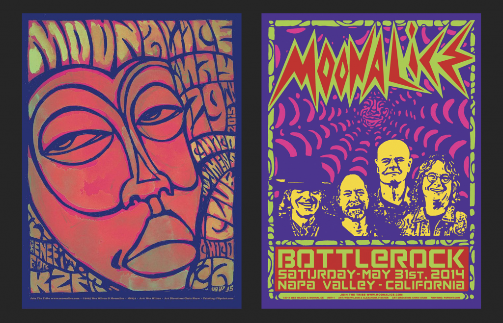
In 2010 Wes joined the Moonalice tribe, launching a decade of creative expression. Moonalice, a psychedelic rock band based in California, provided Wes the opportunity to get back to his poster-making roots. Love, unity, and creative expression are all pillars of the Moonalice tribe.
These are some of the posters that particularly stood out to me.
Chico Women’s club poster,2015 and Napa Valley CA- Wes Wilson & Alexandra Fischer,2014
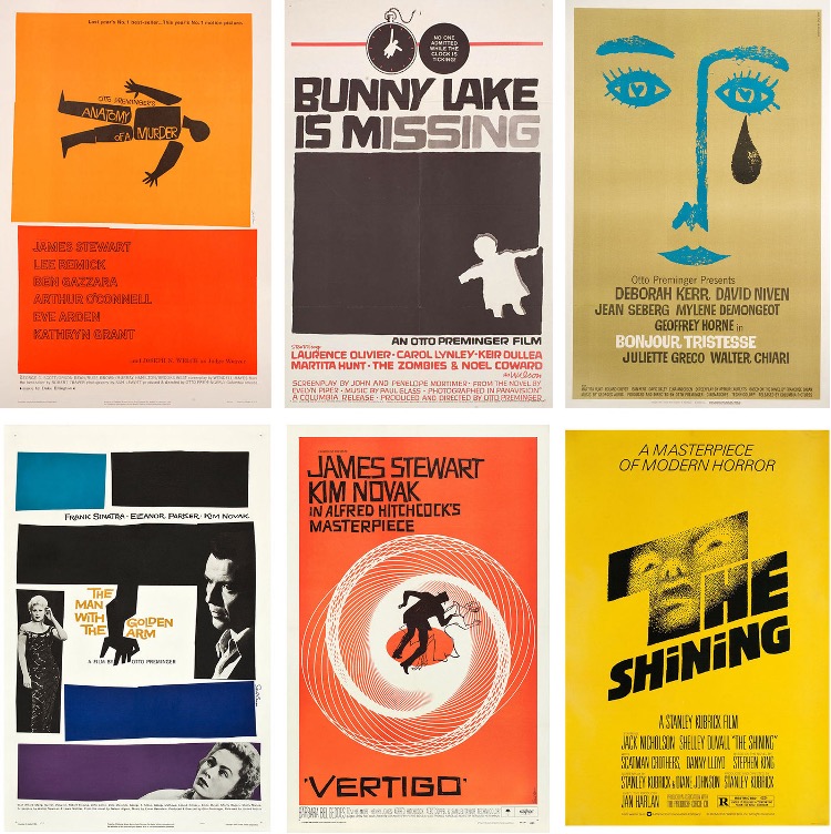
Saul Bass (May 8, 1920 – April 25, 1996) was an American graphic designer and filmmaker best known for his work on film posters and title sequences.
Bass worked for Alfred Hitchcock, Stanley Kubrick, Otto Preminger, Billy Wilder, and Martin Scorsese during his 40-year career.
Saul Bass is possibly the most skilled graphic designer in history. Working in the mid-twentieth century, when graphic design was just beginning to gain traction, Bass branded a startling array of prominent firms with his classic, basic designs.
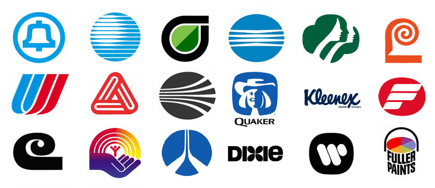
He also created some of the most recognizable corporate designs in North America, including AT&T’s first “bell” logo in 1969 and their later “globe” logo in 1983. He also created the 1968 “Jetstream” logo for Continental Airlines and the 1974 “tulip” logo for United Airlines, both of which have become some of the most recognizable logos of the era.
Before I enrolled in this program, I looked up to Saul Bass because he elevated the sophistication of movie posters with his distinct simple style and entirely transformed the role of title credits in films.

