EMIGRE

Postmodernism in Europe

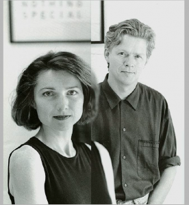
Rudy VanderLans is a Dutch graphic designer, photographer, and the co-founder of Emigre Fonts with his wife Zuzana Licko. 

Rudy VanderLans and Zuzana Licko

the original concept for Emigre has gone through quite a few changes. When Emigre started it was meant to be a magazine for emigrant artists and their experiences. It wasn’t a design magazine but a general arts magazine. The idea was to show the work of people who had the experiences of living and traveling in foreign countries, and the effect these experiences had on their creative work.

Emigre magazines

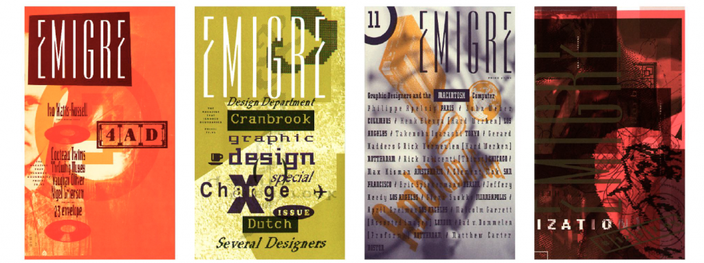
Emigre is both a magazine and a type design lab.Well, type design is the main business.. They  develop, produce, license and distribute typefaces. And then, to challenge themselves creatively and intellectually, and to find ways to test and apply their fonts, they publish a magazine, release music, distribute design and artists books.

As a team, Emigre has been honored with numerous awards including the 1994 Chrysler Award for Innovation in Design, and the 1998 Charles Nypels Award for excellence in the field of typography. Emigre is also a recipient of the 1997 American Institute of Graphic Arts Gold Medal Award, its highest honors.

Works cited:

https://www.emigre.com/Essays/Other/FileUnderNowhere:ThePhotoAlbumsofRudyVanderLans

https://www.emigre.com/Designer/RudyVanderLans

https://designobserver.com/feature/emigre-an-ending/3847

https://oa.letterformarchive.org/item?workID=lfa_emigre_0001&LFAPics=Yes&targPic=lfa_emigre_0001_003.jpg

Willi Kunz

Supergraphics innovator

Willi Kunz was born in Switzerland (1943) and moved to America in 1970. In New York City, he found work at Ansapch, Grossman & Portugal, a corporate identity consultancy agency. His success in establishing a branding programme for the Merit fuel station franchise company helped establish his credentials, and he subsequently established an independent design studio that is still in operation today. Despite being steeped in the Swiss typographic style from an early age, he broke out from its more formal requirements and exposed himself to what he called “creative exploration.”

WIlli Kunz

Kunz was essential in introducing new ideas in Swiss typography and design to the United States.

Some of his works below demonstrate how He employed a more instinctive approach to structure and composition rather than the standard grids of the past.

Works cited:

https://www.rit.edu/carycollection/willi-kunz

Saul Bass

New York style and editorial design 

Saul Bass (May 8, 1920 – April 25, 1996) was an American graphic designer and filmmaker best known for his work on film posters and title sequences. 

Bass worked for Alfred Hitchcock, Stanley Kubrick, Otto Preminger, Billy Wilder, and Martin Scorsese during his 40-year career. 

Saul Bass is possibly the most skilled graphic designer in history. Working in the mid-twentieth century, when graphic design was just beginning to gain traction, Bass branded a startling array of prominent firms with his classic, basic designs.

He also created some of the most recognizable corporate designs in North America, including AT&T’s first “bell” logo in 1969 and their later “globe” logo in 1983. He also created the 1968 “Jetstream” logo for Continental Airlines and the 1974 “tulip” logo for United Airlines, both of which have become some of the most recognizable logos of the era. 

Before I enrolled in this program, I looked up to Saul Bass because he elevated the sophistication of movie posters with his distinct simple style and entirely transformed the role of title credits in films.

Work cited:

https://mubi.com/notebook/posts/movie-poster-of-the-week-saul-bass-at-100

https://99designs.ca/blog/famous-design/saul-bass-graphic-designer-of-a-century/