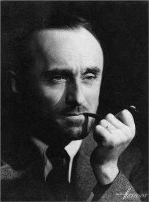
Adolphe Jean-Marie Mouron, aka A.M Cassandre, was born on the 24th of January 1901, in Kharkov, Ukraine.
I chose to write about Cassandre because during the survey presentations in class I enjoyed looking at his posters and artwork. They stood out to me and I would like to put them together and adore his complex yet simplistic style.
A.M Cassandre portrait
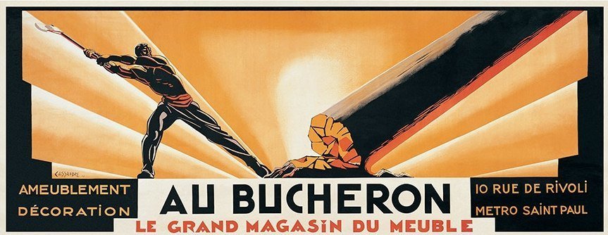
To sustain himself, he found and capitalized on the popularity of advertising posters, which were all the rage in Paris in the late 1910s. He was allowed to work at a printing firm in Paris, where he began signing his artworks, mainly posters, signed as “Cassandre.” By 1922, he was able to open his art studio and create even more posters in his distinct style, which was influenced by cubism and surrealism. One of his most well-known works “Au Bucheron,” was a poster designed for a cabinet builder. It was then printed in a huge size in many “Compagnie Internationale des Wagons-Lits” copies and distributed across Paris.
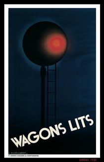
Au Bucheron (1923)Compagnie Internationale des Wagons-Lits (1930)
His early style combined stylized curves and geometric motifs from Art Nouveau with a hint of sleekness and elegance.
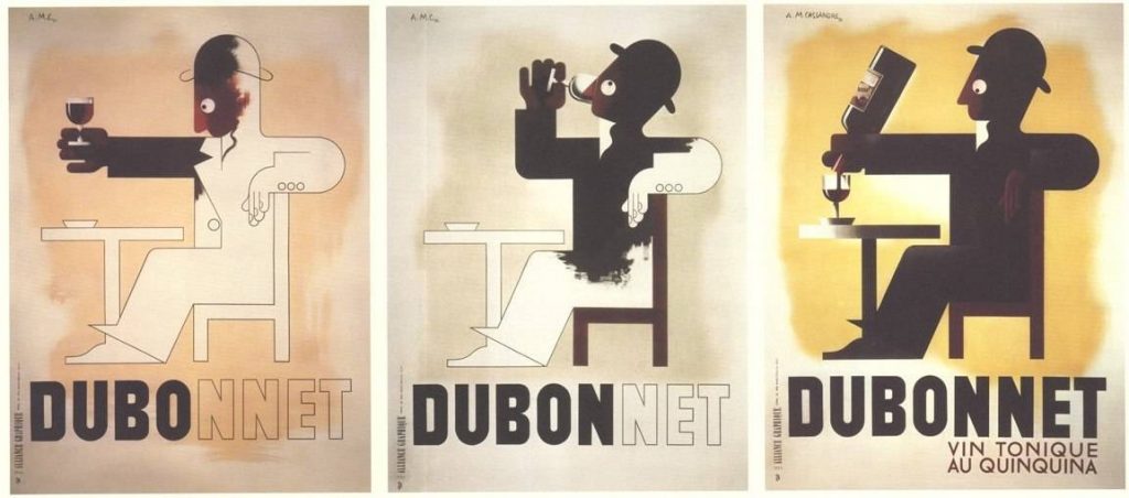
His outstanding works for the “Compagnie Internationale des Wagons-Lits” and “Dubonnet” wine companies were among the first posters designed to be seen and understood from moving vehicles. He was the one who came up with the notion of the Serial Poster, which is a series of posters that delivers an entire engaging topic in fast succession.
Dubonnet (1932)
A.M Cassandre was a highly inventive painter. I admired how he was able to demonstrate sleek, classical, and attractive art deco posters. A.M Cassandre’s designs did not only affect Art Deco but also commercial art. He created memorable travel posters for the well-known travel firms, he also focused on exploring new styles and methods outside of poster arts Like typography. He designed various typeface types through his firm like the one below.
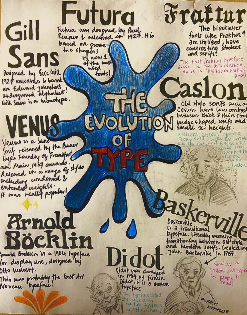
For this assignment, we had to make an entirely hand-drawn poster that featured a brief description of these eight typographic categories before 1945 as well as their distinguishing features. It appeared to be a straightforward exercise at first, but I soon realized that developing a poster with extensive information and making it engage was a difficult process. I had a concept and drew some initial designs for this task, however, I struggled with font layout and rendering.
Even though it took around 4 hours to correctly execute the final poster, the process works, and research required approximately two days to produce and obtain a final design idea. I’d give myself a 7/10 since I believe I could have done a much better job regarding neatness and layout.
My idea of creating a storytelling poster was solid, however, the execution and effectively getting the idea onto paper could have been better. I also feel that I should have spent more time on the project, but I misjudged the amount of effort that was necessary for this assignment to be completed successfully.
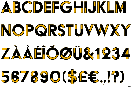
This is my result of the Type identification poster!
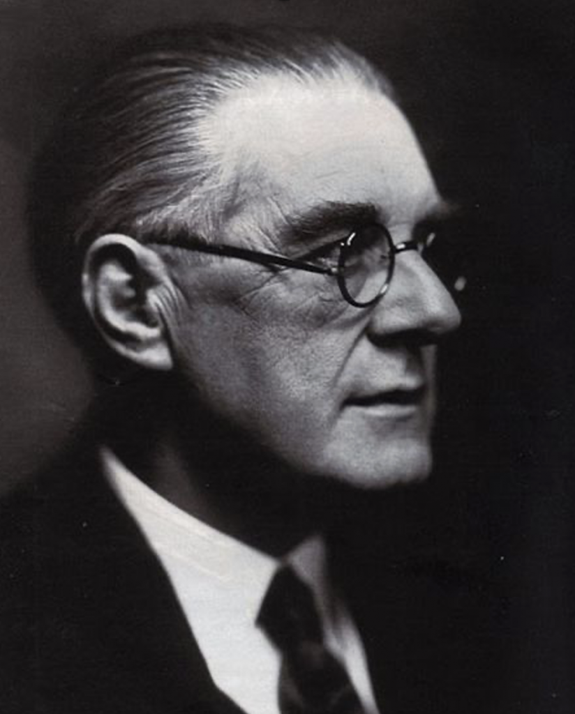
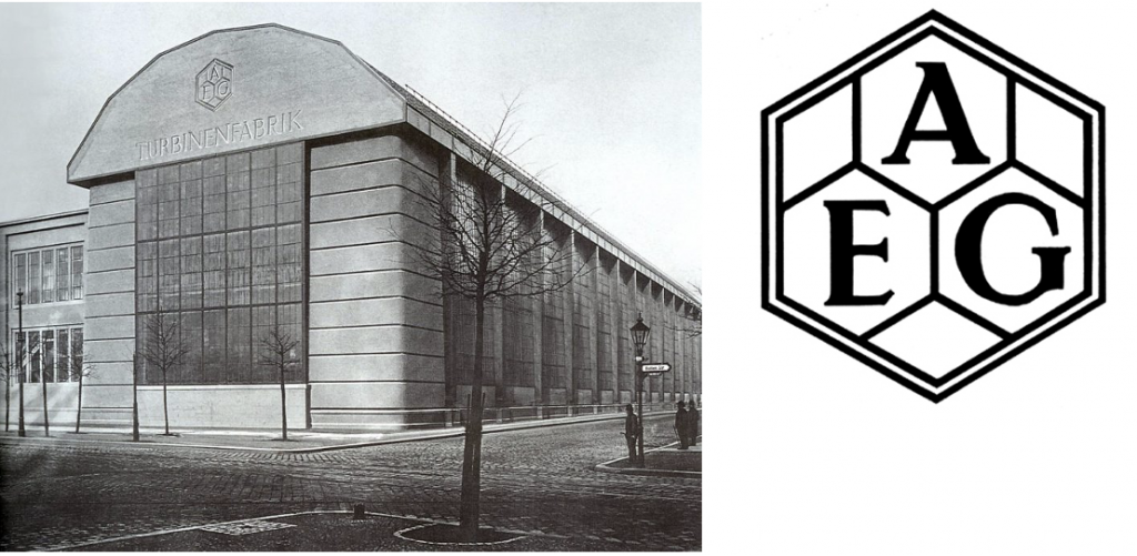
Peter Behrens was a well-known German architect, graphic designer, and industrial designer who is best remembered for the AEG Turbine Hall in Berlin, which he designed in 1909. From the 1900s until the 1930s, he designed products, fonts, and notable structures in a variety of styles such as the following:
AEG Turbine Hall in Berlin and the ‘AEG’ logo Font created by Peter Behrens
In 1907, he became a founding member of the German Werkbund and began designing for AEG, where he pioneered the corporate design, graphic design, and the production of fonts, products, and structures. He created a new set of typefaces known as “write-Behrens”. In the following years, he rose to prominence as a successful architect and a pioneer of the German Reform Movement of the 1910s, which was rationalist and classical.
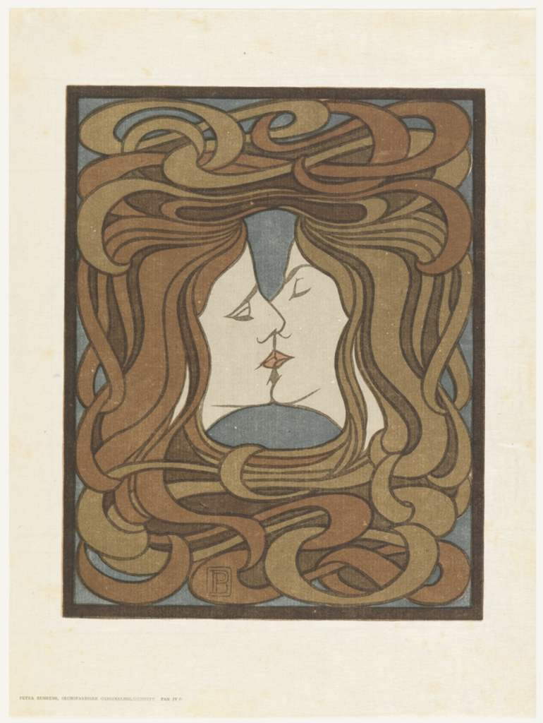
Der Küss (The kiss)
In 1898 he carved the kiss. A woodcut on cream japan paper., which was the fourth of Pan works. ‘Pan’ is the finest of Long’s 1890s series of pastoral paintings. “The kiss” is one of just six woodcuts created by Peter Behrens, and it is the only one in the art nouveau style. This print deviates from standard graphic motifs and is the most well-known German woodcut of the period. Furthermore, while many of the prints in Pan were photo relief line cuts a medium that was appropriate to the art nouveau style’s swirling, linear patterning.
At the same time, the artwork is both erotic and clean. In this beautiful, perfectly arranged composition, two features in profile are enveloped by an intertwined mass of hair on a dark blue backdrop. Despite appearing to show both sexes, the clear linear patterning and flat treatment of the positive and negative regions erase the delineation between the sexes, resulting in an androgynous coupling. The entwined hair implies a suffocating hug from which neither party can break free.
The medium of woodcut reflects a renewed interest in German graphics as well as a fresh interest in Japanese aesthetics.
Der Küss (The Kiss) completed in 1898
I personally liked this piece of Behrens since it stands out from the style of his other works. It is also one of his pieces that is not straightforward, but open to interpretation. The fact that it was created in 1898 really intrigues me since the style and features of this artwork are not exactly the norm.
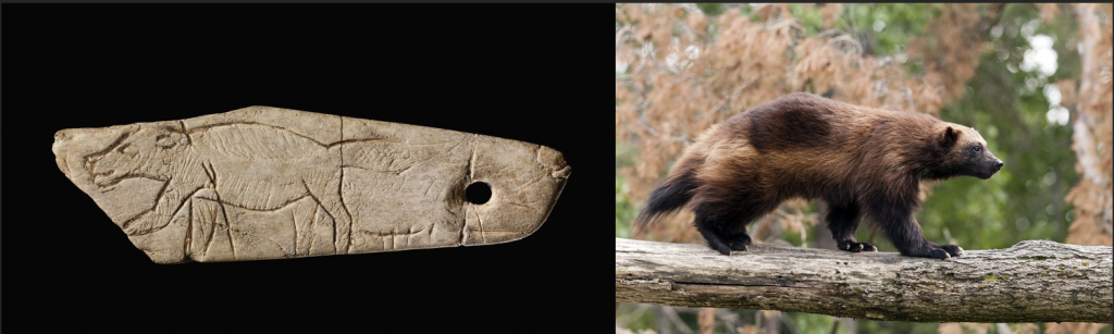
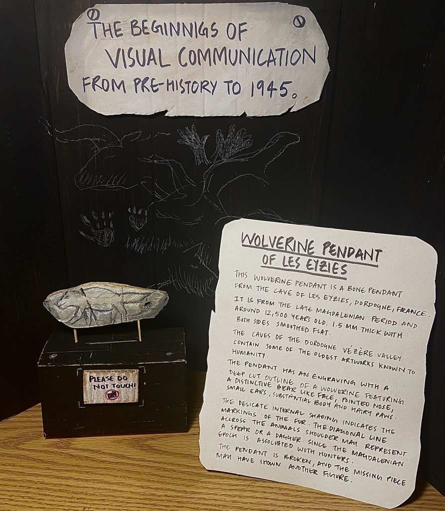
For this assignment, I decided to remake the wolverine pendant from the Magdalenian period( c. 17,000 – c. 12,000 BP). This Wolverine Pendant is a bone pendant decorated with an engraved drawing of a wolverine from the cave of Les Eyzies, Dordogne, France. At first, I was hesitant about my choice, but as I learned more about the pendant’s history and how it came from a time when the earliest artworks known to mankind were created, I was compelled to create it.
I was planning on changing the wolverine engraving to a reindeer because the Magdalenian epoch was dominated by reindeer hunters, but after learning about how the wolverine population was declining, I felt inclined to draw the wolverine and perhaps spread some information about it through my post so that it could be preserved. The pendant is approximately 12,500 years old and dates from the late Magdalenian era. It’s composed of a carved bone that’s roughly 1.5 mm thick and smoothed on both sides.
On the left is thee pendant with the Wolverine engraving and the right is the wolverine animal
The pendant is approximately 12,500 years old and dates from the late Magdalenian era. It’s composed of a carved bone that’s roughly 1.5 mm thick and smoothed on both sides.
The engraving struck me because it was so simplistic, yet it depicted a wolverine with a characteristic bear-like face, pointed snout, tiny ears, substantial torso, and hairy paws. The delicate internal shading highlights the fur’s distinctive markings. A spear or dart might be represented by the diagonal line across the animal’s shoulder. The pendant is broken, and the missing piece may have shown a different figure.
When Richard Hollis writes in his book “Graphic design” about how “Visual communication in widest sense has a long history. When the early man hunted for food and spotted the imprint of the animal in the mud, he was looking at a graphic sign” This inspired me to recreate the wolverine pendant.
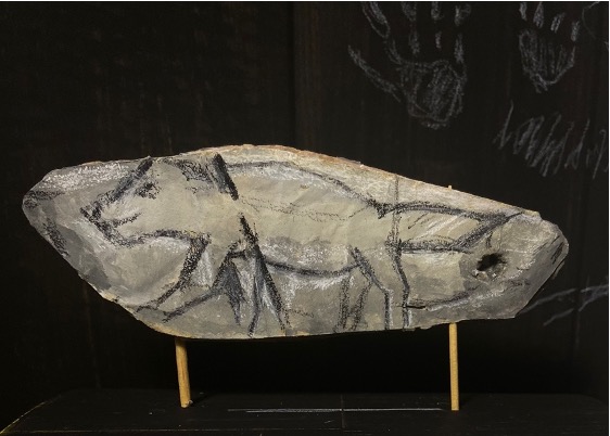
This was the outcome of the pendant that I worked on. I made it out of cardboard and paper. I crumpled some paper, painted it a light grey tone, and glued it on the cardboard; I then used several colours of grey to create the bone impression. I tried to produce the same engraving on cardboard with a paper cutter before I designed the shape of the engraving, and I was surprised at how challenging it was! This piqued my curiosity in knowing more about prehistoric art and the techniques employed to create it.
The wolverine pendant I recreated
Furthermore, I painted some cardboard using black paint to create a stable backdrop so the artifact could stand out. At first, I was going to leave the background plain black but I felt it was a little too empty, so I drew some cave paintings from the Magdalenian period to enhance the experience and make it seem like the viewer is literally in a cave. These are the images I used for reference in my drawings:
Reference images-sources sighted below
To conclude with my final outcome of the historical artifact assignment. I spent 2 hours on research time and finding my reference material and I took apporximately 2 days to make the artifact, get my entire setup in place and photograph it. I would give myself an 8.5/10 since I feel I could have invested a little more time in creating a more interesting background and conducting a little more research.
I decided to write about Hokusai and his Mount Fuji paintings because I was amazed by how one individual, in their late seventies, was able to create 36 different perspectives of Mt. Fuji. I have seen Mount Fuji in person and was awestruck by its enormity; until this year did, I learn that Hokusai, painted this massive mountain, not once but 36 times.
Self-portrait as fishermanThe Great wave of Kanagawa
Katsushika Hokusai was a Japanese artist, ukiyo-e painter, and printmaker during the Edo period. Hokusai is best known for the “36 Views of Mount Fuji” woodblock print series, which includes the worldwide iconic painting “The Great Wave of Kanagawa.”
Each print design features the sacred Mount Fuji, either prominently or as a little element in the backdrop. The series is a 19th-century Japanese woodblock printing classic.
The following are some of the Mt.Fuji prints that particularly stood out to me:
Red Fuji (1603-1868)
I adore how subtle colour are contrasting with each other and minimalistic strokes somehow manage to create such depth in this print.
Mt.Fuji – Shimo Meguro ( 1603-1868)
Unlike the earlier print I found it interesting as to how Mt.Fuji in the drawing is just an subtle shape in the backdrop of this busy print. But yet somehow the viewer tends to focus on the mountain in the distance.
Hokusai inspired Impressionism, with themes echoed in the work of Claude Monet and Pierre-Auguste Renoir, as well as art nouveau. Many European artists, including Degas, Gauguin, Klimt, Manet, and van Gogh, acquired his woodcuts. Degas had this to say about him: “In the Floating World, Hokusai is more than just another artist. He is an island, a continent, and a whole globe in his own right.”
I picked the Baskerville typeface for my Zine because I’ve noticed that anytime I write something on my laptop, I’m drawn to how elegant and timeless the Baskerville font appears. At first, I thought I’d chosen a popular subject and should opt for a different typeface. However, after doing some study on this type, I discovered that the origin story and growth of the font, which was inspired by old styles, was rather fascinating.
When I pick a typeface to write with, I now research it to learn about its history as well as where and how it was utilized when it was initially developed.
I would I’ve myself an 8 out of 10 since I feel I put in a lot of effort to research, understand and implement the zine however I feel I could have spent more time working on the layout design and my handwriting. I spent approximately 6 hours including my research.
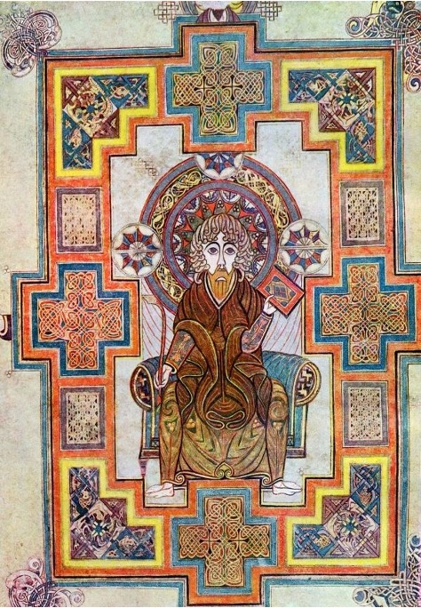
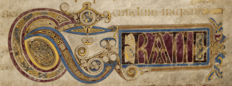
The Book of Kells was written in the 800s in Scotland, Ireland. Kells is a tiny town in Ireland’s Meath county. It takes its name from the Kells monastery in Meath County. The precise data about the exact time and people who wrote the Book of Kells are still unknown. The book of Kells is thought to have been composed by monks of the St Columbus order of Iona, Scotland, because illuminated manuscripts are typically written by monks. The mystification of this particular document piqued my interest.
The Book of Kells is an illuminated manuscript that contains the Christian New Testament’s four gospels. The copious use of gold and silver that lighted these books, giving them a royal and heavenly look, is why they are termed Illuminated manuscripts. Illuminated manuscripts are handcrafted books that usually contain Christian scripture and are only read aloud for ceremonial purposes. They were extremely costly to create, and only those with great financial resources could afford them.
The book has a height of 10 inches and a width of 13 inches. It was written on calfskin Vellum, which is made from stretched calfskin that is dried on frames and then utilised for writing.
Illuminated illustrationIlluminated illustration
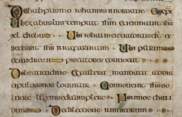
The images are extremely detailed and on a bigger scale, the Book of Kells highlights this ceremonial activity, while the text is modest, with many repeats and paragraphs missing.
The Hiberno-Saxon style is used to write this work. This style combines Irish Celtic curving motifs and elaborate initials with Anglo-Saxon zoomorphic interweaving and dazzling coloration.
Hiberno-Saxon Style
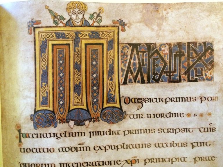
On every page each title has a large bright first letter that is meticulously detailed with men and animals that are engaging in a range of actions.
Title examples
Book of Kells unsolved:
Other than the fact that it is unsure about the creators of the book of kells. Based on the opinions of the Annals of Ulster the book was once stolen. There are many parts of the book that are missing and the reason for that till today is unknown.I enjoyed the process of research this specific book.
Inspiration:
One of my favourite animated films, “Secret of Kells,” directed by Tom Moore and animated by Cartoon Saloon, inspired me to write about the Book of Kells. This Film revolves aroundthe ‘Book of Iona,’ which is the term for the unfinished Book of Kells, as I learnt today. It’s energising to learn so much about subjects I’ve always found fascinating and how I can better comprehend them now.
I choose to write on three inventions that occurred between 1850 and 1895. New technical discoveries have always piqued my interest, and I continue to be fascinated by technological advancements and developments today. As a result, I decided to go back and investigate the origins of the technology I use today. Researching to connect the three innovations, the telephone developed by Alexander Graham Bell (1876), the practical electric lamp invented by Thomas Edison (1879), and the Zippers invented in 1891, was a challenging but rewarding task. This assignment made me appreciate what I have today. I would give myself an 8 out of 10 since I feel I could have researched more and pushed myself a little more to think of captivating titles.
The first design of the zipperThe electric bulbThe first telephone
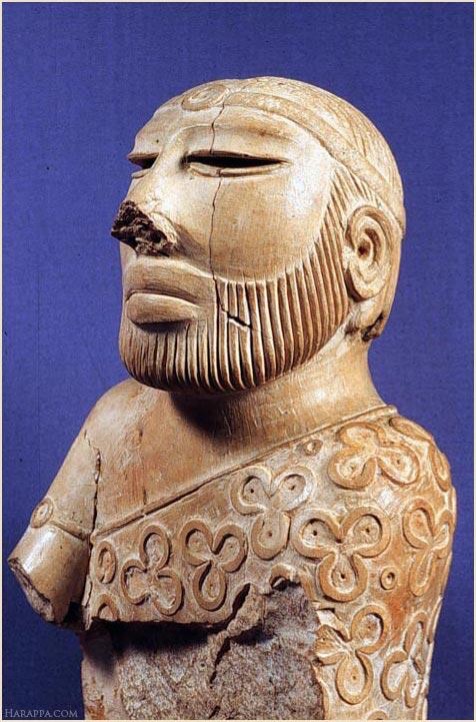
The Indus Valley civilization, also known as the Harrapan civilization, prevailed from 3300 to 1300 BCE and spanned sections of Afghanistan, Pakistan, and northwestern India as far as Rajkot. The people who lived during the course of the Indus Valley civilisation seemed to be artisans or craftsmen.
They created art through many mediums. A few of them being Seals, sculptures, pottery, terracotta figurines and gold ornaments.
They not only drew flawlessly from memory and observation, but they also created their gods and goddesses using their artistic abilities and imagination.
This sculpture of a bearded man depicts how the craftsmen exaggerated features in order the emphasize the characteristics of the man. The elongated eyelids give a sense of peace and wisdom. The simple lines accurately depict an unembellished beard, the detail of the shawl over one shoulder tells the viewer about the type of clothing that priests during the period of the Indus Valley civilization wore. This piece of art also effectively displays the emotion of serenity and respect one feels when in the presence of this priest.
It also shows how the artisans tried to create 3-dimensional sculptures.
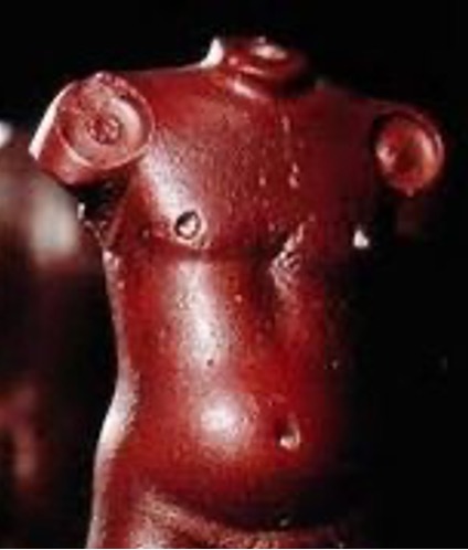
Naked male torso, image source: https://in.pinterest.com/pin/437201076297289179/
Male torso
This stone sculpture while being the complete opposite of the earlier stone sculpture clearly demonstrates how exceptional the observational skills of some the earliest artisans were. The sockets have been created for the attachment of the rms and the head. This sculpture has perfectly captured the weight and realistic feel of this torso.
The various styles of these stone sculptures demonstrate how various artistic forms were promoted and developed during the civilisation.
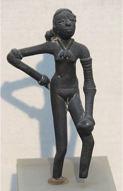
Copper Figure:
The Dancing girl, image source: https://en.wikipedia.org/wiki/Dancing_Girl_(sculpture)
The Dancing Girl (2300–1750 BCE)
This is a 4-inch copper figurine that depicts a girl dancing.
The ornaments she is wearing, and her pose give the viewer so much information about how the dancer was meant to look like.
Seals:
While trying to mimic the realistic features of peoples and animals that one would see in everyday life, the artisans of the Indus valley civilization also created symbols and seals of their deities.
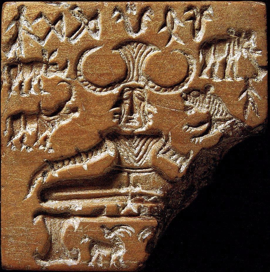
The Pashupati seal, image source: https://www.sutori.com/en/story/indus-river-valley-cultures-mohenjo-daro-harappa–m5vB1GXTqmzBEYP5GzmoxdaF
The Pashupati Seal(2350-2000 BCE)
The goddess of fertility. ‘Pashupati’ in the Sanskrit language means the lord of animals. Even though the Script has not been completely deciphered, this seal perfectly depicts the meaning. The tiger and elephant on the right-hand side and the rhinoceros and buffalo on the left-hand side along with the two antelopes at the bottom all surround the deity representing their worship and respect for the female goddess.
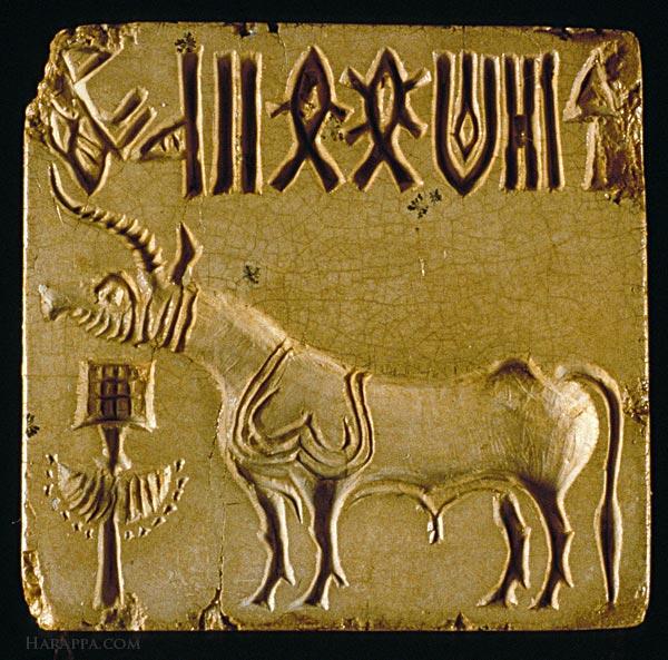
Archaeologists have found numerous seals depicting various animals, monsters and mythical creatures. This is one of the famous depictions of the unicorn bull.
Works cited:
Indus valley civilisation context and facts: https://ncert.nic.in/textbook/pdf/kefa102.pdf
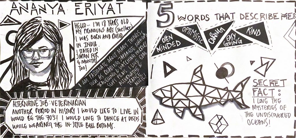
For this project, I used my most regularly used medium, black and grey markers. I also used black and white card paper that I cut out in different shapes and used in various areas in this spread. I generally love working with black and white moreover I felt there is no better way to represent my art style than using the colours I am most content with. The theme of my yearbook spread is monochrome and modernised. My spread style is inspired by a music video that portrays an alluring peek into a bleak dystopian future using only a monochromatic palette. ( I am also attaching the link to the music video below)
I only utilized grey tones in a few places, such as my self-portrait and the shark illustration, since I wanted the grey to convey that the living things on my yearbook spread seem to be three-dimensional.
Although my spread depicts a very dismal setting, I am quite the contrary! When I see illustrations made with black markers, I admire how bold they are. I feel captivated by the white space and few black lines that form a shape or a character.
I’d give myself an 8/10 since I believe my overthinking has been unconsciously reflected on my yearbook spread by the overcrowding on the left side of the layout, making the right side feel relatively emptier. However, I believe that the consistent theme and clear distribution of information effectively describes my art style and personality.
This project took me a total of 5 hours of planning and execution.