Historical type identification poster

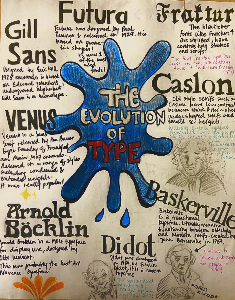
For this assignment, we had to make an entirely hand-drawn poster that featured a brief description of these eight typographic categories before 1945 as well as their distinguishing features. It appeared to be a straightforward exercise at first, but I soon realized that developing a poster with extensive information and making it engage was a difficult process. I had a concept and drew some initial designs for this task, however, I struggled with font layout and rendering.

Even though it took around 4 hours to correctly execute the final poster, the process works, and research required approximately two days to produce and obtain a final design idea. I’d give myself a 7/10 since I believe I could have done a much better job regarding neatness and layout.

My idea of creating a storytelling poster was solid, however, the execution and effectively getting the idea onto paper could have been better. I also feel that I should have spent more time on the project, but I misjudged the amount of effort that was necessary for this assignment to be completed successfully.

This is my result of the Type identification poster!
Visual Research I

Inception(2010) Film poster, by unknown

Scale/ Size 

Inception is one of the most complex yet brilliant films that I have ever seen. 

The scale has been utilised in this Inception poster to make it appear as if the surrounding metropolitan area is slowly overpowering the screen. The six characters’ diminutive scale in comparison to the towering buildings demonstrates how they are overwhelmed by their environment. This is expanded upon in the film when the dream in which these characters are trapped in begins to collapse on them.

AMAMI Homes logo (2015), by Koji Matsumoto

Line

  This logo for luxury housing in Japan has very strong design elements. Koji Matsumoto cleverly uses both simple straight lines and lines that form planes to not only signify a name but also the ‘housing’ aspect of this company logo. The isolated vertical line is situated in the extreme right, standing out it in the white space, and seems open to viewer interpretation. In my opinion, it could be symbolising a person without a home or the customer viewing the home options.

The design of the simple lines also allows the logo to be placed differently as shown above.

‘Cape Animal Dentistry Service’ (2017)logo , by Andrew Whitehouse

Shape

Even without the words, this logo elegantly conveys the service’s concept. With the addition of one small blue circle on the right side, the white tooth shape is also modified to resemble an elephant. This logo is used to symbolize a veterinary dentistry service, and it successfully incorporates both the animal and the dentist components.

Works Cited:

Amami Home: https://www.dandad.org/awards/professional/2015/graphic-design/24566/amami-home/

Cape Animal Dentistry services: https://www.dandad.org/awards/professional/2017/branding/25932/cape-animal-dentistry-service/