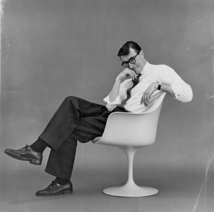
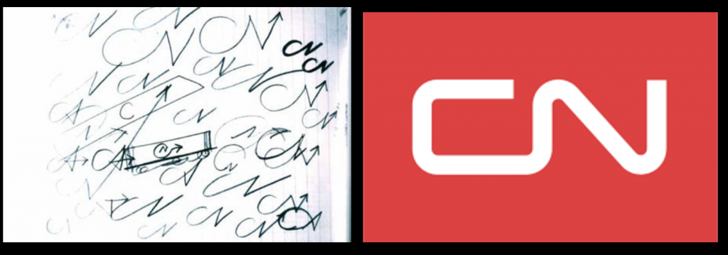
Allan Fleming was only 30 years old when he was hired to create a new logo for CN. Despite this, the young Canadian designer had earned a name for himself with the bold, poetic nature of his designs.
Fleming, who was born in Toronto in 1929, took an unusual path to professional success. At the age of 16, he dropped out of art studies at Toronto’s Western Technical School to work as an apprentice designer at several Toronto firms. Then followed further learning opportunities in England, where he soaked up as much knowledge as he could from major individuals in the design field.
Allan Flemmming
After Returning to Canada, he joined the typographic company Cooper and Beatty Ltd. in 1957, where he was working until the CN opportunity presented itself.
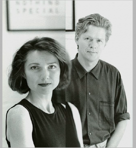
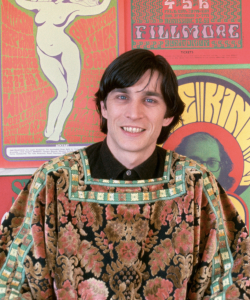
Rudy VanderLans is a Dutch graphic designer, photographer, and the co-founder of Emigre Fonts with his wife Zuzana Licko.
Rudy VanderLans and Zuzana Licko
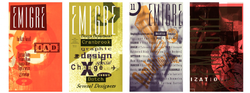
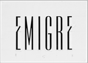
the original concept for Emigre has gone through quite a few changes. When Emigre started it was meant to be a magazine for emigrant artists and their experiences. It wasn’t a design magazine but a general arts magazine. The idea was to show the work of people who had the experiences of living and traveling in foreign countries, and the effect these experiences had on their creative work.
Emigre magazines
Emigre is both a magazine and a type design lab.Well, type design is the main business.. They develop, produce, license and distribute typefaces. And then, to challenge themselves creatively and intellectually, and to find ways to test and apply their fonts, they publish a magazine, release music, distribute design and artists books.
As a team, Emigre has been honored with numerous awards including the 1994 Chrysler Award for Innovation in Design, and the 1998 Charles Nypels Award for excellence in the field of typography. Emigre is also a recipient of the 1997 American Institute of Graphic Arts Gold Medal Award, its highest honors.
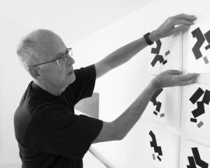
Willi Kunz was born in Switzerland (1943) and moved to America in 1970. In New York City, he found work at Ansapch, Grossman & Portugal, a corporate identity consultancy agency. His success in establishing a branding programme for the Merit fuel station franchise company helped establish his credentials, and he subsequently established an independent design studio that is still in operation today. Despite being steeped in the Swiss typographic style from an early age, he broke out from its more formal requirements and exposed himself to what he called “creative exploration.”
WIlli Kunz
Kunz was essential in introducing new ideas in Swiss typography and design to the United States.
Some of his works below demonstrate how He employed a more instinctive approach to structure and composition rather than the standard grids of the past.
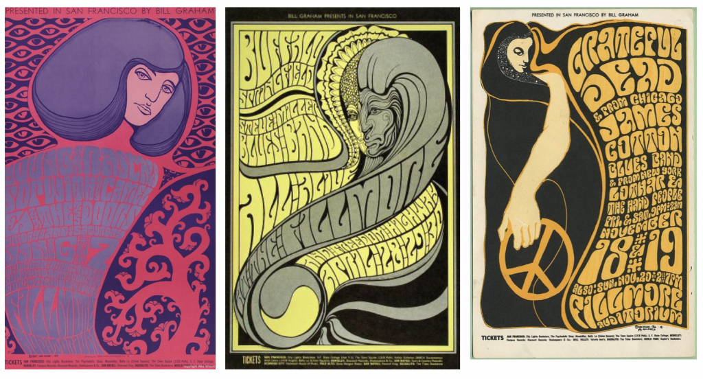
On July 15, 1937, Wes Wilson, the pioneer of the 1960s rock concert poster, was born in Sacramento, California. His interests as a child ranged from artistic hobbies to a strong appreciation of the beauty of nature. His post-secondary education echoed similar interests; he studied forestry and horticulture before settling on philosophy. Over the latter half of the 1960s, Wes had found tremendous inspiration in San Francisco’s avant-garde districts, and he quickly found himself creating fine art for the public. His approach, influenced by the Master of Art Nouveau, took what was known about promotional art and twisted it inside out. Letters that were nearly cryptic covered every available space, lines melted into lines, colours clashed… and the psychedelic poster was born.
Wes Wilson
Bill Graham, the Fillmore Auditorium’s music organiser, commissioned the following concert posters from Wes Wilson between 1966 and 1968.
In only 14 months, he made 56 posters for Bill Graham, averaging one poster per week for the Fillmore.
These are some of my favourite posters from his Bill Graham posters collection.
BG-44 :1967 : featuring Young Rascals, BG-61 :1967 :featuring Buffalo Springfield, Steve Miller Blues Band, Freedom Highway and BG-38 : 1996 :featuring Grateful Dead, James Cotton Blues Band, Lothar & the Hand People
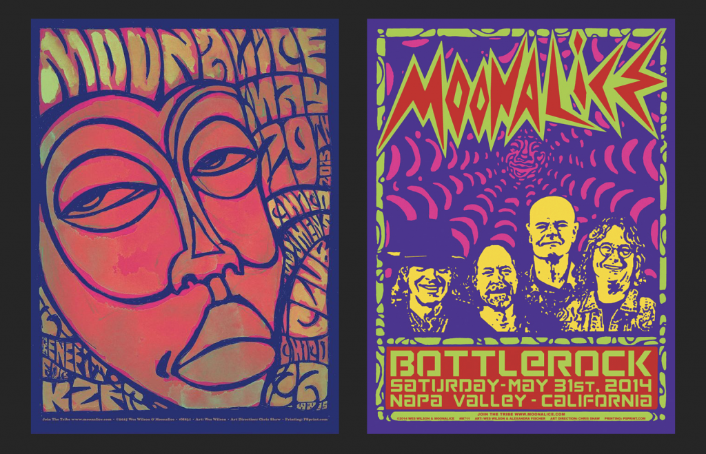
In 2010 Wes joined the Moonalice tribe, launching a decade of creative expression. Moonalice, a psychedelic rock band based in California, provided Wes the opportunity to get back to his poster-making roots. Love, unity, and creative expression are all pillars of the Moonalice tribe.
These are some of the posters that particularly stood out to me.
Chico Women’s club poster,2015 and Napa Valley CA- Wes Wilson & Alexandra Fischer,2014
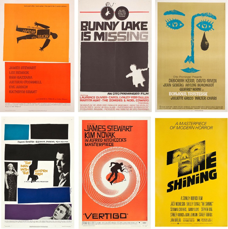
Saul Bass (May 8, 1920 – April 25, 1996) was an American graphic designer and filmmaker best known for his work on film posters and title sequences.
Bass worked for Alfred Hitchcock, Stanley Kubrick, Otto Preminger, Billy Wilder, and Martin Scorsese during his 40-year career.
Saul Bass is possibly the most skilled graphic designer in history. Working in the mid-twentieth century, when graphic design was just beginning to gain traction, Bass branded a startling array of prominent firms with his classic, basic designs.
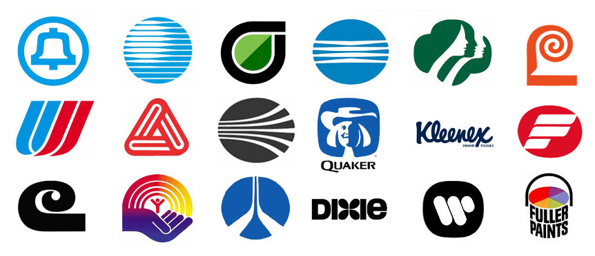
He also created some of the most recognizable corporate designs in North America, including AT&T’s first “bell” logo in 1969 and their later “globe” logo in 1983. He also created the 1968 “Jetstream” logo for Continental Airlines and the 1974 “tulip” logo for United Airlines, both of which have become some of the most recognizable logos of the era.
Before I enrolled in this program, I looked up to Saul Bass because he elevated the sophistication of movie posters with his distinct simple style and entirely transformed the role of title credits in films.
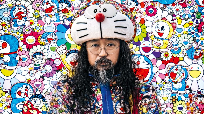
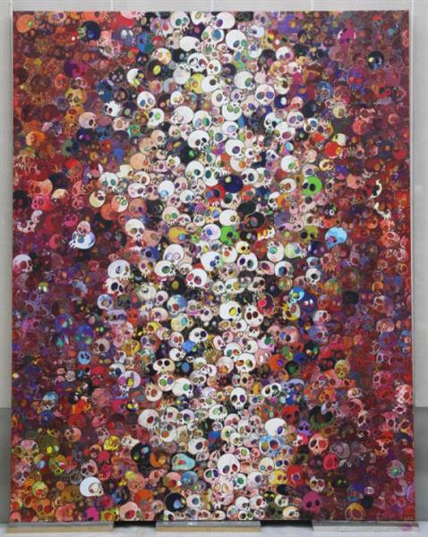
Takashi Murakami is a Japanese modern artist who was born on February 1, 1962. He works with both painting and sculpture and commercial mediums and is noted for blurring the barrier between high and low arts. He popularized the phrase “superflat,” which defines both the aesthetic aspects of Japanese creative heritage and the nature of postwar Japanese culture and society and is also used to characterise Murakami’s artistic style and other Japanese artists influenced by him.
Portrait of Murakami
Murakami was born and raised in Tokyo. He had always been a lover of anime and manga (Japanese cartoons and comics), and he aspired to work in the animation industry. He studied drawing at Tokyo University of the Arts to become an animator, but he finally concentrated in Nihonga, the ‘traditional’ form of Japanese painting that integrates ancient Japanese aesthetic traditions, methods, and topics.
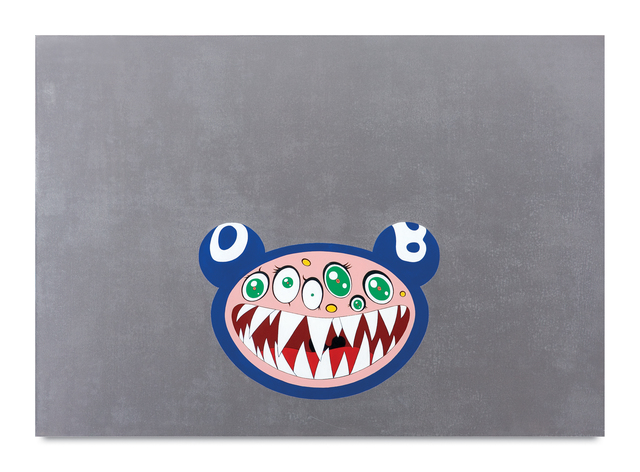
Below is one of the first characters he created. I love the colours, simplicity of the shapes and the silly yet eerie effect this piece has on its viewers.
“DOB’s March”-1995
Personally, ever since I went to Japan to pursue my Japanese language studies, I have always admired his work. I want to study at Tokyo university of art in the future and have always looked up to Takashi Murakami’s work. Like him, I have also grown up watching anime and reading manga since my parents are both animators and were big fans of the Japanese animation films. This was what drove me to admire Murakami’s work.
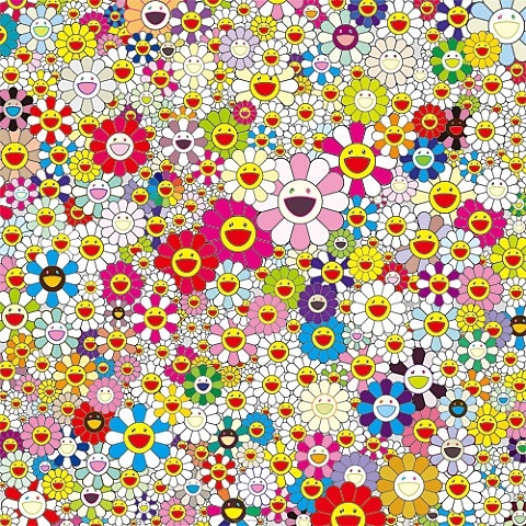
“flowers in heaven” -2010
This one of his trademark artworks, that is recognized globally. I love how simplistic yet captivating this piece is. The name of the piece also makes me wonder what the artist thought before naming the piece.
Even though at first, I did not understand the impact of his work, after listening to my peers talk about his journey in class, I realized what an impact he has created.
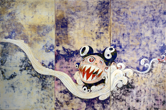
These are some of his other artworks that really resinated with me:
This artwork of his named “727” really stood out to me. I admired how he merged the tradidtioal Japanese style painting along with his personal character style.
“One of the most successful forms of adaptation to the social space is achieved by people who take to this space like ducks to water and who therefore do not need a pocket calculator to find their way. ” -Pierre Bourdieu
This was part of one of the first readings I did in this class. When I was just getting settled into my new university life, I was scared and nervous because it was my first time away from home. This quotation above truly struck a chord with me.
This quote did not make sense to me at first. But as I began to socialise and comprehend my surroundings, I recognised that this was an excellent example of one of the most successful kinds of adaptation. Personally, I haven’t had the finest social experiences, but I now do my best to adapt to my surroundings.
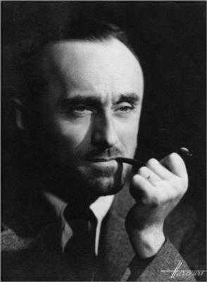
Adolphe Jean-Marie Mouron, aka A.M Cassandre, was born on the 24th of January 1901, in Kharkov, Ukraine.
I chose to write about Cassandre because during the survey presentations in class I enjoyed looking at his posters and artwork. They stood out to me and I would like to put them together and adore his complex yet simplistic style.
A.M Cassandre portrait
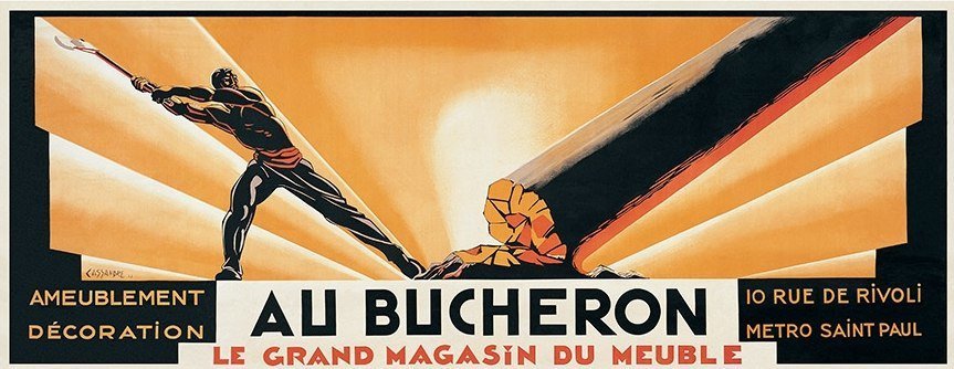
To sustain himself, he found and capitalized on the popularity of advertising posters, which were all the rage in Paris in the late 1910s. He was allowed to work at a printing firm in Paris, where he began signing his artworks, mainly posters, signed as “Cassandre.” By 1922, he was able to open his art studio and create even more posters in his distinct style, which was influenced by cubism and surrealism. One of his most well-known works “Au Bucheron,” was a poster designed for a cabinet builder. It was then printed in a huge size in many “Compagnie Internationale des Wagons-Lits” copies and distributed across Paris.
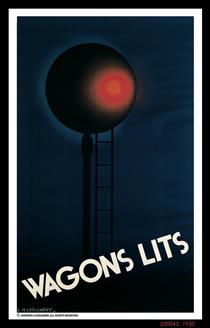
Au Bucheron (1923)Compagnie Internationale des Wagons-Lits (1930)
His early style combined stylized curves and geometric motifs from Art Nouveau with a hint of sleekness and elegance.
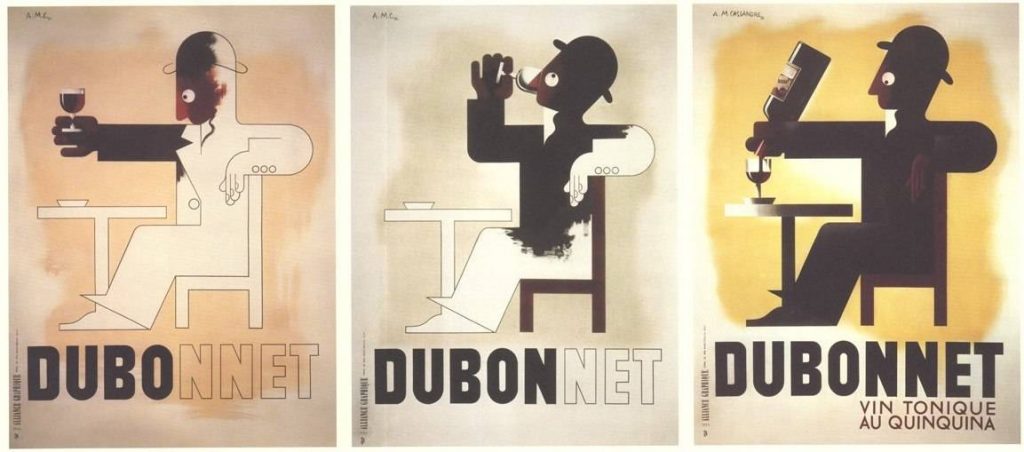
His outstanding works for the “Compagnie Internationale des Wagons-Lits” and “Dubonnet” wine companies were among the first posters designed to be seen and understood from moving vehicles. He was the one who came up with the notion of the Serial Poster, which is a series of posters that delivers an entire engaging topic in fast succession.
Dubonnet (1932)
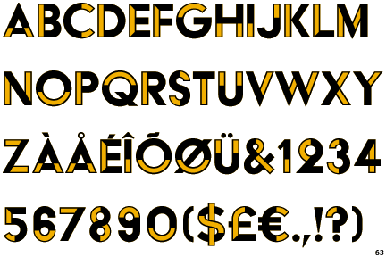
A.M Cassandre was a highly inventive painter. I admired how he was able to demonstrate sleek, classical, and attractive art deco posters. A.M Cassandre’s designs did not only affect Art Deco but also commercial art. He created memorable travel posters for the well-known travel firms, he also focused on exploring new styles and methods outside of poster arts Like typography. He designed various typeface types through his firm like the one below.
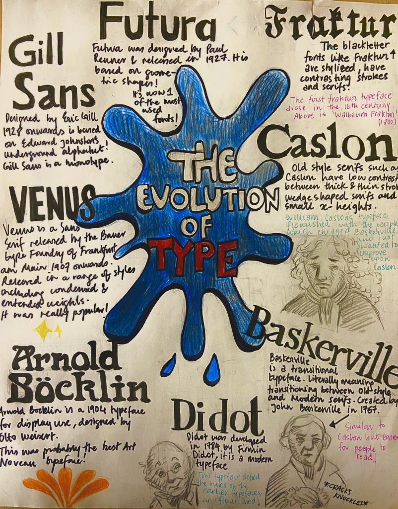
For this assignment, we had to make an entirely hand-drawn poster that featured a brief description of these eight typographic categories before 1945 as well as their distinguishing features. It appeared to be a straightforward exercise at first, but I soon realized that developing a poster with extensive information and making it engage was a difficult process. I had a concept and drew some initial designs for this task, however, I struggled with font layout and rendering.
Even though it took around 4 hours to correctly execute the final poster, the process works, and research required approximately two days to produce and obtain a final design idea. I’d give myself a 7/10 since I believe I could have done a much better job regarding neatness and layout.
My idea of creating a storytelling poster was solid, however, the execution and effectively getting the idea onto paper could have been better. I also feel that I should have spent more time on the project, but I misjudged the amount of effort that was necessary for this assignment to be completed successfully.
This is my result of the Type identification poster!
Remedios Varo Uranga, born on 16th December 1908, was one of the few female surrealist artists recognized in the first half of the twentieth century. Through her distinct and unconventional approach to surrealism, she defied the male-dominated artistic milieu of the time.
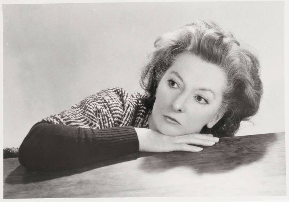
Portrait of Remedios Varo. Photo by Walter Gruen
When the Spanish war broke out, Varo fled to Paris where she was influenced by the surrealist movement. Francisco Goya and Hieronymus Bosch’s artworks played a major role in her style. However, the foundations of surrealism were laid early throughout her youth, fuelled by her multicultural upbringing and background. Her father was also a major influence, instilling in her essential principles such as her impassioned perfectionism and freedom of imagination, which eventually manifested in her art.
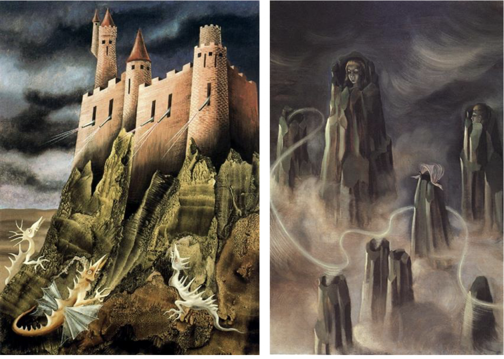
The battle , La batalla, (1947) and The Souls of the Mountain, (1938)
Varo found a safe haven in her paintings to rebel against catholic practices from her maternal side, from which she felt extremely confined. She fused supernatural entities and utopic technologies to create her own, unique aesthetic which can be seen in all her artworks.
Her major focus was mysticism and the occult, personally, I really admire the style and how she interprets her mystical thoughts and concepts into art while also rejecting Christian and religious symbols.
Varo passed away in 1963, under unfortunate circumstances at the peak of her career, from a heart in Mexico City.
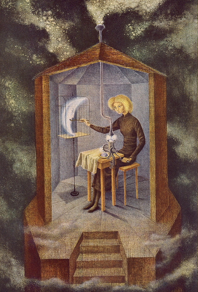
The Star maker
The painting above is one of her paintings that stood out to me the most. At first, I thought about how the painting could depict the moon being trapped, but the title of the painting ” The star maker” really took me aback. I was so impressed by how she thought of this painting! A woman sitting in a small house feeding the moon to make stars, pushing them out through some simplistic technology. The colors used in this painting are also really interestingly used. The sky is a dull grey, even though it is filled with stars and the bright mood that’s meant to be in the sky is in a cage that is in a small house. I love this painting and hope to develop my ideation and thinking abilities as Varo does.
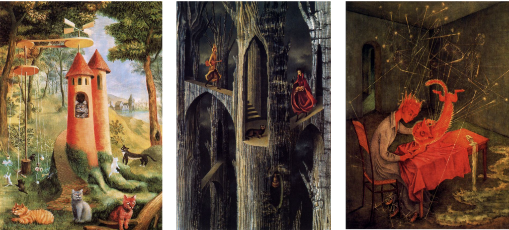
Cats Paradise (1955), Plant architecture (1962) and Sympathy (1955)
Another really interesting aspect about Varo’s paintings that I found was the element of cats spread across some of her paintings. At first, I thought she adored cats but after researching, I realized that Varo painted cats to represent feminine symbols. I like how some painting’s main element is a cat while in some, for instance in her painting “Plant architecture” the cat is subtly placed in the center, in atone that almost merges with the background. I find Surrealist art captivating since the interpretation is more open and it makes the viewer sit down and think about what the painting is trying to portray.