Continuation (Gestalt principle)
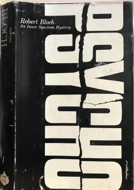
This cover design effectively demonstrates not only the principle of continuation but also closure and contrast.
The viewer’s eye is drawn from top to bottom by the tear running down the center of the title; the width of the tear is thicker at the top and thinner at the bottom, and the audience is compelled to focus on the P of ‘PSYCHO’ first. The tear line also pushes our ability to assume that the title continues off the page where we can’t see it. However, there isn’t as much evidence here because the entire composition finishes with the word on the page. Even if the title is divided from the centre, the closure succeeds here because the audience can make out what the title is. The striking black and white contrast, closure, and continuation all contribute to the title’s long-lasting impact on the audience.
What’s really clever about this design is that it evokes imagery of a disturbed mind without really showing any visual representation of human emotion!
Similarity (Gestalt principle)
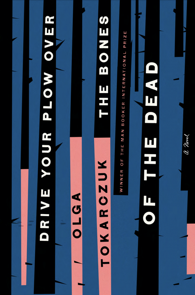
This book cover demonstrates how the principle of Similarity causes the audience to group similar design elements, which in this case are the fonts and the colour bands. The viewer is compelled to group the bold white lettering on the black illustrations of the trees together on this book cover, moving them to read the title first. The bold black lettering above the pale pink trees takes second place in the overall visual hierarchy of this piece, highlighting the book’s author. Because of the varied font styles, the smaller pink and black texts in the background are divided into two groups.
In this situation, similarity leads to grouping, which makes information interpretation fairly straightforward.
Repetition (Design principle)
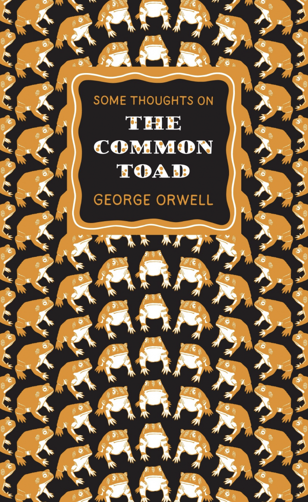
The title of this book cover, “The Common Toad,” is perfectly depicted in a pictorial style. The toad is replicated at different angles but is designed identically to every other toad on the page, emphasising how common it is.
The repetition also emphasises the mundane feeling associated with a common toad.
Contrast (Design principle)

Contrast is displayed prominently on this book cover. Both the contrast in scale and the contrast in colour are crucial. The bright red colour contrasted against the white moves the audience to stop and examine the cover. The contrast between the bright background and the black typography enables the title stand out. Despite their relatively small scale, the 2 minor characters on the side against the contrasting red hue make the audience want to look at the minute details of the characters because they evoke intrigue.
Works cited:
Image source for ‘PSYCHO’ book cover: https://www.creatopy.com/blog/best-book-covers/
Image source for ‘The Common Toad’ book cover: https://www.designboom.com/design/interview-with-graphic-designer-david-pearson-01-21-2014/?utm_source=dlvr.it&utm_medium=twitter
Image source for ‘The Nickel Boys’ and ‘DRIVE YOUR PLOW OVER THE BONES OF THE DEAD‘ : https://lithub.com/the-78-best-book-covers-of-2019/