This week is my final week with TRIUMF. I have been with TRIUMF for a month and a half now. I have managed to accomplish a lot for the development of the Discover Our Lab site. Although I have spent 240 hours working, it feels like I only started my practicum a week ago. Time flies if you’re working and enjoying the job that you do.
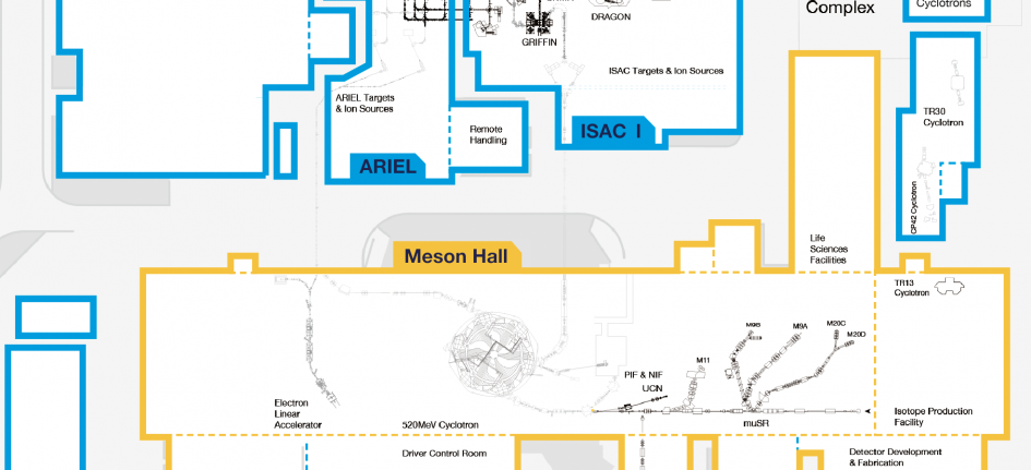
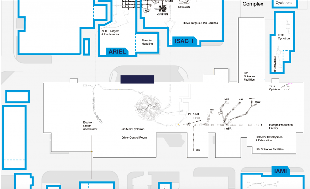
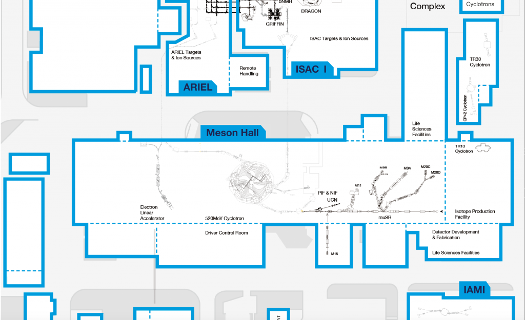
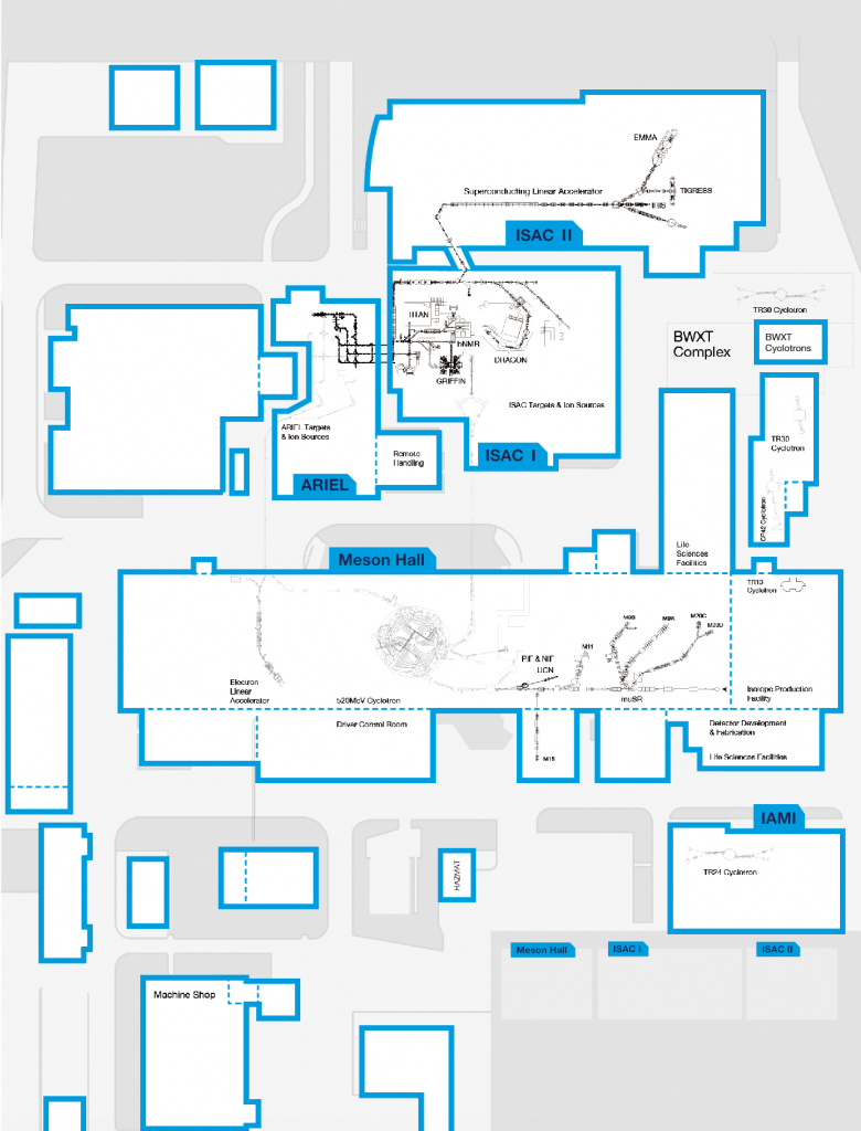
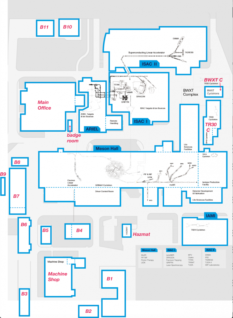
This final week I have been working on deconstructing and redesigning the TRIUMF map. At first glance, it might not seem like a lot of progress have been complete, but this week’s work has been “backstage preparations” and has not changed much visually. I have turned TRIUMF’s flat image of a map into layer friendly interactive format for the site. I have also tweaked the building shapes to look more simplified and have exported everything piece by piece for Cheryl.
This task might seem straightforward, but it still involved creative solutions to make everything work perfectly. For example, if your SVG file is more than one colour, then Elementor would be confused, and you wouldn’t be able to change the element’s colour on hover. This issue came up with the labelled buildings because the outline was blue and the label text was navy blue. To make the outline change into yellow on hover, I had to cut the text out of the outline shape. I’ve also placed a navy blue box underneath the outline. This way, the blue outline on top will change to yellow on hover, and the navy blue text will appear the same.

It is helpful to work with people that are knowledgeable in different skill sets. If Cheryll didn’t tell me how the hover feature works in Elementor, I wouldn’t have prepared my files as SVGs, or even go an extra step of breaking shapes down as described in the above example.
It is also important to remember that files you’re working on might be confusing and even cause distress to other workers who are not familiar with them. With the map example, Cheryl had to place each building outline on the flat map separately. Most of the building shapes are just square/rectangular looking. Cheryl would also have a hard time knowing where to place the buildings (without any guidelines). I took some extra time to make this process much easier and quicker for her.
I have left faint black building outlines on the flat map background so she could see where to place buildings on top.
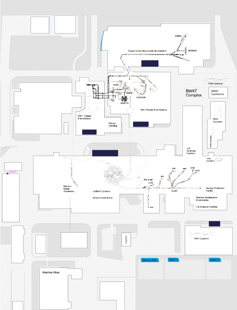
You can see how that would already make it a bit easier, but I have also decided to make a legend for the buildings in correspondence to the building file names.
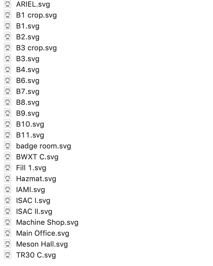
You can see how it would be easy to navigate the files in such a manner. As designers (or just workers), it is important to remember that we work with other people. Treat files the way you would if you were to send them to yourself.
This week wraps up my TRIUMF experience. However, I will write one more blog post next week summarizing my general experience.
Leave a Reply