Ariana Thompson is a first-year student enrolled in the IDEA Bachelors of Design and Visual Communication at Capilano University. They attended and graduated from Correlieu Secondary School in Quesnel, British Columbia in 2018. At the age of 21, they are a first-generation Canadian who is very passionate about art. Capilano is not Ariana’s first experience in university. They previously studied Geography at the University of Northern British Columbia, aiming to graduate with a Bachelor in the Arts. After discovering their drive for art, they left the program to pursue design in hopes to graduate with the credentials to have a career driven by illustration.
On English 100
As an art student, English has never been my strong suit, throughout high school, it was my most challenging course. University as well has been a struggle, processing the readings and writing essays is no new of a struggle. Although, the team I had around me greatly helped my experience in English 100. There are so many resources in Capilano University to guide someone who may struggle with this. One piece of this class that I thoroughly enjoyed was the weekly class response. The weekly class responses helped to warm me up whenever I needed to write, whether it was for a blog post for another class or for an English essay, I found this useful and very interactive.
From The Persistence of Word
Writing and language is a force that has been known for a long time, looking into “From the Persistence of Word” by Gleick we break down the quote, “writing was a new method of civil direction.” Writing is a being that is essential to a designer, its written form does not change but the verbal form does. As design majors, this quote indicates the beginning of the civil direction, the direction which later branches out into languages, books, typefaces, and writing. This proposes that writing has led humanity to the point it is today.
Herbert Bayer
Bayer was an American-Austrian designer, painter, photographer, sculptor, and art director born on April 5th, 1900 in Haag, Austria-Hungary. He was a student who later became a teacher at the Bauhaus in Weimar, he worked in a diverse selection of fields. When he became a teacher, he began his first class in the Bauhaus teaching typography. As he taught, Bayer spent time working as an Art Director for the Container Corporations well as an architect in Germany and America. Between 1925 and 1930, Bayer spent five years in total designing a geometric sans-serif typeface which we know as “Universal” typefaces. His typefaces were often known to be very dynamic.

Post-Bauhaus
In 1928, Bayers remained in Germany, leaving the Bauhaus to later become an art director for Vogue magazine in the city of Berlin. Though this didn’t remain for very long and Bayer son immigrated to America in 1938 with an invitation from Alfred H. Barr, Jr., who was a founding director of The Museum of Modern Art. He was invited to display his theories in the museum under the exhibition, “Bauhaus: 1919–28” (1938). Whilst in the US, Bayers was mainly active as a painter, advertising graphic designer, and exhibition designer. In the year 1944, Bayers married Dada artist, Joella Syrara Haweis. His architectural skills were up to work when he was offered a job opportunity by industrialist and visionary Walter Paepcke. Bayers later designed the Aspen Institute and restored the Wheeler Opera House.
Sources
https://www.bauhauskooperation.com/knowledge/the-bauhaus/people/masters-and-teachers/herbert-bayer/
https://www.moma.org/artists/399
https://www.bauhauskooperation.com/knowledge/the-bauhaus/people/masters-and-teachers/herbert-bayer/
https://en.wikipedia.org/wiki/Herbert_Bayer
Takashi Murakami
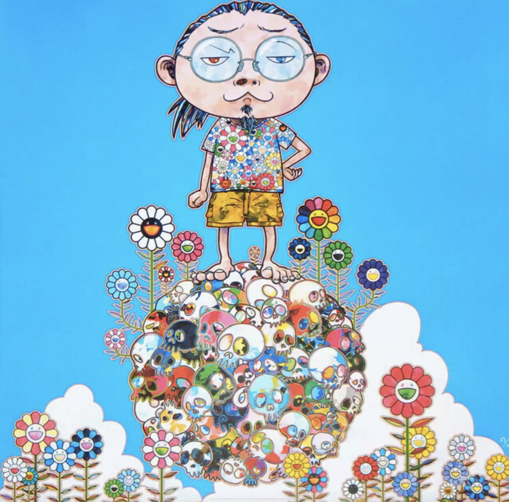
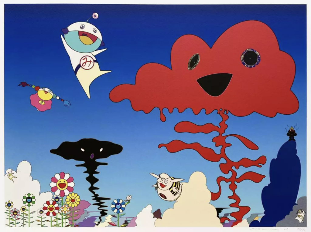
Takashi Murakami is a Japanese contemporary artist, born on February 1st, 1962 in Tokyo, Japan. He is well known for his works within the fashion industry. Growing up, Murakami was a fan of Japanese anime and manga, growing his aspiration to join the animation industry. After enrolling in the Toyko University of Arts, he gained the qualifications to become an animator just as he hoped. After his graduation, Murakami’s focus shifted and he became dissatisfied with the contemporary art within Japan. He claimed it felt like, “a deep appropriation of Western trends.” Around the year 2000, Murakami established “Superflat.” This was an exhibition created to help feature works that were inspired by Japanese culture such as ukiyo-e or even anime. Murakami’s art varied in style, one of his most expensive pieces of work is a figure of a naked anime character with spikey hair.

One of my favourite works created by Murakami is his iconic happy flower illustration. This illustration is recognizable by many and I admire the bright colours and the overall joy it represents. Although the Murakami Flower debuted in 1995, it steadily became a sensation in the pop culture industry. Artists such as Kanye West featured the flower on his album cover or Jung Ho-seok (J-Hope) of BTS wore the flower to symbolize hope and happiness. Even companies such as Louis Vuitton have collaborated with Murakami. I have a strong overall appreciation for Murakami, I admire how well he can encapsulate colour in an image and utilize it to create hope and happiness for the viewers.

Flowers of Hope, 2020
Me Among The Supernatural, 2013
Eco Eco Rangers Earth Force, 2005
Sources
https://gagosian.com/artists/takashi-murakami/
https://hypebeast.com/2020/11/takashi-murakami-flowers-behind-the-hype-video
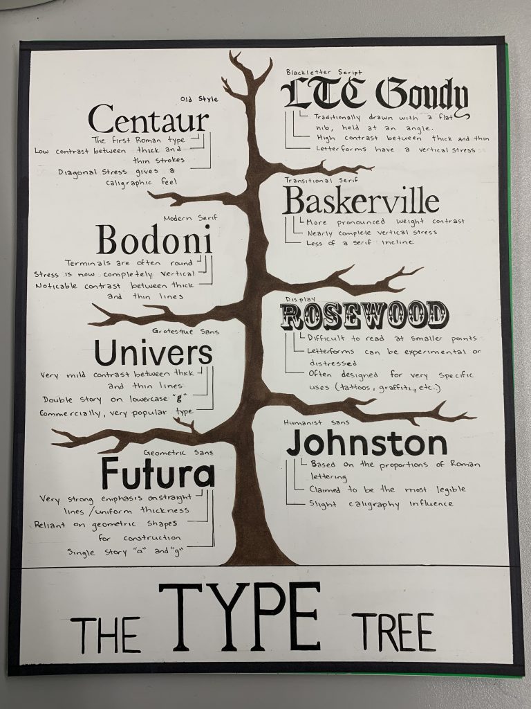
Type Poster
For my typography poster, I decided to go with the idea of a “type tree.” I felt that the use of a tree helped to display each section of type in an orderly fashion which was simple, but yet understandable. For colour, I originally planned to add some more variety on the bottom text and the background though, I felt this would be much more overwhelming. I decided to stick with the simple colour tone and planned to focus mainly on the type itself.
I feel that my idea could have been a little bit more creative so I rank myself an overall 7/10. I spent approximately 6 to 7 hours finishing the entire thing, the majority of the time spent in writing on the typefaces themselves.
A Trip To The Moon (1902)
Welcome to the Moon
Back in 1902, a silent, French short film called “Le Voyage dans la Lune” (A Trip to the Moon) was produced. The movie was written and directed by French director and actor, Georges Méliès. This movie was created during a time where technology was very new and the concept of “sci-fi” hardly even existed. It follows a group of astronomers throughout their journey to the moon, travelling via a canon-propelled capsule that launches towards the surface of the moon.
/cdn.vox-cdn.com/uploads/chorus_image/image/59605469/melies.0.jpg)
Filming the Moon
The budget for the film was ₣10,000 (French Franc) and took approximately 3 months for the 13-minute film to be completed. The majority of the budget for the film went towards the making of the scenery and the costumes. For the costumes, Méliès himself would create the costume prototypes for the head, knees and feet in terracotta and then create plaster moulds for them. For filming, most of the special effects in the film used the substitution splice technique. This was a technique in which the cameraman would stop filming for a moment and an object would be altered, added, or removed before filming resumed. In a way, much like stop motion.
A Legacy for Sci-Fi
As a personal fan of sci-fi, I have yet to even view the film, I would like to watch it. This film would be even more intriguing to watch during the time it was released. The concept and the visuals surrounding the film itself were very unique for the date it was released, yet it opened up another world to the sci-fi movie industry, despite there not being much for technology. The sci-fi and fantasy themes showed the viewers that reality itself could be altered behind the camera for cinematic purposes. Today, “A Trip to the Moon” remains to be Méliès’s most popular film. The image of the moon with the capsule stuck in its right eye remains to be the most iconic scene from the film, it has been referenced in present-day films such as “Hugo.”

Sources
http://brainknowsbetter.com/news/2014/2/21/georges-melies-a-trip-to-the-moon-reveals-the-psychology-of-film
Paul Klee
Paul Klee was a Swiss artist born in Münchenbuchsee, Switzerland of German descent. He was known for his style which was influenced by the expressions, cubism, and surrealism movements. Klee was known as the father of abstract art with a style containing many forms from non-existent creatures to “mystical hieroglyphics.”
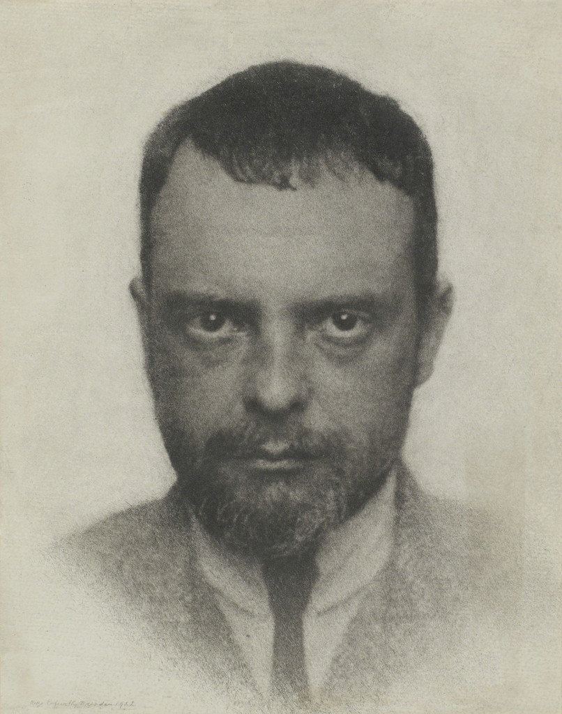
Portrait of Paul Klee, 1922 by Hugo Erfurth
After Klee relocated to Munich to study various art forms, he was influenced by artists such as Van Gogh and Henri Matisse. It also speculated that abstractionist painter, Kandinsky, was an inspiration for Klee’s works. Being an artist during the early 1900s, his work, and a group of other painters, greatly influenced future generations of artists with his abstract and cubism. During the twentieth century, there had been a resurgence of interest and returns to the forefront of modern art.
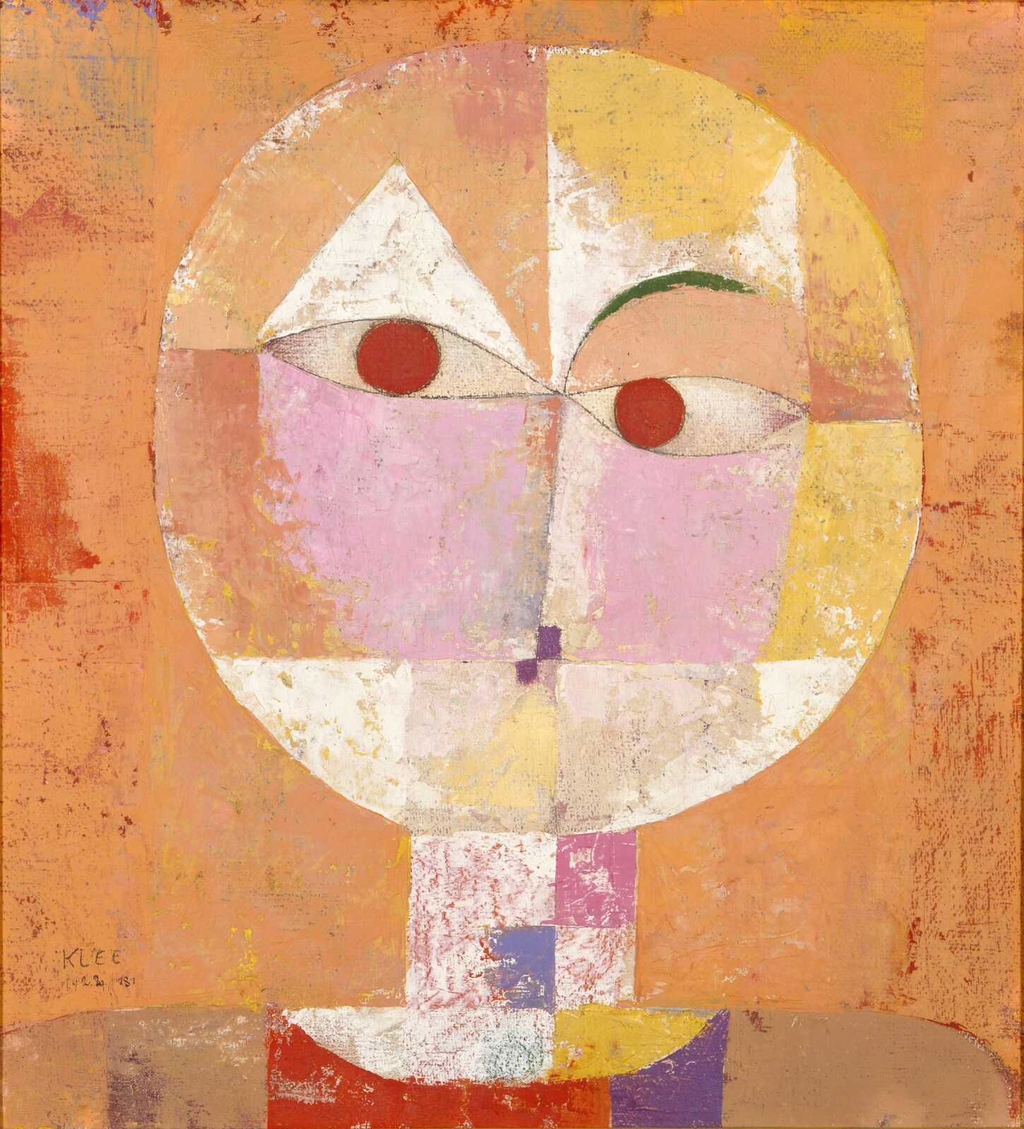
Senecio, 1922
Despite the massive interest in cubism and abstract, I do not find myself very interested in these movements. They are very playful figures, although, do not elicit any emotional or mental response when looking at them. Despite my dislike for the simplicity of abstract and cubism, I found myself enjoying Klee’s piece, “Hammamet with Its Mosque.” It indeed looks like a simple piece, what intrigues me is the use of colour and the messy art style.
It was very intriguing to look at the works of Paul Klee, I gained a better understanding of abstract art after researching.
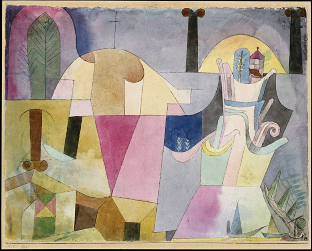
Black Columns in a Landscape, 1919
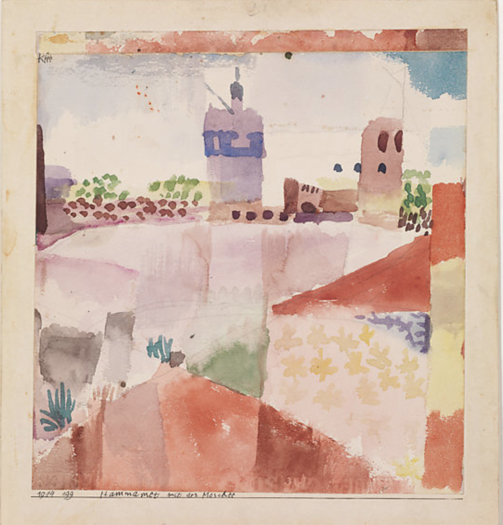
Hammamet with Its Mosque, 1914
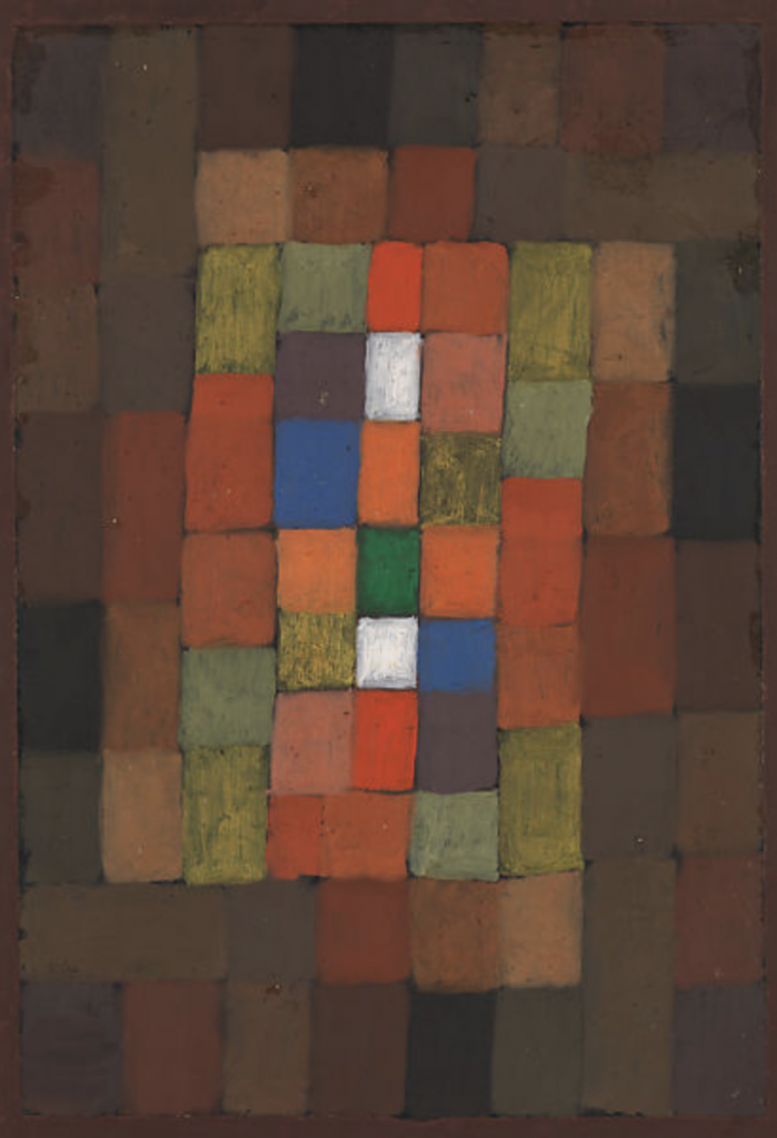
Static-Dynamic Gradation, 1923
Sources:
https://www.metmuseum.org/toah/hd/klee/hd_klee.htm
https://en.wikipedia.org/wiki/Paul_Klee#Reception_and_legacy
https://www.artsy.net/article/artsy-editorial-what-you-need-to-know-about-paul-klee
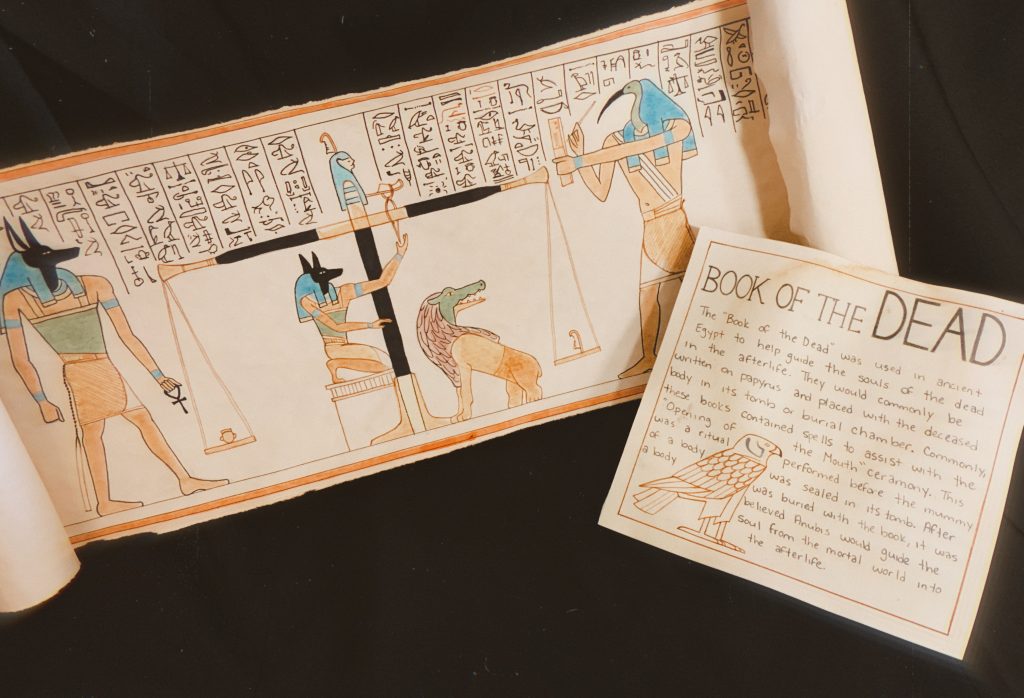
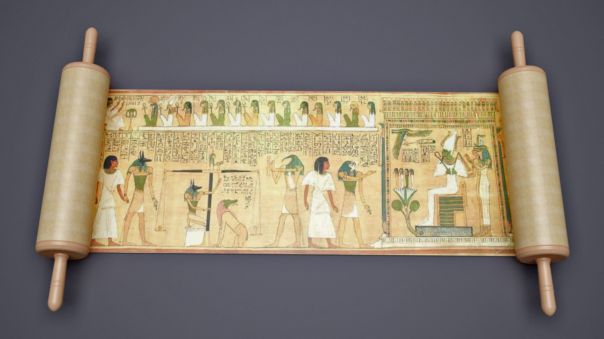
Egyptian Book of the Dead – Historical Artifact
For my historical artifact, I chose to do an Ancient Egyptian book of the dead. I chose this artifact to learn more about the book of the dead and to convey my interest in ancient Egypt. My approach to begin the “papyrus scroll” was to cut out a longer, slimmer strand of paper and proceed to draw on it. I tried to keep the images true to the historical illustrations and match the hieroglyphs to the best of my ability. After I finished drawing and then inking, I soaked the pages into some black tea for a few minutes and then hung them to dry, this process helped to stain the pages to make them look older. I felt applying this final stain was the easiest method to “age” the pages with the materials I had in my own dorm.
Overall, I am quite satisfied with the final product. I wish I could’ve aged the pages a little more to make them older and more yellow to appear more like papyrus. I’ve spent approximately a total of 5 hours putting it together, not including the drying time for the pages. Personally, I would evaluate about an 8out of 10 for myself, I feel like more thought could’ve gone into my museum sign.


Sources:
https://www.arce.org/resource/book-dead-guidebook-afterlife
https://www.worldhistory.org/Egyptian_Book_of_the_Dead/
https://www.britishmuseum.org/collection/object/Y_EA9901-3
https://www.britannica.com/topic/Book-of-the-Dead-ancient-Egyptian-text
Katsushika Hokusai
Leading up to the Wave
Katsushika Hokusai, famously known for his piece “The Wave off Kanagawa,” was a Japanese artist, ukiyo-e painter, and printmaker during the Edo period. Although having a long career, the importance of Hokusai’s works peaked after the age of 60. His largest known work was a 15-volume collection of Hokusai Manga, published in 1814. Hokusai was best known for his woodblock print series such as “Thirty-six Views of Mount Fuji,” this was the series where the iconic wave originated. His decision to depict Mount Fuji was mainly contributed due to his religious beliefs and tradition itself, he was a member of the Nichiren sect of Buddhism. Traditionally, Mount Fuji stands and symbolizes eternal life, it’s believed that a goddess has deposited an elixir for eternal life right at the peak.
The Great Wave off Kanagawa, ca. 1830–32
Hokusai’s Artistic Characteristics
His very distinct style, use of line and colour are notable to many. In the nineteenth century, his influences spread over to western cultures, reaching Europe to create what we know as Japonism. Japonism was a massive craze known for collecting traditional Japanese art. When the Europeans collected these prints, Hokusai had an impact on the Impressionist movement. His themes often contributed to the works of Claude Monét and Pierre-Auguste Renoir.
The Inume Pass in Kai Province, ca. 1831–32
The Wave Present Today
Hokusai’s work today is widely known, even by those who are nowhere near artists. Today, The Great Wave remains his most iconic work, often seen on clothing and posters. I, myself have seen the piece countless times before and have always admired it. Often when traditional Japanese art is mentioned, this is the very first one to come to mind, alongside the simplistic art style. As stated in Encyclopedia Britannica, “since the later 19th century, impressed Western artists, critics, and art lovers alike, more, possibly, than any other single Asian artist.”
“Umezawa Manor in Sagami Province,” ca. 1830–32
Sources
https://www.katsushikahokusai.org