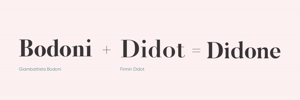
The creation of Modern type
Modern type is probably one of the most seen genres of typefaces. Compared to the Old-style typefaces, it is elegant and trendy. Ultimately, it provides an organized aesthetic that other typefaces do not. However, how did this genre come about? Modern type is accredited to two printers: Firmin Didot and Giambatta Bodoni. It began in the late 18th century when Firmin Didot created his typeface Didot by taking the contrast of the thick and thin lines of transitional types like Baskerville, and enhancing it to a higher level. Later on, Giambatta Bodoni decides to build on Didot and Fournier’s work to create his own modern serif. These two inventions lead to a new term for these new types which is called Didone. This name comes from a combination of the names of Didot and Bidone, and it becomes the synonym for modern serifs.
What defines a Didone?
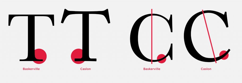
The main characteristic of a Didone font is the abrupt contrast between thick and thin strokes. The hairlines are unbracketed which is what differentiates it from a transitional font. For instance, if we were to compare the Didot and Caslon; we can see that Caslon has curves that connect its thicker lines to its thinner ones which is why we cannot consider it as a Didone. Further, modern typefaces are weighted along the y axis meaning that the vertical strokes are thicker. Thus, ultra bolded vertical lines from fonts like fat face still fall under the umbrella of modern serif. Lastly, Didones are unornamented: they have a “modern appearance.” Ultimately, they move away from the humanist approach; they become more precise than the handwritten letterform.
Modern type in action
The thick and thin lines of Didone became known for being seen in fashion magazines across the globe. The fashion industry typically picks modern serifs because they look unhurried and controlled. They lead our eyes up and down the page which is why Didones are great for headers. Another reason as to why they are perfect of titles is because they come across as striking. Regardless, they are not very suited for big bodies of text. Due to its verticality, the horizontal rhythm doesn’t work. Considering that extended texts are supposed to make us read from right to left (or vice versa), the weighted y axis becomes contradictory and it overall does not make for a pleasing look. Finally, to this present day, there are different interpretations of modern type which is what makes it so widely used and known. They continue to be a staple of the fashion industry and are extremly identifiable in magazines such as Vogue and Bazaar. All in all, we can thank Didot and Bodoni for this trendy type genre.

Sources
https://ilovetypography.com/2008/05/30/a-brief-history-of-type-part-4/
https://en.wikipedia.org/wiki/Didone_(typography)
https://www.thoughtco.com/modern-typeface-1079102
https://www.madewithover.com/blog/didones-back-on-trend-after-250-years
http://typeandmusic.com/page/3/
https://www.vogue.com/article/zendaya-interview-july-vogue-cover-spider-man-homecoming