The Abhorring Spin to Art History

The urinal that changed the course of art. Source: https://www.artsy.net/article/artsy-editorial-duchamps-urinal-changed-art-forever
The inception of a controversial series

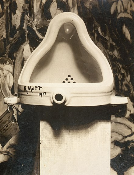
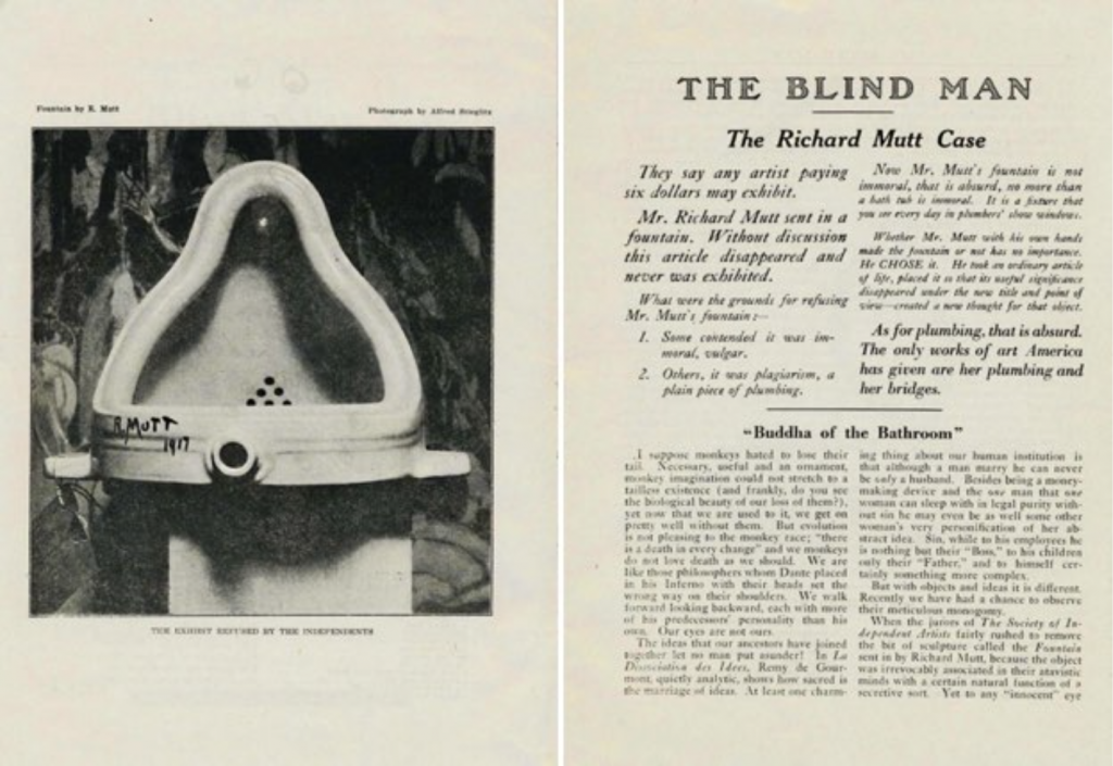
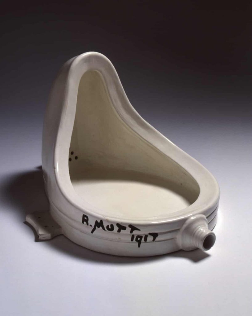
In 1917, a urinal was submitted to the American Study of Independent Artist as a display piece which was signed by “R. Mutt”. Marcel Duchamp submitted this piece to shine a new light on the perspective of art, but he didn’t want his artist status to impact the decision of the board members. Thus, he signed his piece under a new name. The Board of Directors voted to reject the urinal to be a part of the exhibition, contradicting the society’s constitution to accept all submissions. Regardless, they did this because they did not consider Duchamp’s store-bought object as a piece of art; and they said that it would be an indecent piece to demonstrate specifically to women. Subsequently, a discussion took place to decide the fate of the Fountain being displayed at the upcoming show of the Inaugural Exhibition. After conducting a vote amongst 10 board members, they came to the conclusion of excluding the urinal.

Is it truly disturbing, or am I just a female? Source: https://en.wikipedia.org/wiki/Fountain_(Duchamp)
The Uproar for a New Outlook on Art

Duchamp along with Walter Arensberg protested against the board for making the decision to turn down and “censor an artist’s work,” as Sophia Howarth wrote in her Tate article, Marcel Duchamp Fountain. Additionally, these two were not the only ones who disagreed with the board. Several people who followed the Dada movement in the 20th century also felt that it was an outrage. For instance, in the Dadaist magazine, The Blind Man, the photographer, Alfred Stieglitz, published a picture of the Fountain and captioned it “THE EXHIBIT REFUSED BY THE INDEPENDENTS.” The article assigned to the photograph wrote about it in high esteem, but still had many individuals who did not appreciate the concept of the Ready-Made.

The Blind Man’s appreciation. Source: https://scalar.usc.edu/works/the-space-between-literature-and-culture-1914-1945/vol14_2018_goodyear
A Repelling Side to Artistic Movements

Honestly, the Dadaists did not need the Fountain to establish its belief in an anti-art idea. However, the concept behind the piece counted towards the revolution in art history and it became one of the first pieces of Duchamp’s Ready-Made series. In my opinion, the Ready-Mades are appalling and do no justice to art history. I understand that the whole point of its “genius” is that no one else had thought to do it, but it feels disrespectful to artists who worked really hard to create pieces that make their audience feel something. The idea of just buying an object and slapping a name on it is insulting to any piece that was assembled by hand and had a lot of thought put into it. Overall, the Dadaists had an interesting perspective on art, but there are pieces that make me feel outraged.

R. Mutt was the name to remember. Source: https://www.theguardian.com/artanddesign/2017/oct/20/examining-the-plumbing-of-marcel-duchamps-fountain-1917

Sources

https://www.philamuseum.org/doc_downloads/education/lessonPlans/Duchamps%20Fountain%20and%20the%20Role%20of%20Information.pdf

https://www.britannica.com/art/ready-made

https://www.tate.org.uk/art/artworks/duchamp-fountain-t07573

https://www.artsy.net/article/artsy-editorial-duchamps-urinal-changed-art-forever

https://en.wikipedia.org/wiki/Fountain_(Duchamp)

https://scalar.usc.edu/works/the-space-between-literature-and-culture-1914-1945/vol14_2018_goodyear

https://www.theguardian.com/artanddesign/2017/oct/20/examining-the-plumbing-of-marcel-duchamps-fountain-1917

Historical Type Identification Poster

For my type poster, I struggled to find a nice design that would fit all of the required information. I kept sketching multiple designs and I felt that nothing worked. When I took a pause, I finally had an idea come to mind, which is the one reflected below. I wanted to design a poster that showed the playful yet constructive aspects of typography. I felt that the bright colours mixed with the geometric shapes demonstrated that concept.

I spent around 10 hours putting together the poster. However, if we wanted to include sketching time, then it would have been approximately 11 hours. Further, If I were to give myself a mark out of 10, I would give myself an 8. I’m fond of the design, but I think my typographic sections could have been better executed.

Revamping Architectural Styles in the Art Nouveau

A task assigned by a friend

The Emile Tassel House was an architectural job assigned to Victor Horta by his great friend, Emile Tassel. The house would become Tassel’s mansion and part of Horta’s series of townhouses. The other townhouses included the architect’s own mansion and studio as well as the Solvay mansion and the Van Eetvelde mansion with extension. These four mansions revived the traditional idea of the Bourgeois private houses: they combine residential and representational functions. Overall, they demonstrate the individual personalities of the owners while maintaining a cohesive style that treats architecture as a whole. This was the genius behind Victor Horta’s work.

The innovative exterior of the Emile Tassel House. Source: https://www.berkshirefinearts.com/04-07-2011_victor-horta-s-art-nouveau.htm
Behind the elegance of the Art Nouveau aesthetic

Horta’s stylistic choices made the houses distinctive compared to any others made during that time. These changes mainly came from the fusion of new materials that represented an entirely new look. The exterior of the structure was made to be fluid and smooth. Horta also decided to produce the columns that dominate the front portion out of iron instead of stone. This housed a bay window allowing his goal of creating a lightness to the building to become a reality. Further, Horta created unity through his continuous use of large brackets around the doors and windows. He also made a merger of nature and industry by putting the organic acanthus iron beams on the window displays. Lastly, the interior of the mansions combined stain glass windows, mosaics, wall paintings, and wrought iron that drew inspiration from Japanese art and plants. The rooms were built around a central hall which was an innovative move in this period.

The georgeous interior of the Emile Tassel House. Source: https://insideartnouveau.eu/en/edifices/the-tassel-mansion/
A pioneer in the history of architecture

These mansions, particularly the Tassel mansion, are said to be the first prime example of the Art Nouveau architecture movement due to its inventive plan and groundbreaking use of materials. They are the first perfectly designed Art Nouveau buildings in Belgium. The Emile Tassel House would mark the start of the aesthetics of Horta’s later townhouses. Although they were truly a unique style that was admired by many, they were only affordable to the haute-bourgeoisie which is why it never caught onto other architects. The other Art Nouveau structures in different European countries would draw inspiration from Horta’s “whiplash” style which applied to traditional buildings. However, the Tassel house impacted the Art Nouveau architect, Hector Guimard, who took on this style and put his own personal twist on it. All in all, Horta became iconic for his organic elements in his architectural designs.

Sources

https://insideartnouveau.eu/en/edifices/the-tassel-mansion/

https://en.wikipedia.org/wiki/Hôtel_Tassel

https://whc.unesco.org/en/list/1005/

https://insideartnouveau.eu/en/edifices/the-tassel-mansion/

https://www.berkshirefinearts.com/04-07-2011_victor-horta-s-art-nouveau.htm

https://www.telegraph.co.uk/travel/destinations/europe/belgium/brussels/8803574/Brussels-revisiting-the-magic-of-Victor-Horta.html

https://theplacesihavebeen.com/site_whs/major-town-houses-of-the-architect-victor-horta-brussels/

Historical Artifact Project

For my historical artifact, I decided to recreate Cassandre’s poster for the Intransigeant newspaper in Paris. The main thing that intrigued me was the fact that Cassandre is only one letter off from Cassandra which is what made me want to research it in the first place. The other reason was that this poster design style wasn’t necessarily an aesthetic that I loved, but I thought it would be more interesting to look into a topic that I wouldn’t normally choose. Further, I decided to put the poster onto a newspaper vehicle because I had a feeling that it would be the most logical place to find the poster in 1925. I also decided to print some photos of the streets in Paris and put them in black and white for the background of my photograph to make it look like the vehicle was driving around the town. I also added a little poster stand as my museum label to mimic the signs that restaurants or stores put out to advertise the specials.

If I were to mark my project, I would give myself a 7.5/10. I think that my vehicle turned out great, but I feel like the proportions of the background compared to the vehicle, and the vehicle compared to the sign aren’t quite accurate. However, I was proud of the fact that I wasn’t rushing to finish my artifact at the last minute and I managed my time well.

Final photograph
Reference photo #3 Source: https://www.moma.org/collection/works/218730

Sources for Artifact

https://www.rennart.co.uk/website.pdfs/CassandrePoster.pdf

https://www.thevintageposter.com/poster-detail/?inv=12063

https://www.philamuseum.org/collection/object/199890

https:www.alamy.com/stockphoto-lintransigeant-french-newspaper-original-reporting-armistice-news-173483984.html?pv=1&stamp=2&imageid=51B4A221=E9F0-4B19-BBD8-B847AA16035A&p=5665&n=0&orientation=0&pn=1&searchtype=0&IsFromSearch=1&srch=foo%3dbar%26st%3d0%26pn%3d1%26ps%3d100%26sortby%3d2%26resultview%3dsortbyPopular%26npgs%3d0%26qt%3dl%2520intransigeant%26qt_raw%3dl%2520intransigeant%26lic%3d3%26mr%3d0%26pr%3d0%26ot%3d0%26creative%3d%26ag%3d0%26hc%3d0%26pc%3d%26blackwhite%3d%26cutout%3d%26tbar%3d1%26et%3d0x000000000000000000000%26vp%3d0%26loc%3d0%26imgt%3d0%26dtfr%3d%26dtto%3d%26size%3d0xFF%26archive%3d1%26groupid%3d%26pseudoid%3d%26a%3d%26cdid%3d%26cdsrt%3d%26name%3d%26qn%3d%26apalib%3d%26apalic%3d%26lightbox%3d%26gname%3d%26gtype%3d%26xstx%3d0%26simid%3d%26saveQry%3d%26editorial%3d1%26nu%3d%26t%3d%26edoptin%3d%26customgeoip%3d%26cap%3d1%26cbstore%3d1%26vd%3d0%26lb%3d%26fi%3d2%26edrf%3d%26ispremium%3d1%26flip%3d0%26pl%3d

https://www.moma.org/collection/works/218730

Type can’t get any more fashionable than this

The birth of Didone. Source: https://www.madewithover.com/blog/didones-back-on-trend-after-250-years
The creation of Modern type

Modern type is probably one of the most seen genres of typefaces. Compared to the Old-style typefaces, it is elegant and trendy. Ultimately, it provides an organized aesthetic that other typefaces do not. However, how did this genre come about? Modern type is accredited to two printers: Firmin Didot and Giambatta Bodoni. It began in the late 18th century when Firmin Didot created his typeface Didot by taking the contrast of the thick and thin lines of transitional types like Baskerville, and enhancing it to a higher level. Later on, Giambatta Bodoni decides to build on Didot and Fournier’s work to create his own modern serif. These two inventions lead to a new term for these new types which is called Didone. This name comes from a combination of the names of Didot and Bidone, and it becomes the synonym for modern serifs.

Bodoni’s beatifully composed Manuel Tipografico. Source: https://en.wikipedia.org/wiki/Didone_(typography)
What defines a Didone?

The main characteristic of a Didone font is the abrupt contrast between thick and thin strokes. The hairlines are unbracketed which is what differentiates it from a transitional font. For instance, if we were to compare the Didot and Caslon; we can see that Caslon has curves that connect its thicker lines to its thinner ones which is why we cannot consider it as a Didone. Further, modern typefaces are weighted along the y axis meaning that the vertical strokes are thicker. Thus, ultra bolded vertical lines from fonts like fat face still fall under the umbrella of modern serif. Lastly, Didones are unornamented: they have a “modern appearance.” Ultimately, they move away from the humanist approach; they become more precise than the handwritten letterform.

The visual differences of type throughout history. Source: http://typeandmusic.com/page/3/
Modern type in action

The thick and thin lines of Didone became known for being seen in fashion magazines across the globe. The fashion industry typically picks modern serifs because they look unhurried and controlled. They lead our eyes up and down the page which is why Didones are great for headers. Another reason as to why they are perfect of titles is because they come across as striking. Regardless, they are not very suited for big bodies of text. Due to its verticality, the horizontal rhythm doesn’t work. Considering that extended texts are supposed to make us read from right to left (or vice versa), the weighted y axis becomes contradictory and it overall does not make for a pleasing look. Finally, to this present day, there are different interpretations of modern type which is what makes it so widely used and known. They continue to be a staple of the fashion industry and are extremly identifiable in magazines such as Vogue and Bazaar. All in all, we can thank Didot and Bodoni for this trendy type genre.

Sources

https://ilovetypography.com/2008/05/30/a-brief-history-of-type-part-4/

https://en.wikipedia.org/wiki/Didone_(typography)

https://www.thoughtco.com/modern-typeface-1079102

https://www.madewithover.com/blog/didones-back-on-trend-after-250-years

http://typeandmusic.com/page/3/

https://www.vogue.com/article/zendaya-interview-july-vogue-cover-spider-man-homecoming

Typography Zine

For my typography zine I decided to research the first most impactful Mexican typographer, Ignacio Cumplido. I tried to think of a topic that wasn’t centred on western culture. Not to say that there is anything bad about it, I’d just prefer to take the liberty of being able to research whatever we want and find a topic that I won’t learn about in class. Ignacio Cumplido also spoke to me because I’m half Mexican and it was captivating to find an important person such as him as part of their history. I found that Mexico was delayed in catching up to the trend of printing, thus it was cool to see the inspiration Cumplido drew from the Europeans in order to popularize his work.

If I were to mark my project, I would give it an 7/10. I would take off a couple of marks because I find that my first layout is not as strong as it possibly could be and I would take off another because I could have managed my time better with this. It took me around 13 hours to complete it, this time includes sketching, researching, and assembling.

Sources used for Zine

http://sheltonography.com/resources/Articles/NineteenthCenMexicanGD.pdf

https://www.encyclopedia.com/humanities/encyclopedias-almanacs-transcripts-and-maps/cumplido-ignacio-1811-1887

https://www.mexicodesconocido.com.mx/ignacio-cumplido-notable-personaje-del-mexico-decimononico.html

https://archive.org/details/presenteamistoso00cump/page/18/mode/2up

https://www.alamy.com/stock-photo/steam-press.html

https://www.wikidata.org/wiki/Q5913191

Let the hair do the talking

The beginning of the cornrow trend

In the 16th century, Columbia brought in their first slaves after the Spaniards colonized the area. These slaves were Africans who were forced to leave their continent to do free labour in South America. Some chores that they had to do were extracting alluvial gold deposits and growing sugar canes. In Eastern Columbia, there were also slaves that manufactured textiles. Further, the masters of the slaves forced many of them to shave their heads because they said they wanted the slaves to be more sanitary. However, what they truly wanted was to strip away their African identity; but not all Africans would shave their heads, some would style their hair in cornrows so that the tight braids would give them a tidy look.

A tactful way to freedom

Later on, Benkos Bioho, who was a kind that was captured by the Portuguese, found a way to escape and build a new community. He created villages in Columbia in the 17th century and with the aid of other slaves, he made a language and a network that helped other slaves escape. Benkos eventually invented a way to communicate through cornrows. His idea was to make maps and pass messages by coming up with different designs and patterns. Additionally, slaves were not allowed to read or write, and even if they had been able to, the information could end up in their masters’ hands and it would not end well. An example of a cornrow that was used to pass on messages is called “departes,” and it was used as a sign of escape. In Washington Post’s article, Ziomara Asprilla Garcia explains “It had thick, tight braids, braided closely to the scalp, and was tied into buns on the top.” Ultimately, cornrows were a genius was to relay information because it didn’t raise any suspicion with the masters.

Remembering the ancestors

Rather than turning a blind eye, many people of this culture are still using braided hair as a stylistic choice. Even though cornrows are being worn by Africans for aesthetic purposes, they are also being worn to commemorate the brutal past of their ancestors. They’re a sign of pride and honor to this genius method of discreet communication. Thus, by pairing cornrows with traditional garments; they are, like Garcia says, keeping their “tradition alive.” Although cornrows are seen as unprofessional in a workplace, they should be recognized and admired for the significant impact it has had on the freedom of slavery.

Sources

https://www.africanexponent.com/post/7891-how-cornrows-were-used-by-slaves-to-escape-slavery-in-south-america

https://aaregistry.org/story/afro-columbians-a-brief-history/

https://edtimes.in/africans-used-to-hide-escape-maps-from-slavery-in-their-hairstyles/

https://www.washingtonpost.com/lifestyle/style/afro-colombian-women-braid-messages-of-freedom-in-hairstyles/2011/07/08/gIQA6X9W4H_story.html

https://oldnaija.com/2019/04/01/how-the-cornrow-hairstyle-was-used-as-an-escape-map-from-slavery-across-south-america/

Mood Board

For my mood board, I decided to touch upon paper and books and how they were made. I was originally attracted to the timeline event of Jane Austen’s Pride and Prejudice book being published because it was a book I studied in my senior year of high school. It became my favourite piece of literature that we studied that year. From there, I chose to link events that allowed Austen’s story to become reality. Without the invention of paper and movable type, we would not have influential books like hers.

If I were to rate my project on a scale of 1-10, I would give myself an 8. I would deduct a point for procrastinating a lot on this, and I would deduct another point for the lack of aesthetics in my composition. I spent around 8 hours on this project because I spent a lot of time trying to compare research sources.

https://projects.invisionapp.com/boards/7K42ZCTVJEW/

Who said chicken scratch writing was bad?

A brief history of Chinese characters. Source: https://www.thechairmansbao.com/brief-history-chinese-characters/
The Chinese written language and the unsolvable root of origin.

The Chinese written language is quite unique because no one knows where it truly came from and what the first evidence of it was. There are a few theories of the writing’s inception, but each of them involves a legendary character whose name was Cangjie. The first is that he was born knowing how to write, which doesn’t necessarily feel like a logical explanation. The other is that because he worked for the Yellow Emperor, he was instructed to create this written form of language. Therefore, he went out to observe the natural patterns such as bird footprints in the sand and implemented them in his pictographic language. Either way, these stories are mythological; his story was incorporated into Daoist mythology and was said to have four eyes and a dragon face as shown above.

As people flourish, so does their writing

Although it is uncertain of how it was invented, a clear development in Chinese writing is seen in the 2nd millennium BCE during the Shang dynasty. According to Patricia Buckley, the scholar, the reason there wasn’t evidence of previous writing in China was that most of them were likely to have been written on materials like wood, bamboo, and silk which were perishable. However, the ancient Chinese began to use oracle bones which were bones that were cleaned and inscribed with marks. They were made from shoulder blades of oxen or plastrons of turtles. As said in the world history encyclopedia, oracle bones were used by diviners (also known as psychics), who answered questions of the future using these tools. If a person had a question the diviner would carve it onto the bone and place it by the fire to make it crack. Once it cracked, the lines made were deciphered by the diviner to solve the inquiry. It was thought that the oracle bones were a way for the spirits of the ancestors to communicate with diviners directly and ultimately affect the divination.

Finally. The end of confusion as pictographs become logographs

As time went on, Chinese scripts began to evolve from Jiaguwen to Lishu. Jiaguwen was the starting script that was used on oracle bones in 1600-1000 BCE. It was primarily made up of pictographs that represented objects connected to different concepts. Eventually, Jiaguwen’s script turned to Dazhuan which began in 1000 BCE and lasted until 700 BCE. Dazhuan was mainly pictographic as well but it became more refined by adding new characters. The next script was Xiaozhuan which began to develop in 700 BCE. This script is still used to this present day and it began to be the beginning of logographic writing. The final important script started in 500 BCE: the Lishu script. Lishu was mostly used for documents and government affairs. One can find Lishu on bamboo scrolls that were tied together with string as seen above. Nevertheless, as aesthetics became more important to poetry and calligraphy, more scripts were formed to be more cursive. These three scripts that prevailed in aesthetics were Kaishu, Xingshu, and Caoshu.

Xiaoshuan Script. Source: https://www.mutualart.com/Artwork/Explanation-of-Xiaozhuan/4593DFDFFD05C0AC
An incredible legend that would go on to impact several other asian countries

From objects to symbols, the scripts had to evolve to become more used and to write more concepts. It overall paid off because Chinese writing became incredibly influential and moved on to affect the written languages of Korea, Japan, Vietnam, and several other countries.

References

https://ancientchinesemythology.blogspot.com/2013/08/cangjie-chinese-god-of-writing.html

https://www.worldhistory.org/Chinese_Writing/

https://www.britannica.com/topic/Chinese-writing#ref255828

https://www.globaltimes.cn/content/1167735.shtml

https://www.green-coursehub.com/research-blog/bamboo-and-wooden-slip-chinese-bamboo-book

https://www.mutualart.com/Artwork/Explanation-of-Xiaozhuan/4593DFDFFD05C0AC

https://www.thechairmansbao.com/brief-history-chinese-characters/

My Yearbook Spread

For my yearbook spread, the main mediums I used were collage and acrylic paint. I’m most comfortable with acrylic paint because it was the kind of paint I used at during my painting course at Sheridan College.

To begin, I wanted to incorporate a lot of natural objects because I’ve always been fascinated by outdoor scenery. Therefore, I painted an image of the sunset at Sunset beach in Vancouver and added some flowers. I drew a daffodil, an orchid, and a Mexican marigold. Each flower represents a different part of my life. The daffodil represents my mother. Her favourite flower is the daffodil and they remind me of her every time I see one. The orchid represents the Chinese side of my life. I see one at every Chinese function I attend. Lastly, the Mexican marigold evidently symbolizes my Mexican heritage.

Finally, this assignment took me around 7 hours. The first hour consisted of me drafting several ideas. I’m still not entirely content with this layout, however I settled for this one because I felt as though the minimalistic composition embodied my reserved personality. Further, if I were to rate my project, I would probably rate it as a 8/10. I deducted a point for the large amount of time I spent trying to choose a design. Then I deducted another because I felt like one side of my design looked more cluttered than the other and it overall did not feel entirely balanced.