Proximity

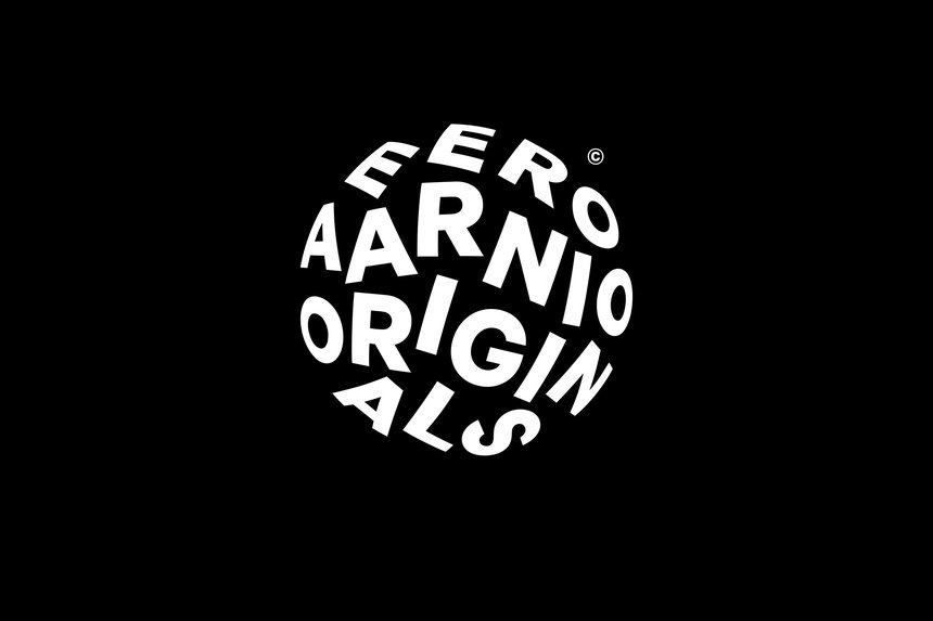
Eero Aarnio’s logo for his original design company is a great example of proximity. Even though Aarnio could have simply placed his company’s name in straight, horizontal lines, he wanted to make his design more complex and visually appealing. By placing the letters in a form of a circle, he portrays his “iconic design” of the ball chair. Therefore, his design becomes more symbolic and representative because he is relating it to a piece for which he is known. Regardless of the words being put in a circle, the proximity of the title makes it legible and easy to read.

Eero Aarnio, Eero Aarnio Originals: “Eero Aarnio Originals.” D&AD, Bond, 2017, https://libguides.capilanou.ca/citeit. Accessed 27 September 2021.

“Eero Aarnio Originals.” D&AD, Bond, 2017, https://libguides.capilanou.ca/citeit. Accessed 27 September 2021.

Closure

In this logo made for a toy store called Gund, we see an example of closure. The creators, Cynda Media lab, outline the ear shape of a bear on top of the red letters, then place a face below the ear silhouette. Despite not having outlined the chin, we are still able to imagine the rest of the figure. The logo “pays homage to the company’s tradition of capturing facial expressions in their toys,” (HOW Logo Award winners, Logo Design Love), and the aspect of closure allows us to focus on the facial features of the bear. Had Cynda Media lab used a black border to shape the face of the bear, we would concentrate on the entire image of the animal rather than zeroing in on his expression.

Cynda Media Lab, Gund Logo: “How logo awards winners.” Logo Design Love. David Airey, 2018, https://www.logodesignlove.com/how-logo-awards. Accessed 27 September 2021

“How logo awards winners.” Logo Design Love. David Airey, 2018, https://www.logodesignlove.com/how-logo-awards. Accessed 27 September 2021

Shape

This poster created by Matchbox Studio uses many shapes to make up an entire figure of a man. Each form is used to demonstrate a different part of Texas and its culture. For instance, on the bottom of the man’s left arm, we can see Texas’ state capitol building, it is the second largest building in the United States. It comes after the White House in Washington D.C. In addition, the Tower of Americas is portrayed next to the rocket, which can be seen on the torso of the man. Overall, shape plays a big role in this poster by symbolizing major landmarks in Texas. These landmarks identify Texas as a state.

Matchbox Studio, Poster for state fair of Texas in 2017: “State Fair of Texas Poster” Print Magazine, Callie Budrick, March 1 2018, https://www.printmag.com/post/rda-60-poster-design-ideas/. Accessed September 21 2021.

“The State Capitol — Austin Texas” Hill Country News, MarLee Berry, September 27 2017, https://texashillcountry.com/10-famous-texas-landmarks-see/. Accessed September 21 2021.

Direction

A good example of direction can be seen in this poster created by an organization called AIGA Philadelphia to celebrate its 35th anniversary. On this poster, we can see several lines going at different angles to create an illusion of letters that make up the saying “my time was running wild.” There is also a suggested line that goes down vertically across the design. This line points our eye towards the first word “my” all the way to the last one, “wild.” Without this line, the words would be more difficult to figure out and would seem more random than intentional.

AIGA Philadelphia, Poster celebrating 35 years of AIGA Philadelphia: “AIGA 35th Anniversary Posters” Print Magazine, Callie Budrick, March 1 2018, https://www.printmag.com/post/rda-60-poster-design-ideas/. Accessed September 21 2021.

Size

In this poster created by Joseba Elorza to advertise a Spanish show called “Vis a Vis,” there is a strong usage of size to convey the story of the show. The show follows a girl named Macarena Ferreiro, (the blonde woman in the bottom right), who is imprisoned for four tax crimes. She faces the prisoner who is considered the most dangerous, Zulema (The lady with bangs). To continue, by enlarging Zulema, Elorza portrays her as Macarena’s biggest foe during her time in prison. It establishes the dominance and power Zulema has over her.

Joseba Elorza (MiraRuido), Poster for Vis a Vis on Fox: “Vis a Vis” Mira Ruido, Joseba Elorza, https://www.miraruido.com/portfolio/vis-a-vis/. Accessed September 21 2021.

“Vis a Vis Plot Summaries” IMDB, ahmetkozan, https://www.imdb.com/title/tt4524056/plotsummary#summaries. Accessed September 21 2021.