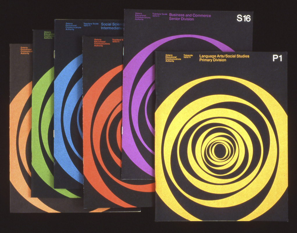
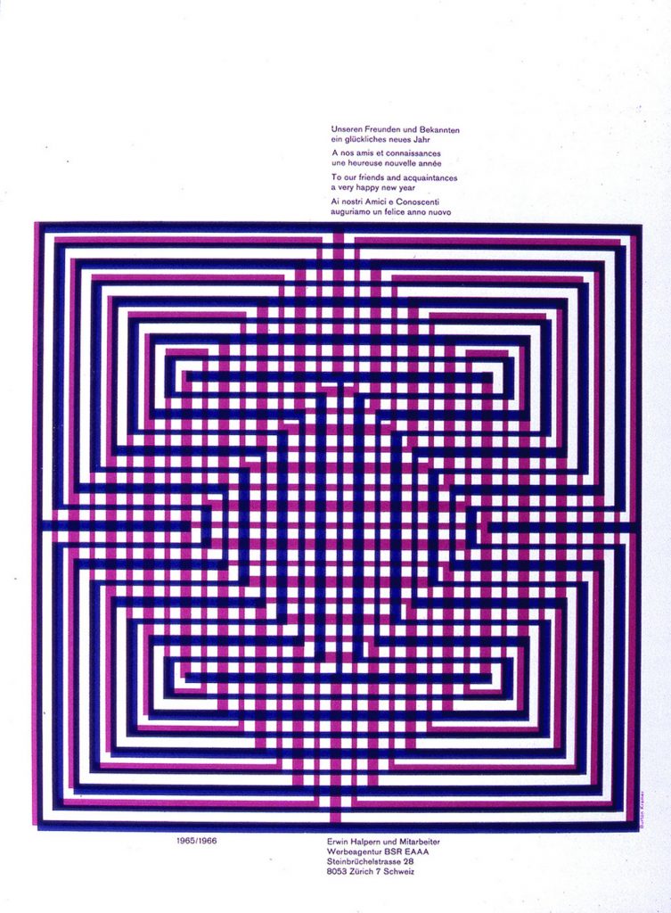
Burton Kramer is an internationally known graphic designer who has had a big impact on Canadian graphic design. He was originally born in the Bronx, New York City and was educated at New York state university, the Institute of Design in Chicago, and Yale University. At Yale, Kramer had the opportunity to learn under people like Alexey Brodovitch, Herbert Matter, Joseph Albers, Paul Rand, and Bradbury Thompson. Of all these inspiring designers, Rand became a big inspiration to him. Further, Kramer began working at the Will Burtin Office in New York. This is where he worked on major exhibits and packaging. Later, he became the assistant art director of the Architectural Record magazine and the New York Life Insurance company, which led him to move to Zurich two years later to work as chief designer at Erwin Halpern Advertising. He finally moved to Toronto to work for Paul Arthur on signage for Expo 67 and then for Clairtone. However, when both companies didn’t survive, Kramer went on to establish Burton Kramer & Associated Ltd. It was at this point that he produced his best-known work and designed for major Canadian institutions which would include the logo for CBC. All in all, I’m in awe of Burton Kramer because of the recognition he has built for himself. His work is incredible because it’s everlasting. I aspire to create work that’s at least a fraction as amazing as his.
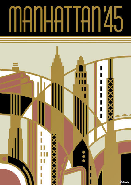
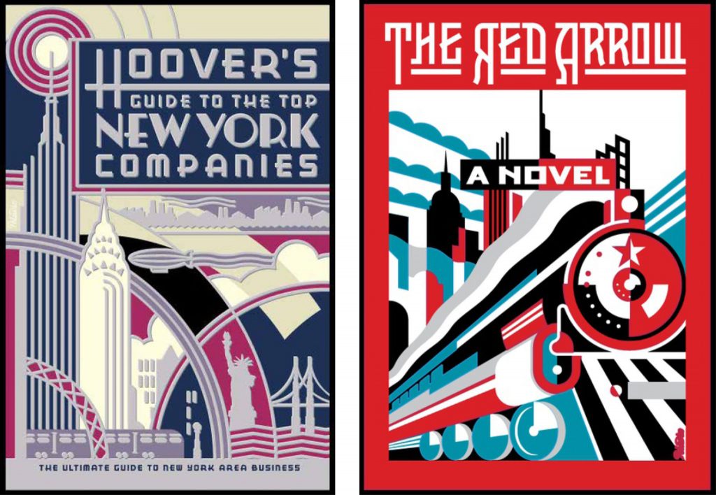
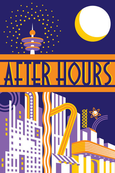
Daniel Pelavin is an illustrator, graphic designer, and typographer who grew up in Detroit, Michigan. He began his career doing apprenticeships at local art studios and later got his Master of Fine Arts in Graphic Design in New York. Pelavin is known for his knowledge of geometric forms, rich colours, and letterforms inspired by 20th-century culture. His work demonstrates a retro-futuristic style that also implements modernist and art deco elements. Further, He’s worked on book covers, postcards, posters, and typefaces. He created a well-known typeface called ITC Anna. Eventually, he won several awards from institutions such as the American Institute of Graphic Arts, Graphis Posters, Society of Publication Designers, etc. Since then, he has become a full member of the Graphic Artists Guild and the president of the Type Directors Club. He’s even had a studio in New York since 1979. All in all, I love Pelavin’s illustrations and graphics. However, I’m not very fond of his typefaces. I really like the colour palettes and shapes he uses to give each of his pieces a beautiful aesthetic.
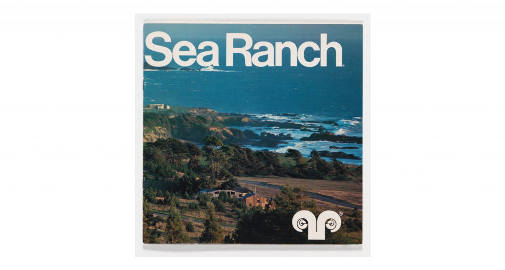
Barbara Stauchaffer Solomon is a multi-talented woman who was trained in dance and graphic design. She began studying dance in San Francisco, but later moved on to study painting and sculpture at the San Francisco Art Institute. After the death of her husband, Frank Stauffacher, she had to find a way to support her young daughter. She decided to move to Switzerland to study graphic design at the Basel School of Design because she knew that she would get paid more. At Basel, she studied under Armin Hoffman, and he became her main reference throughout her lifelong work. When she returned to the United States, she was hired at landscape architect Larry Halprin’s studio. This is where she did her first major project: Sea Ranch. The logo and supergraphics that were produced for this project influenced many designers. After that, many clients were a fan of the same minimalistic and modernist style that was created for the Sea Ranch. It was at this point that Solomon became known for defining supergraphics. Finally, Solomon decided to go back to school to study history, philosophy, and architecture at the University of California. This education allowed her to advance her writing skills and she now writes her own books. Overall, I think that Solomon is a major inspiration because she was able to push through difficult barriers in her life in a successful manner. Her work may be simplistic, but it is obvious that a lot of thought and hard work goes into her projects.
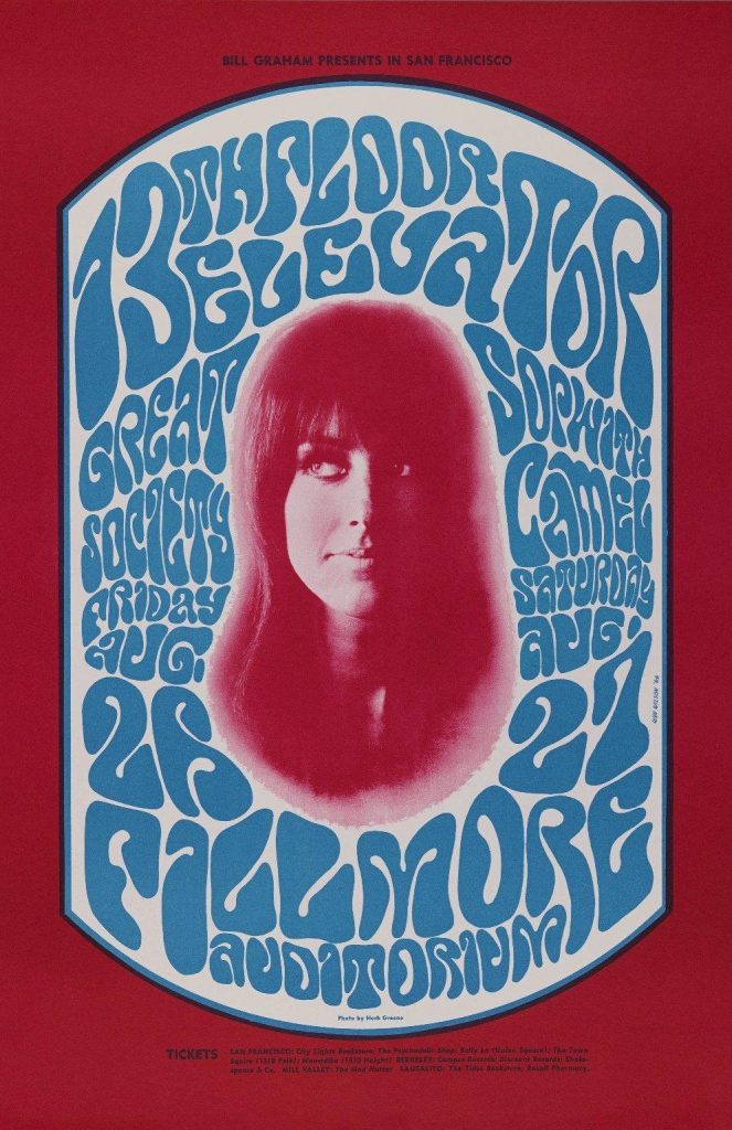
After serving in the Army National guard, Wes Wilson moved to San Francisco where he started his career as a designer. He worked at Contact Printing where his first job was to produce handbills for Mime Troupe Appeal parties. This job ultimately profiled him as a poster designer and he would be commissioned to create posters for weekly dance concerts for the Avalon Ballroom and the Bill Graham’s Fillmore Auditorium. Further, Graham allowed Wilson to be experimental, this led to Wilson’s inspiration derived from the Art Nouveau movement and the Viennese Secessionist lettering style developed by Alfred Roller. Wilson used this style to create his own aesthetic and made them indistinguishable by expanding their outlines and inset shapes. He experimented with foreground, background, and colour to make his designs more exaggerated with each new creation. Melted lines, letters that filled every space, and vibrant colours is what made up his new style of the psychedelic poster. Wilson’s style was very unique, but by the mid 1960s, many artists copied it. Wilson is still credited for pioneering the psychedelic poster style and became the father of 60s rock concert posters. Overall, I love his work because it gives me a sense of joy when I look at it. His aesthetic his always been one that I admired and it’s really fascinating to learn about how it all started.
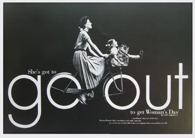
Gene Federico was an American graphic designer and art director who pioneered the idea of mixing type and imagery. He was first influenced to become a designer in high school where the prestigious Art Squad was formed. Federico was inspired by the European advertisements shown in his classes and based his early designs on the work of A.M. Cassandre. After high school, he left for the Pratt Institute in Brooklyn to enhance his knowledge of European and American design. With the help of one of his professors, Federico eventually took a job with the Abbot Kimball Company in New York. Later on, he received a position in advertisement for Bamberger’s Department Store, but it was cut short because he was shipped off to serve over seas for World War II. Following this setback, Federico received opportunities to work on some projects, but he wasn’t able to find a stable job until he landed a position in the Doyle Dane Bernbach firm where he worked on ads displayed for Woman’s Day magazine. This started the beginning of his “visual puns.” Once he concluded his job at Doyle Dane Bernbach, he began working for Benton and Bowles for eight years. After creating successful IBM advertisement, the rest of his work kept getting rejected by his department. Due to this, Federico began his own firm known as Lord Federico but would later leave after receiving an AIGA medal. Overall, Gene Federico is an inspiration. His work is timeless and his creativity is admirable. I love his work because it reminds designers to always think outside of the box and not to conform to societal trends.
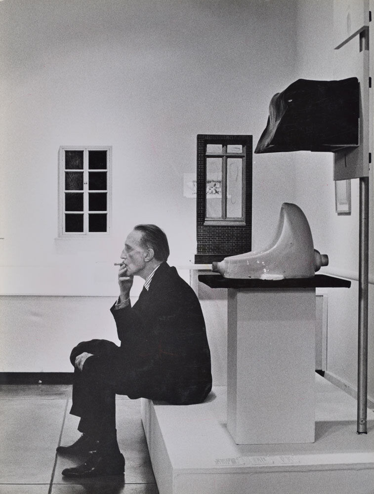
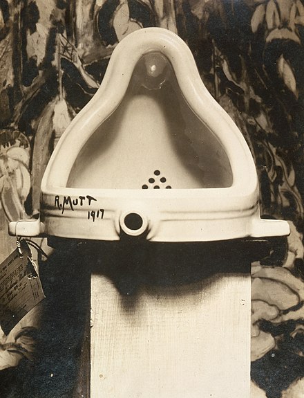
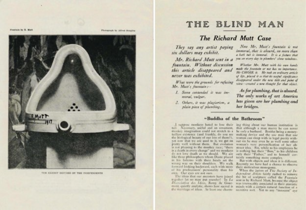
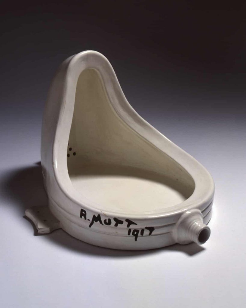
In 1917, a urinal was submitted to the American Study of Independent Artist as a display piece which was signed by “R. Mutt”. Marcel Duchamp submitted this piece to shine a new light on the perspective of art, but he didn’t want his artist status to impact the decision of the board members. Thus, he signed his piece under a new name. The Board of Directors voted to reject the urinal to be a part of the exhibition, contradicting the society’s constitution to accept all submissions. Regardless, they did this because they did not consider Duchamp’s store-bought object as a piece of art; and they said that it would be an indecent piece to demonstrate specifically to women. Subsequently, a discussion took place to decide the fate of the Fountain being displayed at the upcoming show of the Inaugural Exhibition. After conducting a vote amongst 10 board members, they came to the conclusion of excluding the urinal.
Duchamp along with Walter Arensberg protested against the board for making the decision to turn down and “censor an artist’s work,” as Sophia Howarth wrote in her Tate article, Marcel Duchamp Fountain. Additionally, these two were not the only ones who disagreed with the board. Several people who followed the Dada movement in the 20th century also felt that it was an outrage. For instance, in the Dadaist magazine, The Blind Man, the photographer, Alfred Stieglitz, published a picture of the Fountain and captioned it “THE EXHIBIT REFUSED BY THE INDEPENDENTS.” The article assigned to the photograph wrote about it in high esteem, but still had many individuals who did not appreciate the concept of the Ready-Made.
Honestly, the Dadaists did not need the Fountain to establish its belief in an anti-art idea. However, the concept behind the piece counted towards the revolution in art history and it became one of the first pieces of Duchamp’s Ready-Made series. In my opinion, the Ready-Mades are appalling and do no justice to art history. I understand that the whole point of its “genius” is that no one else had thought to do it, but it feels disrespectful to artists who worked really hard to create pieces that make their audience feel something. The idea of just buying an object and slapping a name on it is insulting to any piece that was assembled by hand and had a lot of thought put into it. Overall, the Dadaists had an interesting perspective on art, but there are pieces that make me feel outraged.
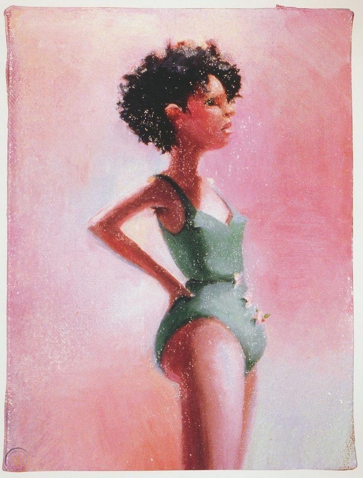
Lisa Yuskavage is an American painter who is known for her female figurative paintings. She received her BFA from The Stella Elkins Tyler School of Art at Temple University and her MFA from Yale University’s School of Art. Then, she went on to exhibit her work in several places such as the Seattle Art Museum and the Whitney Museum of American Art. Further, her work draws techniques from the high renaissance to depict these nudes. She combines this with a strong use of colour to demonstrate an overall mood. To continue, many critics have called upon the absurd proportions of these women. They state that her paintings set high expectations for what a women’s body should look like in this modern day. Yuskavage has responded by saying that she wants to invoke these reactions. She wants to create pieces that will produce different reactions to grab the attention of the audience. She also states that her paintings are supposed to seem anatomically impossible and are supposed to represent the far-fetched male sexual fantasies.
Overall, I am mesmerized by the work of Yuskavage. There is this fantastical quality to her pieces that draws my attention to her work. I wish I could see more representation in her paintings, particularly in body sizes. However, she has created this interesting concept with her inconceivable body proportions that adds an extra reason to admire her art. I think I’m also drawn into her work because she combines two different ideas in art: one that comes from the High Renaissance period and the other that feels more contemporary. Her work is ultimately a modern take on a classical part of art history.
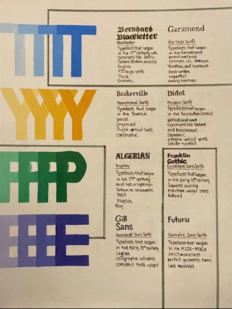
For my type poster, I struggled to find a nice design that would fit all of the required information. I kept sketching multiple designs and I felt that nothing worked. When I took a pause, I finally had an idea come to mind, which is the one reflected below. I wanted to design a poster that showed the playful yet constructive aspects of typography. I felt that the bright colours mixed with the geometric shapes demonstrated that concept.
I spent around 10 hours putting together the poster. However, if we wanted to include sketching time, then it would have been approximately 11 hours. Further, If I were to give myself a mark out of 10, I would give myself an 8. I’m fond of the design, but I think my typographic sections could have been better executed.
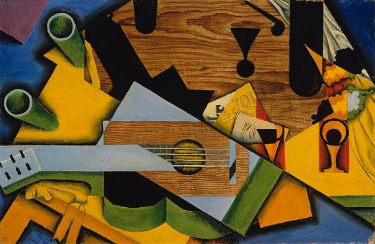
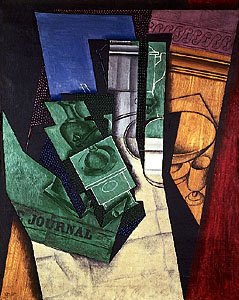
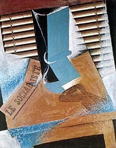
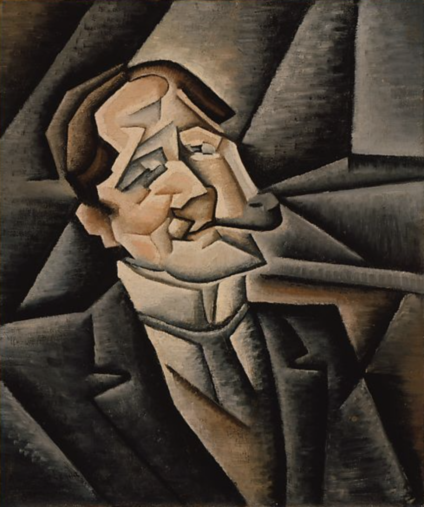
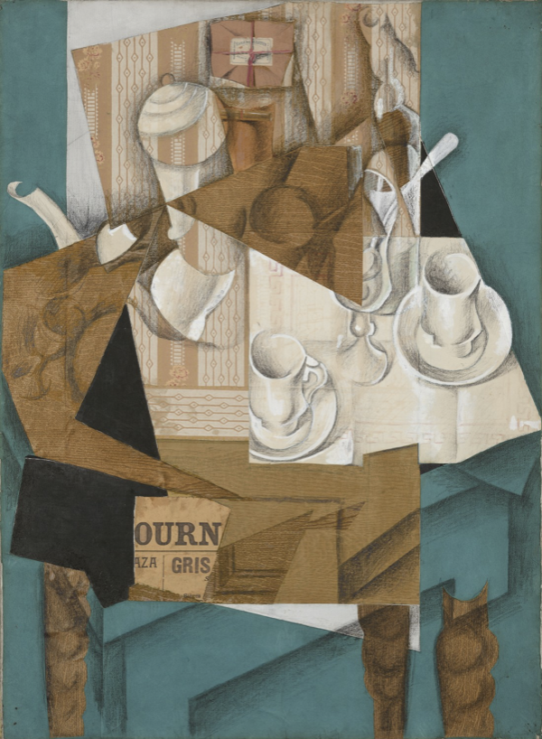
Juan Gris was one of the leading figures in Cubist movement who followed Picasso and Braque. His original name was José Victoriano Carmelo Carlos González-Pérez and was born in Madrid in 1887. Further, he attended the Escuela de Artes y Manufacturas in 1902 until 1904 where he studied math, physics, and mechanical drawing. This academic life did not interest him and he decided to move further with his natural ability to draw. Once he left school, he decided to study under a prominent artist in Madrid, José Moreno Carbonero who also taught Picasso and Dalí. In 1905, the cubist artist changed his name to Juan Gris and moved to Paris in 1906 a little while after his father’s death. During his first few years in Paris, he worked as a cartoonist for several magazines and periodicals. However, once he met artists such as Picasso, Braque, and Matisse; Gris was motivated to work on his own paintings. He began to gear towards Analytic Cubism using monochromatic colours, linear grids, and geometric planes; but later on in his career he shifted to Synthetic Cubism and created his own personal and mature version of it. Overall, he moved on to influence some great artists that came after him such as Salvador Dalí.
Moreover, I am personally not a huge fan of cubism in general. I am a lot more mesmerized by paintings that are similar to reality or that show a looser version of it. When things become distorted, I become a little more hesitant to enjoy the scene that the artist has depicted, but I do respect their techniques and ambitions. Although I must admit, Juan Gris’ version of cubism is a lot more captivating to me than Picasso’s. For some reason, his compositions are a more comforting to me. I do appreciate and recognize that not many people can pull off cubism. I feel that if I were to attempt my own version cubism, I would not be as successful as Gris was. All in all, despite the fact that I am not fond of this area in art history, I do recognize that Juan Gris has a special talent that not many possess.
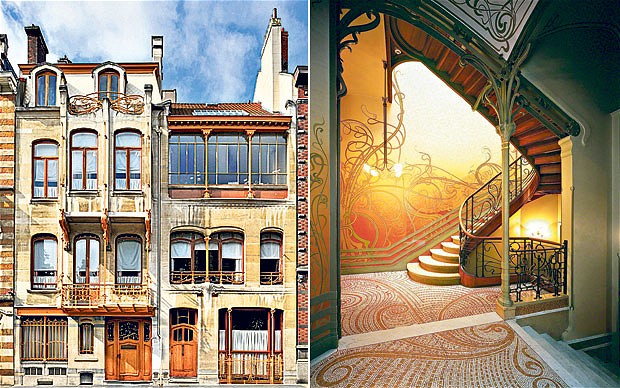
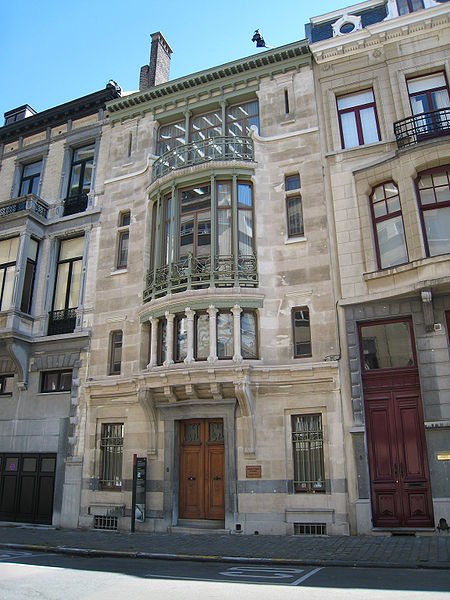
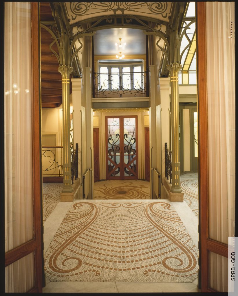
The Emile Tassel House was an architectural job assigned to Victor Horta by his great friend, Emile Tassel. The house would become Tassel’s mansion and part of Horta’s series of townhouses. The other townhouses included the architect’s own mansion and studio as well as the Solvay mansion and the Van Eetvelde mansion with extension. These four mansions revived the traditional idea of the Bourgeois private houses: they combine residential and representational functions. Overall, they demonstrate the individual personalities of the owners while maintaining a cohesive style that treats architecture as a whole. This was the genius behind Victor Horta’s work.
Horta’s stylistic choices made the houses distinctive compared to any others made during that time. These changes mainly came from the fusion of new materials that represented an entirely new look. The exterior of the structure was made to be fluid and smooth. Horta also decided to produce the columns that dominate the front portion out of iron instead of stone. This housed a bay window allowing his goal of creating a lightness to the building to become a reality. Further, Horta created unity through his continuous use of large brackets around the doors and windows. He also made a merger of nature and industry by putting the organic acanthus iron beams on the window displays. Lastly, the interior of the mansions combined stain glass windows, mosaics, wall paintings, and wrought iron that drew inspiration from Japanese art and plants. The rooms were built around a central hall which was an innovative move in this period.
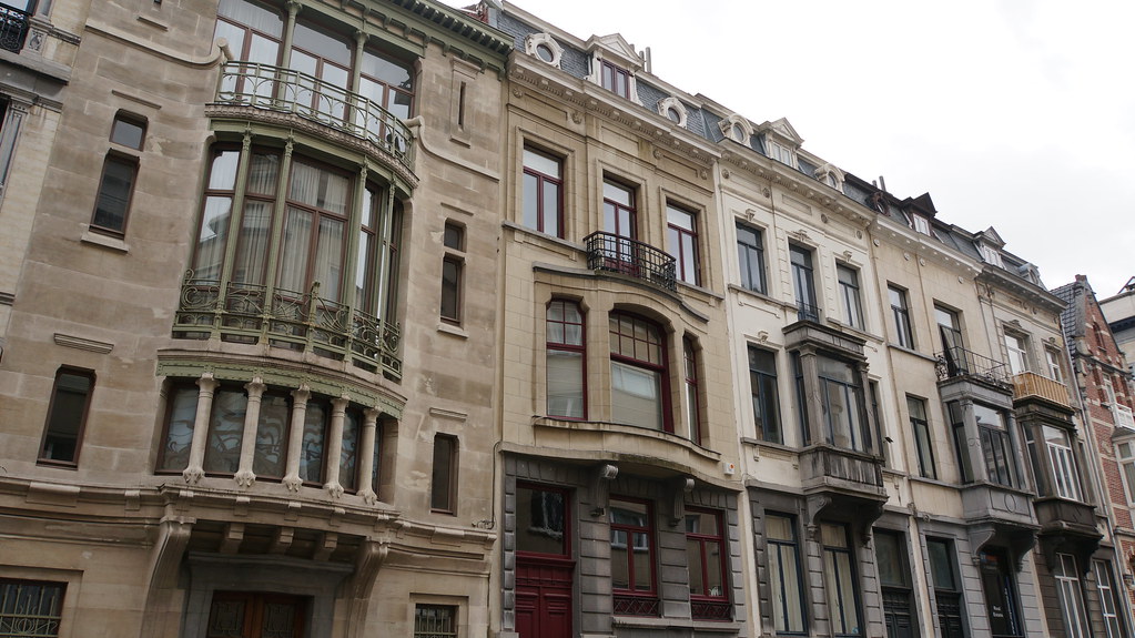
These mansions, particularly the Tassel mansion, are said to be the first prime example of the Art Nouveau architecture movement due to its inventive plan and groundbreaking use of materials. They are the first perfectly designed Art Nouveau buildings in Belgium. The Emile Tassel House would mark the start of the aesthetics of Horta’s later townhouses. Although they were truly a unique style that was admired by many, they were only affordable to the haute-bourgeoisie which is why it never caught onto other architects. The other Art Nouveau structures in different European countries would draw inspiration from Horta’s “whiplash” style which applied to traditional buildings. However, the Tassel house impacted the Art Nouveau architect, Hector Guimard, who took on this style and put his own personal twist on it. All in all, Horta became iconic for his organic elements in his architectural designs.