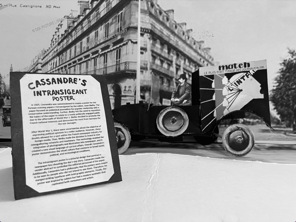
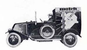
For my historical artifact, I decided to recreate Cassandre’s poster for the Intransigeant newspaper in Paris. The main thing that intrigued me was the fact that Cassandre is only one letter off from Cassandra which is what made me want to research it in the first place. The other reason was that this poster design style wasn’t necessarily an aesthetic that I loved, but I thought it would be more interesting to look into a topic that I wouldn’t normally choose. Further, I decided to put the poster onto a newspaper vehicle because I had a feeling that it would be the most logical place to find the poster in 1925. I also decided to print some photos of the streets in Paris and put them in black and white for the background of my photograph to make it look like the vehicle was driving around the town. I also added a little poster stand as my museum label to mimic the signs that restaurants or stores put out to advertise the specials.
If I were to mark my project, I would give myself a 7.5/10. I think that my vehicle turned out great, but I feel like the proportions of the background compared to the vehicle, and the vehicle compared to the sign aren’t quite accurate. However, I was proud of the fact that I wasn’t rushing to finish my artifact at the last minute and I managed my time well.
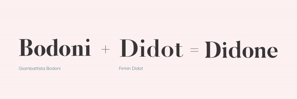
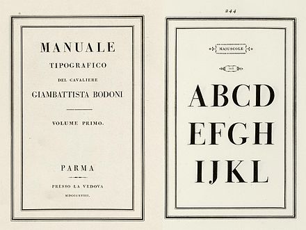
Modern type is probably one of the most seen genres of typefaces. Compared to the Old-style typefaces, it is elegant and trendy. Ultimately, it provides an organized aesthetic that other typefaces do not. However, how did this genre come about? Modern type is accredited to two printers: Firmin Didot and Giambatta Bodoni. It began in the late 18th century when Firmin Didot created his typeface Didot by taking the contrast of the thick and thin lines of transitional types like Baskerville, and enhancing it to a higher level. Later on, Giambatta Bodoni decides to build on Didot and Fournier’s work to create his own modern serif. These two inventions lead to a new term for these new types which is called Didone. This name comes from a combination of the names of Didot and Bidone, and it becomes the synonym for modern serifs.
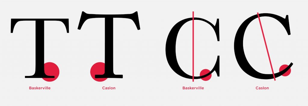
The main characteristic of a Didone font is the abrupt contrast between thick and thin strokes. The hairlines are unbracketed which is what differentiates it from a transitional font. For instance, if we were to compare the Didot and Caslon; we can see that Caslon has curves that connect its thicker lines to its thinner ones which is why we cannot consider it as a Didone. Further, modern typefaces are weighted along the y axis meaning that the vertical strokes are thicker. Thus, ultra bolded vertical lines from fonts like fat face still fall under the umbrella of modern serif. Lastly, Didones are unornamented: they have a “modern appearance.” Ultimately, they move away from the humanist approach; they become more precise than the handwritten letterform.
The thick and thin lines of Didone became known for being seen in fashion magazines across the globe. The fashion industry typically picks modern serifs because they look unhurried and controlled. They lead our eyes up and down the page which is why Didones are great for headers. Another reason as to why they are perfect of titles is because they come across as striking. Regardless, they are not very suited for big bodies of text. Due to its verticality, the horizontal rhythm doesn’t work. Considering that extended texts are supposed to make us read from right to left (or vice versa), the weighted y axis becomes contradictory and it overall does not make for a pleasing look. Finally, to this present day, there are different interpretations of modern type which is what makes it so widely used and known. They continue to be a staple of the fashion industry and are extremly identifiable in magazines such as Vogue and Bazaar. All in all, we can thank Didot and Bodoni for this trendy type genre.
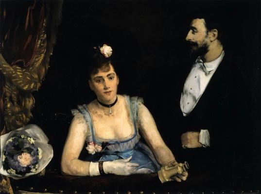
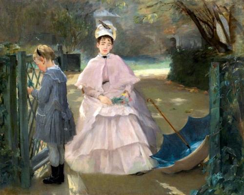
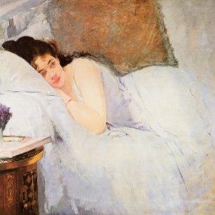
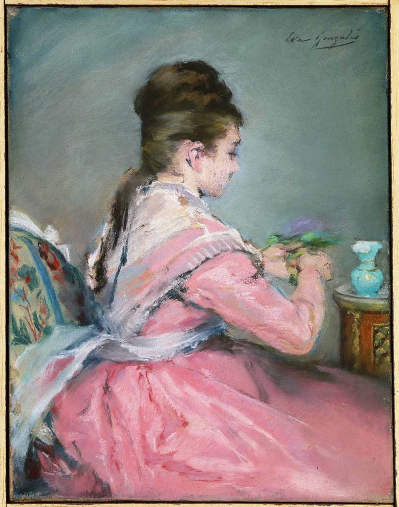
Eva Gonzalès was a french impressionist painter who typically portrayed contemporary Parisian life. Although Gonzalès was considered an impressionist, her pieces displayed a realist style and stayed within the confines of what was considered acceptable in academic salons. She began painting at the age of 16 by studying under Charles Joshua Chaplin. She was unable to go to the École des Beaux-Arts because female students were not allowed to attend at the time, but her high social status granted her enough financial resources to allow her to have this artistic career. A few years later, she met Edouard Manet who would soon be a major influence on her style of painting. Manet took her on as a student after she did some modeling for his work; but as time went on, her audience and critics criticized her for being overly similar to Manet.
Even though Gonzalès’ paintings were judged for sharing nearly identical characteristics with Manet’s work, I feel like they also have dissimilar qualities. I found that Gonzalès had a better depiction of the human face; whereas Manet’s faces look sort of distorted, especially in his painting, Woman Reading. Overall, I don’t think that she deserved the backlash that she received because there were tons of artists in art history who drew inspiration from other painters’ work. The important part was that she stuck to her own content, she never copied the work of her mentor. Finally, I personally love Eva Gonzalès’ work because of the fact that she had that realistic aspect while also having a looser characteristic to her art. I am particularly drawn to that type of work because I feel that it shows a special type of talent that I’ve only ever seen in Manet’s art.
A Loge at the Théâtre des Italiens, Source: “Summary of Eva Gonzalès.” The Art Story, https://www.theartstory.org/artist/gonzales-eva/. Accessed 29 October 2021.
Nanny and Child, Source: “Summary of Eva Gonzalès.” The Art Story, https://www.theartstory.org/artist/gonzales-eva/. Accessed 29 October 2021.
Awakening Woman, Source: “Summary of Eva Gonzalès.” The Art Story, https://www.theartstory.org/artist/gonzales-eva/. Accessed 29 October 2021.
The Bouquet of Violets, Source: “The Bouquet of Violets.” The Met, https://www.metmuseum.org/art/collection/search/438115. Accessed 29 October 2021. On a Boat, Source: “On a Boat.” Fine Art America, 2017, https://fineartamerica.com/featured/on-a-boat-eva-gonzales.html. Accessed 29 October 2021.
“Summary of Eva Gonzalès.” The Art Story, https://www.theartstory.org/artist/gonzales-eva/. Accessed 29 October 2021.
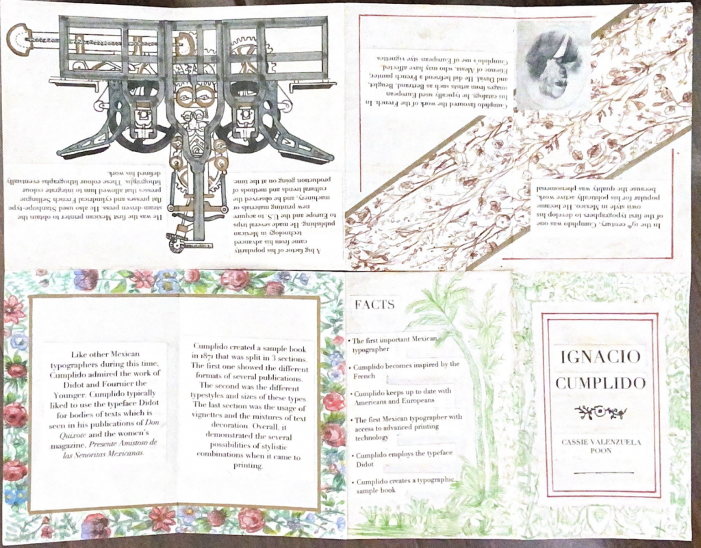
For my typography zine I decided to research the first most impactful Mexican typographer, Ignacio Cumplido. I tried to think of a topic that wasn’t centred on western culture. Not to say that there is anything bad about it, I’d just prefer to take the liberty of being able to research whatever we want and find a topic that I won’t learn about in class. Ignacio Cumplido also spoke to me because I’m half Mexican and it was captivating to find an important person such as him as part of their history. I found that Mexico was delayed in catching up to the trend of printing, thus it was cool to see the inspiration Cumplido drew from the Europeans in order to popularize his work.
If I were to mark my project, I would give it an 7/10. I would take off a couple of marks because I find that my first layout is not as strong as it possibly could be and I would take off another because I could have managed my time better with this. It took me around 13 hours to complete it, this time includes sketching, researching, and assembling.
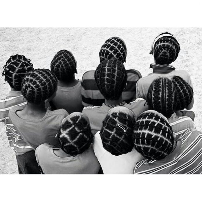
In the 16th century, Columbia brought in their first slaves after the Spaniards colonized the area. These slaves were Africans who were forced to leave their continent to do free labour in South America. Some chores that they had to do were extracting alluvial gold deposits and growing sugar canes. In Eastern Columbia, there were also slaves that manufactured textiles. Further, the masters of the slaves forced many of them to shave their heads because they said they wanted the slaves to be more sanitary. However, what they truly wanted was to strip away their African identity; but not all Africans would shave their heads, some would style their hair in cornrows so that the tight braids would give them a tidy look.
Later on, Benkos Bioho, who was a kind that was captured by the Portuguese, found a way to escape and build a new community. He created villages in Columbia in the 17th century and with the aid of other slaves, he made a language and a network that helped other slaves escape. Benkos eventually invented a way to communicate through cornrows. His idea was to make maps and pass messages by coming up with different designs and patterns. Additionally, slaves were not allowed to read or write, and even if they had been able to, the information could end up in their masters’ hands and it would not end well. An example of a cornrow that was used to pass on messages is called “departes,” and it was used as a sign of escape. In Washington Post’s article, Ziomara Asprilla Garcia explains “It had thick, tight braids, braided closely to the scalp, and was tied into buns on the top.” Ultimately, cornrows were a genius was to relay information because it didn’t raise any suspicion with the masters.
Rather than turning a blind eye, many people of this culture are still using braided hair as a stylistic choice. Even though cornrows are being worn by Africans for aesthetic purposes, they are also being worn to commemorate the brutal past of their ancestors. They’re a sign of pride and honor to this genius method of discreet communication. Thus, by pairing cornrows with traditional garments; they are, like Garcia says, keeping their “tradition alive.” Although cornrows are seen as unprofessional in a workplace, they should be recognized and admired for the significant impact it has had on the freedom of slavery.
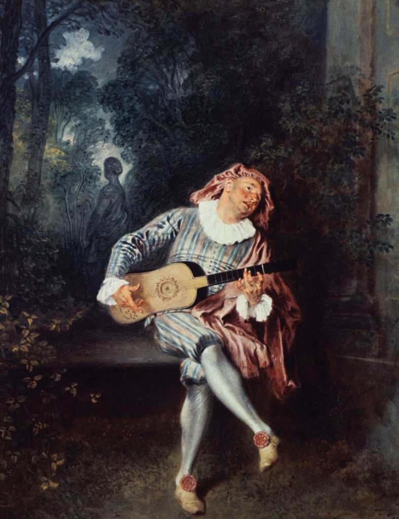
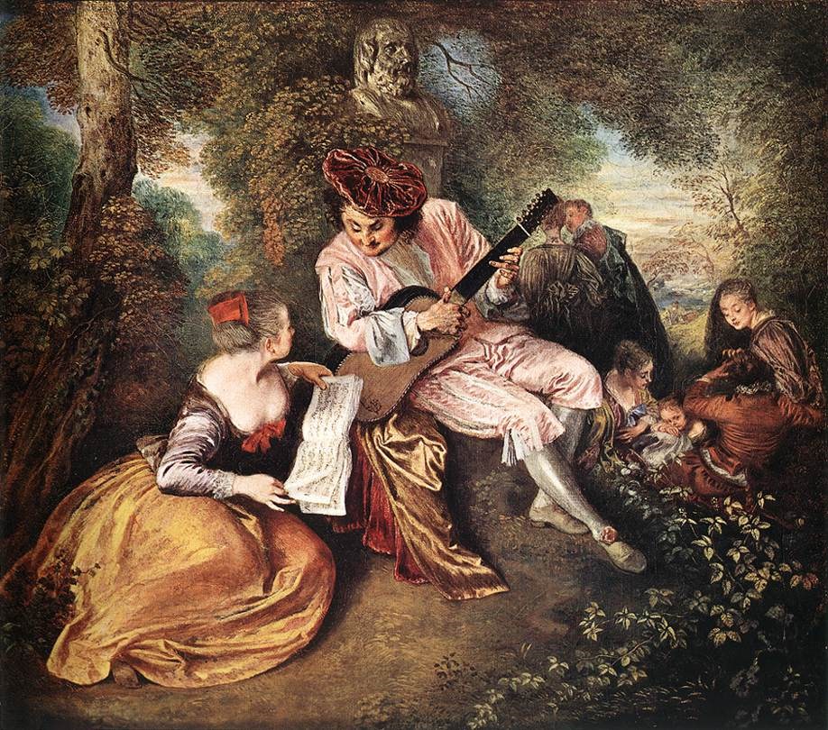
Antoine Watteau was born in a part of Flanders which France had previously dominated. He later moved to Paris where he studied under Claude Gillot. Gillot enjoyed painting theatrical scenes which inspired Watteau and his work. Further, Watteau would go to theatres and observe any details that would serve the scene of the play being shown. He was able to learn the effects of artificial light such as slight shifts in colour on costumes or painted backgrounds and the emergence of deep shadows. These observations in his work later got him accepted to the Académie Royale where he would be distinguished as an artist of fêtes galantes. Fêtes galantes was a term that described art that contained nicely dressed people (likely aristocratic individuals), typically in a park setting, that engaged in playful actions. Despite having only lived 37 years, Watteau became one of the greatest artists in the 18th century and had a significant impact on the beginning of the Rococo movement.
Overall, Watteau’s work fascinates me. Although I am not very fond of the artificial lighting he perceives in his paintings, I do adore the idea of a graceful world where “it never rains.” (Gombrich 454) In my opinion, it sends me into a fantasy where nothing terrible happens. There is no chaos, no war, no controversy. It feels like everyone is always content. Ultimately, I believe that his popularity in that period was well-deserved.
Pleasures of Love (1718-1719). Source: “Antoine Watteau.” Wikipedia, 2021, https://en.wikipedia.org/wiki/Antoine_Watteau. Accessed 14 October 2021. The Feast of Love (1718-1719). Source: “Antoine Watteau.” Wikipedia, 2021, https://en.wikipedia.org/wiki/Antoine_Watteau. Accessed 14 October 2021.Fêtes Vénitiennes (1718-1719). Source: “Jean-Antoine Watteau.” National. Galleries Scotland, https://www.nationalgalleries.org/art-and-artists/artists/jean-antoine-watteau. Accessed 14 October 2021.Mezzetin (1718-1720). Source: “Antoine Watteau.” Britannica, 2021, https://www.britannica.com/biography/Antoine-Watteau. Accessed 14 October 2021. La Gamme D’amour (ca. 1717) Source: “La Gamme D’amour.” Art Renewal Center, https://www.artrenewal.org/artworks/la-gamme-damour/jean-antoine-watteau/3981. Accessed 14 October 2021.
Sources:
“Antoine Watteau.” Britannica, 2021, https://www.britannica.com/biography/Antoine-Watteau. Accessed 14 October 2021.
“Antoine Watteau (1684-1721).” The Met, 2003, https://www.metmuseum.org/toah/hd/watt/hd_watt.htm. Accessed 14 October 2021.
“Fêtes Galantes.” The National Gallery, https://www.nationalgallery.org.uk/paintings/glossary/fêtes-galantes. Accessed 14 October 2021.
Gombrich, Ernst. The Story of Art. 16th Edition, Phaidon Press Inc, 1995.
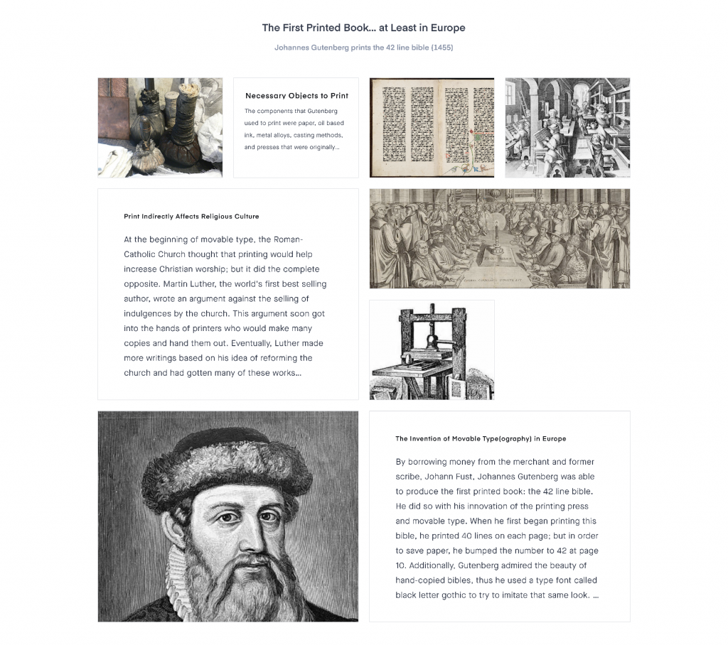
For my mood board, I decided to touch upon paper and books and how they were made. I was originally attracted to the timeline event of Jane Austen’s Pride and Prejudice book being published because it was a book I studied in my senior year of high school. It became my favourite piece of literature that we studied that year. From there, I chose to link events that allowed Austen’s story to become reality. Without the invention of paper and movable type, we would not have influential books like hers.
If I were to rate my project on a scale of 1-10, I would give myself an 8. I would deduct a point for procrastinating a lot on this, and I would deduct another point for the lack of aesthetics in my composition. I spent around 8 hours on this project because I spent a lot of time trying to compare research sources.
The Chinese written language is quite unique because no one knows where it truly came from and what the first evidence of it was. There are a few theories of the writing’s inception, but each of them involves a legendary character whose name was Cangjie. The first is that he was born knowing how to write, which doesn’t necessarily feel like a logical explanation. The other is that because he worked for the Yellow Emperor, he was instructed to create this written form of language. Therefore, he went out to observe the natural patterns such as bird footprints in the sand and implemented them in his pictographic language. Either way, these stories are mythological; his story was incorporated into Daoist mythology and was said to have four eyes and a dragon face as shown above.
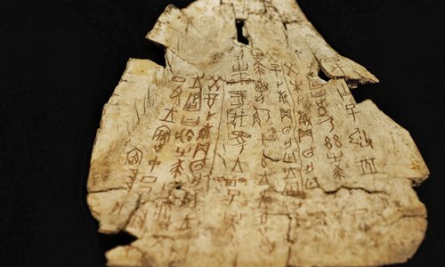
Although it is uncertain of how it was invented, a clear development in Chinese writing is seen in the 2nd millennium BCE during the Shang dynasty. According to Patricia Buckley, the scholar, the reason there wasn’t evidence of previous writing in China was that most of them were likely to have been written on materials like wood, bamboo, and silk which were perishable. However, the ancient Chinese began to use oracle bones which were bones that were cleaned and inscribed with marks. They were made from shoulder blades of oxen or plastrons of turtles. As said in the world history encyclopedia, oracle bones were used by diviners (also known as psychics), who answered questions of the future using these tools. If a person had a question the diviner would carve it onto the bone and place it by the fire to make it crack. Once it cracked, the lines made were deciphered by the diviner to solve the inquiry. It was thought that the oracle bones were a way for the spirits of the ancestors to communicate with diviners directly and ultimately affect the divination.
Finally. The end of confusion as pictographs become logographs
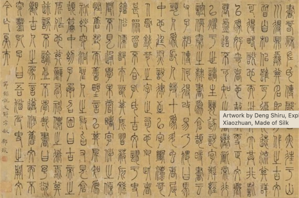
As time went on, Chinese scripts began to evolve from Jiaguwen to Lishu. Jiaguwen was the starting script that was used on oracle bones in 1600-1000 BCE. It was primarily made up of pictographs that represented objects connected to different concepts. Eventually, Jiaguwen’s script turned to Dazhuan which began in 1000 BCE and lasted until 700 BCE. Dazhuan was mainly pictographic as well but it became more refined by adding new characters. The next script was Xiaozhuan which began to develop in 700 BCE. This script is still used to this present day and it began to be the beginning of logographic writing. The final important script started in 500 BCE: the Lishu script. Lishu was mostly used for documents and government affairs. One can find Lishu on bamboo scrolls that were tied together with string as seen above. Nevertheless, as aesthetics became more important to poetry and calligraphy, more scripts were formed to be more cursive. These three scripts that prevailed in aesthetics were Kaishu, Xingshu, and Caoshu.
An incredible legend that would go on to impact several other asian countries
From objects to symbols, the scripts had to evolve to become more used and to write more concepts. It overall paid off because Chinese writing became incredibly influential and moved on to affect the written languages of Korea, Japan, Vietnam, and several other countries.
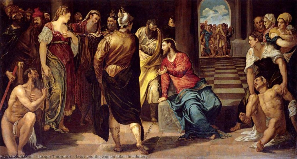
Tintoretto is a Venetian mannerist painter who wanted to shy away from the bright colours being used in Venice during that time. Thus, he employed “weird light and… broken tones” to add a dramatic effect and an emotional strain (Gombrich, 371). Ultimately, he desired to be unlike any other painter in the late 16th century. Many, however, did not appreciate his attempt at uniqueness. Giorgio Vasari, a well-known critic, wrote that he could “‘have become one of the greatest painters seen in Venice,'” but because his paintings had an unfinished look, he was overlooked. Regardless, he never intended to have the same, clean finish that other Venetian painters had; he didn’t want the smooth finish to “[distract] our attention from the dramatic happenings of the picture.” The pencil marks he left on his completed paintings overall added to his intense portrayals of “legends and myths of the past.”
In my opinion, Tintoretto should have been considered as one of the greats. His paintings were incredibly different from any of the other mannerist paintings in Venice during the late 116th century. They demonstrated natural movement and liveliness, whereas models in other mannerist paintings seemed posed. Additionally, his pencil strokes were deliberately left to create a climactic effect; had they been there unintentionally, I would understand the argument of his supposed carelessness. Finally, when Gombrich stated that El Greco’s art “surpass[ed]” Tintoretto’s due to the “medieval ideas” that “lingered” in his work, I was shocked because I felt more inspired by Tintoretto’s work than I did by El Greco’s. Evidently, it is a subjective matter, but I believe that Tintoretto does an amazing job at creating complex and mesmerizing pieces.
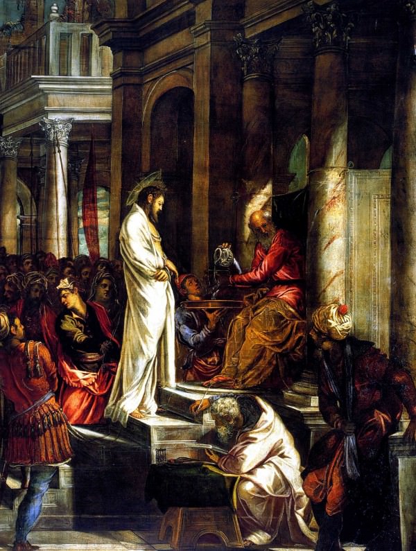
Tintoretto, “Christ Before Pilate,” Scuola di San Rocco, Venice: “Jacopo Tintoretto,” Italian Renaissance Art.com, https://www.italian-renaissance-art.com/Tintoretto.html. Accessed 29 September 2021.
Tintoretto, “Jesus and the Woman taken in Adultery:” “Jesus and the Woman taken in Adultery,” Most Famous Paintings, https://en.most-famous-paintings.com/MostFamousPaintings.nsf/A?Open&A=ARJCBM. Accessed 29 September 2021.
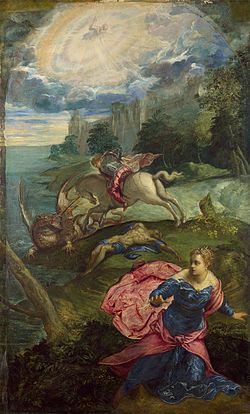
Tintoretto, “Saint George and the Dragon,” National Gallery, London: “Saint George and the Dragon (Tintoretto),” Wikipedia, 2021, https://en.wikipedia.org/wiki/Saint_George_and_the_Dragon_(Tintoretto). Accessed 29 September 2021.
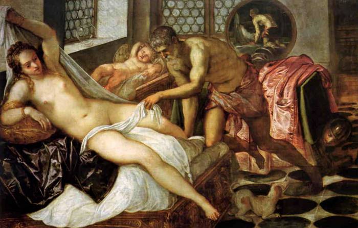
Tintoretto, “Venus, Vulcan, and Mars:” “Jacopo Tintoretto,” Italian Renaissance Art.com, https://www.italian-renaissance-art.com/Tintoretto.html. Accessed 29 September 2021.
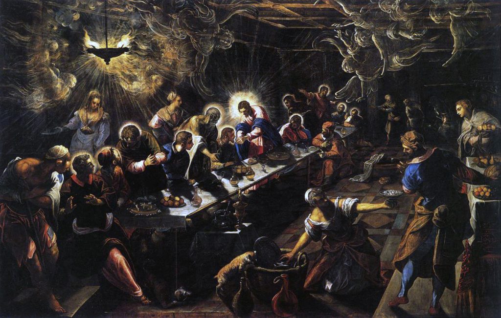
Tintoretto, “The Last Supper,” Basillica di San Giorgio Maggiore, Venice: “Last Supper (Tintoretto).” Wikipedia, 2021, https://en.wikipedia.org/wiki/Last_Supper_(Tintoretto). Accessed 29 September 2021.
Gombrich, Ernst. The Story of Art. 16th Edition, Phaidon Press Inc, 1995.
Eero Aarnio’s logo for his original design company is a great example of proximity. Even though Aarnio could have simply placed his company’s name in straight, horizontal lines, he wanted to make his design more complex and visually appealing. By placing the letters in a form of a circle, he portrays his “iconic design” of the ball chair. Therefore, his design becomes more symbolic and representative because he is relating it to a piece for which he is known. Regardless of the words being put in a circle, the proximity of the title makes it legible and easy to read.
Eero Aarnio, Eero Aarnio Originals: “Eero Aarnio Originals.” D&AD, Bond, 2017, https://libguides.capilanou.ca/citeit. Accessed 27 September 2021.