Burton Kramer

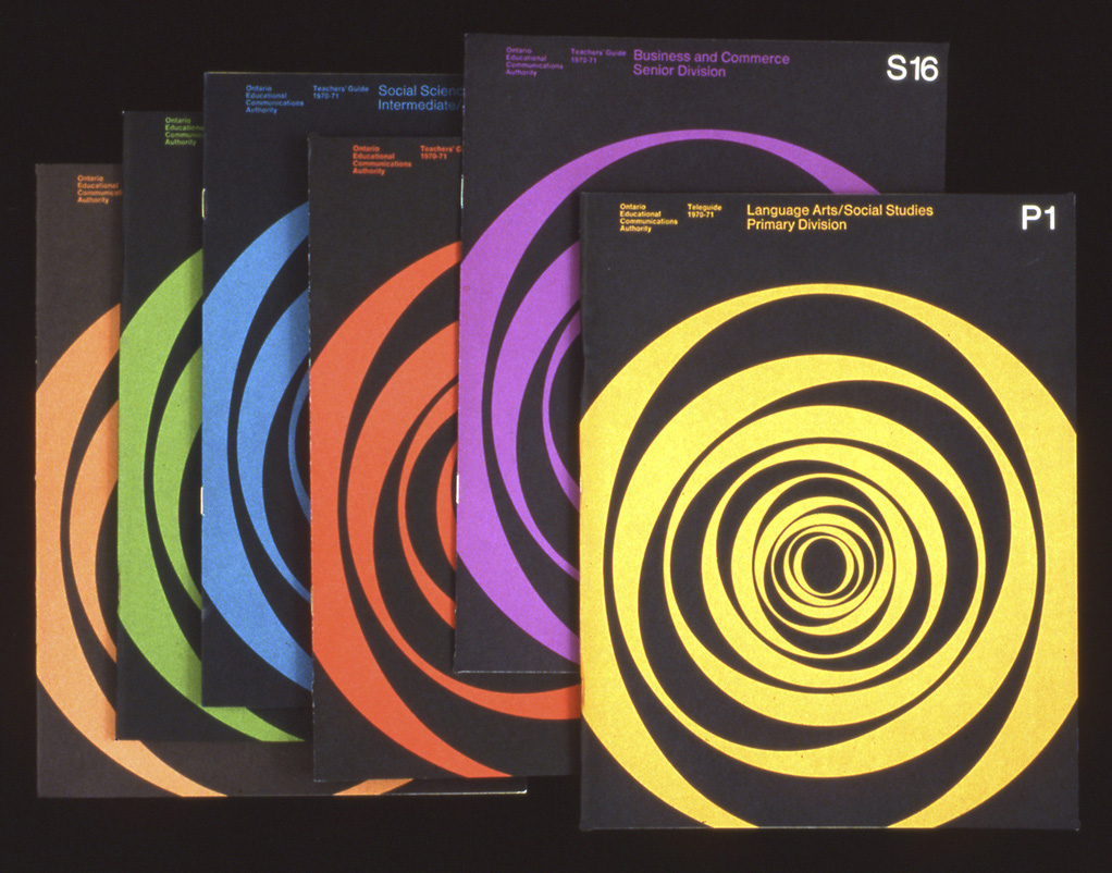
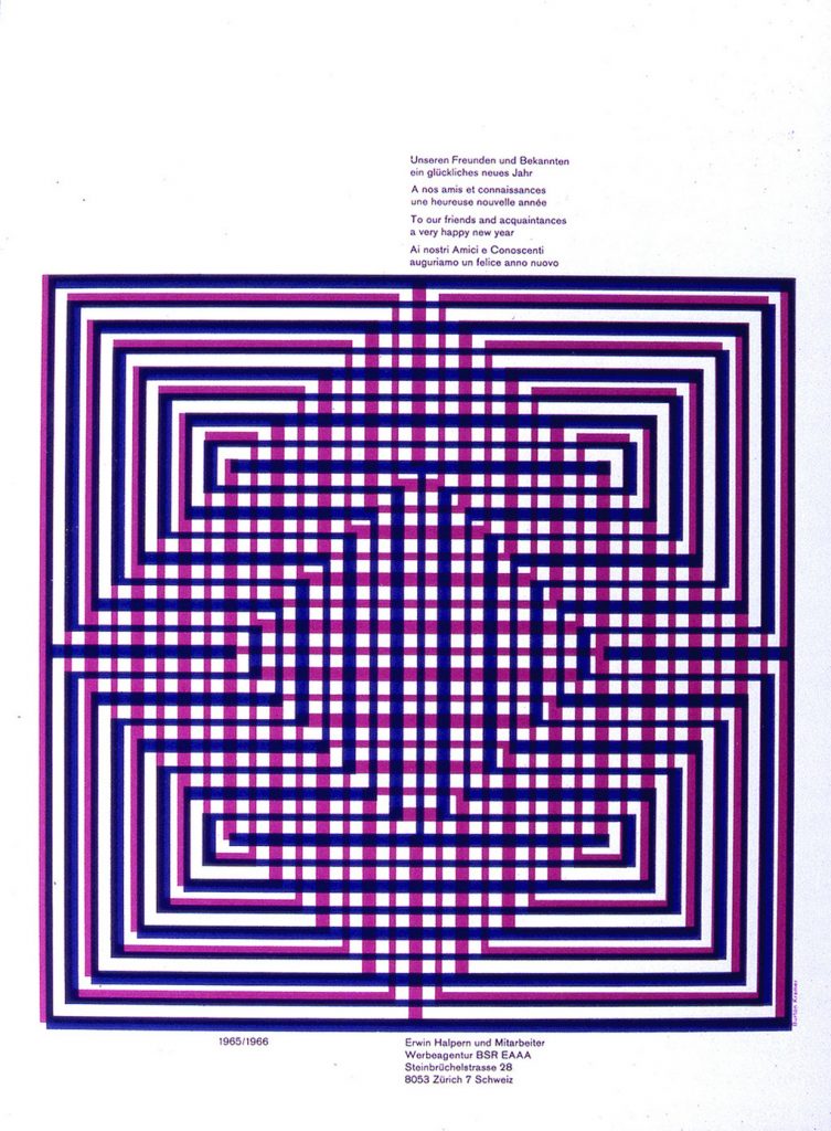
Burton Kramer is an internationally known graphic designer who has had a big impact on Canadian graphic design. He was originally born in the Bronx, New York City and was educated at New York state university, the Institute of Design in Chicago, and Yale University. At Yale, Kramer had the opportunity to learn under people like Alexey Brodovitch, Herbert Matter, Joseph Albers, Paul Rand, and Bradbury Thompson. Of all these inspiring designers, Rand became a big inspiration to him. Further, Kramer began working at the Will Burtin Office in New York. This is where he worked on major exhibits and packaging. Later, he became the assistant art director of the Architectural Record magazine and the New York Life Insurance company, which led him to move to Zurich two years later to work as chief designer at Erwin Halpern Advertising. He finally moved to Toronto to work for Paul Arthur on signage for Expo 67 and then for Clairtone. However, when both companies didn’t survive, Kramer went on to establish Burton Kramer & Associated Ltd. It was at this point that he produced his best-known work and designed for major Canadian institutions which would include the logo for CBC. All in all, I’m in awe of Burton Kramer because of the recognition he has built for himself. His work is incredible because it’s everlasting. I aspire to create work that’s at least a fraction as amazing as his.

Sources:

http://www.designculture.it/interview/burton-kramer.html#start

https://www.burtonkramer.ca/Bio-Artist-Statement

https://canadamodern.org/burton-kramer/

Ontario Educational Communications Authority. Source: http://heythere.ca/interview/burton-kramer/
Swiss Design in Zurich. Source: http://heythere.ca/interview/burton-kramer/

Daniel Pelavin

Daniel Pelavin is an illustrator, graphic designer, and typographer who grew up in Detroit, Michigan. He began his career doing apprenticeships at local art studios and later got his Master of Fine Arts in Graphic Design in New York. Pelavin is known for his knowledge of geometric forms, rich colours, and letterforms inspired by 20th-century culture. His work demonstrates a retro-futuristic style that also implements modernist and art deco elements. Further, He’s worked on book covers, postcards, posters, and typefaces. He created a well-known typeface called ITC Anna. Eventually, he won several awards from institutions such as the American Institute of Graphic Arts, Graphis Posters, Society of Publication Designers, etc. Since then, he has become a full member of the Graphic Artists Guild and the president of the Type Directors Club. He’s even had a studio in New York since 1979. All in all, I love Pelavin’s illustrations and graphics. However, I’m not very fond of his typefaces. I really like the colour palettes and shapes he uses to give each of his pieces a beautiful aesthetic.

Art-deco Inspired Work. Source: https://blog.graphis.com/detroit-style-with-new-york-flair-graphis-master-daniel-pelavin/
After Hours Illustration. Source: https://www.artflakes.com/en/products/after-hours-2

Sources:

http://www.artoftheprint.com/artistpages/pelavin_daniel_heydiddlediddle.htm

https://blog.graphis.com/detroit-style-with-new-york-flair-graphis-master-daniel-pelavin/

https://prabook.com/web/prabook-login.html

Barbara Stauchaffer Solomon

Barbara Stauchaffer Solomon is a multi-talented woman who was trained in dance and graphic design. She began studying dance in San Francisco, but later moved on to study painting and sculpture at the San Francisco Art Institute. After the death of her husband, Frank Stauffacher, she had to find a way to support her young daughter. She decided to move to Switzerland to study graphic design at the Basel School of Design because she knew that she would get paid more. At Basel, she studied under Armin Hoffman, and he became her main reference throughout her lifelong work. When she returned to the United States, she was hired at landscape architect Larry Halprin’s studio. This is where she did her first major project: Sea Ranch. The logo and supergraphics that were produced for this project influenced many designers. After that, many clients were a fan of the same minimalistic and modernist style that was created for the Sea Ranch. It was at this point that Solomon became known for defining supergraphics. Finally, Solomon decided to go back to school to study history, philosophy, and architecture at the University of California. This education allowed her to advance her writing skills and she now writes her own books. Overall, I think that Solomon is a major inspiration because she was able to push through difficult barriers in her life in a successful manner. Her work may be simplistic, but it is obvious that a lot of thought and hard work goes into her projects.

Sea Ranch Brochure with Logo. Source: https://www.sfmoma.org/artwork/2014.709/
Landscape 2018 at BAMPFA. Source: https://www.kqed.org/arts/13839094/barbara-stauffacher-solomon-bampfa-art-wall
“Blue Wave” Graphic at Sea Ranch. Source: https://design-milk.com/the-supergraphics-collection-collab-features-art-by-iconic-barbara-stauffacher-solomon/

Sources:

https://prabook.com/web/barbara.solomon/3756011

https://www.designweek.co.uk/issues/22-28-february-2021/barbara-stauffacher-solomon/

https://www.edwardcella.com/artist/Barbara%20S._Solomon/biography/

Wes Wilson

After serving in the Army National guard, Wes Wilson moved to San Francisco where he started his career as a designer. He worked at Contact Printing where his first job was to produce handbills for Mime Troupe Appeal parties. This job ultimately profiled him as a poster designer and he would be commissioned to create posters for weekly dance concerts for the Avalon Ballroom and the Bill Graham’s Fillmore Auditorium. Further, Graham allowed Wilson to be experimental, this led to Wilson’s inspiration derived from the Art Nouveau movement and the Viennese Secessionist lettering style developed by Alfred Roller. Wilson used this style to create his own aesthetic and made them indistinguishable by expanding their outlines and inset shapes. He experimented with foreground, background, and colour to make his designs more exaggerated with each new creation. Melted lines, letters that filled every space, and vibrant colours is what made up his new style of the psychedelic poster. Wilson’s style was very unique, but by the mid 1960s, many artists copied it. Wilson is still credited for pioneering the psychedelic poster style and became the father of 60s rock concert posters. Overall, I love his work because it gives me a sense of joy when I look at it. His aesthetic his always been one that I admired and it’s really fascinating to learn about how it all started.

Sources:

https://www.rollingstone.com/music/music-news/wes-wilson-psychedelic-poster-artist-dead-obituary-945946/

https://www.bahrgallery.com/artist-master/wes-wilson

https://www.wes-wilson.com/about-wes.html

https://americanart.si.edu/artist/wes-wilson-27389

https://www.classicposters.com/artist/wes-wilson/

13th Floor Elevators, source: https://www.krwg.org/business/2016-05-13/psychedelic-font-how-wes-wilson-turned-hippie-era-turmoil-into-art
Otis Rush & his Chicago blues band; Grateful Dead. Source: https://www.sfmoma.org/artwork/95.663/
The Doors. Source: https://posterhouse.org/blog/wes-wilson-from-art-nouveau-to-psychedelic/

Gene Federico

Gene Federico was an American graphic designer and art director who pioneered the idea of mixing type and imagery. He was first influenced to become a designer in high school where the prestigious Art Squad was formed. Federico was inspired by the European advertisements shown in his classes and based his early designs on the work of A.M. Cassandre. After high school, he left for the Pratt Institute in Brooklyn to enhance his knowledge of European and American design. With the help of one of his professors, Federico eventually took a job with the Abbot Kimball Company in New York. Later on, he received a position in advertisement for Bamberger’s Department Store, but it was cut short because he was shipped off to serve over seas for World War II. Following this setback, Federico received opportunities to work on some projects, but he wasn’t able to find a stable job until he landed a position in the Doyle Dane Bernbach firm where he worked on ads displayed for Woman’s Day magazine. This started the beginning of his “visual puns.” Once he concluded his job at Doyle Dane Bernbach, he began working for Benton and Bowles for eight years. After creating successful IBM advertisement, the rest of his work kept getting rejected by his department. Due to this, Federico began his own firm known as Lord Federico but would later leave after receiving an AIGA medal. Overall, Gene Federico is an inspiration. His work is timeless and his creativity is admirable. I love his work because it reminds designers to always think outside of the box and not to conform to societal trends.

Woman’s Day magazine “She’s got to go out,” source: https://graphiquefantastique.com/2009/07/25/jadore-gene-federico/

Sources:

https://go.distance.ncsu.edu/gd203/?p=52172

http://ideasondesign.net/speakers/speakers/gene-federico/

https://www.nytimes.com/1999/09/10/business/gene-federico-81-graphic-designer-dies.html