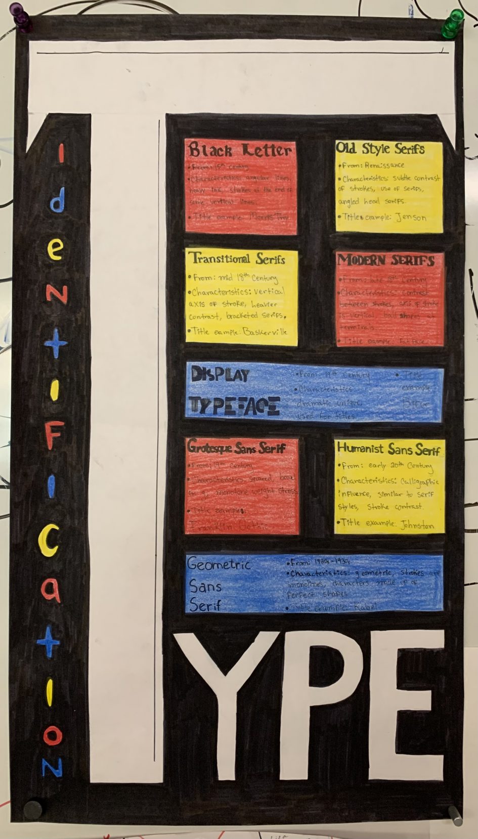
When I was thinking about how to fit the 8 type categories into a poster that would look concise, I was inspired by the geometric shapes of the suprematism movement. I used simple shapes, made up of only primary colors to separate the categories from the background. At first, I was going to leave the background white, but realized that making it black made the important things (like the categories and title) stand out more.
My biggest weakness when it comes to this design is definitely the information text. After I colored over it with colored pencils, the text faded a lot and it’s not as visible as I would like.
If I were to give myself a grade, it’d be an 8. It has its flaws but I really like how it turned out. The title stands out a lot from far away and I think the black background was a very good choice.
Sources:
Leave a Reply