Categories
141

survey 1: more than just mark making

Pictographs: Stories Passed Down

What really inspired me during the survey one lecture were the pictographs, one of the earliest means of communication and storytelling. I would’ve never guessed that people used animal fats, natural pigments, charcoal, and lime to do so. Think about it, nowadays we just pick up a pen and paper. For people at this time, it was like playing a game of Pictionary, only 24/7 because, well, they communicated with only images. Let’s face it, we’ve all cheated at some point and wrote the word down in a final act of desperation. My point is, communication is difficult when there are various languages and people have distinct experiences.

Image #1 consists of The Ojibwa rock painting at Lake superior. They look like dragons to me, what do you see? The Ojibwa people saw serpents with scales and horns. The canoes are interchangeable with water markings. A rusty sepia pigment is painted onto a rock, depicting two serpents, some canoes, and water ripples. The mythical essence of the horns symbolize spiritual strength.

ABC, Not As Easy As 123

Despite how culturally telling pictographs are, they are not the most efficient means of communication. The Phoenicians were people who often traded along the Mediterranean and needed to keep a record of inventory. Therefore, they created the first real alphabet.

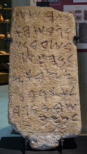
The Phoenician alphabet was developed in the 15th century and served as the basis for numerous languages, such as Greek, Etruscan, Latin, Arabic and Hebrew. Unlike the English alphabet, it was greatly influenced by cuneiform symbols and consisted of twenty-two consonants and absolutely no vowels! In other words, it is like modern day texting, with all the TTYLs and JKs.

In reference to image number two above, one can observe that the letters are fairly simplistic, minimal, and clean. It uses a mixture of lines, form, and shape. For example, the first letter (top right corner) is supposed to be reminiscent of an ox. It really astonishes me how people were able to come up with such simplified symbols at such an early time in history. I would have thought the alphabet would be more detailed, as communication was probably not as universal at that time and most likely needed to be less abstract. It is also intriguing to see the similarities between the Phoenician alphabet and the English language. Notably, the ox rotated ninety degrees clockwise kind of looks like an “A” in English. Additionally, according to the same image, the “.” is used to separate words. That is similar to how many modern languages use periods too.

The Phoenician Alphabet in Archaeology - Biblical Archaeology Society
This Phoenician writing tablet displays some of the written letters in the alphabet. These were basically like receipts, records, and contracts if you were to compare them to modern day use. Imagine carrying that around!

Communication & Society

All in all, communication has evolved to cater towards efficiency and effectiveness. That is why written communication is so different now and probably will be in the future as well. If you think about it, changes in communication occur in our everyday lives. We can see it in the way we abbreviate words and send messages digitally.

Image #1: https://www.warpaths2peacepipes.com/native-indian-art/pictographs.htm

Image #2: https://omniglot.com/writing/phoenician.htm

Image #3: https://www.biblicalarchaeology.org/daily/biblical-artifacts/inscriptions/the-phoenician-alphabet-in-archaeology/

Other sources: https://www.biblicalarchaeology.org/daily/biblical-artifacts/inscriptions/the-phoenician-alphabet-in-archaeology/

http://www.pheniciens.com/articles/alphabet.php?lang=en

Categories
121

gestalt: closure

Adobe logo and symbol, meaning, history, PNG
Source: https://1000logos.net/adobe-logo/

In this example, designed by Marva Warnock, closure is used to create the shape of an “A”. Although the “A” does not technically have a complete outline, our brains are still able to see the letter nonetheless. It was designed this way to reflect the old logo in subtle ways. By doing so, they are able to build on the company from the beginning, creating a lasting and trustworthy impression.

Categories
121

gestalt: proximity

Adidas logo and symbol, meaning, history, PNG
Source: https://1000logos.net/adidas-logo/

Proximity is the use of individual elements to form an image as a whole. In this example, creative director Peter Moore uses three distinctive stripes placed close together, creating a mountain shape. This conveys the challenges and obstacles athletes face, speaking to the brand values. More specifically, the proximity of these stripes provide a sense of movement and direction. The hierarchy within it communicates the concept of overcoming challenges, which is what helps to define the purpose of their sportswear and products.

Categories
121

gestalt: figure / background

Simplicity, symmetry and more: Gestalt theory and the design principles it  gave birth to
Source: https://www.behance.net/kaushikdesign

Kaushik Shivanagere designed this poster using the figure / background technique. It entails what the event will be about using multistability, in which the viewer sees two images. In this case, three bottles of wine are used to form the shape of a fork. It is simple, draws attention to the poster, and clearly communicates the intent of the poster.

Categories
141

yearbook spread

Throughout this assignment, I prioritized the flow of ideas and information. Notably, I have incorporated a subtle constellation concept, which speaks to my love for evening walks and the fact that I am a night owl. This concept and flow is evident as the reader connects the constellations to get from one idea to another. As a result, this project is both interactive and communicates my preference for cleaner, more organized layouts.

As for the overall vibe, the brief states to visually communicate a tone specific to my personality. Therefore, I used three dominant colours (bright yellow, deep blue, pale carmine) to convey my introverted and calm persona, with red used to draw attention and warmth to the images. There is also a certain ratio between text and space. Because I do not have a loud personality, I used space to show my more quieter, introverted side.

Stylistically speaking, there is a prominent use of colour and shape. This is because I am fond of bold colour schemes and love to use solid shapes when illustrating. In my self portrait, I cut pieces of construction paper with an exacto knife to help build contrast between the illustration and the soft watercolour background.

Overall, I would give myself a 9/10. I think this communicates my personality well in an organized, easy to follow, and effective way. I think I also managed to make my focal point (my self portrait) stand out through the usage of size and space. However, I see now that my constellation concept does not shine through as much as it should. Although it is obvious to me, I can see that it may not be obvious to others. I could have brought out the cloudy blue sky in the background more or draw itty bitty stars.

Categories
121

colour & texture

Jessica walsh dating blog | The dating game that went viral. 2019-07-22
Source: https://www.pinterest.ca/pin/147563325277751159/

Jessica Walsh is my favourite art director, not only because her colour palettes are so vibrant, but because she touches on social issues. Texture is also subtly used in this work to convey fine dining at home (lace, she is wearing a casual, soft velvet shirt). This is amusing and challenges the stereotype that men cannot cook exquisite meals for their family on a regular basis. Collectively, this empowers the concept of equality, as men are commonly perceived as breadwinners and atrocious cooks.

Categories
121

lines

Paula Scher: “It took me 20 years to realise I was good at my job” | Design  Week
Source: https://www.designweek.co.uk/issues/25-november-1-december-2019/paula-scher-profile/

Lines are commonly viewed as 2 dimensional components of a drawing. However, Paula Scher uses beautiful and intricate lines in this masterpiece shown above to create dimension. In other words, she demonstrates the use of lines to create form, bringing harmony to the piece as a whole and giving it a sense of direction as well.

Categories
121

size

Source: https://www.shillingtoneducation.com/blog/graphic-design-examples/

VSA Partners manipulate size in this whiskey campaign to magnify the characteristics and flavours offered in the whisky line. These posters are eye-catching due to the peculiar compositions and usage of scale (particularly in the middle one). For example, the girls on the poster to the right are riding penny farthings with huge front wheels. It brings a sense of nostalgia and familiarity relative to refreshing moments and happiness we all once felt as a child.

Categories
121

+ & – space

Source: https://www.shillingtoneducation.com/blog/graphic-design-examples/

Bob2412 (I assume this is a username on a social media platform) effectively communicates the feel of this book and cleverly incorporates the literal portrayal of the book title. “Void” is characterized by negative space, which is very telling of the book genre and the basic plot.

Categories
121

colour

Source: https://www.shillingtoneducation.com/blog/graphic-design-examples/

Animal Chauffeur, by Katrinka Szuhan, demonstrates the usage of two key colours to bring a cohesive element to the brand. In terms of branding, the consistent use of colour makes the company more recognizable, memorable, and trustworthy. It also brings contrast and communicates certain key words that bring value.