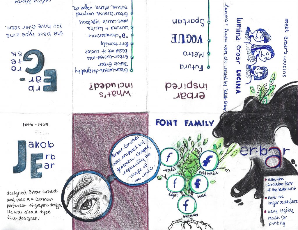
Rationale: While making this zine, I was trying to think of ways to make it engaging, unique, and flow from one idea to another. More specifically, I played with scale in the first page and magnified the initials of Jakob Erbar. I think this helps to create visual hierarchy and draws attention to the main idea of that page. On the second page, I decided to blow up the glasses, having it bleed to the pages beside it. I wanted the viewer to notice this and be inclined to turn the page. I also made it so that there is much white space.
To make it more engaging, I drew a parody of a family tree to show the different weights that exist within the Erbar-Grotesk typeface. I also used the spilling ink to help transition from this page to the one of the three characters. Again, to maintain engagement, I decided to portray similar typefaces created by Erbar as “cousins.” However, I think I should have placed the cousin typefaces consecutively, right next to the font tree. As a result, I could have planned this out more thoughtfully.
As a result of the reasons mentioned above, I would give myself a 9/10.
Corpse of Christ. Image source: http://www.annibalecarracci.com/corpse-of-christ/
Baroque style painter Annibale Carracci often painted with great reference to nature, unlike those of the mannerist period, who often elongated human figures, experimented with scale, and emphasized artificiality. Carracci, alongside Ludovico and Agostino Carracci, was a sixteenth century artist with a fervour for creating atmosphere and incorporating strong usage of light.
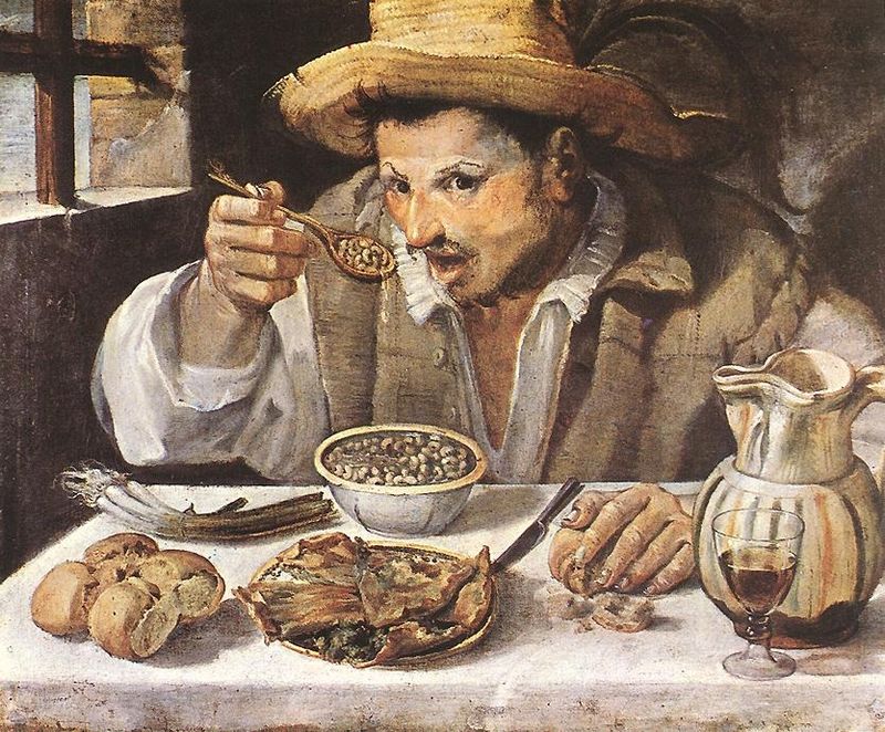
Most notably, Annibale Carracci brought the concept of caricature to his work, as demonstrated by the painting shown below. As you can see, there is an emphasized distortion in the expression of this person’s face, as his eyebrows are significantly raised, his mouth is agape, and his eyes seem to have just noticed the viewer of the painting. This kind of makes me feel like I am interrupting his meal. As well, I can see much natural light coming in, making his expression pop out against the dark background. I like this piece because it captures everyday life in its true, unidealized form. Compositionally, I like how the window in the back creates a bit of dimension and perspective.
The Beaneater. Image source: https://www.artble.com/artists/annibale_carracci/paintings/the_bean_eater
In addition to caricature and light & dark, Carracci brought a new form of landscape painting to life. He used broken brush strokes to capture light and dark, as well as movement, which in turn created a strong sense of atmosphere and space. An example of his landscape work is Landscape With The Flight to Egypt, shown below.
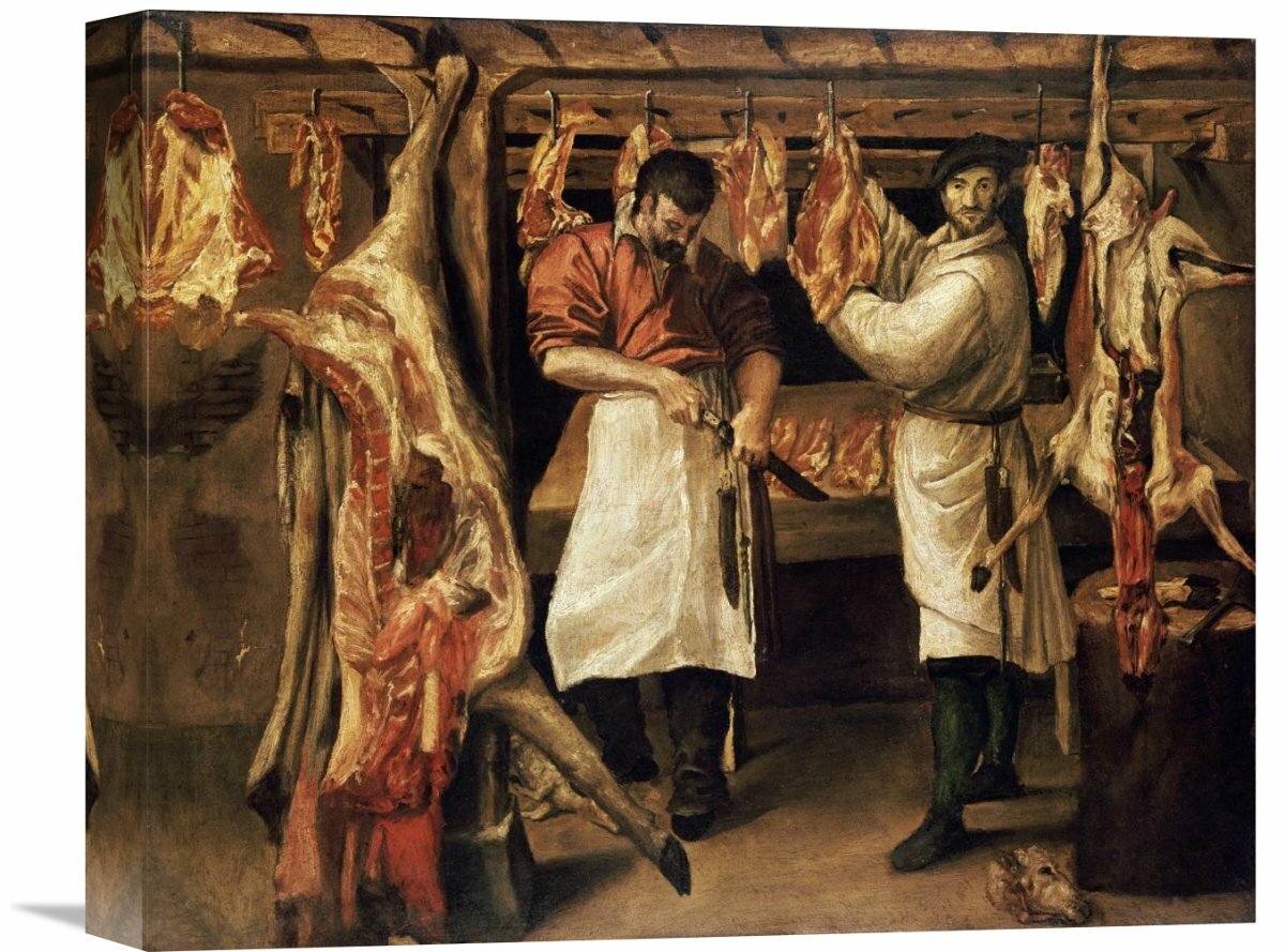
Landscape With The Flight into Egypt. Image source: https://en.wikipedia.org/wiki/Landscape_with_the_Flight_into_Egypt_(Carracci)Butcher’s Shop. Image source: https://www.wayfair.com/decor-pillows/pdx/global-gallery-the-butchers-shop-by-annibale-carracci-painting-print-on-wrapped-canvas-vhy6703.htmlTwo Children Teasing a Cat. Image source: https://www.wga.hu/html_m/c/carracci/annibale/1/children.html
In 1867, Harper’s Bazaar was first issued, making it America’s first fashion magazine for those interested in high fashion. The magazine is well associated with a classic, simplistic, and elegant typeface called Didot. This typeface, designed by Firmin Didot, is notable for its highly stressed vertical lines, thin horizontal lines, and flat serifs. Due to this, it is often used as a display font and not for the body text, as the small sizing would drastically alter legibility.
At first glance, I look at this typeface and immediately think of designer brands. I am reminded of high-end makeup brands at Sephora and fashion lines like Zara. It is a very sophisticated font with exaggerated serifs, very high contrasted thick and thin lines, and a prominent narrow structure. All things considered, I get a regal sense of elegance from these letters.
Didot & The Fashion Industry: A Trendsetter
Didot represented their editorial vision
It is a strong display font that stands out, yet works well with the cover
At the time of the rebrand, it was uncommon for the cover to consist only of a title and image (usually had the table of contents on the cover)
The simplicity really evokes an urban, modern, and sophisticated feel
The edition of Bazaar above really exemplifies the visual hierarchy created by Didot. Since it is very thick in areas and stands well on its own, it catches the eyes of audiences, especially in a busy and highly competitive industry.
In my opinion, although this rebrand occurred in the nineteenth century, the cover is still very reminiscent of current fashion magazines, like Vogue. I believe this shows exactly how impactful Didot was. I think that because of this widely-recognized rebrand, other fashion magazines chose to follow the same guidelines design-wise.
Didot helped shape the culture of fashion magazines. For example, in the image above, the magazine brings a sense of not only fashion, but lifestyle with “Lazybones Diet” and “Easy Living.” This was done to help sustain the interest of their readers.
Soon enough, Bazaar magazine would start promoting ways to upcycle clothing, incorporate elements of social change, and touch on current events. I think this makes Bazaar a more powerful publication that grows with society and reflects the cultural values of its time. Honestly, I would love to see these magazines in a museum exhibition because I can sense the historical, cultural shifts both in the aesthetics of the magazine as well as women’s lifestyles overtime.
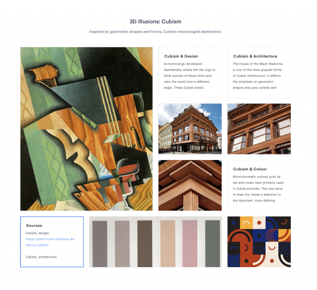
It was quite an experience using Invision. I really like how I was able to change the size of my images and writing to create an interesting composition (I tried to make it look engaging in this way). I also tried to make it visually compelling by featuring dominant photos to catch the viewer’s attention and to make it look less uniform/boring.
Notably, I considered using interesting titles and subtitles, a variety of images, and used colour swatches to add the “mood” to the “board.” Looking back, I think my Cubism moodboard was the most successful layout wise, due to the cohesiveness geometric shapes as the connecting component. The colour swatches also helped to tie the colours together.
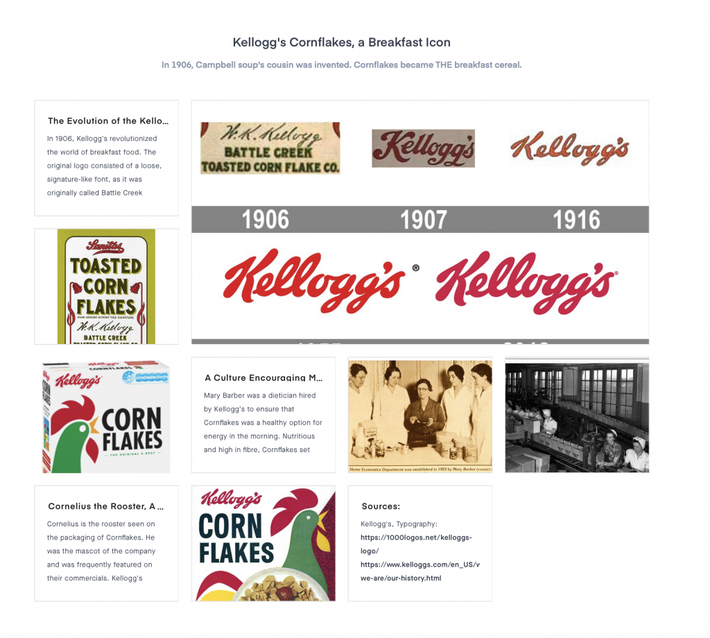
Overall, I tried to make connections within my events, but often found it difficult. Therefore, I could have strengthened this. However, I recognize that I did connect my research with that of society and tried to make connections that way. As well, my Kellogg’s cornflakes moodboard is not as visually appealing as it could be. For the reasons listed, I would give myself a 9/10.
Type! You see it everywhere. It is so common that sometimes I overlook subtle details and characteristics. I mean, think about it. There are hundreds of thousands of typefaces used worldwide. It hurts my brain to think of all the different ways someone can express the word “typeface.”
This is a venetian typeface designed by Frederic W. Goudy and Tony Stan, created for the university of California Press. It was heavily inspired by printing in the eighteenth century, featuring an “e” with a slanted style. Jenson, a post-gothic typeface designer, used a similar technique, thereby inspiring ITC Berkeley Oldstyle, the name of the font in image #1.
I have noticed that the serifs in the ITC Berkeley Oldstyle typeface are inconsistent. Notably, the serif in the letter “U” differs greatly from the serif in the letter “C.” As well, the letter “E” does not seem to have any serifs at all. Although it is much easier to read than black letters, the inconsistencies are a tad distracting to me…oh–the letter “Z” has serifs slanted at an angle, whereas the others have fairly straight serifs. This leads me to wonder why serifs were used in the first place. I imagine that these intricate, seemingly useless details limited the efficiency of printing and probably made punch cutters want to pull their hair out.
Taking A Closer Look: Schneidler
Another Venecian typeface called Stempel Schneidler was designed by F .H. Ernst Schneidler in 1936. Similar to ITC Berkeley Oldstyle, this typeface features an abundance of serifs (cue sarcastic cheers from punch cutters). However, in my opinion, they mostly resemble gothic letters due to the dramatic thick and thin lines. As a result, I think this font would be great for titles and subtitles.
Having A Helvetica Good Time
You don’t have to be a designer to know this typeface! Helvetica was and still is widely used, mostly because of its legibility and potential to correspond with universal context. The transition from venetian typefaces to modern fonts is riveting to me, as sans serif fonts seem to have become more popular over the years. I believe this is due to the rise in minimalistic aesthetics, which seems to be one of the more prominent themes in modern design. Typefaces have become less decorative and more focused on legibility and effectiveness. This may have something to do with the development of literature, as genres expanded and typefaces did not suit these various contexts.
Jacopo Tintoretto was an Italian painter of the mannerism period who was very well known for his use of dramatic lighting to tell narratives. He was deeply inspired by the usage of colour in Titian’s work, as well as the lively configurations demonstrated in Michelangelo’s work. He became famous for his artistic abilities at an especially young age (30 years). Notably, he was famous for the harmony portrayed within the figures he painted, as well as his vivid use of colour.
The image to the left, St. George and the Dragon, demonstrates yet another skill in which Tintoretto has mastered. The foreshortening seen in the bottom right figure provides a sense of depth, which was especially noticeable as it was placed on the ceiling and loomed over people.
I feel that the reasons for his fame are valid, as the art work to the left demonstrates skillful use of colour in the way that it glows. The figures are painted in an effortlessly united way. Additionally, there is always an riveting use of light in almost every one of his works. More examples of this are shown below.


