Categories
131

kay sage & surrealism

Kay Sage was an American Surrealist painter, focusing more on unconventional imagery like geometric shapes, muted colour palettes, scaffolds, and mechanical elements over organic ones to convey the harshness of her psychological state. This was due to her troubling childhood. Although she was privileged financially, her parents did not get along well and ended up leading separate lives. She herself did not have a harmonious relationship with her partner. However, when he died, that proved to be detrimental and greatly affected her work.

My Room Has Two Doors, 1939 - Kay Sage - WikiArt.org
My Room Has Two Doors 1939

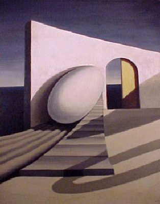
Sage was often inspired by the symbol of an egg, which is a reflection of her father’s egg collection. It also symbolizes potential growth. This juxtaposition between the fragility of the egg and the sturdiness of the wall is what makes this work compelling for me. The position of the egg is also kind of strange. It is placed on an angle, seemingly about to roll away at any given moment. The architectural element is reminiscent of Italian influence and I particularly enjoy the use of space that it creates, as the horizon line and exaggerated shadows suggests depth.

Kay Sage | Tomorrow is Never | The Metropolitan Museum of Art
Tomorrow Is Never 1955

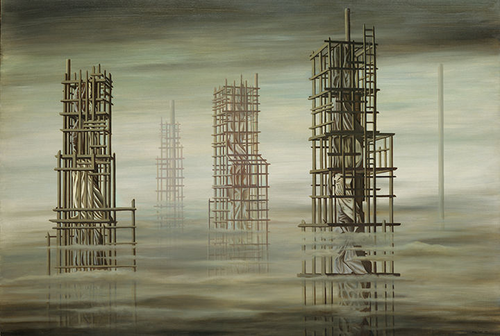
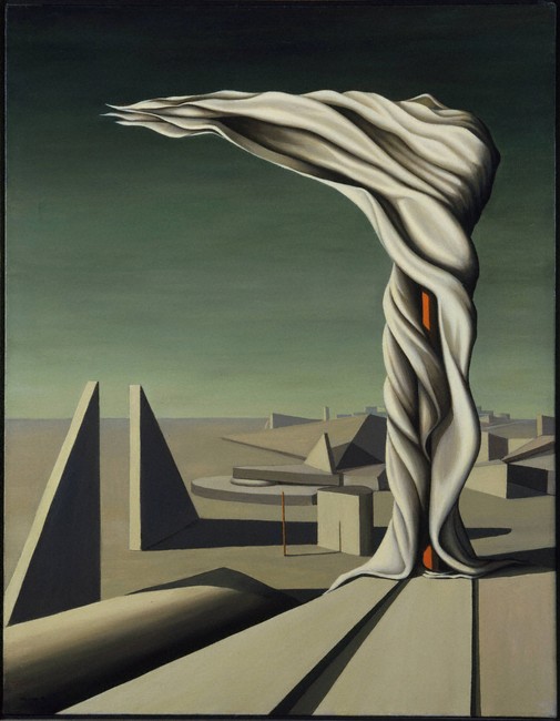
Tomorrow Is Never is a work that I feel emotionally connected to. The groggy eeriness and polluted colours evokes a sense of grief and burden. The use of scaffolding gives it a sense of instability. These towers seem to float in the air, giving it a dream-like atmosphere.

Kay Sage (American, 1898-1963), Starlings, Caravans, 1948. Oil on canvas 32  × 39 in. Fine Arts Museums of San Francisco. Museu… | Surrealism painting,  Painting, Art
Starlings, Caravan 1948
I Saw Three Cities (y1964-162)
I Saw Three Cities 1944
The Answer is No | Yale University Art Gallery
The Answer is No 1958

https://www.theartstory.org/artist/sage-kay/

https://www.wikiart.org/en/kay-sage

https://artgallery.yale.edu/collections/objects/60172

https://www.pinterest.ca/pin/500884789802803123/

Categories
100

main focus: literature review essay

What should cities do to address the problem of excess food waste?

Cities should encourage educational campaigns amongst shoppers and consumers to acknowledge the invisible psychology of overconsumption, thereby helping to integrate a culture of ethical consumerism. As a result, companies will reduce waste at the production level as well.

Categories
100

introducing & comparing two sources

More applicable to modern times than ever, there is an increasing need to address consumer culture and evaluate how these values will influence lifestyles and, inevitably, the future of the natural world (Kimmerer 2013 ; Mourad 2016). There are some varying points of views in regards to the elements of culture that have resulted in this overconsumption. Mourad suggests that irresponsible corporate companies are at fault when it comes to manufacturing unsustainable products in the first place (1). However, Kimmerer differs, suggesting that waste can be reduced if kids are taught “to pick [the single grain] up and kiss it” (189).

Categories
141

artefact: harper’s edition

I chose Penfield’s poster designs because I love the use of white space. It was also a nice break for my eyes in comparison to the ornate posters of the Art Nouveau period. It is interesting to see such shockingly modern techniques being used in his illustrative and design work.

As I was planning my version on this project, I thought about things like contrast, as I needed to use colours and a composition that would be visible from far away. That is why I chose to use the complimentary colours purple and yellow. I also chose to use a muted blue background to help the figure stand out, as that was often Penfield’s focal point.

Since this edition is for November, I also wanted to convey the rainy fall weather. To emphasize this, I included a simple outline of an umbrella and created an oblique horizon line. I wanted to create a sense of direction to represent the chaotic rain and wind in a minimalistic way.

Lastly, I used varied lines to outline the figure, which was yet another prominent characteristic of Penfield’s work. While researching, I also noticed that every poster seemed to have a figure holding a publication of Harper’s. I thought this was a clever way to create cohesiveness as an art director, so I included one as well where the weight of the design seems to fall on.

As for the spread, I tried to make it resemble a magazine and played with first person POV to make it more engaging and interactive. The reason I chose to photograph the poster as I did is because of Harper’s target audience. They consisted of wealthier, upper class people who read Harper’s magazine in their leisure time. That is why I chose to create a more luxurious and relaxing kind of background, communicating a time of relaxation and reading before bed. However, looking at it now, the background may seem too modern.

Overall, I believe I deserve a 12/13 because I considered all the characteristics of Penfield’s work and applied it to my own interpretation of Harper’s magazine. I also managed to keep it simple, making sure that every shape had a significance, whether that was to show fashion trends at the time, or to relate to November weather.

Categories
100

summary

The following is my revised summary for “The Importance of Urban Forests,” by Amy Fleming.

Amy Fleming’s “The Importance of Urban Forests: Why Money Really Does Grow on Trees,” suggests the potential environmental, financial, mental, and physical impact trees can have on modern living. Referring to public health expert William Bird, Fleming emphasizes the decreasing value of trees within younger generations (5). Bird compares this idea to an “extinction of experience” (qtd. in Fleming 5). In other words, an increasingly scarce number of people will be able to identify with trees as a means of finding groundedness. Due to the stress-relieving qualities of nature, withdrawal from these experiences will become the new normal, resulting in higher levels of anxiety (4). Subsequently, Bird reports that less people will have the “energy to be active” (qtd. in Fleming 5). His point here is that a collective deficiency in self-care will result in increased health care costs. Additionally, as trees become a trivial idea, fewer people will understand the ways in which trees can reduce heating and air conditioning costs (2), encourage “empathy and altruism” (Fleming 4), and promote active lifestyles through the reduction of stress (4). Collectively, lack of understanding will put a heavier financial strain on modern living. One way or another, Fleming suggests that “children will ultimately understand and value nature less” (Fleming 5). Therefore, the accumulative lack of understanding for trees will result in unhealthy lifestyles, air pollution, and financial tension for generations to come.

Categories
100

about me


Hi, there! My name is Celina Zhong and I am an artsy, creative student at the IDEA School of Design. I have always had a lifelong obsession with drawing. After numerous years of studio art classes at Burnaby North Secondary, I decided to partake in the Graphic & Media Arts Ace-it program at Byrne Creek Community School. It was during this preeminent time in my life that I learned to cultivate my spirit for art and design in both traditional and digital form. Since this epiphany, I have acquired a fervor for typefaces, colour palettes, communication design, and quirky illustrations. I am currently composing this paragraph in hopes of becoming an art director at a creative advertising agency. Aside from my creative work, I spend the majority of my free time arduously working two jobs, fulfilling my perfectionistic obsession, listening to indie music, walking to undetermined destinations, and eating vegetarian sushi rolls at the park.
Categories
131

Impression, Morisot

undefined
Child In The Rose Garden, Morisot, 1881
https://commons.wikimedia.org/wiki/File:Morisot_-_child-in-the-rose-garden.jpg

Berthe Morisot was an impressionist painter who was also a pupil of Edouard Manet. Interestingly enough, her grandfather was the one and only Fragonard, an artist of the Rococo period. As one can tell, Morisot has had many artistic influences throughout her life and within her family.

Morisot was not always an impressionistic painter. She started off painting classically. After studying with Manet, she notably began using large amounts of paint in varying directions, creating an element of transparency. Details were overlooked if they proved to be insignificant. She was also interesting in the sense that she chose to paint unorthodox subjects at the time. She focused her work on everyday life, gardens, family, and friends. These key characteristics in technique are what separates her work from others.

Upon researching, I have found that Woman at Her Toilette is one of personal favourites. This is due to the masterful use of brushstrokes to mimic the texture of the dress. It creates a light and feathery effect that harmoniously compliments the muted pastel colour scheme. I love the blend of lavender, soft blues, gentle pinks, and greys. The fleshy colour of the face is also done really well. Also, the background definitely portrays a sense of movement with the brushstrokes, which is a common characteristic of Morisot’s world.

The Mother and Sister of the Artist
The Mother and Sister of the Artist, Morisot, 1869/70 https://www.nga.gov/collection/art-object-page.46661.html

Sources: https://biography.yourdictionary.com/berthe-morisot

https://www.artsy.net/article/artsy-editorial-berthe-morisot-brought-radically-feminine-perspective-impressionism

Categories
141

survey 6: horta brings the outdoors to the indoors

Ah, France and Belgium–where Art Nouveau all began. It was a time where natural colour palettes and organic shapes were dominant trends in both architecture and design. Victor Horta was a Belgium architect who consistently exemplified a beautiful portrayal of nature both architecturally and in his interior decorative design work.

An Interior Design Expert

Chair for the Hôtel Aubecq, Brussels (1899)
Hotel Aubecq, Brussels is where this beautiful chair is located. I love the natural texture and harmonious flow of lines, creating a war and inviting feel.

It is not a surprise that Horta applied his skills in interior design. He designed this chair for the Hotel Aubecq in Brussels. I love how the thick, curvy lines of the armrest leads the viewers’ eyes to the back of the chair. This focal point resembles a flower in my opinion, and acts as the cherry on top. It is also lovely to see how the chair sits elegantly on the floor, as if it is “tip-toeing”. This gives it a light and elegant feel to it.

Architecture Galore

Horta’s goal was often to create an open and airy atmosphere, which I imagine worked well for the hotels he designed for. He often had some kind of focal point and, in the case of his architectural work for hotels, they were the extravagant staircases. These staircases often had an emphasis on structural design and frequently had an abundance of dainty lines resembling nature.

Hôtel Tassel, Brussels (1893)
The Tassel House, Brussels features a beautiful staircase that virtually screams gardens and vines. I personally love how the stairs resemble ripples of water and convey a dynamic sense of rhythm as it flows down. The vine-like railings give it a light feel too.

Victor Horta was a huge influence and basically made Art Nouveau a national style. His accomplishments include designing for numerous department stores, where he often used glass panels on the facade (the exterior design). This created a sense of transparency, where people walking outside could peer inside the stores. It is interesting to note this because if you take a walk in downtown Vancouver, nearly all the stores have this kind of transparency with glass facades. This shows the impact his work has on architecture today. It is also interesting to think about why he chose to do this. Was it for aesthetic reasons? Or perhaps because he was using this tool as a means of communication. I imagine the openness of his department store designs strengthened the honest relationships with shoppers and sellers. Horta not only incorporated lovely nature designs and palettes, but designed for clients based on their needs.

L'Innovation Department Store, Brussels (1901-03)
Department store design, Brussels. Victor Horta’s designs were intricate, highly detailed and had a luxurious feeling to it.

All image sources: https://www.theartstory.org/artist/horta-victor/artworks/

Informational sources: https://theculturetrip.com/europe/belgium/articles/victor-horta-belgiums-greatest-art-nouveau-architect/

https://www.theartstory.org/artist/horta-victor/artworks/