Categories
142

Postmodernism in Europe

Robert Venturi was an American Architect born in 1925, Philadelphia. He graduated from Princeton University in 1947, where he earned his Master of Fine Arts degree. He founded his own firm, Venturi (later to be called Venturi and Scott Brown & Associates). He always urged for more eclectic architecture, rejecting modernism. Instead, his work was focused on functionality, yet had some ornamental elements that give his work a postmodern feel.

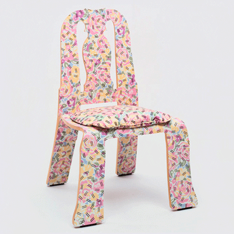
His partner, Denise Scott Brown, is an architect, author, and educator. In fact, Venturi and Scott Brown met each other while teaching at the University Pennsylvania in 1960. Together, they defied modernism and its set ways, and created work that was playfully vernacular.”Less is a bore,” a phrase coined by these architects when designing chairs for Knoll, as seen below. There are historical elements, like Art Nouveau. They also wanted the chairs to be cheap and therefore easily accessible, so fabric and materials were relatively plain.

Mr. Venturi’s Guild House, a retirement home, in Philadelphia, completed in 1966. With its flat facade punctured by mismatched windows, “it is meant to make the educated viewer look twice, to see why the ordinary is extraordinary,” the Times critic Ada Louise Huxtable wrote.
Guild House, 1966
https://www.nytimes.com/2018/09/19/obituaries/robert-venturi-dead.html

https://www.pritzkerprize.com/biography-robert-venturi

https://www.archdaily.com/769194/spotlight-robert-venturi-and-denise-scott-brown

https://archive.curbed.com/2018/9/20/17879874/robert-venturi-works-vanna-venturi-postmodern-architecture

Categories
142

Supergraphics

Barbara Stauffacher Solomon is an unforgettable name, most well known for her supergraphics work at the Sea Ranch Tennis Club in San Francisco. She was initially hired to create their logo and brochure designs, but ended up innovating a whole new concept of visual identity. Her project with the Sea Ranch Tennis Club was then featured in Life magazine in 1966, where it became a trend. Her work reminds me of the Swissted posters for class, except they are on a much larger scale and are displayed on walls and buildings.

Colorful Sea Ranch Tennis Club supergraphics by Barbara Stauffacher Solomon
1960s Sea Ranch Tennis Club Supergraphics https://archive.curbed.com/2018/1/3/16842200/barbara-stauffacher-solomon-sea-ranch-supergraphics

Solomon first studies at the California School of Fine Arts, before moving to Switzerland to study graphic design. As a result, she frequently used Helvetica, influenced by the Swiss International style, West Coast Pop, and California Cool style. Her work features colourful environmental solutions that are stylishly bold in comparison to the typical monochromatic European designs at the time. Geometric shapes and scale were also common characteristics of her designs. Overall, her supergraphics heavily influenced graphic design, public spaces, and spatial decoration. Her work remains on a permanent exhibition at the San Francisco Museum of Modern Art

Suzanne Hudson on Barbara Stauffacher Solomon - Artforum International
https://www.artforum.com/print/reviews/201908/barbara-stauffacher-solomon-80873
Supergraphics: the bold and colorful world from the 1970s.
https://www.lateralobjects.com/post/city-survival-bar-dress-code-guide

https://archive.curbed.com/2018/1/3/16842200/barbara-stauffacher-solomon-sea-ranch-supergraphics

https://www.typeroom.eu/article/barbara-stauffacher-solomon

https://www.lateralobjects.com/post/city-survival-bar-dress-code-guide