Categories
142

Burton Kramer

Kramer attended the Industrial Arts Program of the New York State University in 1951, before attending the Yale School of Arts and Architecture in 1954. While at Yale, he also went to the Royal College of Art in London. After years of studying art and design, Kramer graduated from Yale University in 1957.

He worked at Will Burton Office, worked for Architectural Record magazine, and New York Life Insurance Company before moving to Toronto, Canada. There, he worked for Paul Arthur & Associates as an art director. In 1967, he established his own branding agency with a focus on corporate designs.

Burton Kramer - Wikipedia
Canadian Broadcasting Corporation Logo
https://en.wikipedia.org/wiki/Burton_Kramer

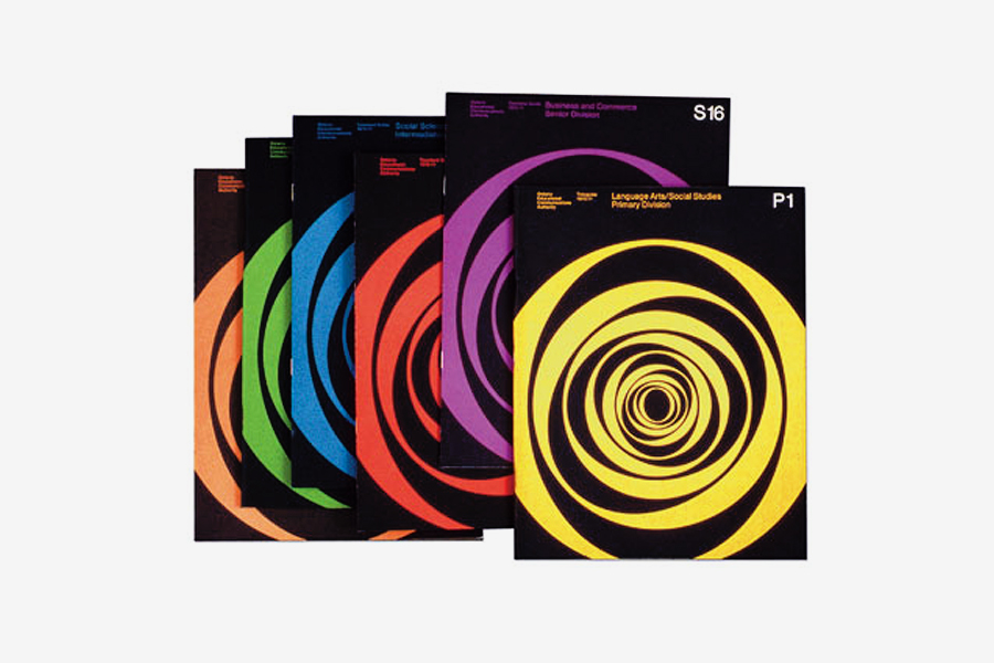
The logo Kramer designed for CBC features the letter C in the middle, surrounded by geometric circular shapes that echo the form of the C. Many people used to call it the “exploding pizza.” The goal was to represent both English and French broadcasting.

File:CBC Logo 1992-Present.svg - Wikimedia Commons
Canadian Broadcasting Corporation, New Logo https://commons.wikimedia.org/wiki/File:CBC_Logo_1992-Present.svg

However, in the 1990s, the logo was changed. It became one solid Pantone colour, and the C that appeared in the previous logo is closed. Kramer dislikes this change, as he was not responsible for this change in design.

From 1980-2001, he began teaching design for corporations and typography. He is still alive today and continues to build a legacy of geometric, energetic, and expressive designs.

10th International Sculpture Conference Brochure, 1978 http://www.designculture.it/interview/burton-kramer.html

http://www.designculture.it/interview/burton-kramer.html

https://www.cbc.ca/radio/day6/coronavirus-impeachment-then-and-now-picard-returns-fruits-of-the-goop-lab-cbc-logo-designer-and-more-1.5437706/an-icon-of-canadian-graphic-design-meet-burton-kramer-designer-of-the-cbc-logo-1.5437708

Categories
142

Postmodernism in Europe

Robert Venturi was an American Architect born in 1925, Philadelphia. He graduated from Princeton University in 1947, where he earned his Master of Fine Arts degree. He founded his own firm, Venturi (later to be called Venturi and Scott Brown & Associates). He always urged for more eclectic architecture, rejecting modernism. Instead, his work was focused on functionality, yet had some ornamental elements that give his work a postmodern feel.

His partner, Denise Scott Brown, is an architect, author, and educator. In fact, Venturi and Scott Brown met each other while teaching at the University Pennsylvania in 1960. Together, they defied modernism and its set ways, and created work that was playfully vernacular.”Less is a bore,” a phrase coined by these architects when designing chairs for Knoll, as seen below. There are historical elements, like Art Nouveau. They also wanted the chairs to be cheap and therefore easily accessible, so fabric and materials were relatively plain.

Mr. Venturi’s Guild House, a retirement home, in Philadelphia, completed in 1966. With its flat facade punctured by mismatched windows, “it is meant to make the educated viewer look twice, to see why the ordinary is extraordinary,” the Times critic Ada Louise Huxtable wrote.
Guild House, 1966
https://www.nytimes.com/2018/09/19/obituaries/robert-venturi-dead.html

https://www.pritzkerprize.com/biography-robert-venturi

https://www.archdaily.com/769194/spotlight-robert-venturi-and-denise-scott-brown

https://archive.curbed.com/2018/9/20/17879874/robert-venturi-works-vanna-venturi-postmodern-architecture

Categories
142

Supergraphics

Barbara Stauffacher Solomon is an unforgettable name, most well known for her supergraphics work at the Sea Ranch Tennis Club in San Francisco. She was initially hired to create their logo and brochure designs, but ended up innovating a whole new concept of visual identity. Her project with the Sea Ranch Tennis Club was then featured in Life magazine in 1966, where it became a trend. Her work reminds me of the Swissted posters for class, except they are on a much larger scale and are displayed on walls and buildings.

Colorful Sea Ranch Tennis Club supergraphics by Barbara Stauffacher Solomon
1960s Sea Ranch Tennis Club Supergraphics https://archive.curbed.com/2018/1/3/16842200/barbara-stauffacher-solomon-sea-ranch-supergraphics

Solomon first studies at the California School of Fine Arts, before moving to Switzerland to study graphic design. As a result, she frequently used Helvetica, influenced by the Swiss International style, West Coast Pop, and California Cool style. Her work features colourful environmental solutions that are stylishly bold in comparison to the typical monochromatic European designs at the time. Geometric shapes and scale were also common characteristics of her designs. Overall, her supergraphics heavily influenced graphic design, public spaces, and spatial decoration. Her work remains on a permanent exhibition at the San Francisco Museum of Modern Art

Suzanne Hudson on Barbara Stauffacher Solomon - Artforum International
https://www.artforum.com/print/reviews/201908/barbara-stauffacher-solomon-80873
Supergraphics: the bold and colorful world from the 1970s.
https://www.lateralobjects.com/post/city-survival-bar-dress-code-guide

https://archive.curbed.com/2018/1/3/16842200/barbara-stauffacher-solomon-sea-ranch-supergraphics

https://www.typeroom.eu/article/barbara-stauffacher-solomon

https://www.lateralobjects.com/post/city-survival-bar-dress-code-guide

Categories
142

gunther kieser

Gunther Dieser was a German music poster designer in the 1960s and 70s. He was born in 1930 in Kronberg. In the beginning, Kieser was a freelancer. However, after partnering with Hans Michel in 1952, they co-founded their own studio. Initial projects included designing work for the German Mail Service. This then progressed into designing for music concerts and musicians, which really helped to define his career and reputation.

Notable concerts Kieser and Michel designed for include those of Ella Fitzgerald, John Coltrane, and Oscar Peterson. After the partnership ended, Kieser continued to work as a designer for Lippmann & Rau. He produced work that was essentially displayed everywhere.

Image result for jimi hendrix experience poster by gunther kieser
Above is Kieser’s poster design for Jimi Hendrix.
https://recordmecca.com/item-archives/jimi-hendrix-experience-original-1969-us-tour-merchandising-poster-by-gunther-kieser/

The poster design above was designed for Jimi Hendrix’s concert in 1969 and is arguably the most popular of his designs. It was extensively reproduced for other aspects of Hendrix’s shows. I personally love the unorthodox colour palette and the chaotic feel of it. Normally, I would think this design is too busy, but I think it embodies the culture of music concerts well with the high contrast and lively feel. It is very graphic.

ella
Ella Fitzgerald Concert Poster in 1959.
https://www.printmag.com/post/psychedelic-music-posters-of-gunther-kieser
Kieser, Cecil Taylor
1955 Jazz Festival in Frankfurt.
https://www.printmag.com/post/psychedelic-music-posters-of-gunther-kieser

https://www.bahrgallery.com/artist-master/gunther-kieser

https://www.printmag.com/post/psychedelic-music-posters-of-gunther-kieser

Categories
142

Art Director: Helmut Krone

Helmut Krone was an advertising art director born on July 16, 1925. He helped to establish a reputable and international creative advertising agency called DDB (Doyle Dane Bernbach). Most well known for timeless corporate images, Krone made a name for himself in a world where advertising and graphic design was heavily statistically based. 

In reference to his work with Volkswagen, Krone focused his attention on gaining and maintaining the loyalty of those already interested in the car company, rather than attempting to acquire new audiences. This ad campaign was successful because of its simplicity. No logo was needed to establish the Volkswagen company. No dramatic pop of colour was used to capture attention. The honest and minimalist visual language of the ads in contrast to their competitors was all that was needed to reinforce the brand. In addition, I think the ease of the phrase “Think Small” was a very successful element of the campaign, similar to Nike’s “Just Do It.”

VW BEETLE: 'THINK SMALL' | theadvertisingreviewblog
VW Think Small - The Advertising Campaign to Remember - HIP Creative