Simply Elegant
In 1867, Harper’s Bazaar was first issued, making it America’s first fashion magazine for those interested in high fashion. The magazine is well associated with a classic, simplistic, and elegant typeface called Didot. This typeface, designed by Firmin Didot, is notable for its highly stressed vertical lines, thin horizontal lines, and flat serifs. Due to this, it is often used as a display font and not for the body text, as the small sizing would drastically alter legibility.

Didot & The Fashion Industry: A Trendsetter

- Didot represented their editorial vision
- It is a strong display font that stands out, yet works well with the cover
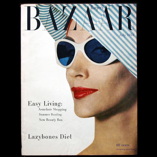
- At the time of the rebrand, it was uncommon for the cover to consist only of a title and image (usually had the table of contents on the cover)
- The simplicity really evokes an urban, modern, and sophisticated feel
The edition of Bazaar above really exemplifies the visual hierarchy created by Didot. Since it is very thick in areas and stands well on its own, it catches the eyes of audiences, especially in a busy and highly competitive industry.
In my opinion, although this rebrand occurred in the nineteenth century, the cover is still very reminiscent of current fashion magazines, like Vogue. I believe this shows exactly how impactful Didot was. I think that because of this widely-recognized rebrand, other fashion magazines chose to follow the same guidelines design-wise.

Soon enough, Bazaar magazine would start promoting ways to upcycle clothing, incorporate elements of social change, and touch on current events. I think this makes Bazaar a more powerful publication that grows with society and reflects the cultural values of its time. Honestly, I would love to see these magazines in a museum exhibition because I can sense the historical, cultural shifts both in the aesthetics of the magazine as well as women’s lifestyles overtime.
Sources:
Image #1: https://1000logos.net/harpers-bazaar-logo/
Image #2: https://www.typography.com/blog/the-timeless-typography-of-harpers-bazaar
Image #3: https://news.artnet.com/exhibitions/bazaar-1766079