Ah, France and Belgium–where Art Nouveau all began. It was a time where natural colour palettes and organic shapes were dominant trends in both architecture and design. Victor Horta was a Belgium architect who consistently exemplified a beautiful portrayal of nature both architecturally and in his interior decorative design work.
An Interior Design Expert

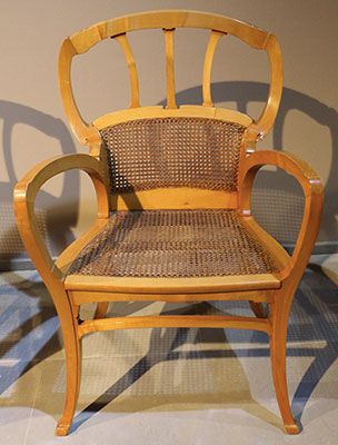
It is not a surprise that Horta applied his skills in interior design. He designed this chair for the Hotel Aubecq in Brussels. I love how the thick, curvy lines of the armrest leads the viewers’ eyes to the back of the chair. This focal point resembles a flower in my opinion, and acts as the cherry on top. It is also lovely to see how the chair sits elegantly on the floor, as if it is “tip-toeing”. This gives it a light and elegant feel to it.
Architecture Galore
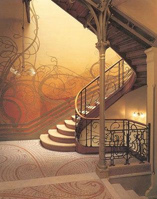
Horta’s goal was often to create an open and airy atmosphere, which I imagine worked well for the hotels he designed for. He often had some kind of focal point and, in the case of his architectural work for hotels, they were the extravagant staircases. These staircases often had an emphasis on structural design and frequently had an abundance of dainty lines resembling nature.

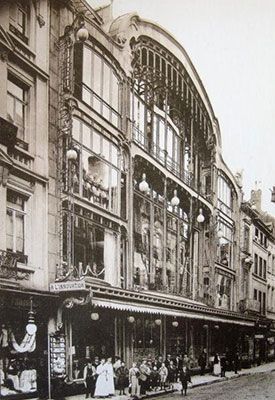
Victor Horta was a huge influence and basically made Art Nouveau a national style. His accomplishments include designing for numerous department stores, where he often used glass panels on the facade (the exterior design). This created a sense of transparency, where people walking outside could peer inside the stores. It is interesting to note this because if you take a walk in downtown Vancouver, nearly all the stores have this kind of transparency with glass facades. This shows the impact his work has on architecture today. It is also interesting to think about why he chose to do this. Was it for aesthetic reasons? Or perhaps because he was using this tool as a means of communication. I imagine the openness of his department store designs strengthened the honest relationships with shoppers and sellers. Horta not only incorporated lovely nature designs and palettes, but designed for clients based on their needs.

All image sources: https://www.theartstory.org/artist/horta-victor/artworks/
Informational sources: https://theculturetrip.com/europe/belgium/articles/victor-horta-belgiums-greatest-art-nouveau-architect/