
I chose Penfield’s poster designs because I love the use of white space. It was also a nice break for my eyes in comparison to the ornate posters of the Art Nouveau period. It is interesting to see such shockingly modern techniques being used in his illustrative and design work.
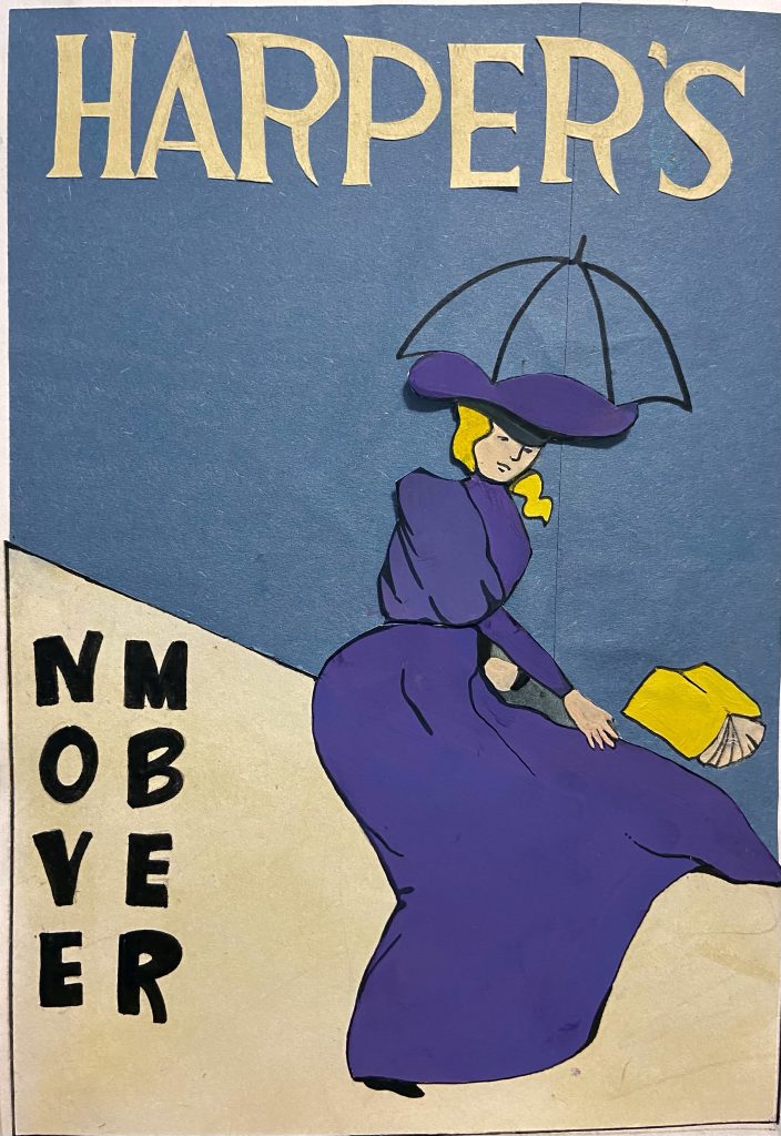
As I was planning my version on this project, I thought about things like contrast, as I needed to use colours and a composition that would be visible from far away. That is why I chose to use the complimentary colours purple and yellow. I also chose to use a muted blue background to help the figure stand out, as that was often Penfield’s focal point.
Since this edition is for November, I also wanted to convey the rainy fall weather. To emphasize this, I included a simple outline of an umbrella and created an oblique horizon line. I wanted to create a sense of direction to represent the chaotic rain and wind in a minimalistic way.
Lastly, I used varied lines to outline the figure, which was yet another prominent characteristic of Penfield’s work. While researching, I also noticed that every poster seemed to have a figure holding a publication of Harper’s. I thought this was a clever way to create cohesiveness as an art director, so I included one as well where the weight of the design seems to fall on.
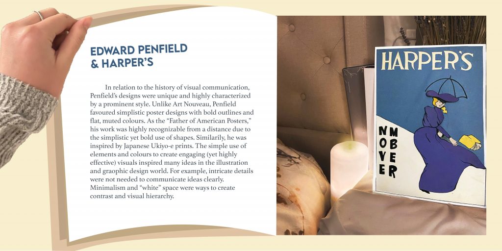
As for the spread, I tried to make it resemble a magazine and played with first person POV to make it more engaging and interactive. The reason I chose to photograph the poster as I did is because of Harper’s target audience. They consisted of wealthier, upper class people who read Harper’s magazine in their leisure time. That is why I chose to create a more luxurious and relaxing kind of background, communicating a time of relaxation and reading before bed. However, looking at it now, the background may seem too modern.
Overall, I believe I deserve a 12/13 because I considered all the characteristics of Penfield’s work and applied it to my own interpretation of Harper’s magazine. I also managed to keep it simple, making sure that every shape had a significance, whether that was to show fashion trends at the time, or to relate to November weather.