Corporate Culture, Cubism, & Change


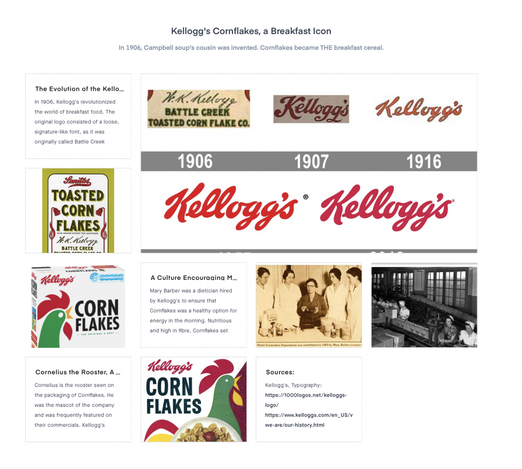
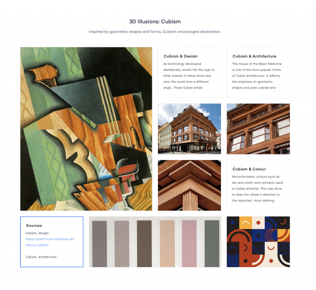
It was quite an experience using Invision. I really like how I was able to change the size of my images and writing to create an interesting composition (I tried to make it look engaging in this way). I also tried to make it visually compelling by featuring dominant photos to catch the viewer’s attention and to make it look less uniform/boring.
Notably, I considered using interesting titles and subtitles, a variety of images, and used colour swatches to add the “mood” to the “board.” Looking back, I think my Cubism moodboard was the most successful layout wise, due to the cohesiveness geometric shapes as the connecting component. The colour swatches also helped to tie the colours together.
Overall, I tried to make connections within my events, but often found it difficult. Therefore, I could have strengthened this. However, I recognize that I did connect my research with that of society and tried to make connections that way. As well, my Kellogg’s cornflakes moodboard is not as visually appealing as it could be. For the reasons listed, I would give myself a 9/10.