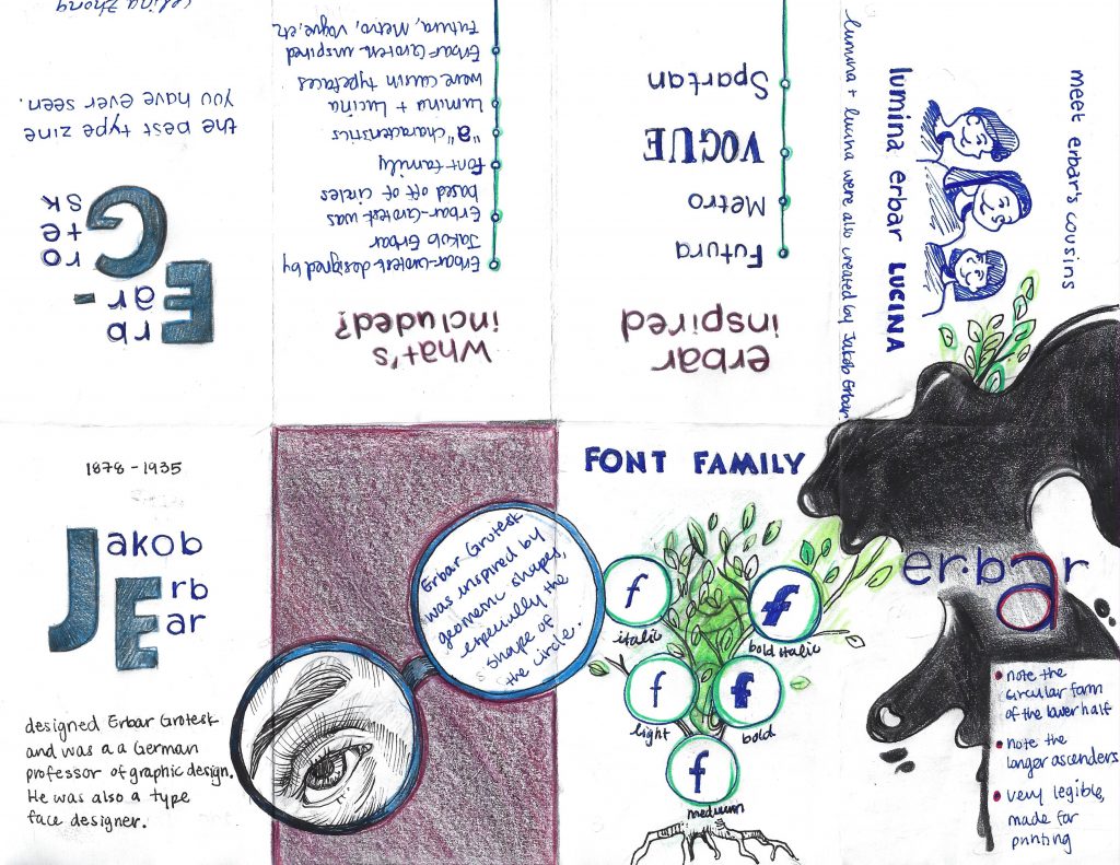
Rationale: While making this zine, I was trying to think of ways to make it engaging, unique, and flow from one idea to another. More specifically, I played with scale in the first page and magnified the initials of Jakob Erbar. I think this helps to create visual hierarchy and draws attention to the main idea of that page. On the second page, I decided to blow up the glasses, having it bleed to the pages beside it. I wanted the viewer to notice this and be inclined to turn the page. I also made it so that there is much white space.
To make it more engaging, I drew a parody of a family tree to show the different weights that exist within the Erbar-Grotesk typeface. I also used the spilling ink to help transition from this page to the one of the three characters. Again, to maintain engagement, I decided to portray similar typefaces created by Erbar as “cousins.” However, I think I should have placed the cousin typefaces consecutively, right next to the font tree. As a result, I could have planned this out more thoughtfully.
As a result of the reasons mentioned above, I would give myself a 9/10.