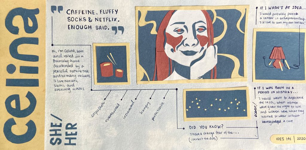
Throughout this assignment, I prioritized the flow of ideas and information. Notably, I have incorporated a subtle constellation concept, which speaks to my love for evening walks and the fact that I am a night owl. This concept and flow is evident as the reader connects the constellations to get from one idea to another. As a result, this project is both interactive and communicates my preference for cleaner, more organized layouts.
As for the overall vibe, the brief states to visually communicate a tone specific to my personality. Therefore, I used three dominant colours (bright yellow, deep blue, pale carmine) to convey my introverted and calm persona, with red used to draw attention and warmth to the images. There is also a certain ratio between text and space. Because I do not have a loud personality, I used space to show my more quieter, introverted side.
Stylistically speaking, there is a prominent use of colour and shape. This is because I am fond of bold colour schemes and love to use solid shapes when illustrating. In my self portrait, I cut pieces of construction paper with an exacto knife to help build contrast between the illustration and the soft watercolour background.
Overall, I would give myself a 9/10. I think this communicates my personality well in an organized, easy to follow, and effective way. I think I also managed to make my focal point (my self portrait) stand out through the usage of size and space. However, I see now that my constellation concept does not shine through as much as it should. Although it is obvious to me, I can see that it may not be obvious to others. I could have brought out the cloudy blue sky in the background more or draw itty bitty stars.