More applicable to modern times than ever, there is an increasing need to address consumer culture and evaluate how these values will influence lifestyles and, inevitably, the future of the natural world (Kimmerer 2013 ; Mourad 2016). There are some varying points of views in regards to the elements of culture that have resulted in this overconsumption. Mourad suggests that irresponsible corporate companies are at fault when it comes to manufacturing unsustainable products in the first place (1). However, Kimmerer differs, suggesting that waste can be reduced if kids are taught “to pick [the single grain] up and kiss it” (189).
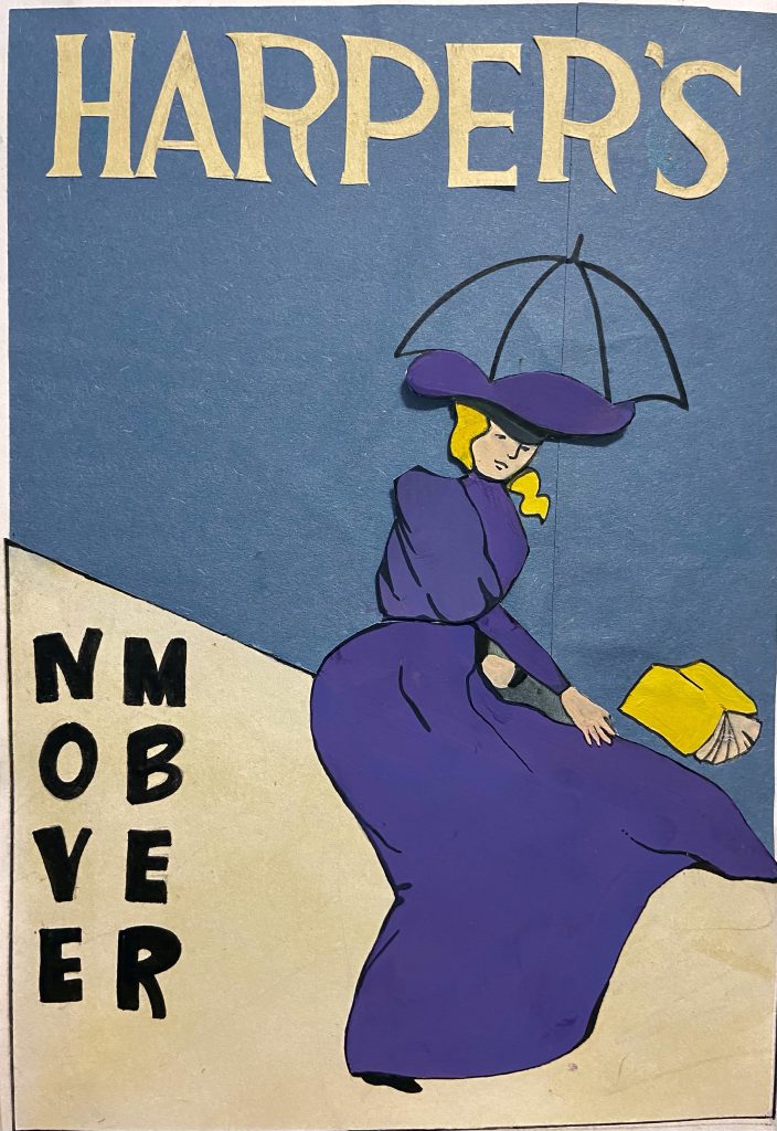
I chose Penfield’s poster designs because I love the use of white space. It was also a nice break for my eyes in comparison to the ornate posters of the Art Nouveau period. It is interesting to see such shockingly modern techniques being used in his illustrative and design work.
As I was planning my version on this project, I thought about things like contrast, as I needed to use colours and a composition that would be visible from far away. That is why I chose to use the complimentary colours purple and yellow. I also chose to use a muted blue background to help the figure stand out, as that was often Penfield’s focal point.
Since this edition is for November, I also wanted to convey the rainy fall weather. To emphasize this, I included a simple outline of an umbrella and created an oblique horizon line. I wanted to create a sense of direction to represent the chaotic rain and wind in a minimalistic way.
Lastly, I used varied lines to outline the figure, which was yet another prominent characteristic of Penfield’s work. While researching, I also noticed that every poster seemed to have a figure holding a publication of Harper’s. I thought this was a clever way to create cohesiveness as an art director, so I included one as well where the weight of the design seems to fall on.
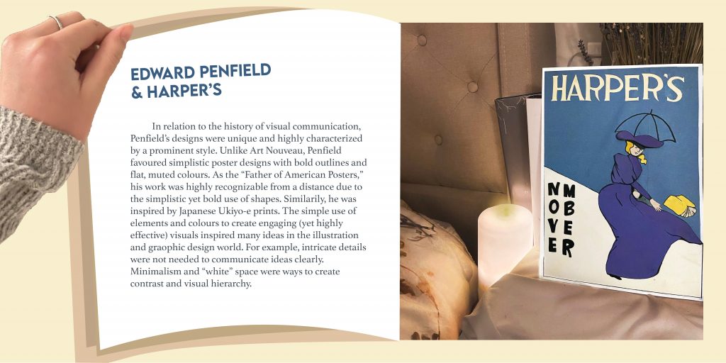
As for the spread, I tried to make it resemble a magazine and played with first person POV to make it more engaging and interactive. The reason I chose to photograph the poster as I did is because of Harper’s target audience. They consisted of wealthier, upper class people who read Harper’s magazine in their leisure time. That is why I chose to create a more luxurious and relaxing kind of background, communicating a time of relaxation and reading before bed. However, looking at it now, the background may seem too modern.
Overall, I believe I deserve a 12/13 because I considered all the characteristics of Penfield’s work and applied it to my own interpretation of Harper’s magazine. I also managed to keep it simple, making sure that every shape had a significance, whether that was to show fashion trends at the time, or to relate to November weather.
The following is my revised summary for “The Importance of Urban Forests,” by Amy Fleming.
Amy Fleming’s “The Importance of Urban Forests: Why Money Really Does Grow on Trees,” suggests the potential environmental, financial, mental, and physical impact trees can have on modern living. Referring to public health expert William Bird, Fleming emphasizes the decreasing value of trees within younger generations (5). Bird compares this idea to an “extinction of experience” (qtd. in Fleming 5). In other words, an increasingly scarce number of people will be able to identify with trees as a means of finding groundedness. Due to the stress-relieving qualities of nature, withdrawal from these experiences will become the new normal, resulting in higher levels of anxiety (4). Subsequently, Bird reports that less people will have the “energy to be active” (qtd. in Fleming 5). His point here is that a collective deficiency in self-care will result in increased health care costs. Additionally, as trees become a trivial idea, fewer people will understand the ways in which trees can reduce heating and air conditioning costs (2), encourage “empathy and altruism” (Fleming 4), and promote active lifestyles through the reduction of stress (4). Collectively, lack of understanding will put a heavier financial strain on modern living. One way or another, Fleming suggests that “children will ultimately understand and value nature less” (Fleming 5). Therefore, the accumulative lack of understanding for trees will result in unhealthy lifestyles, air pollution, and financial tension for generations to come.
Hi, there! My name is Celina Zhong and I am an artsy, creative student at the IDEA School of Design. I have always had a lifelong obsession with drawing. After numerous years of studio art classes at Burnaby North Secondary, I decided to partake in the Graphic & Media Arts Ace-it program at Byrne Creek Community School. It was during this preeminent time in my life that I learned to cultivate my spirit for art and design in both traditional and digital form. Since this epiphany, I have acquired a fervor for typefaces, colour palettes, communication design, and quirky illustrations. I am currently composing this paragraph in hopes of becoming an art director at a creative advertising agency. Aside from my creative work, I spend the majority of my free time arduously working two jobs, fulfilling my perfectionistic obsession, listening to indie music, walking to undetermined destinations, and eating vegetarian sushi rolls at the park.
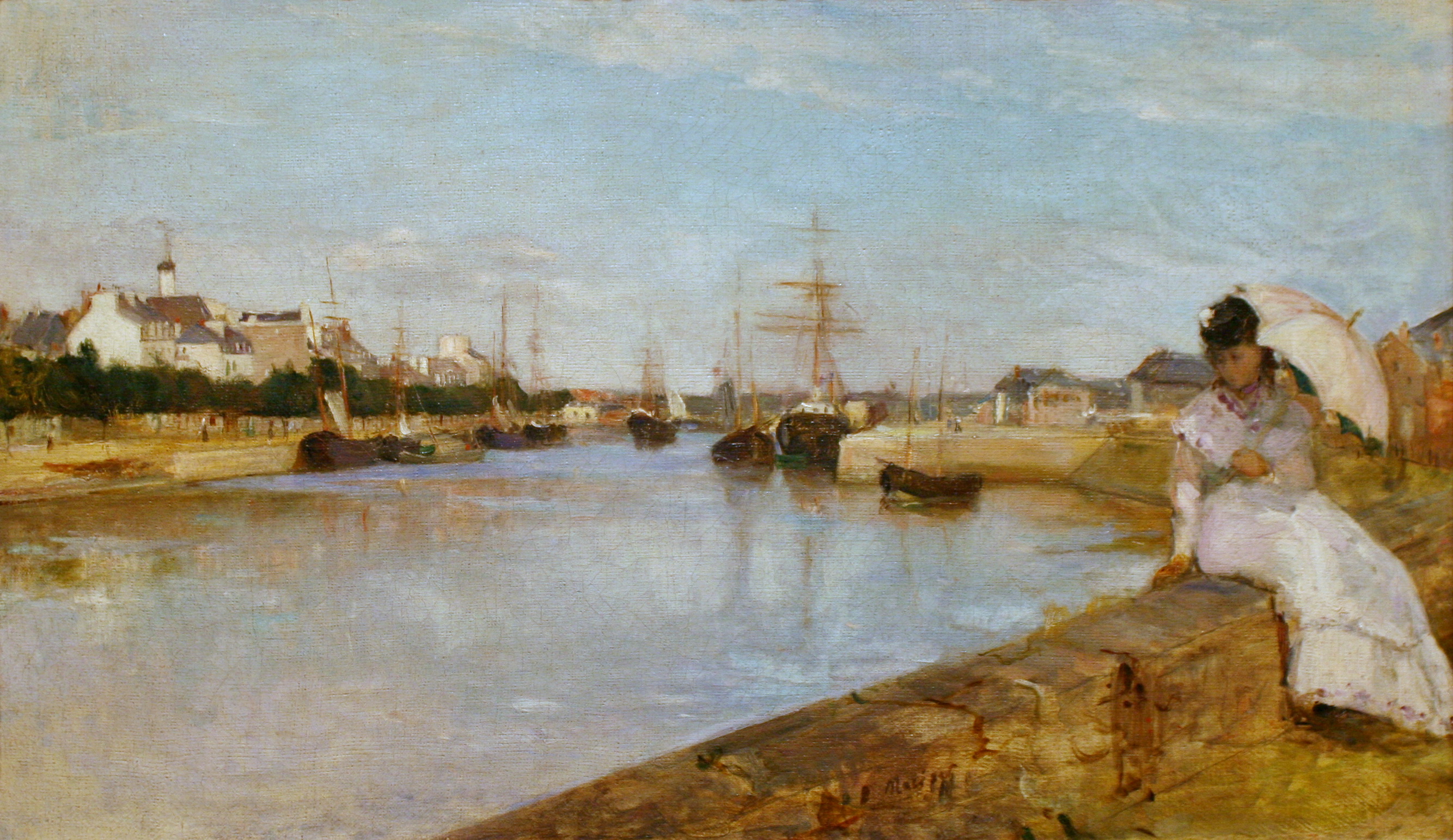
Child In The Rose Garden, Morisot, 1881 https://commons.wikimedia.org/wiki/File:Morisot_-_child-in-the-rose-garden.jpg
Berthe Morisot was an impressionist painter who was also a pupil of Edouard Manet. Interestingly enough, her grandfather was the one and only Fragonard, an artist of the Rococo period. As one can tell, Morisot has had many artistic influences throughout her life and within her family.
Morisot was not always an impressionistic painter. She started off painting classically. After studying with Manet, she notably began using large amounts of paint in varying directions, creating an element of transparency. Details were overlooked if they proved to be insignificant. She was also interesting in the sense that she chose to paint unorthodox subjects at the time. She focused her work on everyday life, gardens, family, and friends. These key characteristics in technique are what separates her work from others.
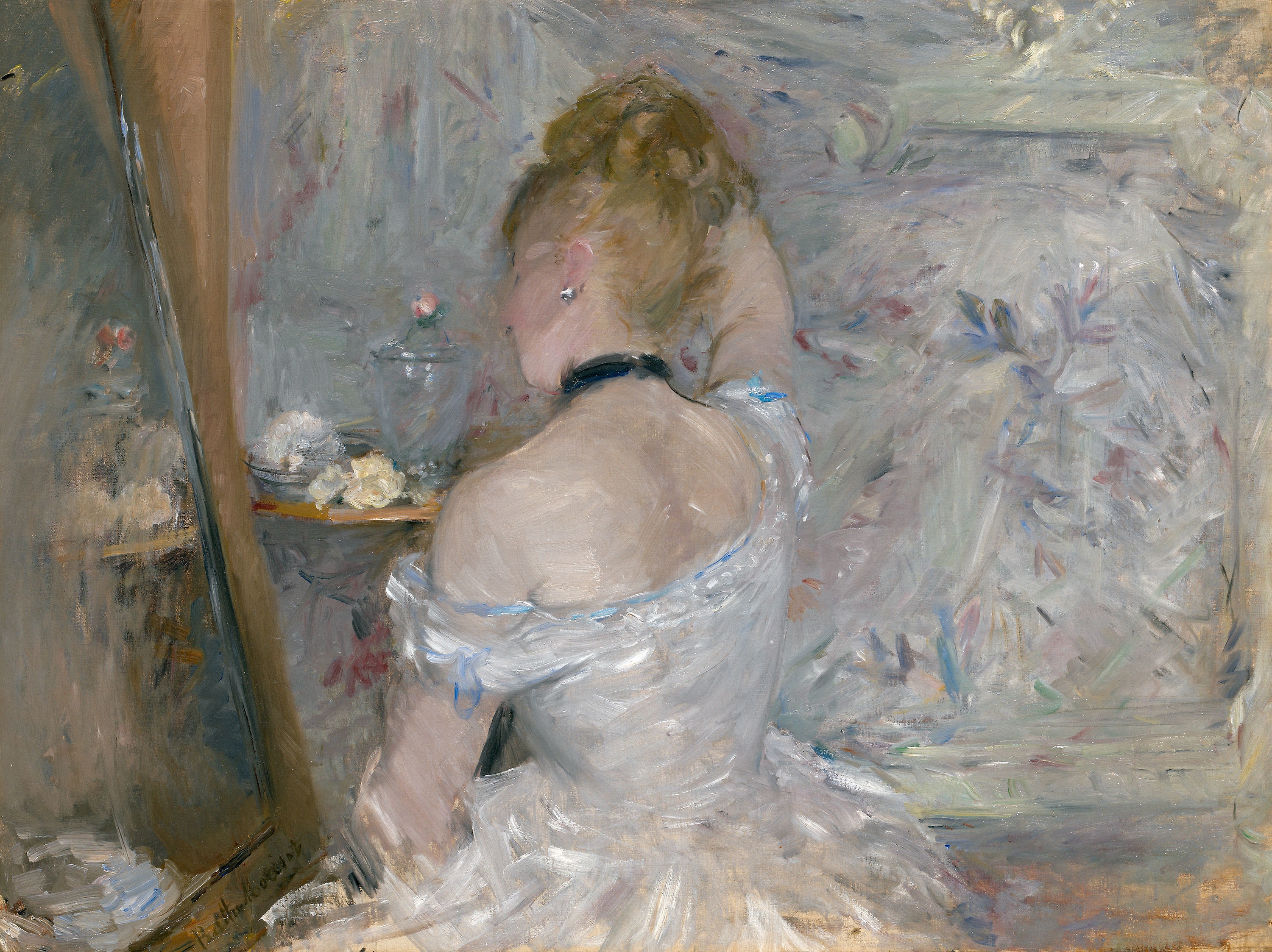
Upon researching, I have found that Woman at Her Toilette is one of personal favourites. This is due to the masterful use of brushstrokes to mimic the texture of the dress. It creates a light and feathery effect that harmoniously compliments the muted pastel colour scheme. I love the blend of lavender, soft blues, gentle pinks, and greys. The fleshy colour of the face is also done really well. Also, the background definitely portrays a sense of movement with the brushstrokes, which is a common characteristic of Morisot’s world.
Ah, France and Belgium–where Art Nouveau all began. It was a time where natural colour palettes and organic shapes were dominant trends in both architecture and design. Victor Horta was a Belgium architect who consistently exemplified a beautiful portrayal of nature both architecturally and in his interior decorative design work.
An Interior Design Expert
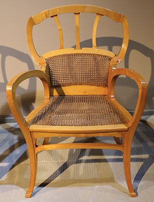
Hotel Aubecq, Brussels is where this beautiful chair is located. I love the natural texture and harmonious flow of lines, creating a war and inviting feel.
It is not a surprise that Horta applied his skills in interior design. He designed this chair for the Hotel Aubecq in Brussels. I love how the thick, curvy lines of the armrest leads the viewers’ eyes to the back of the chair. This focal point resembles a flower in my opinion, and acts as the cherry on top. It is also lovely to see how the chair sits elegantly on the floor, as if it is “tip-toeing”. This gives it a light and elegant feel to it.
Architecture Galore
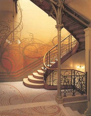
Horta’s goal was often to create an open and airy atmosphere, which I imagine worked well for the hotels he designed for. He often had some kind of focal point and, in the case of his architectural work for hotels, they were the extravagant staircases. These staircases often had an emphasis on structural design and frequently had an abundance of dainty lines resembling nature.
The Tassel House, Brussels features a beautiful staircase that virtually screams gardens and vines. I personally love how the stairs resemble ripples of water and convey a dynamic sense of rhythm as it flows down. The vine-like railings give it a light feel too.
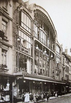
Victor Horta was a huge influence and basically made Art Nouveau a national style. His accomplishments include designing for numerous department stores, where he often used glass panels on the facade (the exterior design). This created a sense of transparency, where people walking outside could peer inside the stores. It is interesting to note this because if you take a walk in downtown Vancouver, nearly all the stores have this kind of transparency with glass facades. This shows the impact his work has on architecture today. It is also interesting to think about why he chose to do this. Was it for aesthetic reasons? Or perhaps because he was using this tool as a means of communication. I imagine the openness of his department store designs strengthened the honest relationships with shoppers and sellers. Horta not only incorporated lovely nature designs and palettes, but designed for clients based on their needs.
Department store design, Brussels. Victor Horta’s designs were intricate, highly detailed and had a luxurious feeling to it.
All image sources: https://www.theartstory.org/artist/horta-victor/artworks/
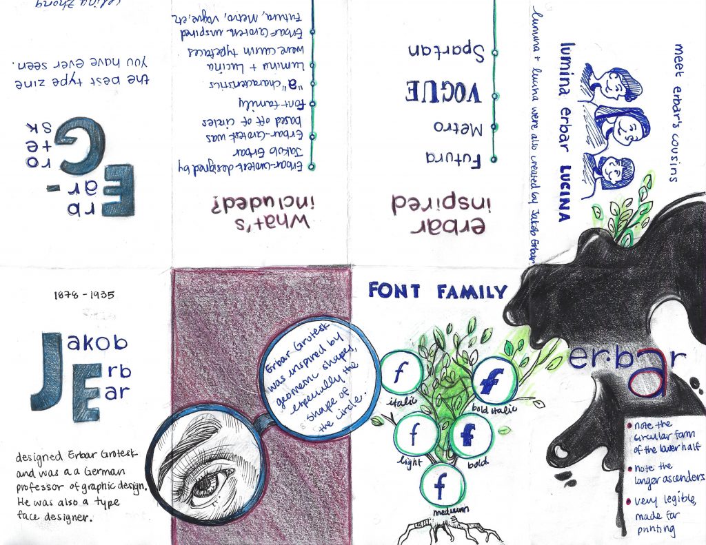
Rationale: While making this zine, I was trying to think of ways to make it engaging, unique, and flow from one idea to another. More specifically, I played with scale in the first page and magnified the initials of Jakob Erbar. I think this helps to create visual hierarchy and draws attention to the main idea of that page. On the second page, I decided to blow up the glasses, having it bleed to the pages beside it. I wanted the viewer to notice this and be inclined to turn the page. I also made it so that there is much white space.
To make it more engaging, I drew a parody of a family tree to show the different weights that exist within the Erbar-Grotesk typeface. I also used the spilling ink to help transition from this page to the one of the three characters. Again, to maintain engagement, I decided to portray similar typefaces created by Erbar as “cousins.” However, I think I should have placed the cousin typefaces consecutively, right next to the font tree. As a result, I could have planned this out more thoughtfully.
As a result of the reasons mentioned above, I would give myself a 9/10.
Corpse of Christ. Image source: http://www.annibalecarracci.com/corpse-of-christ/
Baroque style painter Annibale Carracci often painted with great reference to nature, unlike those of the mannerist period, who often elongated human figures, experimented with scale, and emphasized artificiality. Carracci, alongside Ludovico and Agostino Carracci, was a sixteenth century artist with a fervour for creating atmosphere and incorporating strong usage of light.
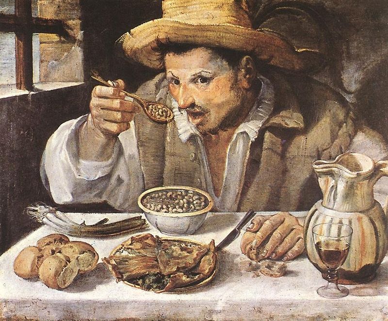
Most notably, Annibale Carracci brought the concept of caricature to his work, as demonstrated by the painting shown below. As you can see, there is an emphasized distortion in the expression of this person’s face, as his eyebrows are significantly raised, his mouth is agape, and his eyes seem to have just noticed the viewer of the painting. This kind of makes me feel like I am interrupting his meal. As well, I can see much natural light coming in, making his expression pop out against the dark background. I like this piece because it captures everyday life in its true, unidealized form. Compositionally, I like how the window in the back creates a bit of dimension and perspective.
The Beaneater. Image source: https://www.artble.com/artists/annibale_carracci/paintings/the_bean_eater
In addition to caricature and light & dark, Carracci brought a new form of landscape painting to life. He used broken brush strokes to capture light and dark, as well as movement, which in turn created a strong sense of atmosphere and space. An example of his landscape work is Landscape With The Flight to Egypt, shown below.
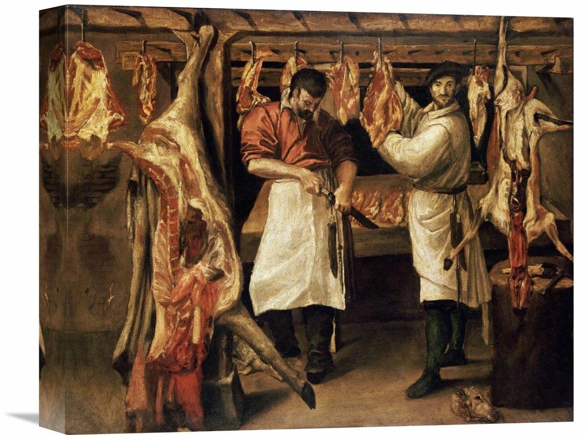
Landscape With The Flight into Egypt. Image source: https://en.wikipedia.org/wiki/Landscape_with_the_Flight_into_Egypt_(Carracci)Butcher’s Shop. Image source: https://www.wayfair.com/decor-pillows/pdx/global-gallery-the-butchers-shop-by-annibale-carracci-painting-print-on-wrapped-canvas-vhy6703.htmlTwo Children Teasing a Cat. Image source: https://www.wga.hu/html_m/c/carracci/annibale/1/children.html
In 1867, Harper’s Bazaar was first issued, making it America’s first fashion magazine for those interested in high fashion. The magazine is well associated with a classic, simplistic, and elegant typeface called Didot. This typeface, designed by Firmin Didot, is notable for its highly stressed vertical lines, thin horizontal lines, and flat serifs. Due to this, it is often used as a display font and not for the body text, as the small sizing would drastically alter legibility.
At first glance, I look at this typeface and immediately think of designer brands. I am reminded of high-end makeup brands at Sephora and fashion lines like Zara. It is a very sophisticated font with exaggerated serifs, very high contrasted thick and thin lines, and a prominent narrow structure. All things considered, I get a regal sense of elegance from these letters.
Didot & The Fashion Industry: A Trendsetter
Didot represented their editorial vision
It is a strong display font that stands out, yet works well with the cover
At the time of the rebrand, it was uncommon for the cover to consist only of a title and image (usually had the table of contents on the cover)
The simplicity really evokes an urban, modern, and sophisticated feel
The edition of Bazaar above really exemplifies the visual hierarchy created by Didot. Since it is very thick in areas and stands well on its own, it catches the eyes of audiences, especially in a busy and highly competitive industry.
In my opinion, although this rebrand occurred in the nineteenth century, the cover is still very reminiscent of current fashion magazines, like Vogue. I believe this shows exactly how impactful Didot was. I think that because of this widely-recognized rebrand, other fashion magazines chose to follow the same guidelines design-wise.
Didot helped shape the culture of fashion magazines. For example, in the image above, the magazine brings a sense of not only fashion, but lifestyle with “Lazybones Diet” and “Easy Living.” This was done to help sustain the interest of their readers.
Soon enough, Bazaar magazine would start promoting ways to upcycle clothing, incorporate elements of social change, and touch on current events. I think this makes Bazaar a more powerful publication that grows with society and reflects the cultural values of its time. Honestly, I would love to see these magazines in a museum exhibition because I can sense the historical, cultural shifts both in the aesthetics of the magazine as well as women’s lifestyles overtime.
It was quite an experience using Invision. I really like how I was able to change the size of my images and writing to create an interesting composition (I tried to make it look engaging in this way). I also tried to make it visually compelling by featuring dominant photos to catch the viewer’s attention and to make it look less uniform/boring.
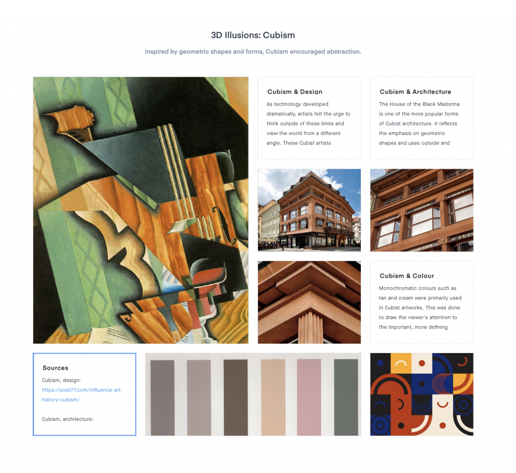
Notably, I considered using interesting titles and subtitles, a variety of images, and used colour swatches to add the “mood” to the “board.” Looking back, I think my Cubism moodboard was the most successful layout wise, due to the cohesiveness geometric shapes as the connecting component. The colour swatches also helped to tie the colours together.
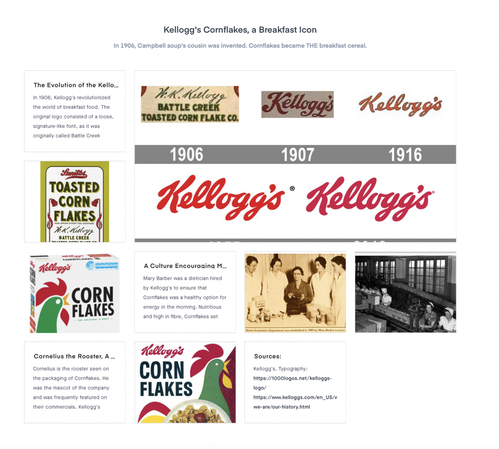
Overall, I tried to make connections within my events, but often found it difficult. Therefore, I could have strengthened this. However, I recognize that I did connect my research with that of society and tried to make connections that way. As well, my Kellogg’s cornflakes moodboard is not as visually appealing as it could be. For the reasons listed, I would give myself a 9/10.