IDES – 244: Reconciliation Project – Week 3

What are we communicating?

I will be working with Cale Cooper on the reconciliation project and we hope to use a podcast to address the Truth and Reconciliation of Canada’s 84th call to action:

84. We call upon the federal government to restore and increase funding to the CBC/Radio-Canada, to enable Canada’s national public broadcaster to support reconciliation, and be properly reflective of the diverse cultures, languages, and perspectives of Aboriginal peoples, including, but not limited to:

i. Increasing Aboriginal programming, including Aboriginal-language speakers.

ii. Increasing equitable access for Aboriginal peoples to jobs, leadership positions, and professional development opportunities within the organization.

iii. Continuing to provide dedicated news coverage and online public information resources on issues of concern to Aboriginal peoples and all Canadians, including the history and legacy of residential schools and the reconciliation process.

Truth and Reconciliation Commission of Canada: Calls to Action, 2012

The call to action refers to an increase in funding needed for Aboriginal broadcasting.

In order to address this call to action, we are going to be creating a podcast that would address numerous issues that First Nations people across Canada face. We plan to include information on these topics:

  • Residential School survivors
  • Water advisories
  • Harsh price increases for products being sold further up North for products such as baby formula and bottled water

We chose this call to action because podcast/radio is a very direct way for Indigenous voices to be heard and the medium is flexible and allows for many different issues to be covered.

Who are we communicating to?

We have decided that we will communicate to young adults in Canada who have learned a bit about Indigenous issues such as residential schools in their education but want to learn more.

We chose the podcast medium because many young adults listen to podcasts when they are working or sitting in their cars. Podcasts are available on platforms that are used most by younger people such as Spotify and Audible.

Sources


Residential Schools

  1. https://www.thecanadianencyclopedia.ca/en/article/residential-schools
  2. https://indigenousfoundations.arts.ubc.ca/the_residential_school_system/


Northern Food Prices:

  1. https://www.ctvnews.ca/canada/20-hamburgers-and-2-bananas-the-cost-of-food-insecurity-in-canada-s-north-1.5154743
  2. https://www.ctvnews.ca/climate-and-environment/climate-change-harming-indigenous-access-to-healthy-food-and-the-worst-is-yet-to-come-report-1.5154155

Water Advisories:

  1. ** https://www.fnha.ca/what-we-do/environmental-health/drinking-water-advisories
  2. https://globalnews.ca/news/7497223/indigenous-services-minister-says-trudeau-government-wont-end-boil-water-advisories-by-march-2021/

UX Storyboard: Colin Jones – Group A

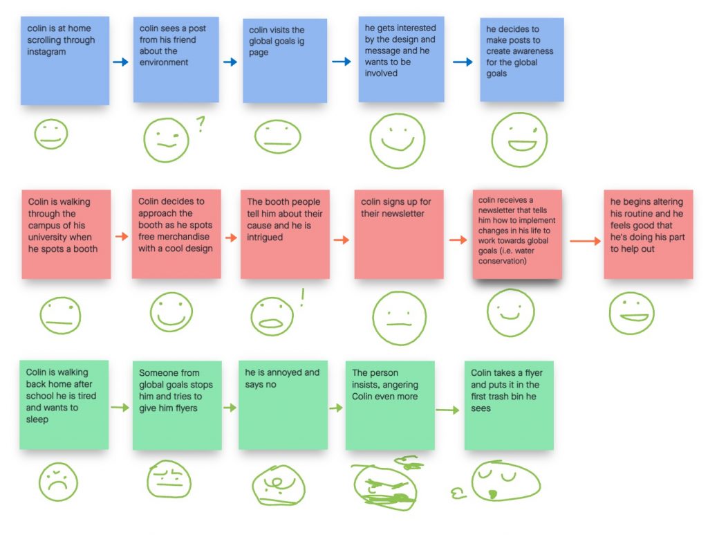
Three user storyboards using the text and arrow method
Three user storyboards adding the emoticons

In my group, we worked together to brainstorm scenarios that our user, Colin, would be likely to encounter in his regular life. We understood that strong design, activism, and social media would cater to his interests.

Launching off those points, we created three scenarios that had both positive and negative outcomes for the global goals which we wanted to get Colin involved in.

Each storyboard took the user profile into careful consideration but we felt that the second storyboard was the strongest of the bunch. The first storyboard, while realistic, felt stagnant and less compelling. The third storyboard is very straightforward and relatable, but we decided we wanted to focus on a positive outcome rather than a negative one. The second storyboard had considered his background as a university design student along with a very clear path towards his use of the global goals.

Final Storyboard

DSGN142: Canadian Design Today – Marian Bantjes

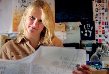
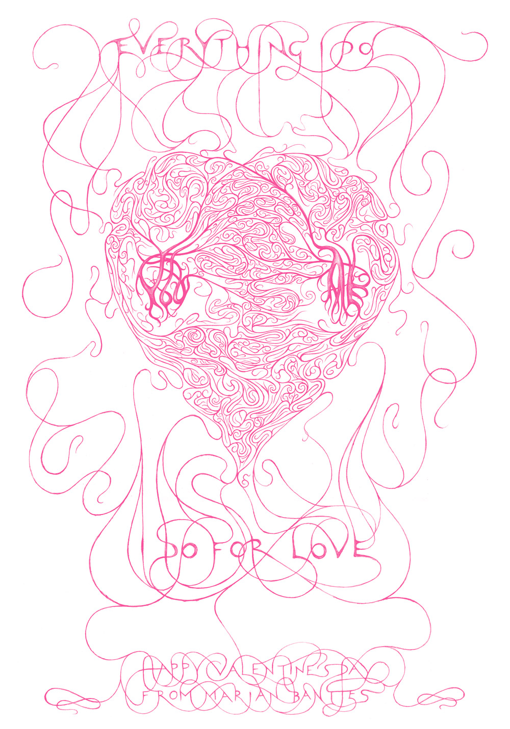
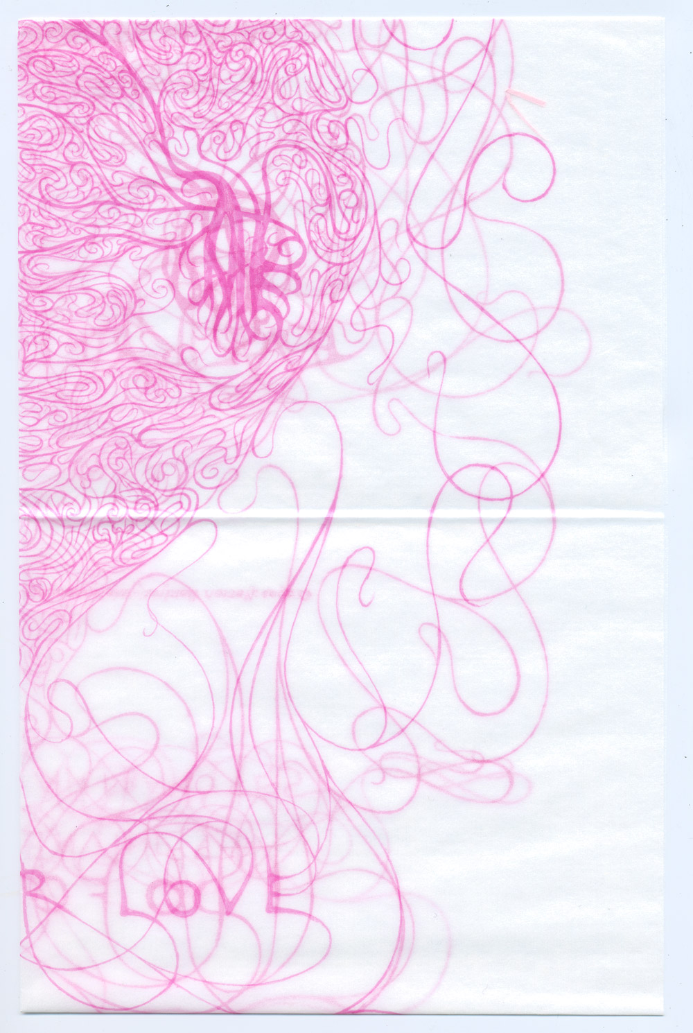
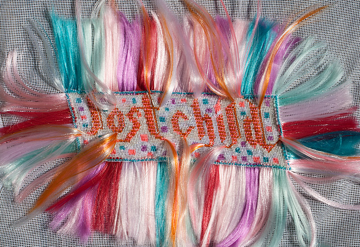
Marian Bantjes is a Canadian typographer and designer who is best known for her intricate typography work including her annual Valentine’s day cards which are featured in her Ted Talk. She does beautiful work and uses a variety of interesting mediums, ranging from salt to household objects, to create unique patterns that frame her typography.

I especially like her Valentine from 2005, which is a heart design that almost looks like arteries. I find that the type is not always legible, but I think that the overall design excuses it. I admire her ability to create unique patterns.

I find it interesting that despite her large portfolio of work in all kinds of mediums, each piece still has a certain design sensibility that makes it a Marian Bantjes piece. Each piece has a sense of exploration, fun, and wonder that is especially welcome during this time.

Sources:

DSGN 142: Supergraphics Innovator – Paula Scher

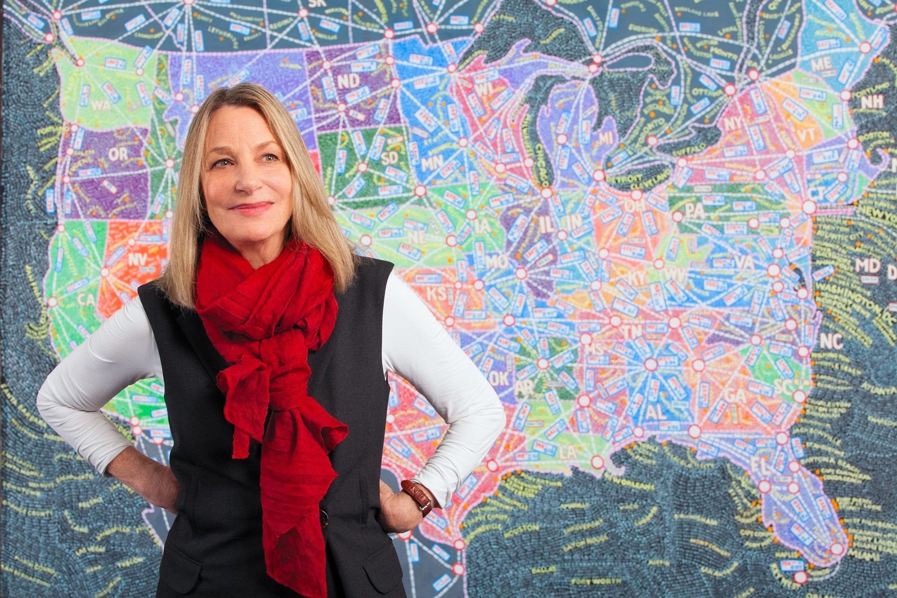
Paula Scher is an American graphic designer, painter, and educator who works as the principal of Pentagram. She is an accomplished designer and has worked at Random House Publishing, CBS Records, and Koppel & Scher.

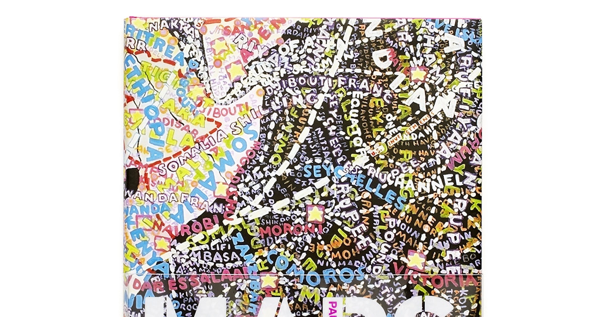
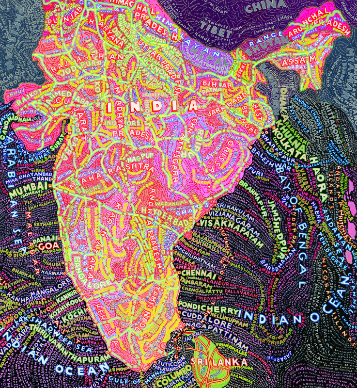
She’s done a lot of innovative work during her career and I think her work is a good resource to look to learn from and be inspired by. I think her maps are particularly interesting because they are so visually dynamic and unique. I think maps are often really boring and uninteresting to look at since they need so much information and have to be easily legible but her maps have a much more artistic take that makes the same information infinitely more engaging.

Despite the fact that her maps are so busy and that there is writing in every space— even in the spaces that appear to be all black— she uses colour and size to draw attention to the landmasses themselves and manages to create a balance amongst all the chaos.

Sources:

DSGN 142: Psychedelic Design Hero – Victor Moscoso

Victor Moscoso

Victor Moscoso is a prominent psychedelic artist who is beste known for rock music art and underground comics- such as ZAP Comix.

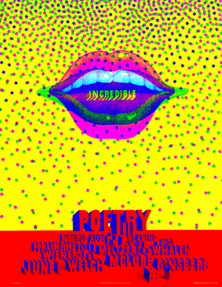
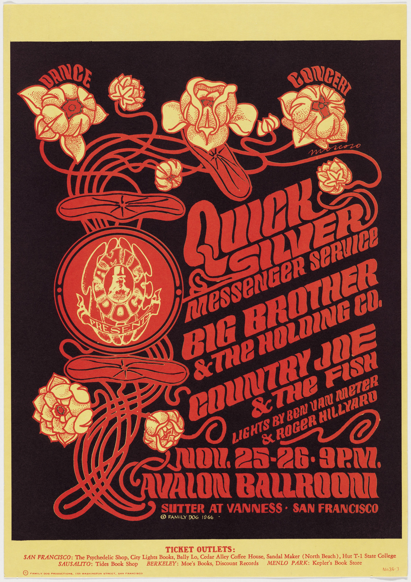
He has a very fun and humorous art style and I think his comics are really interesting in the way he transitions between different comic panels. Some of my favourite pieces of his are the various advertisements and posters he created, in particular this one about a poetry reading night. Looking at this poster inspired my design for the 1960’s album cover assignment and I layered the lips in blue and pink in the same manner as Victor Moscoso.

Moscoso has an interesting range of work and compared to other designers during the time his font choices and typography is much easier to read which I think helps his work stay more relevant.

ZAP comix cover art by Victor Moscoso
comic strip by Victor Moscoso
poetry night poster by Victor Moscoso
‘The San Francisco Poster’ by VIctor Moscoso
poster by Victor Moscoso

Sources: