
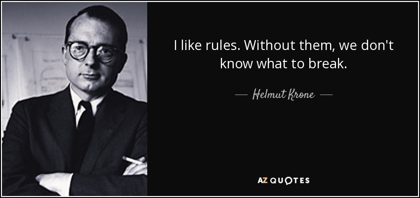
Helmut Krone (1925-1996):
Helmut Krone was an American advertising art director who was considered a pioneer of modern advertising. Born in Yorkville, Manhattan, he started his design career at 29 at Doyle Dane Bernbach where he would continue to work (except for a short time in the early ’70s) for the next 30 years and practically his entire career.
Before the term “branding” had even come to exist, Krone already understood how graphic design could define an institution’s personality. He was always after a product’s individual personality and this “total way of speaking”. He believed that the ad that reflects the company is the company itself.
Krone worked closely with DDB’s copywriters to create advertising campaigns that caught the public’s eye with innovative graphics and unexpected sales pitch. His best works had always exemplified honesty and his top goal was always to create an advertising look that was substantially different than what was being done by his peers. For he loved to do what everyone else was not doing.
For example, his “We Try Harder” ad campaign for Avis used the formula of “little picture, big body copy”. Since no one else was using this, Krone did and liked it because it was not understood automatically. It had to take time to be read.

Sometime in the early ’70s, he tried to start his own agency but it did not last long. Krone was addicted to “zigging when everyone else was zagging” so when he started his own agency, he did not have this. He enjoyed the friction of straining against conventional advertising and against the conventions of an established workplace. Thus, after three short years, he returned to DDB and continued working there for the rest of his career.
In addition to his urge to be different from his peers, Helmut Krone also hated logos with a passion. Even more amazingly, he was able to create corporate images that last even to this day without ever designing a single logo or often without even using one. After all, who else could have created such powerful ad campaigns that Volkswagen is able to “own” the typeface Futura Bold?

In Krone’s own words, “[he] spent [his] whole life fighting logos” as he believed that all logos basically said was “I am an ad. Turn the page.” He often succeeded in vanquishing logos from his designs, or better yet, replacing them with something better. For example, he often tries to make the page he’s designing so clean and effective that one can not stick a logo on it.
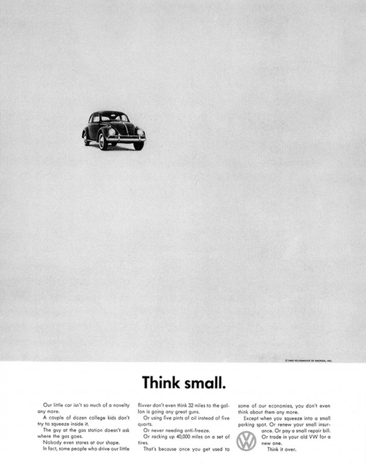
Both his desire to create something distinct and hatred for logos that have influenced his successful advertising campaigns are not the only contributions he made towards the advertising and graphic design industry. He also introduced the use of a full stop or period after a headline. This was first present in his “Think small.” ad for volkswagen. Krone used the period as it broke the pace and invited inspection; he wanted the statements he made to be examined.
Helmut Krone’s outstanding career as an art director has won him numerous awards and inducted him in two halls of fame: the One Club’s Hall of Fame and the Art Directors Hall of Fame. His designs, especially the ad campaigns for Volkswagen and Avis, have changed the culture of the advertising industry and it’s easy to see why.
_
References:
- “Helmut Krone.” ADC • Global Awards & Club, adcglobal.org/hall-of-fame/helmut-krone/.
- “Helmut Krone, Period.” Design Observer, designobserver.com/feature/helmut-krone-period/4657.
- Reed Abelson. “Helmut Krone, 70, a Creator of Ad Campaigns.” New York Times, 13 April 1996.