
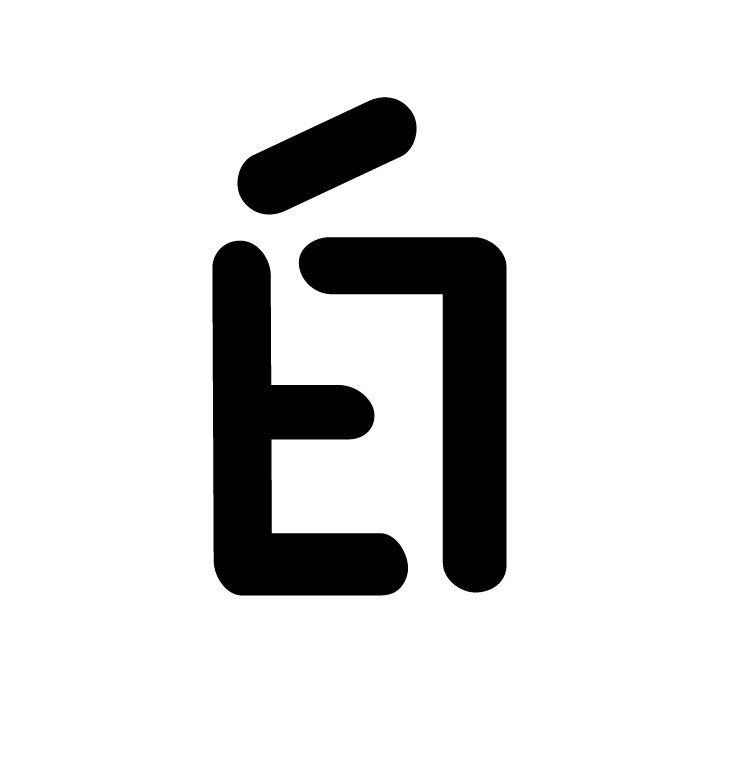
The brand I chose shows a professional and functional part of me, both qualities that I feel exemplify not only the style of my design but also how I approach problem-solving. Using angular lines while also applying a soft rounded look to the edges, it is a logo that well represents my simple yet functional approach to design. In addition, it has a very geometric shape that is reminiscent of my style that I am known for in my illustrations and designs. I am pretty satisfied by how cohesive it looks together as well as the cleverness that is hidden in the icon that not everyone will see at first glance. It is simple and mysterious and an icon I think well represents my values as a designer.
Overall, I would give myself a 8.5/10 for the simple and sophisticated look as well as the flexibility of the logo as it’s able to be used in many layouts and mediums. It’s simple and it works and I feel those ideals are what truly my designs are all about.