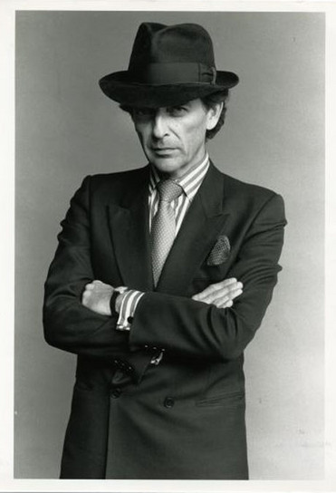
“See life as a 10-year-old. Dress like an 18-year-old. Think like a 25-year-old” – Theo Dimson

Theo Dimson:

Theo Dimson was a graphic designer known for his art deco style movie and theatre posters.

He began his career with a 3 year apprenticeship with Art Associates Limited in Toronto. After freelancing for 7 years, he rejoined AA as a vice-president of creative design. In 1965, he became president and director of a new partnership called Reeson Dimson and Smith Ltd. Later, it was named Dimson and Smith Ltd and it kept this name until Dimson created Theo Dimson Designs Inc. in 1985 where he was president and creative director.

Continue reading ““See life as a 10-year-old. Dress like an 18-year-old. Think like a 25-year-old” – Theo Dimson”

Present Technology and Tradition /// New Horizons: Noma Bar (b. 1973)

Noma Bar:

Noma Bar is a graphic designer, illustrator, and artist who is renowned for his negative space artworks that have adorned the covers of over 100 magazines. His graphic works are celebrated for their impact and simplicity and they translate a sensitive subject into thought-provoking art that exposes social and political situations with a wry sense of juxtaposition.

Bar does this by cleverly using negative space. With a limited palette, he subtlety and precisely manipulates shapes and forms where familiar symbols and pictograms evolve to form new meaning. He uses this technique best when dealing with social and political issues that are illustrated with a hidden twist of humour.

Continue reading “Present Technology and Tradition /// New Horizons: Noma Bar (b. 1973)”

New Forms: Chris Ware (b. 1956)

Chris Ware:

Chris Ware is a cartoonist known for his New Yorker magazines covers and is hailed as a master of the comic art form. He has contributed cartoons and many covers to the New Yorker since 1999 and his complex graphic novels tell stores that reflect on the role that memory plays in constructing identity.

Ware’s style of comic art is like no other’s. His work is usually devoid of the hatching or rendering that is found in most comics and his drawings are mostly outlines filled with colour. Linear perspective is often flattened or replaced with orthographic projection and he sidesteps atmospheric perspective in favour of utilizing colour for design and mood. His often muted colours are carefully chosen in relationship to not only to other colours on the panel, but also to the entire page as a work of design. In addition, Ware plays with the conventions of comic art page design and storytelling.

Continue reading “New Forms: Chris Ware (b. 1956)”

New Voices: Francis Livingston (b. ?)

Francis Livingston:

Francis Livingston is an American painter and is considered to be in the top ranks of American illustrators. In the beginning of his career, he painted primarily in a monochromatic style until he studied the work of the Bay Area Figurative Movement. This led him to experimenting with colour and developing a fondness for the California and French Impressionists.

Livingston’s paintings and works are famous and unique. He painted the Santa Cruz boardwalk for 8 years and did numerous portrayals of scenes from New York City and Coney Island. In these, he focussed mainly on the dramatic architecture and colour. However, his paintings of western landscapes and pueblo architecture are what makes him one of the West’s premier living artists: he is able to capture colours and light effects that are unique to west.

Continue reading “New Voices: Francis Livingston (b. ?)”

Social Awakenings: George Hardie (b. 1944)

George Hardie:

George Hardie was an English graphic designer, educator, and illustrator. To him, illustration is a problem-solving process: one that involves looking, collecting, and drawing. He also sees illustration and graphic design as just two different points on a single graphic continuum- an idea that has influenced his style of art.

His unique style consists of clean lines and exacting geometry along with a conceptual-oriented mode of thought. He uses highly-skilled draftsmanship and intricate compositions to convey richly imagined visions of their physical or psychological conditions. In essence, he draws visual ideas that force viewers to “wear a new pair of spectacles” and to open up to a new visual experience of even the most familiar terrain. In addition, his neutral vision style allows viewers to focus on an idea or object under examination rather than an artist’s hand.

Continue reading “Social Awakenings: George Hardie (b. 1944)”

Departures and Rumblings: Wes Wilson (b. 1927)

Wes Wilson:

Wes Wilson is considered the father of 1960s rock concert poster and the first psychedelic poster artist. He translated signs and sounds of counterculture society into psychedelic iconography, leading his posters to be wildly experimental.

One of the prominent features of his style was his freehand lettering. While his typography was influenced by the Viennese Secessionist lettering of Alfred Roller, he expanded outlines and inset shapes, largely altered the style to fit his own ambitions. His other major breakthrough was the use of colour. Inspired by light shows of concerts, he mixed colours with wild abandon, resulting in visuals that perfectly captured the revolutionary essence of music that his art promoted. In addition, he also played with the foregrounds and backgrounds, creating design patterns that became increasingly exaggerated with each new creation. This combination of nearly cryptic letters that filled every available space, lines that melted into lines, and colours that clashed is how the psychedelic poster was born.

Continue reading “Departures and Rumblings: Wes Wilson (b. 1927)”

Postwar Prosperities: André Francois (1915-2005)

André Francois:

André Francois was a French graphic artist, cartoonist, and illustrator whose career formed a bridge from the beginnings of modern graphic design to the present. He had contributed many roughly drawn, darkly satiric cartoons and covers for many well-known magazines, including 57 covers for The New Yorker. Since the 1940s, his exquisitely witty and elegantly executed illustrations have earned him an enduring international career- in the US, Europe, and Japan- and he has been a major influence on many of the best-known illustrators and designers of the past 5 decades in these places.

Throughout Francois’ career, he devised commercial advertising and poster graphics, designed ballet and theatre costumes and sets, and wrote and illustrated children’s books, including his own. In addition, he also designed countless book covers for Penguin Books, playing cards for the art director of Simpson Piccadilly and graphic works for the 1937 World Exhibition in Paris. He also used to have numerous one-man shows, but since 1960, his time has mainly been devoted to painting, engraving, collage, and sculpture.

Continue reading “Postwar Prosperities: André Francois (1915-2005)”

The Golden Age Part 2: Bill Mauldin (1921-2003)

Bill Mauldin

Bill Mauldin was an American cartoonist who is one of the best known and best-loved newspaper cartoonists in America. He is remembered for his depiction of life in the trenches during World War 2- which initially gained him fame- and then later became known for his editorial cartoons that dealt with a wide range of social and political issues. During his time in the military where he was assigned in Europe, he produced numerous cartoons that essentially captured the experiences and emotions of an entire generation of soldiers, usually through his characters Willie and Joe, two infantrymen. He chose to draw pictures for and about soldiers because he knew what it was like and wanted to make something out of the humorous situations that came up even when the soldiers thought that life could not get any more miserable. In addition to his cartoons about fighting in the war, he also created cartoons that boldly displayed social and political commentary. For example, some of the cartoons attacked the issues of racism, the Ku Klux Klan (KKK), and McCartyism.

Continue reading “The Golden Age Part 2: Bill Mauldin (1921-2003)”

The Golden Age Part 1: Hergé (1907-1938)

Hergé:

Hergé (Georges Prosper Remi) was a Belgian cartoonist who was best known as the creator of the comic series, Adventures of Tintin. One of the most influential comic creators in history, he single handily launched the Belgian comics industry with Adventures of Tintin. He was a master at crafting suspenseful page-turners where humour was never far away and had the latest political, cultural, and scientific inventions of the time mirrored in his work.

Through his comics, he developed his own graphic style, “Ligne Claire” (Clear Line). This style had thin, bright, and clean lines and avoided the use of hatches, shadow effects, or excessive details. This gave his work the clarity of readability. Decades later, when he started adding colours, they were applied in his open outlined areas and were flat and plain. Hergé insisted that his drawings’ line quality formed the true structure of his work, which is why he used a light pastel palette to help his lines stand out and allow more complex images to be easily read.

Continue reading “The Golden Age Part 1: Hergé (1907-1938)”

Illustration’s Early Masters: Coles Phillips (1880-1927)

Coles Phillips:

Coles Phillips was an American illustrator that was the first to introduce the Art Deco styles into advertising design. He created illustrations of magazine covers of very modern and seductively designed women by using radical techniques. This became his signature trademark, the “Fadeaway Girl”, which became a hallmark throughout his career. While other illustrators created more elegant images, Phillips used a certain cerebral approach and design device to create his “Fadeaway Girl” technique. He cleverly linked the background colour surrounding the model’s dress to its colour so that she would give the impression of being close and far away at the same time. To do so he subtly combined the foreground and background by using the same colour to add to his other uses of unique compositions and themes, and pastels.

I thoroughly enjoy Coles Phillips’ illustrations. Especially, his “Fadeaway Girl”, the technique that he was famously known for. The contrast between the flatly coloured dress and the model’s exposed flesh is well used and if I were to live during his time, I would’ve definitely been enamoured in the ads he illustrated for. I also appreciate the “simplicity” he has managed to display in his illustrations as I know that to successfully pull it off, extensive planning must’ve been used.

Continue reading “Illustration’s Early Masters: Coles Phillips (1880-1927)”