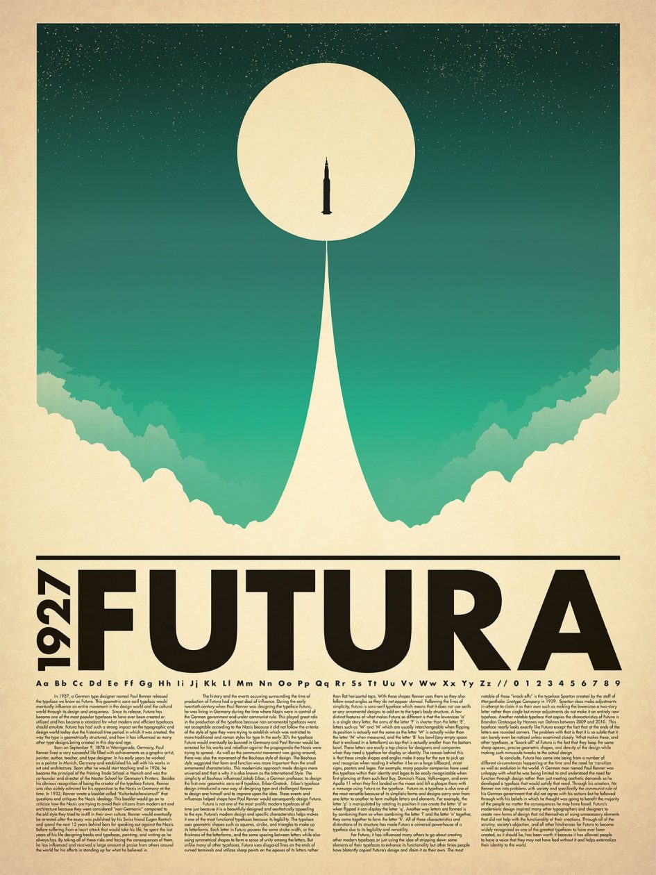
For my typography zine project, I decided to research Paul Renner and the font he created, Futura. I picked this font because many of the posters and logos with it in use are very bold, eye-catching and have a great sense of design.
My full scanned zine:
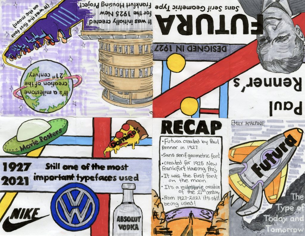
I actually found researching Paul Renner quite interesting given how in-depth a lot of websites go into his life. He was a German graphic designer, type designer and typographer (also painter and teacher) and studied at many different academies to master them. However, while studying he found that he had a big dislike towards some aspects of modern culture like dancing, jazz, cinema, etc. Renner preferred a functionalist strain in modernism for his designs and found he had a great passion for typography.
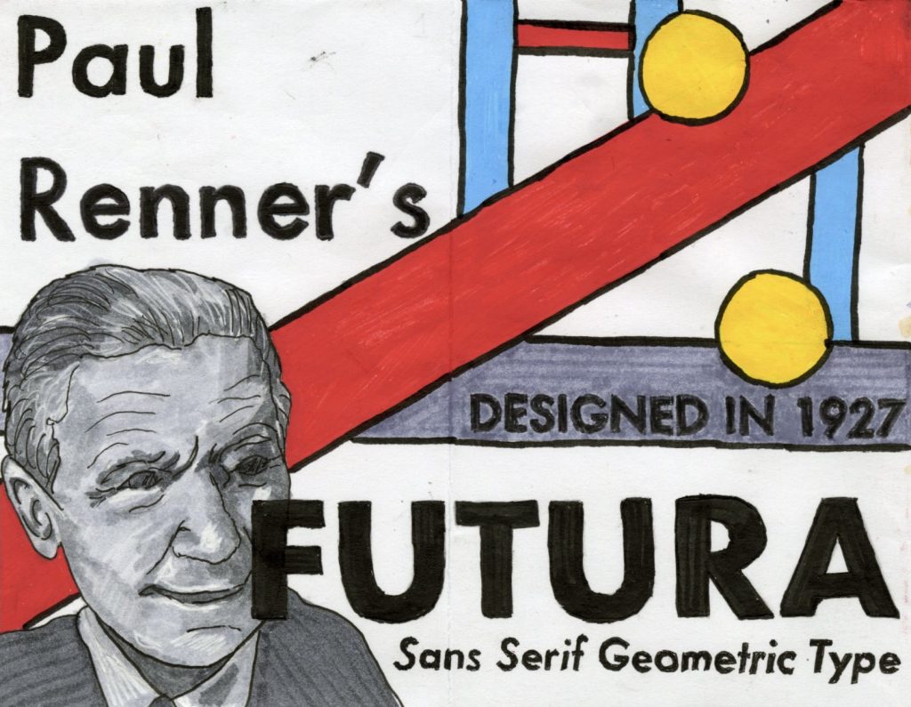
One fun fact that REALLY stood out to me while researching, and I did my best to incorporate it into my zine was that Futura was actually the first font on the moon via the Apollo 11 Mission.
I personally think I deserve a 10/10 for this because I put over 9/10 hours into making and researching this. I agree it probably shouldn’t have taken me this long, I just made the executive decision to trace all of the writing in my zine to look like the Futura font and didn’t realize how long it would actually take until it was too late!
Leave a Reply