
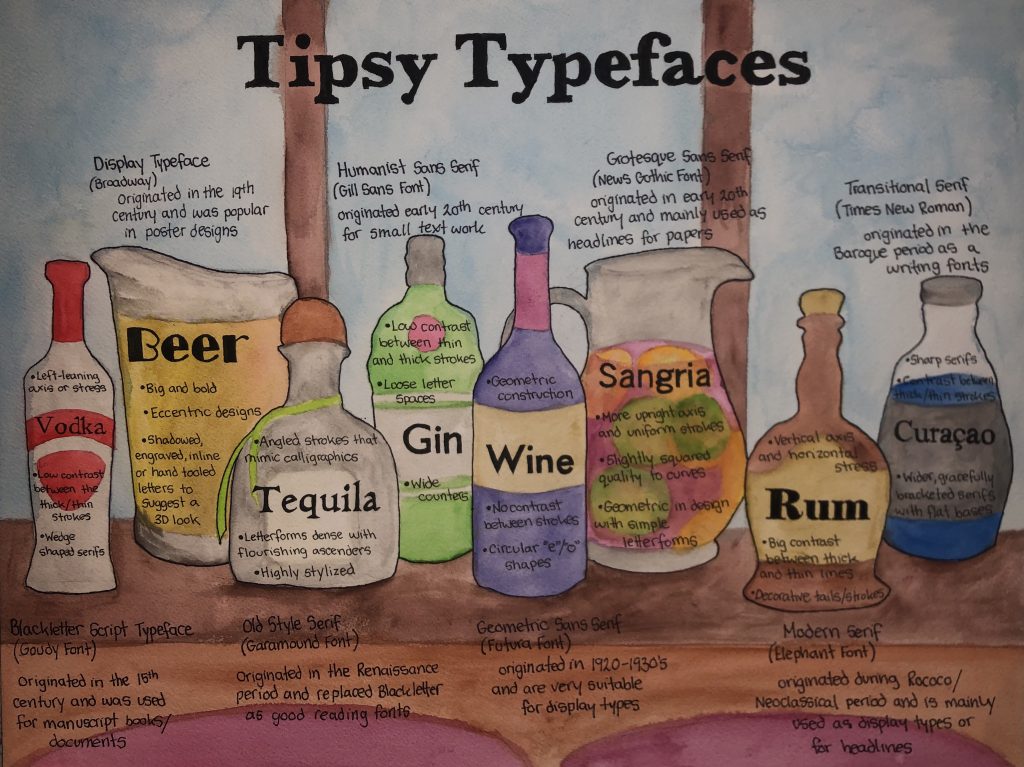
For my type identification poster, I wanted to design something that would stand out, and after many (and I mean many) ideas I decided to use a “drinking” or “bar theme” hence the title, Tipsy Typefaces.
I wanted to visually show that all these 8 typefaces are very different to one another, despite how similar some might seem. This is where I landed on my drinking design. Because even if you aren’t a drinker, or don’t enjoy doing it, you can still agree that they are all very different. Whether it’s about a specific occasion, the food you’re eating with your drink, or a certain cocktail, each alcohol has it’s own purpose and use.
For example, It’s very common in traditions to toast champaign on New Years eve, a promotion, or just any occasion worth a celebration. However, you wouldn’t really think about maybe throwing down a shot of vodka during the same events.
So just like alcohol, each typographic category has their own specific uses and purposes. By putting each bottle of alcohol next to each other, I was hoping to ‘reenact’ when people go to a bars order a certain drink based on their mood or occasion, just the same as when designers/ businesses go and chose a certain font for the visual mood and occasion of their product or poster.
For my project, I spent around 7-8 hours completing it and am quite happy with the outcome. The only part I wish I had foreseen was the amount of information I wanted to put on it, and tried to make it look a bit less busy. I think overall I deserve an 8/8.5 out of 10 on this.
Leave a Reply