by Ethan Woronko | Sep 30, 2020 | IDEA 141
Babylon, a small town along the Euphrates river, started out with not too much going for it but was destined for great things. This small city state located in modern day Iraq was largely overshadowed by larger states like Assyria, stayed mostly to itself until a ruler with ambition and ideas was sworn in. This ruler, Hammurabi, was to change the tide for this town and leave a lasting legacy.
Hammurabi ruled from 1792 B.C. till 1750 B.C. and made the most of his time as king. He worked hard to build Babylon into a far larger city and set on a conquest of the surrounding lands, eventually taking over most of lower Mesopotamia and creating the empire of Babylonia. This expansion allowed culture to grow and change significantly and also allowed for more precious materials to be used in the arts among other things. Due to the conquest of Hammurabi, Babylon became the “holy city’ and cultural capital of the empire. after doing all this for the small town of Babylon, Hammurabi was to do one final thing for his empire that would put his name down in history- the code of Hammurabi!
During Hammurabi’s reign he put together a set of 282 laws which he had inscribed on a large block of diorite. Hammurabi’s code is one of the earliest forms of law and one of the longest deciphered writings discovered to date. This code went over such things as fraud, slavery, theft, trade and various other subjects that related to both crime and home life. This code along with his major building projects allowed Babylon to thrive and go through massive cultural changes and eventually take over the surrounding area and become the empire of Babylonia. After taking over the surrounding states and towns he would give smaller clay tablets with the rules inscribed to the annexed cities to keep the laws uniform across his empire. It is also known now that most towns had a library as they believe both men and women should be educated in order to be prosperous. Many of these texts were translated from sumerian and many of these works still exist today
History.com Editors. “Babylonia.” History.com, A&E Television Networks, 2 Feb. 2018, www.history.com/topics/ancient-middle-east/babylonia.
“Babylonia.” Wikipedia, Wikimedia Foundation, 27 Sept. 2020, en.wikipedia.org/wiki/Babylonia.
“Babylon.” Wikipedia, Wikimedia Foundation, 29 Sept. 2020, en.wikipedia.org/wiki/Babylon.
“Code of Hammurabi.” Wikipedia, Wikimedia Foundation, 23 Sept. 2020, en.wikipedia.org/wiki/Code_of_Hammurabi.
by Ethan Woronko | Sep 26, 2020 | IDEA 121
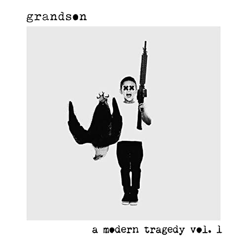
matt Meiners- grandson a modern tragedy vol.1
I chose this album cover for closure as the child in the piece doesnt have a torso but yet you still know where his shirt is and where it ends. I chose this image over others from teh same designer as the break in the element was rather large and yet still worked very effectively.
by Ethan Woronko | Sep 26, 2020 | IDEA 121
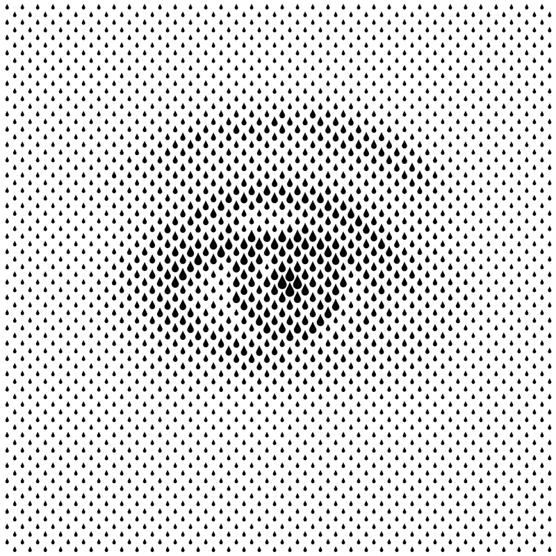
Sergi Delgado- The Eye
I feel this piece is a great example of the principle of proximity as the whole image is just made out of teardrop shapes of varying sizes but if looked at from a distance or when squinting looks like an eye. The grouping of the teardrop elements creates a whole new image just by making the illusion that pasrt are darker than others
by Ethan Woronko | Sep 23, 2020 | IDEA 141, Uncategorized

It took me quite a while to settle on an idea for my yearbook spread and my train of thought was all over the place but eventually it clicked! I was reading my book on RayGun magazine and realized that it was perfect for the project and if done well would perfectly capture who I am. I started researching Chris Ashworth, David Cardson and swiss grit as a whole and what guidelines I waould need to follow (turns out not very many) then I set to work designing a layout. I started by planning rough layouts and spreads on paper and figured out what photos I would need to take or use then once I had a plan I hopped on photoshop to comp together a more meticulously planned work. I spent quite a long time messing with where to place text and my pictures but once I got into the flow work went smoothly. I knew that the lettering on my hand drawn piece would be a bit tricky as Letraset is no longer sold so I went for a hand lettered approach using paint pens and Im pretty happy with the result. I think I would give myself a 9/10 as i fell i replicated the style i was going for to the best of my abilities and ended up with an end product that is recognisable as a Swiss grit inspired work.
by Ethan Woronko | Sep 18, 2020 | IDEA 121
Concepcion Studios- The Shining, 2018
I chose this piece as my example for size as the small barely noticeable characters make the maze that takes up most of the image feel vast and desolate.
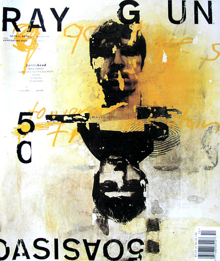
David Carson- Ray Gun issue 50. 1997
I feel this piece is a great example of texture as you look at it and can imagine exactly how it feels if you were to touch it. The charcoal and pastel in the blackground gives a very gritty feel that adds to the scratchy letraset and faces to make a piece where no part is left untextured.
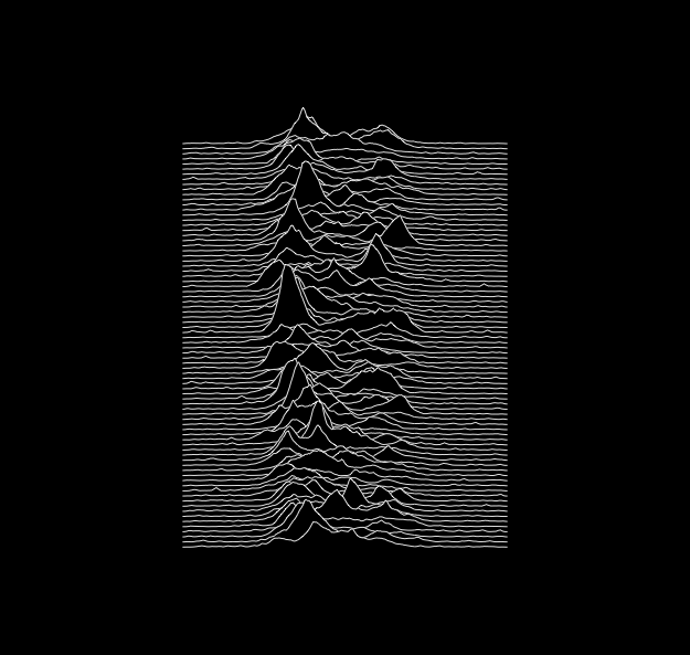
Peter Saville- Unknown Pleasures.1979
I chose this image for my example of the line element as its one of the most recognizable album covers of all time and its made using only a bunch of lines.
")


Recent Comments