Paula Scher
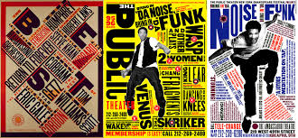
Paula Scher is heralded as a design titan, and for a good reason! Working with companies like Microsoft, the MOMA, and CBS records, she has revolutionized design through her distinct style. Her work uses typography to its full potential- bold, full of motion, and definitely worthy of the supergraphic title. personally, my favourite works from her that I have seen are her map series and her redesign of the Atlantic Theater Company’s brand identity. I was immediately drawn to these projects due to how unique and fun they were, the maps almost looking like pop art! And of course her super graphics, some of the most interesting public art I’ve seen recently. Her use of perspective and angles makes pieces seem full of life and extremely thought out while also delivering the desired message extremely well.


Sources:
https://www.itsnicethat.com/articles/paula-scher-atlantic-theater-company
https://www.pentagram.com/about/paula-scher
https://www.aiga.org/medalist-paulascher
Recent Comments