Abstract Expressionism & Pop Art

Takashi Murakami

Your Title Goes Here

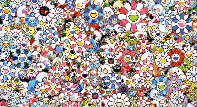
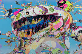
Takashi Murakami is a Japanese pop/contemporary artist known for his wild imagery and inviting yet bizarre works. Murakami’s work uses extremely bright colours,  reoccurring characters and images, anime-inspired imagery and a mix between glossy and matte mediums on the same work. He was inspired by ukiyo-e prints, post-war Japanese low art like manga, and modern pop culture in japan to create what he deemed “Superflat” art. This term refers to both how his art uses flat planes and how the differentiation between high and low art has disappeared and become flat. Murakami makes statues and high art as well as products for the general public like clothing, album covers, merchandise, and animations.

I went to his 2016 show “Juxtapox x Superflat” at the VAG and remember being amazed by the massive scale of his work and how beautiful the imagery was. I personally feel he is one of the best artist working today as his art is for everyone and still shows an immense prowess and love of the craft.

Survey 9

The Bauhaus

In 1919, the Bauhaus in Germany was founded by architect Walter Gropius. The goal of the school was to bring all types of art together and embrace mass production, as well as the new materials of the time. Simplicity of form and only adding things that were essential to the design, and that art should meet the needs of society were their ideals, some of the only similarities between the vast variety of works and styles to come out of the bauhaus

Design


The Bauhaus wanted to bring art and industrialization together and into everyday life. They intended to reject and reinterpret the ideas of design and art at the time and show it can be part of everyday life. They worked on everyday items like chairs, tables, clothing, and textiles so that the general populace could use them and have a masterfully crafted piece of design in their home. Due to this ease of access the style spread easily to the general public and inspired many other movements and styles. The design of the Bauhaus is characterized by their bold primary colours, functionality, and geometric shapes- these exemplifying the ideas of simplicity in form.

Bauhaus logo

https://abduzeedo.com/bauhaus-influence

Bauhaus Dessau

https://www.floornature.com/100-years-bauhaus-14386/


Architecture


Architecture in the Bauhaus and coming out of the school followed the same ideals of function and bringing design into the modern industrial age. As with their furniture, posters and other designs, everything in the architecture had to have a purpose, no ornaments or additions just because it looked good. Most buildings were made of concrete, glass, and steel so they could celebrate the new materials and also be built to last. Large walls of glass, use of simple geometric forms, asymmetry, and open floor plans were extremely common in these buildings as well as truth to materials (the celebration of the building material through leaving it exposed.). This style greatly inspired American architecture later on after the closing of the Bauhaus in 1933.

Sources

https://www.metmuseum.org/toah/hd/bauh/hd_bauh.htm

Bauhaus: How the Avant-Garde Movement Transformed Modern Art

The bauhaus (book)- whitford

The bauhaus reassessed(book)- Gillian naylor

Typography infographic

TYPE a brief history

This project was a struggle to plan out, I had pages upon pages of ideas and thoughts before I landed on my final design. I knew I wanted to do the whole history of type from its creation to the start of WW2 but other than that I had no idea what to do. The long format made most ideas I had fall flat or look strange but I also didn’t want to do a basic timeline and eventually, I landed on using the letters to show the timeline. The word “history” also happened to have the perfect amount of letters for each era of typography up to the point we were to go to. I decided to spice up my title by throwing it into CMYK and offsetting my lettering so it showed the effect of misaligned print from modern printing.  I did research on a multitude of sites and on each style in particular so I got a good understanding of each and was sad to realize I couldn’t fit all the cool info I had found. Overall this project was rather fun but also extremely time-consuming as the format was MASSIVE and I also had to go and buy a pad of paper that fit the large size. The project did feel at times much like the zine but with a bit less creative freedom but that isn’t necessarily a bad thing as the zine was fun. I would give myself a 9/10 as I learnt a lot from doing the project, followed the brief well, and came out with a piece of work I am proud of and plan to put on my wall.