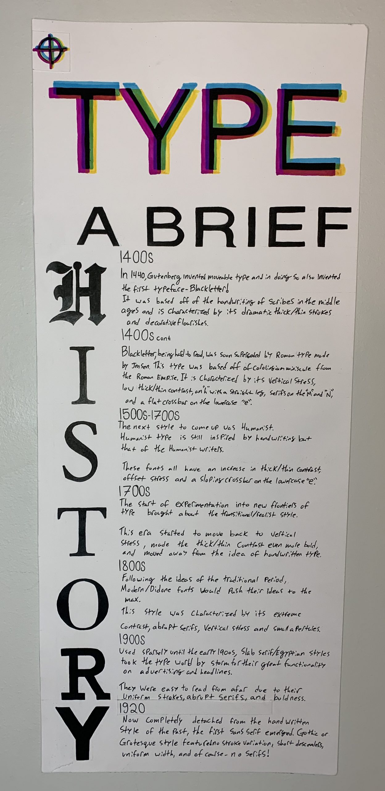
TYPE a brief history
This project was a struggle to plan out, I had pages upon pages of ideas and thoughts before I landed on my final design. I knew I wanted to do the whole history of type from its creation to the start of WW2 but other than that I had no idea what to do. The long format made most ideas I had fall flat or look strange but I also didn’t want to do a basic timeline and eventually, I landed on using the letters to show the timeline. The word “history” also happened to have the perfect amount of letters for each era of typography up to the point we were to go to. I decided to spice up my title by throwing it into CMYK and offsetting my lettering so it showed the effect of misaligned print from modern printing. I did research on a multitude of sites and on each style in particular so I got a good understanding of each and was sad to realize I couldn’t fit all the cool info I had found. Overall this project was rather fun but also extremely time-consuming as the format was MASSIVE and I also had to go and buy a pad of paper that fit the large size. The project did feel at times much like the zine but with a bit less creative freedom but that isn’t necessarily a bad thing as the zine was fun. I would give myself a 9/10 as I learnt a lot from doing the project, followed the brief well, and came out with a piece of work I am proud of and plan to put on my wall.
Sources
https://creativemarket.com/blog/slab-serifs
https://www.britannica.com/technology/typography/History-of-typography
https://www.printmag.com/post/evolution-typography-history
https://www.britannica.com/biography/Nicolas-Jenson
https://articles.c-a-s-t.com/nicolas-jenson-and-the-success-of-his-roman-type-9f0afeba4103
https://www.fonts.com/content/learning/fontology/level-1/type-anatomy/type-classifications
https://www.sitepoint.com/the-old-style-typeface/#:~:text=Old%20Style%20(occasionally%20referred%20to,15th%20century%2C%20before%20Modern%20typefaces.&text=The%20very%20first%20italic%20letters,fonts%20in%20the%20early%201500s.
Recent Comments