Water Story ENG 100

MY WATER STORY

Recently, I have taken up the hobby of wildlife photography, and more frequently than not this hobby leads me to water. Two weeks ago, I went to Stanley Park to try to get pictures of the goslings and various birds that are in the area currently and set up on a bench with a good view of Beaver Lake. The air was crisp, and the weather overcast so shooting conditions weren’t great, but I was determined to go home with at least one good capture to show for my efforts.

Scanning the area, I noticed a family of geese fishing in the reeds across from where I was sitting and quickly raised my viewfinder to my eye. I knew the photos wouldn’t be anything special, but it was a start, so I focused in and had my finger hovering over the shutter button waiting for the geese to raise their heads. Seconds stretch and feel like minutes, my finger shakes in anticipation, until suddenly, the geese get riled up and start yelling to the heavens. The cacophony of honks is accompanied by the parent geese taking to the air, as if possessed. I sat there confused but still looking through the viewfinder trying to figure out what was happening when a large shape dived the lake sending ribbons of water into the sky right beside the goslings. I lowered the camera so I could get a better look at the situation and saw the geese in pursuit of the culprit, an eagle on the hunt!

The eagle continued to circle the area and dive the goslings, looking for an easy meal, but the parents were on a warpath and were close behind every move it made. The goslings were going crazy, diving under the water, and darting around in the reeds, scared their lives may end before they had a chance to truly start. As the geese chasing the eagle, and the goslings start to tire, the odds looked more and more in the eagle’s favour as the swoops got closer and closer to landing their mark.

As all hope seemed lost, a gaggle of geese came out of the sky and locked their sights on the enemy. The newly arrived geese managed to catch up to the eagle and drive it away from the area. Within seconds the geese were back to grazing in the lake and the water was still. My visit ended with me walking away with no photos, but an experience that will be linked to the lake forever.

Postmodernism In Europe

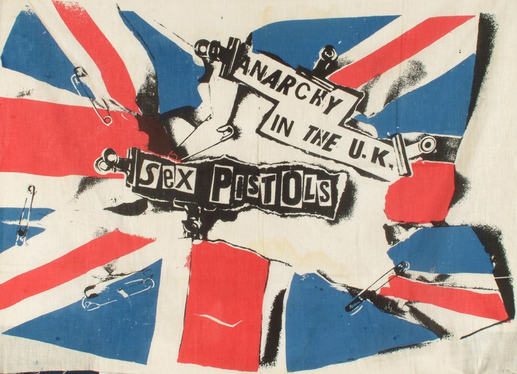
Jamie Reid

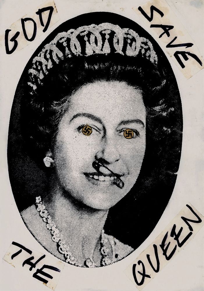
“God Save The Queen”

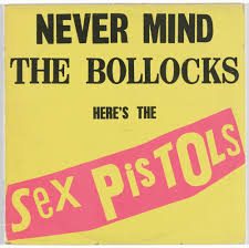
Jamie Reid is a designer whose work is all too well known to me. Creating the infamous cover for The Sex Pistols “Never Mind The Bollocks”, he used a mix of harsh bold colours and ransom note style type. This album cover would go on to define punk art and design to this day. His work was anarchistic, Nationalistic, and used heavily defaced pop imagery (like his work ” God Save The Queen” on the left). He continued to design for The Sex Pistols and still does design work to this day. His work for The Sex Pistols has been shown in the MOMA, the Tate Gallery, and others.

Sources

https://medium.com/fgd1-the-archive/jamie-reid-god-save-the-queen-25852ef575d4

http://www.artnet.com/artists/jamie-reid/

http://www.artnet.com/artists/jamie-reid/

Supergraphics Innovator

Paula Scher


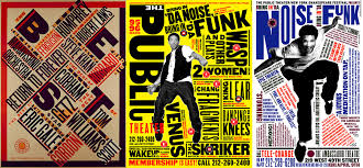
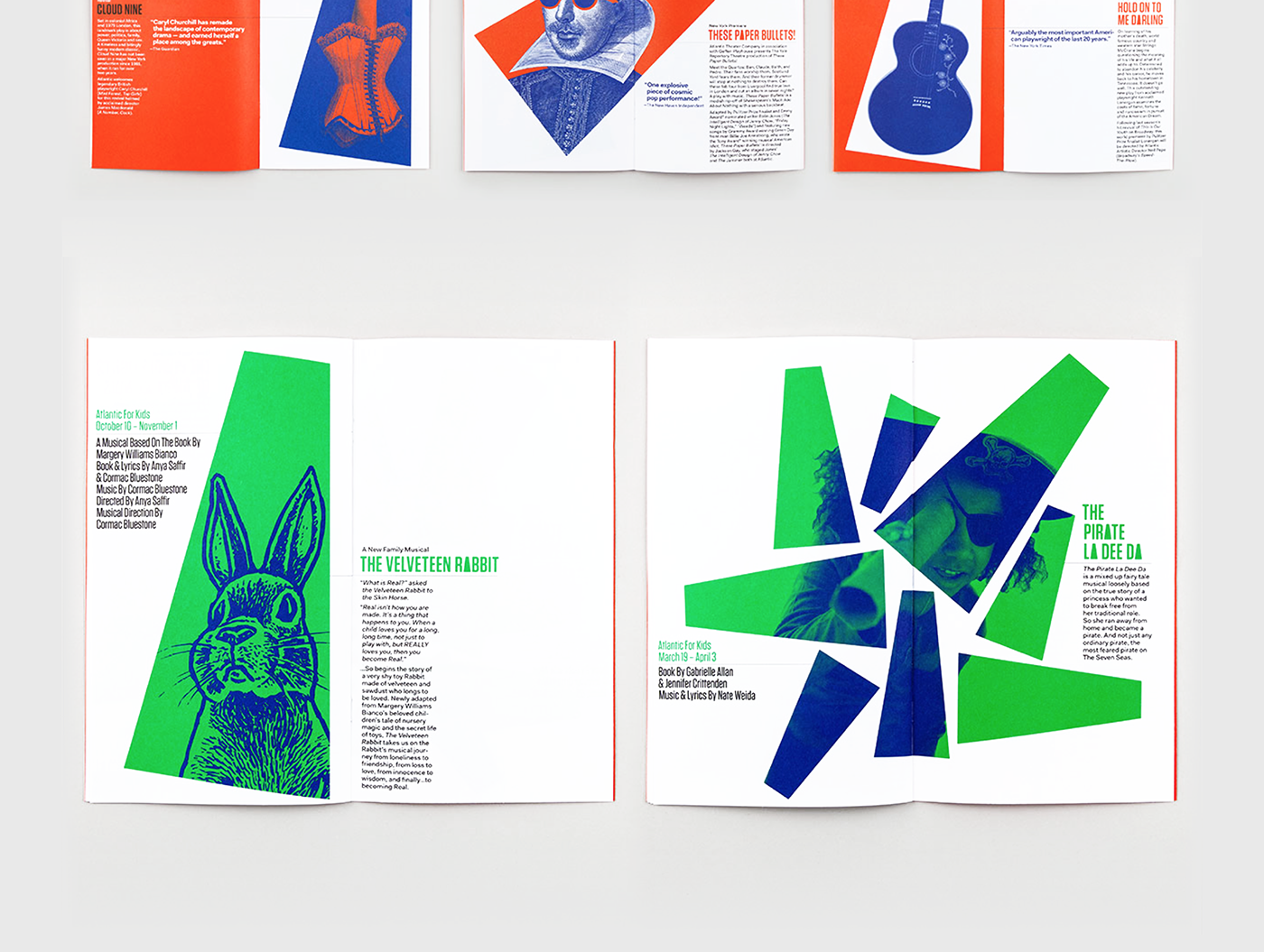
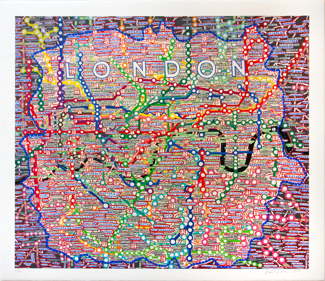
Paula Scher is heralded as a design titan, and for a good reason! Working with companies like Microsoft, the MOMA, and CBS records, she has revolutionized design through her distinct style. Her work uses typography to its full potential- bold, full of motion, and definitely worthy of the supergraphic title. personally, my favourite works from her that I have seen are her map series and her redesign of the Atlantic Theater Company’s brand identity. I was immediately drawn to these projects due to how unique and fun they were, the maps almost looking like pop art! And of course her super graphics, some of the most interesting public art I’ve seen recently. Her use of perspective and angles makes pieces seem full of life and extremely thought out while also delivering the desired message extremely well.

Psychedelic Poster Hero

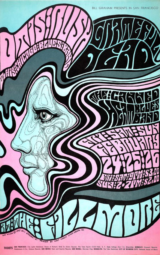
WES WILSON

A Founding Father Of Psychadelic Rock Art

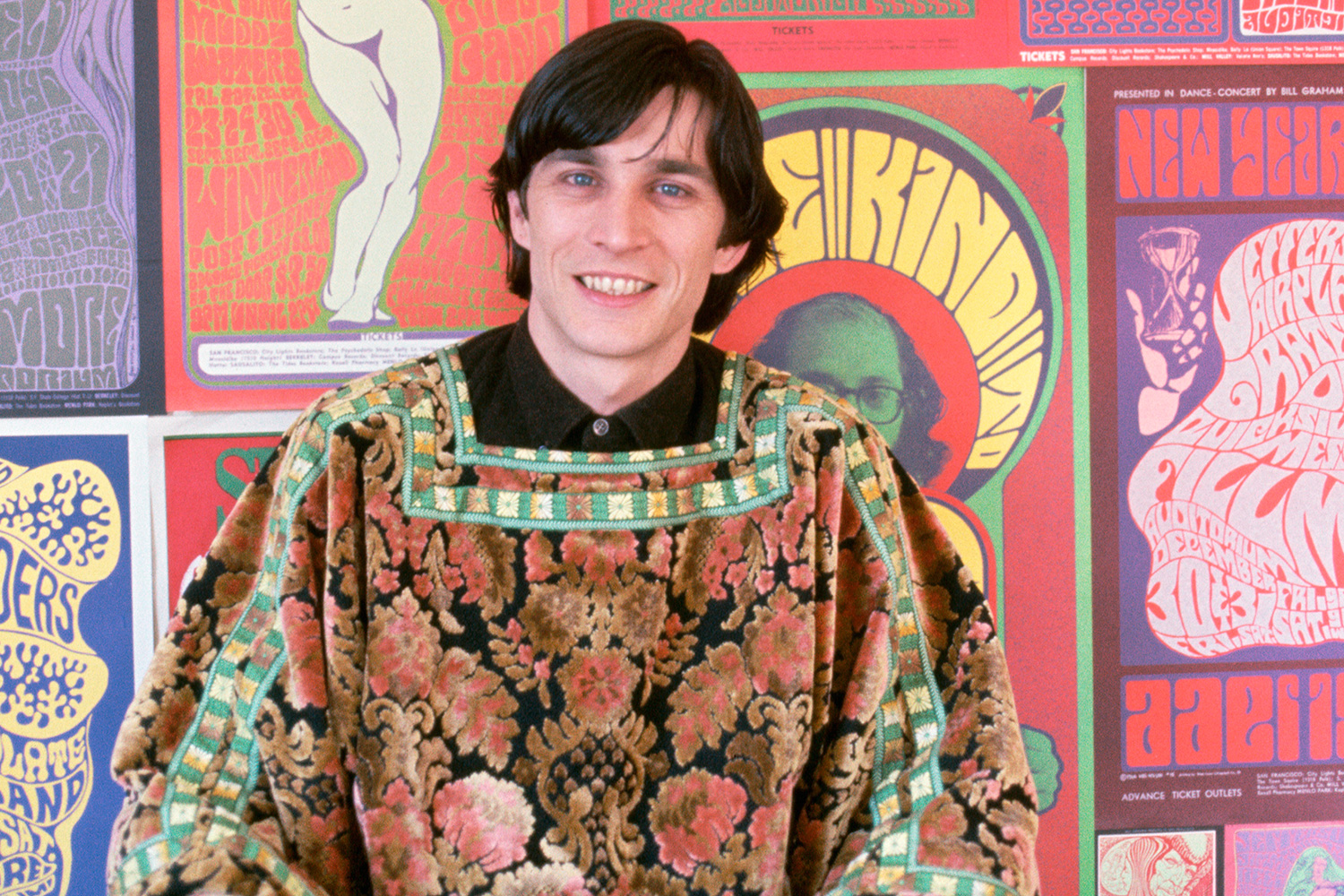
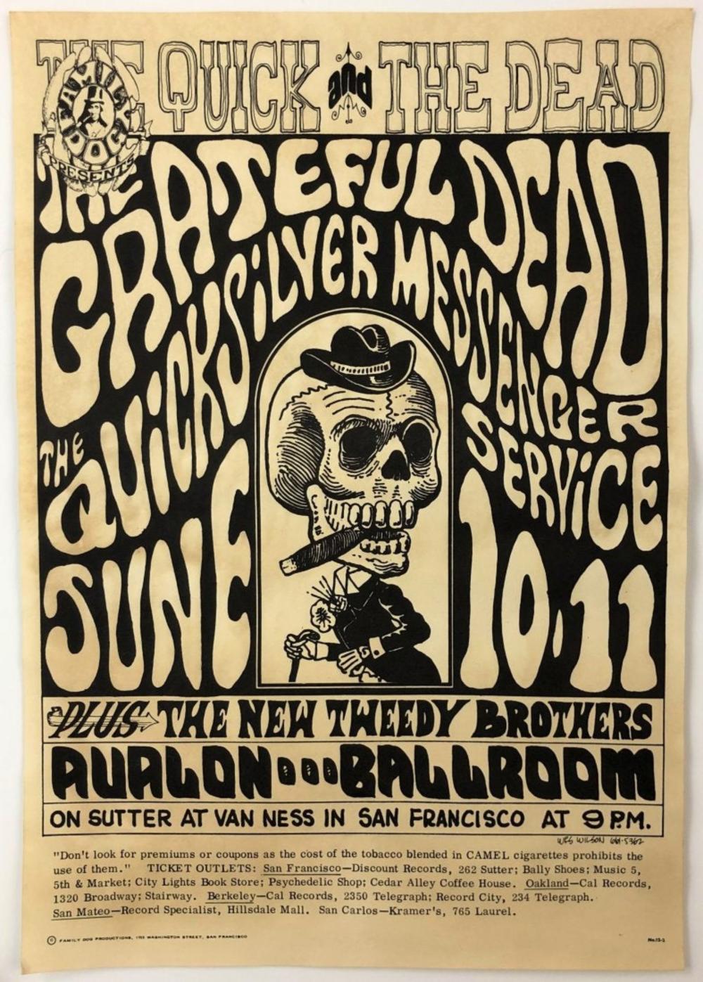
Born in 1937, Wes Wilson was to grow up to be one of the most influential poster artists of all time.  After making a Vietnam protest poster in 1965, he was noticed by Chet Helms, a rock promoter and that’s when his story really starts. Wes created a style of typography and poster design influenced by art nouveau but with a bright, flashy, and hippie twist. his posters used strong complementary colors and blended hand-done type into the imagery. he made posters for bands including Jefferson Airplane, Grateful Dead, and the Beatles. his style was so revolutionary that he is now credited with starting the 60’s psychedelic rock poster movement and called the most well-known poster artist in the US. Wes was to live a long and prosperous life before passing on at the old age of 82 last January.

Advertising Art Director

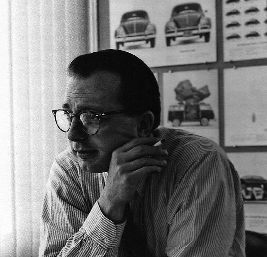
HELMUT KRONE

A Modern Advertising Pioneer

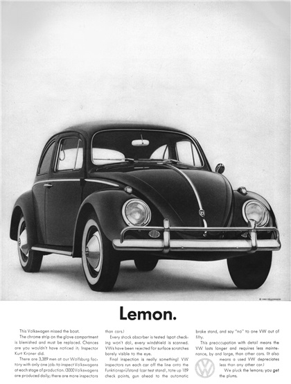
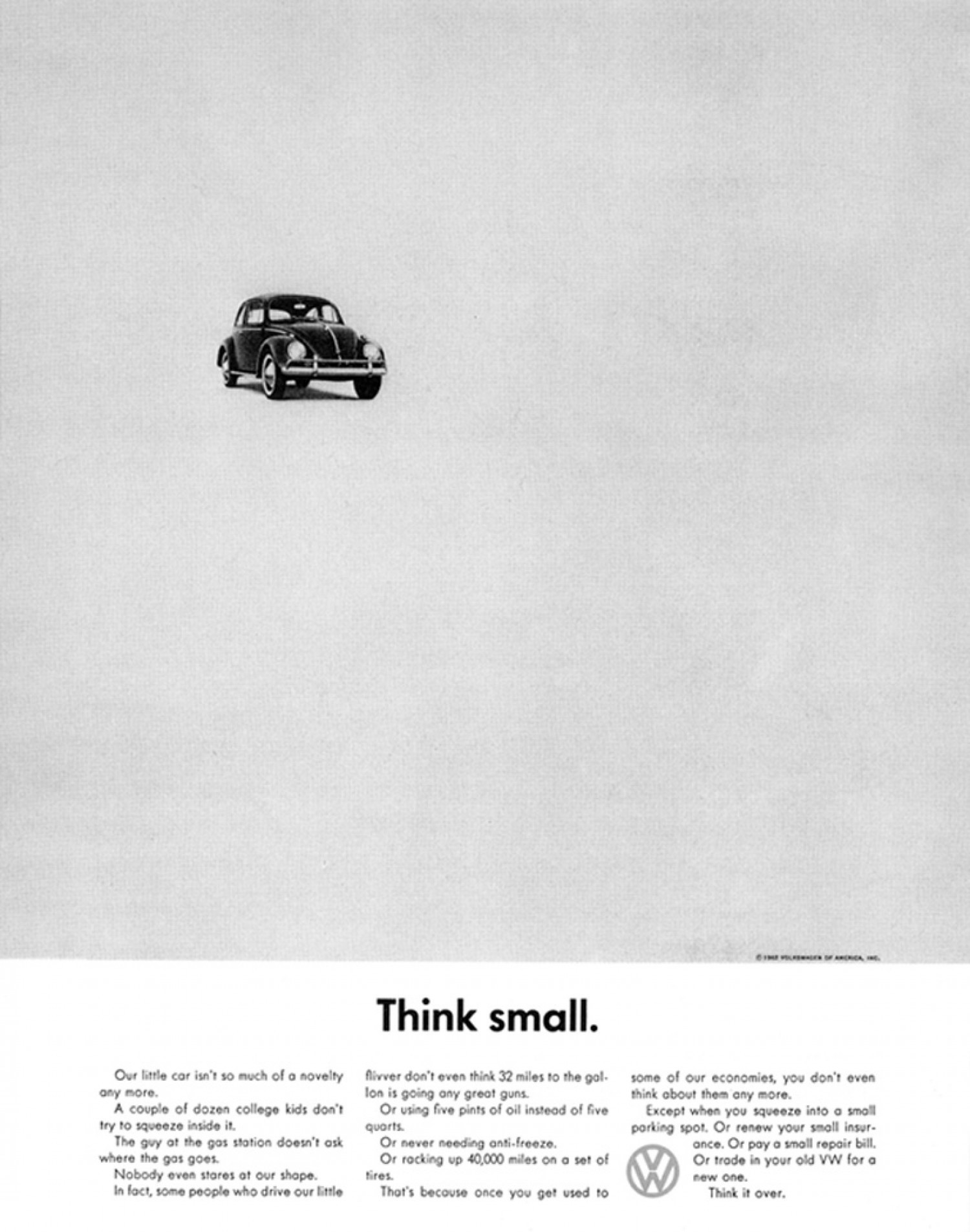
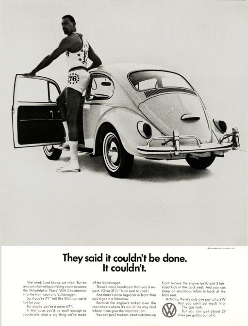
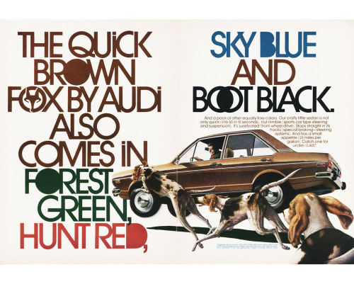
Helmut Krone (1925-1996) was an advertising director well known for his advertisements for Volkswagen. His work on the 1960 Volkswagen Beetle not only sold cars but also twisted the societal norms for advertising. The ads were fun, witty, black and white, and used ingenious copy paired with smart imagery to connect you with the company and show their lighthearted side, a stark comparison to their muscle car competitors. The ad campaign would win no.1 best campaign of all time in Advertising Ages “the century of advertising’ issue from 1999.

Sources:

Volkswagen_Advertising_Campaign_by_Helmut_Krone_1960_Think_Small

Abstract Expressionism & Pop Art

Takashi Murakami

Your Title Goes Here

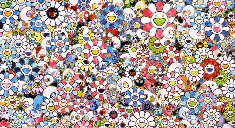
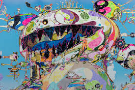
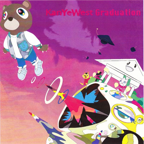
Takashi Murakami is a Japanese pop/contemporary artist known for his wild imagery and inviting yet bizarre works. Murakami’s work uses extremely bright colours,  reoccurring characters and images, anime-inspired imagery and a mix between glossy and matte mediums on the same work. He was inspired by ukiyo-e prints, post-war Japanese low art like manga, and modern pop culture in japan to create what he deemed “Superflat” art. This term refers to both how his art uses flat planes and how the differentiation between high and low art has disappeared and become flat. Murakami makes statues and high art as well as products for the general public like clothing, album covers, merchandise, and animations.

I went to his 2016 show “Juxtapox x Superflat” at the VAG and remember being amazed by the massive scale of his work and how beautiful the imagery was. I personally feel he is one of the best artist working today as his art is for everyone and still shows an immense prowess and love of the craft.

Survey 9

The Bauhaus

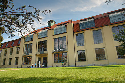
In 1919, the Bauhaus in Germany was founded by architect Walter Gropius. The goal of the school was to bring all types of art together and embrace mass production, as well as the new materials of the time. Simplicity of form and only adding things that were essential to the design, and that art should meet the needs of society were their ideals, some of the only similarities between the vast variety of works and styles to come out of the bauhaus

Design


The Bauhaus wanted to bring art and industrialization together and into everyday life. They intended to reject and reinterpret the ideas of design and art at the time and show it can be part of everyday life. They worked on everyday items like chairs, tables, clothing, and textiles so that the general populace could use them and have a masterfully crafted piece of design in their home. Due to this ease of access the style spread easily to the general public and inspired many other movements and styles. The design of the Bauhaus is characterized by their bold primary colours, functionality, and geometric shapes- these exemplifying the ideas of simplicity in form.

Bauhaus logo

https://abduzeedo.com/bauhaus-influence

Bauhaus Dessau

https://www.floornature.com/100-years-bauhaus-14386/


Architecture


Architecture in the Bauhaus and coming out of the school followed the same ideals of function and bringing design into the modern industrial age. As with their furniture, posters and other designs, everything in the architecture had to have a purpose, no ornaments or additions just because it looked good. Most buildings were made of concrete, glass, and steel so they could celebrate the new materials and also be built to last. Large walls of glass, use of simple geometric forms, asymmetry, and open floor plans were extremely common in these buildings as well as truth to materials (the celebration of the building material through leaving it exposed.). This style greatly inspired American architecture later on after the closing of the Bauhaus in 1933.

Sources

https://www.metmuseum.org/toah/hd/bauh/hd_bauh.htm

Bauhaus: How the Avant-Garde Movement Transformed Modern Art

The bauhaus (book)- whitford

The bauhaus reassessed(book)- Gillian naylor

Typography infographic

TYPE a brief history

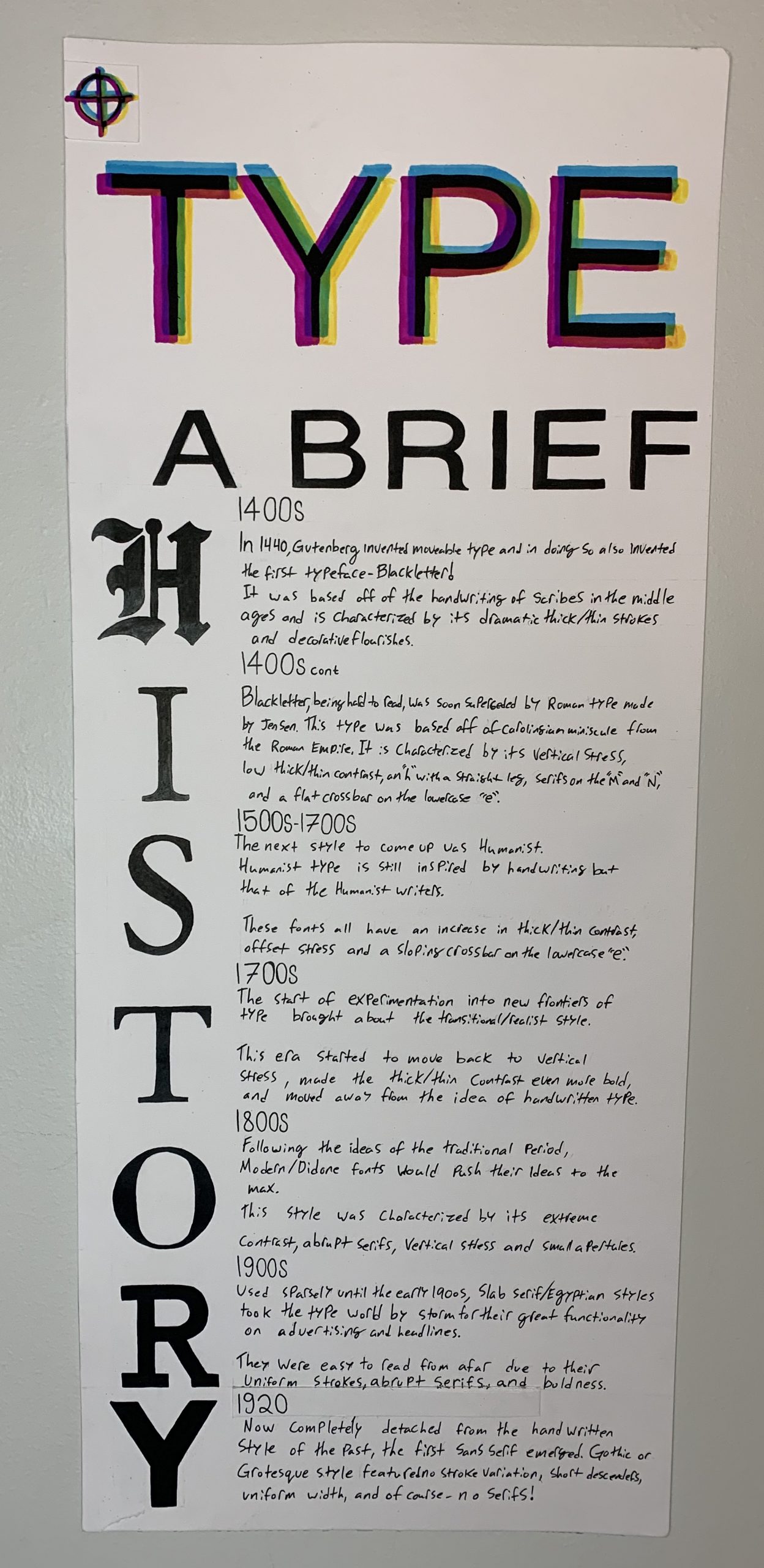
This project was a struggle to plan out, I had pages upon pages of ideas and thoughts before I landed on my final design. I knew I wanted to do the whole history of type from its creation to the start of WW2 but other than that I had no idea what to do. The long format made most ideas I had fall flat or look strange but I also didn’t want to do a basic timeline and eventually, I landed on using the letters to show the timeline. The word “history” also happened to have the perfect amount of letters for each era of typography up to the point we were to go to. I decided to spice up my title by throwing it into CMYK and offsetting my lettering so it showed the effect of misaligned print from modern printing.  I did research on a multitude of sites and on each style in particular so I got a good understanding of each and was sad to realize I couldn’t fit all the cool info I had found. Overall this project was rather fun but also extremely time-consuming as the format was MASSIVE and I also had to go and buy a pad of paper that fit the large size. The project did feel at times much like the zine but with a bit less creative freedom but that isn’t necessarily a bad thing as the zine was fun. I would give myself a 9/10 as I learnt a lot from doing the project, followed the brief well, and came out with a piece of work I am proud of and plan to put on my wall.

Cubism, Dadaism, & Surrealism

“I wish to approach truth as closely as possible, and therefore I abstract everything until I arrive at the fundamental quality of objects”

Piet Mondrian

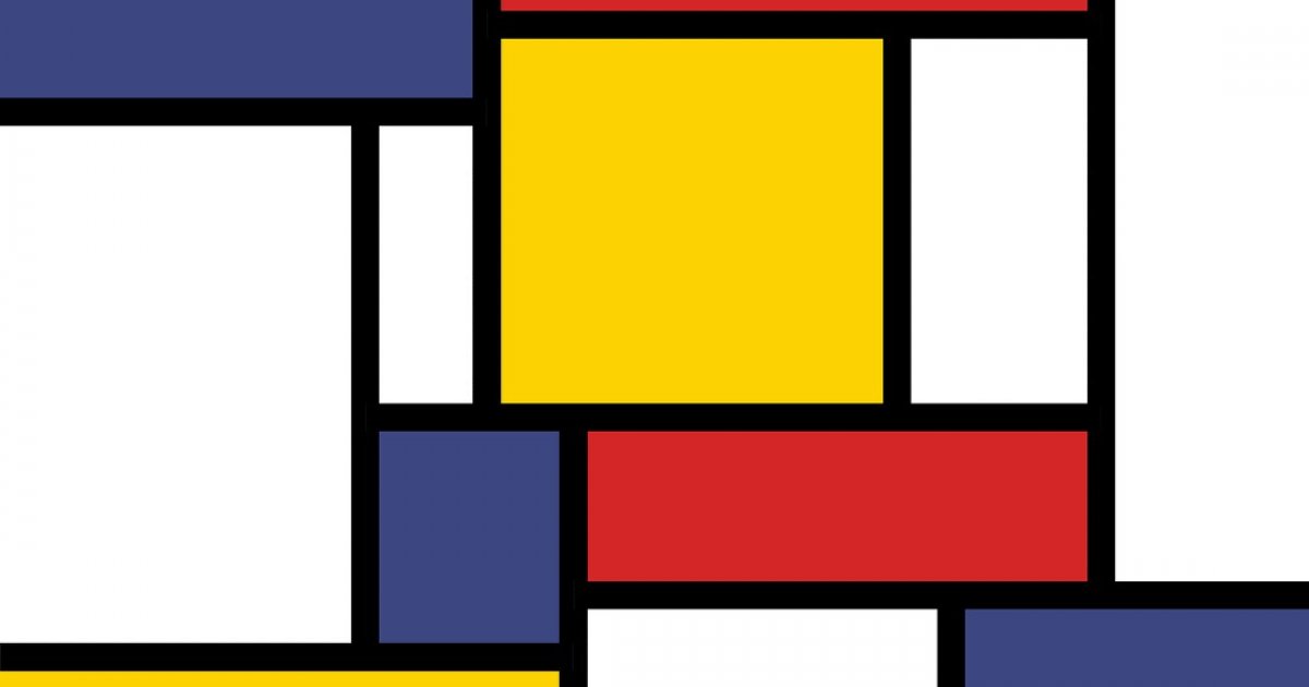
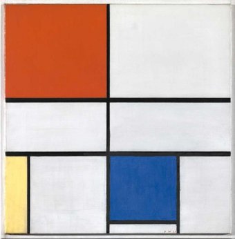
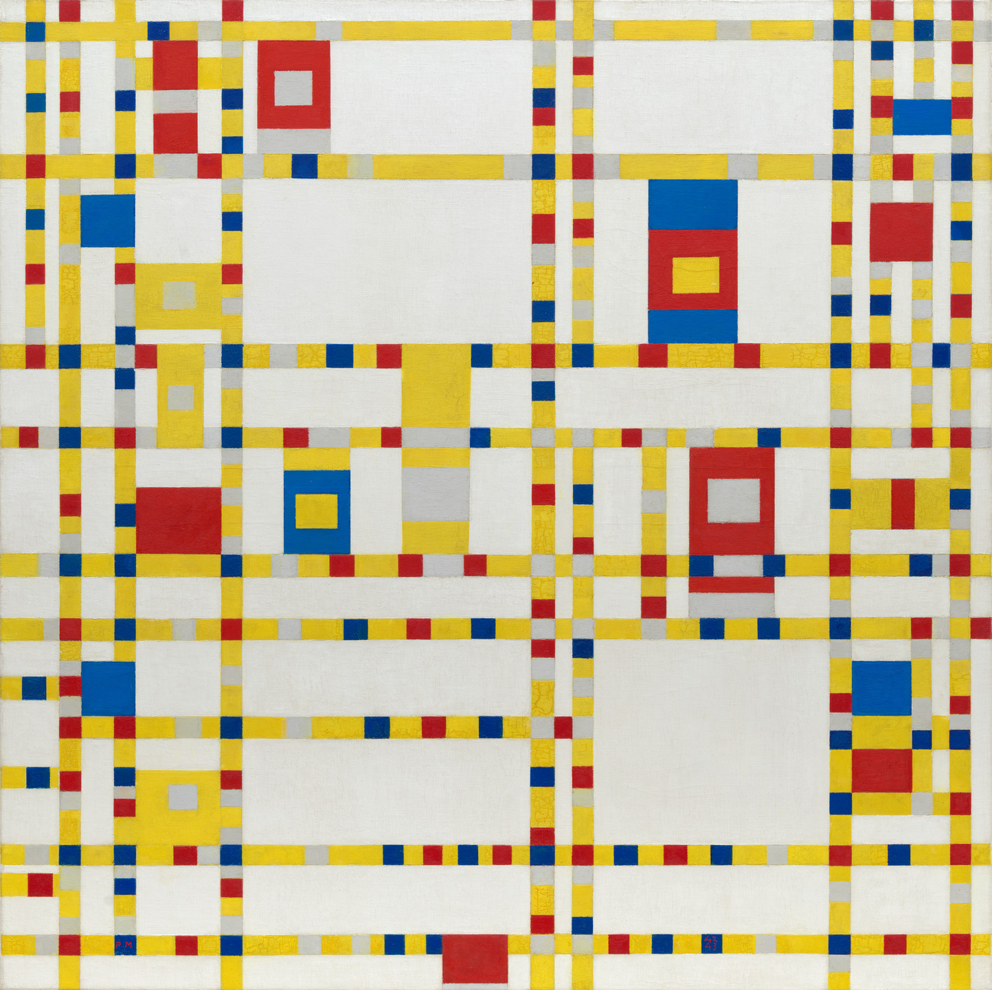
Mondrian was born Pieter Cornelis Mondriaan but changed his name so it was an anagram of “I paint modern”. Co founder of De Stijl, an art group focused on true abstraction and reduction of form. Mondrian created the movement he called “Neoplasticism” which used primary colours, values and vertical and horizontal lines to create a “dynamic balance”.  his work, though simple to the eye, took him months to complete and an immense amount of thought- definitely more than i put into most of my work. He used plasticism to represent modern reality through his colours and the action portrayed in his pieces as well as his need to pair everything down to the simplest forms. His work has helped to develop modern abstract art in a profound way and still is heralded as one of the most important artists of the 20th century

composition II

compositionII

https://en.wikipedia.org/wiki/Composition_with_Red_Blue_and_Yellow

Broadway Boogie Woogie

https://www.moma.org/collection/works/78682

Exhibit Artifact

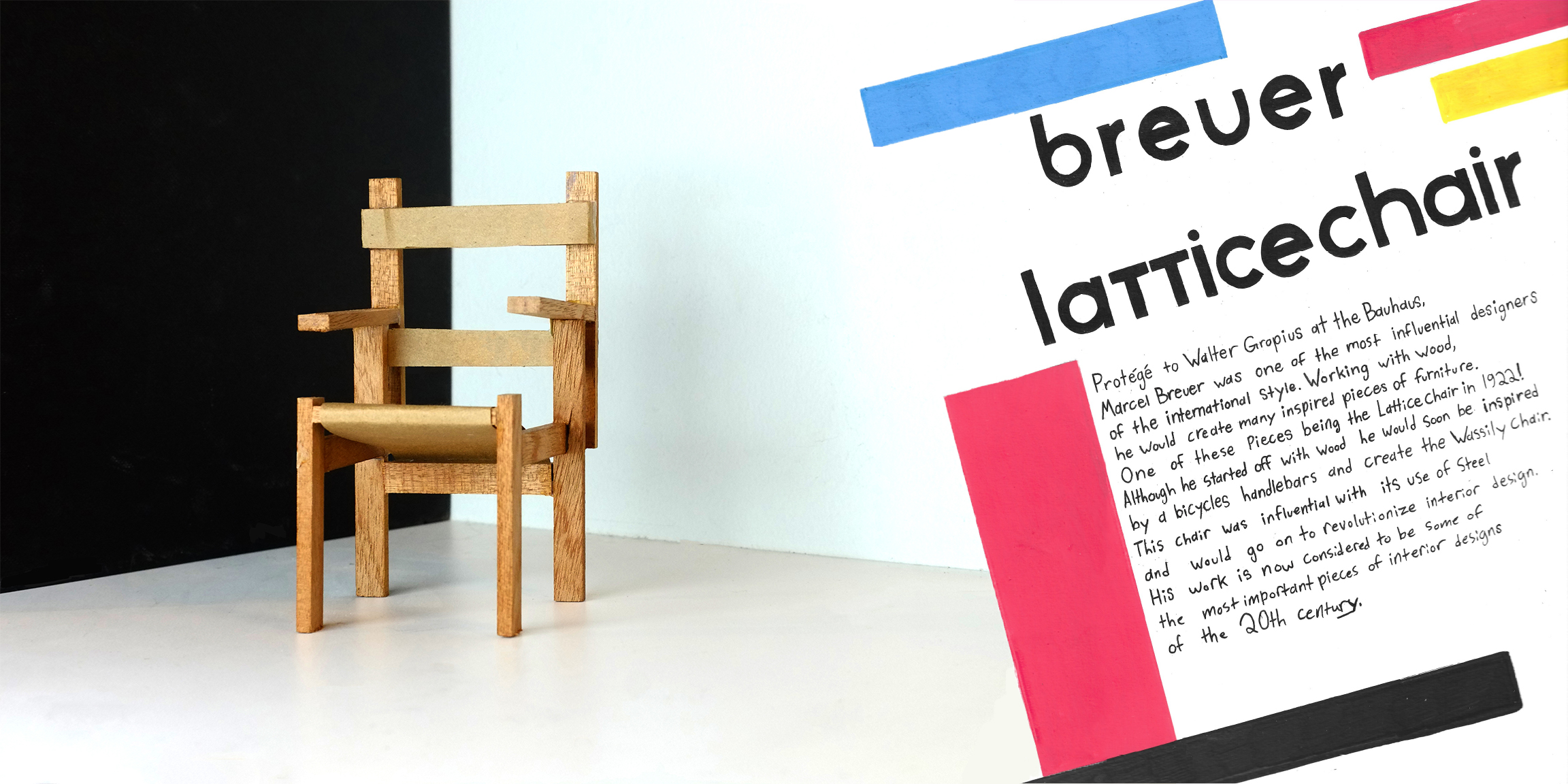
The Breuer Lattice chair

This project was super open-ended so I had to think for a while about my topic. In the end, I decided on something to do with the Bauhaus and Marcel Breuer has interested me since I saw his works. Most of his furniture uses steel so I had to find one that I would be able to do and the lattice chair worked great. I went for a roughly 1/3 scale model using wood and paper and used my extremely limited woodworking knowledge to put it together. the staging was my desk and a book for the black part to emulate how the furniture was shown off at the time.  I also made my description in the Bauhaus style and tried to get it to blend into the white wall to embrace the pristine modern ideas. Overall I feel I did pretty well in following the brief and creating my object and spread while also having a fun time doing it. I did give myself a big challenge so it’s not perfect but I still would give myself an 8.5-9/10.