Typography Zine!

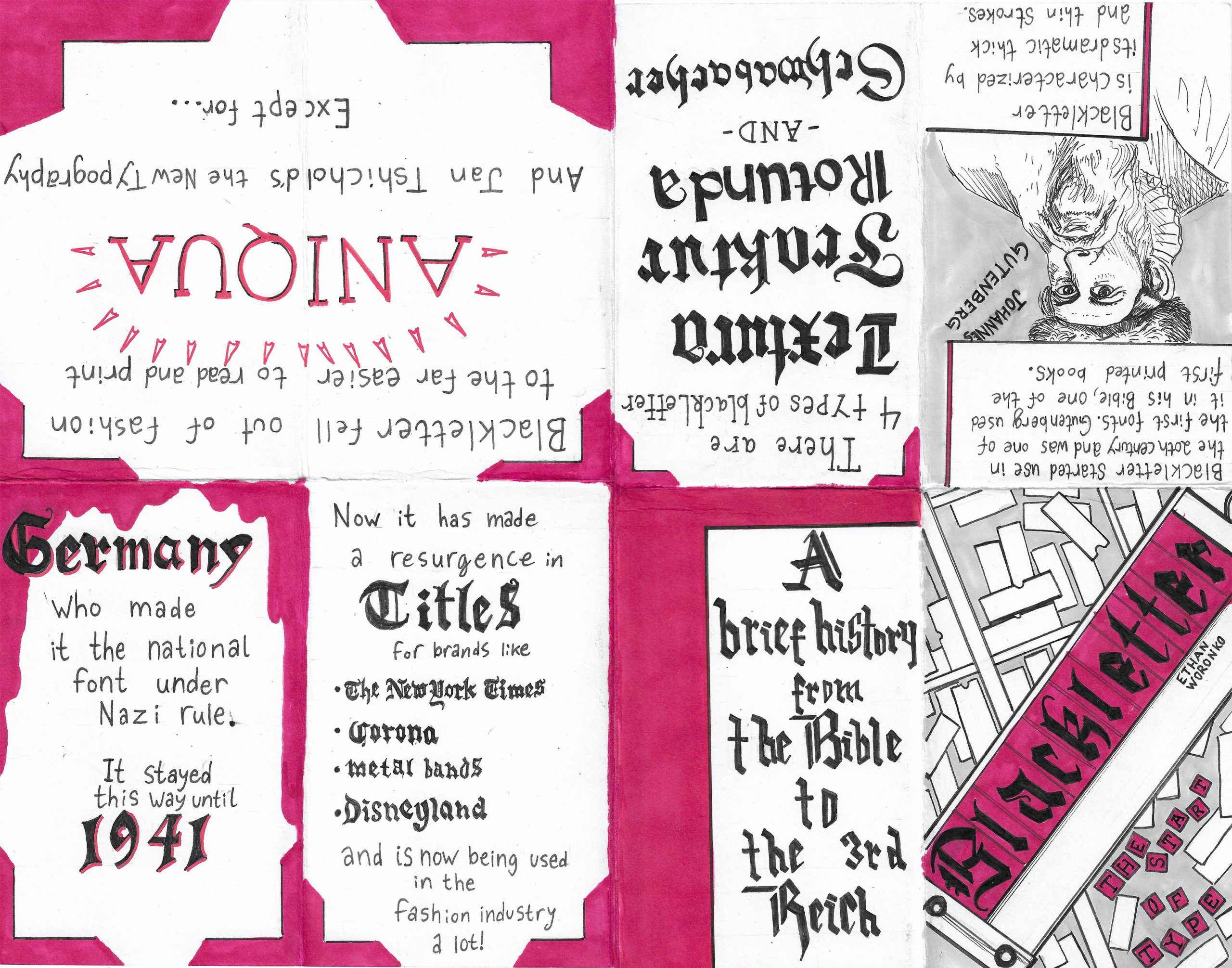
I did my zine on blackletter and how it changed and was used throughout history. blackletter has many forms and evolved over time so I decided to have my titles and use of blackletter follow the time period I was talking about as best I could. For my title, I decided to put the title in the typesetter and over top of the boxes of extra letters as this is how it would have been printed when it was first used in print. I decided not to go for too much colour as for a good portion of blackletters history it would have been used purely black and white or with one accent colour. overall I feel I worked hard, spent a long time thinking and researching for this project and came out of it with a project I am very happy with and a lot more knowledge on something I was interested in. I would give myself an 8.5-9/10 as I followed the brief to the best of my abilities and made something I feel is unique.
Baroque, Rococo, Neoclassicism, & Romanticism

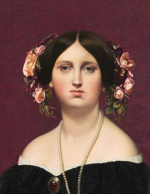
Jean-Auguste-Dominique Ingres

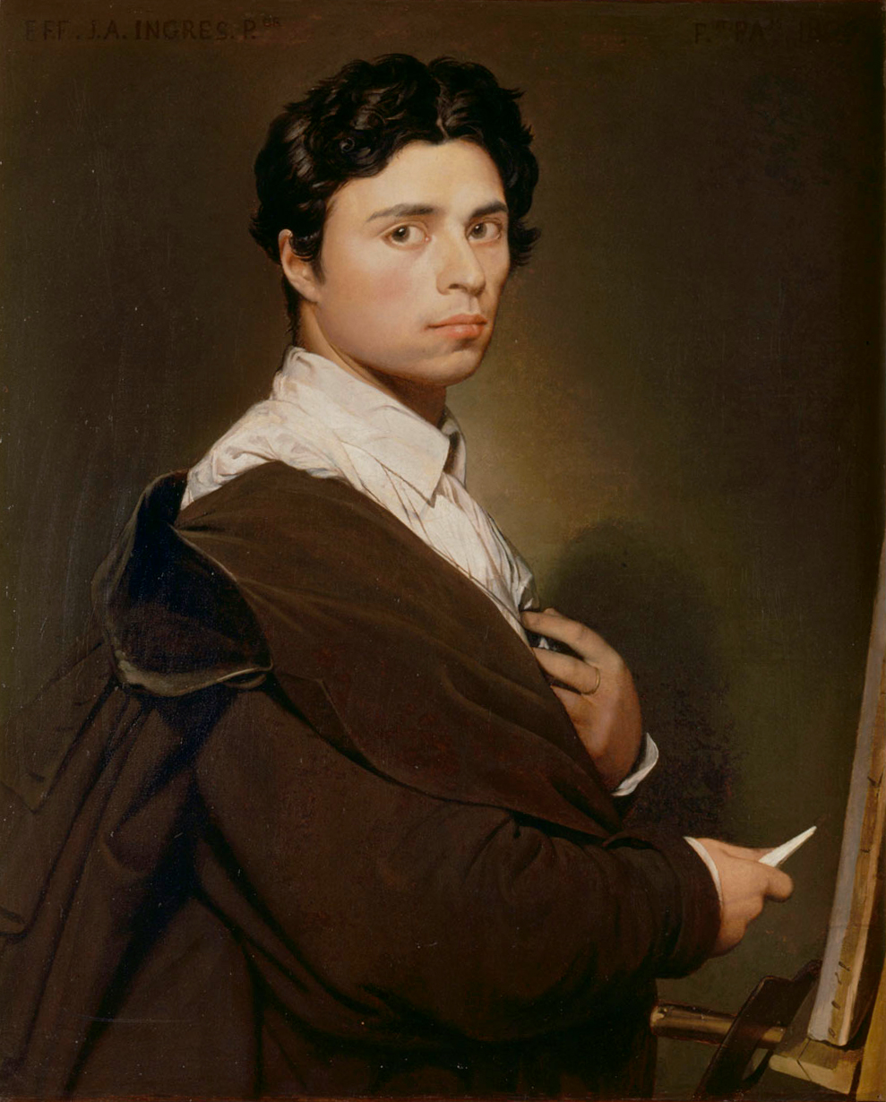
Self portrait

J-A-D Ingres

Ingres is a painter hailing from France who worked under Jaques-Louis David and is famous for his neoclassical work. Ingres hated romantic artists with a passion and made his style to be the antithesis of their work- using purity of colour, distorted proportions, extreme levels of realism, and stiff portraits. His warping of anatomy and figures was inspired by the Mannerism movement (late renaissance).

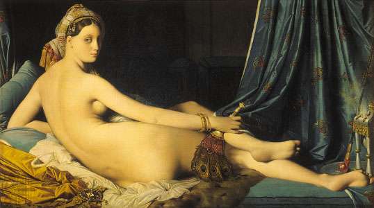
La Grande Odalisque

this piece is a prime example of the distorted anatomy.

Napoleon I on Imperial Throne

His piece titled “Napoleon I on Imperial throne”  was controversial and critics deemed him “Gothic”, a title it would take him years to get out from under.

Self portrait at 78

Survey 4

The start of the French revolution. 1789

geopolitics

The French revolution had quite a few causes but two main ones were an incompetent king and economic struggle. King louis XVI and his wife Marie Antoinette were hated by the public for living a posh life as they fell into poverty and the lack of help they received. Philosophers like Voltaire and Montesquieu wrote of reform and taking power away from the monarchy, and giving rights to the working class but it was clear the only way to put these ideas into action was a revolution. So a revolution they had!

Art

Although the French revolution would push France into a new era, it would send the artists of the time looking back at the style of the past. At this time, as a sort of reaction against the grandeur and pastel colours of the Rococo period, artists looked to the Neoclassical movement as the next big thing. As Pompeii had been re-discovered, Ancient Greek and roman art and architecture was back on the rise and being used for inspiration. Art from this period is characterized by its use of subject matter from ancient Greece, duller colours, no noticeable brush strokes, and the return of “ideal beauty”.

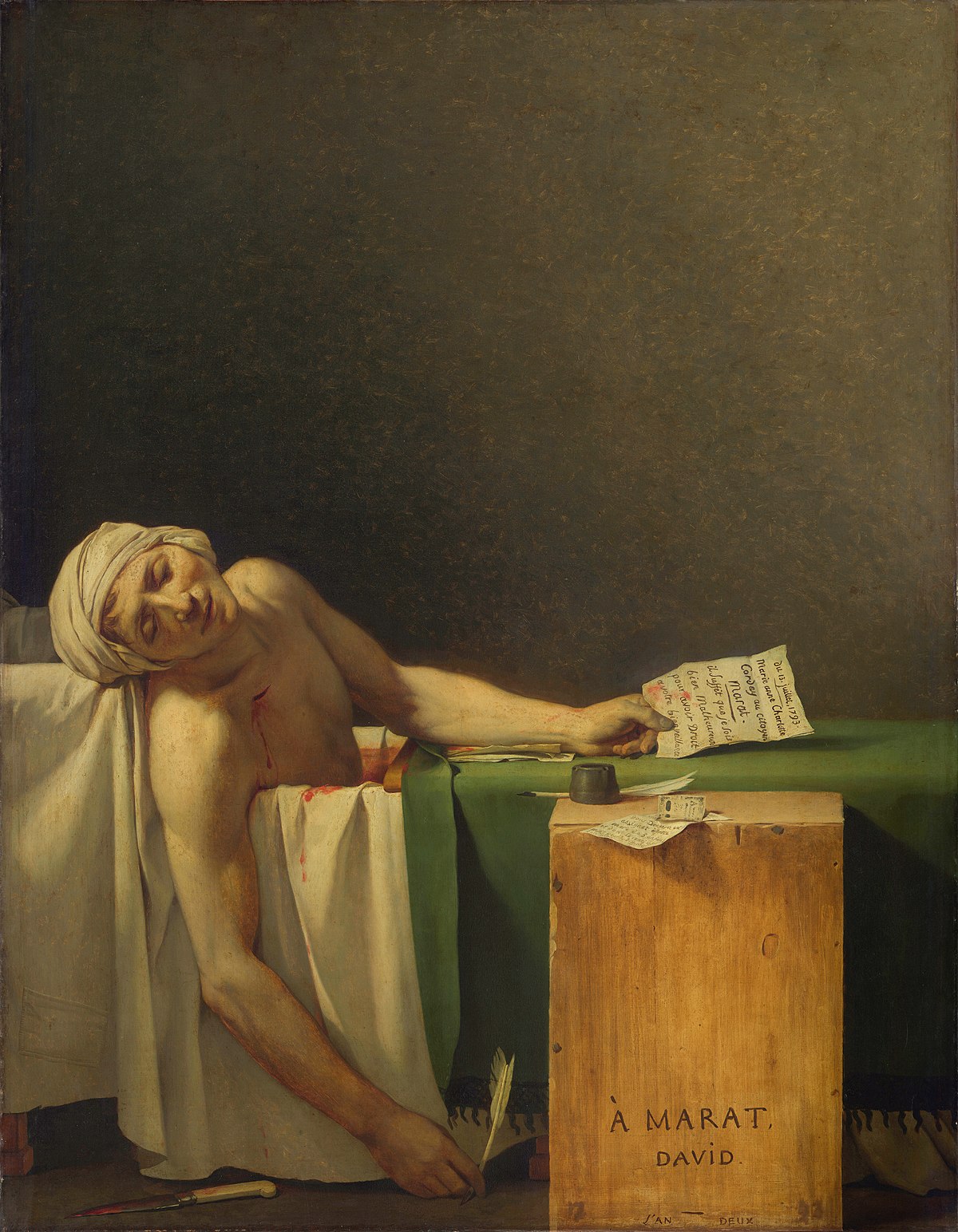
A notable painter from this period is Jaques-Louis David, Known for such pieces as Death of Socrates and The Death of Marat.

Citations

History.com. “French Revolution.” HISTORY, A&E Television, 2009, www.history.com/topics/france/french-revolution.

Nechvatal, Joseph. “How Artists of the French Revolution Embraced Neoclassical Revivalism.” Hyperallergic, 2019, hyperallergic.com/495416/how-artists-of-the-french-revolution-embraced-neoclassical-revivalism.

Irwin, David. “Neoclassical Art.” Brittanica, www.britannica.com/art/Neoclassicism.

Survey 3: The age of Rococo

Colour

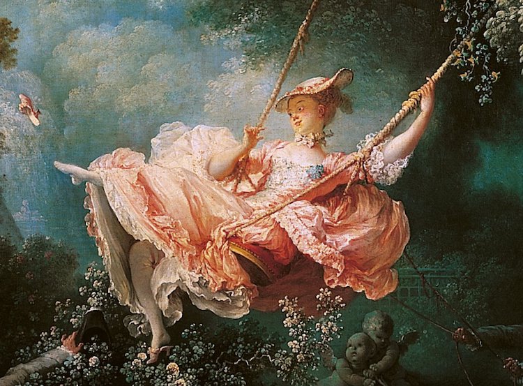
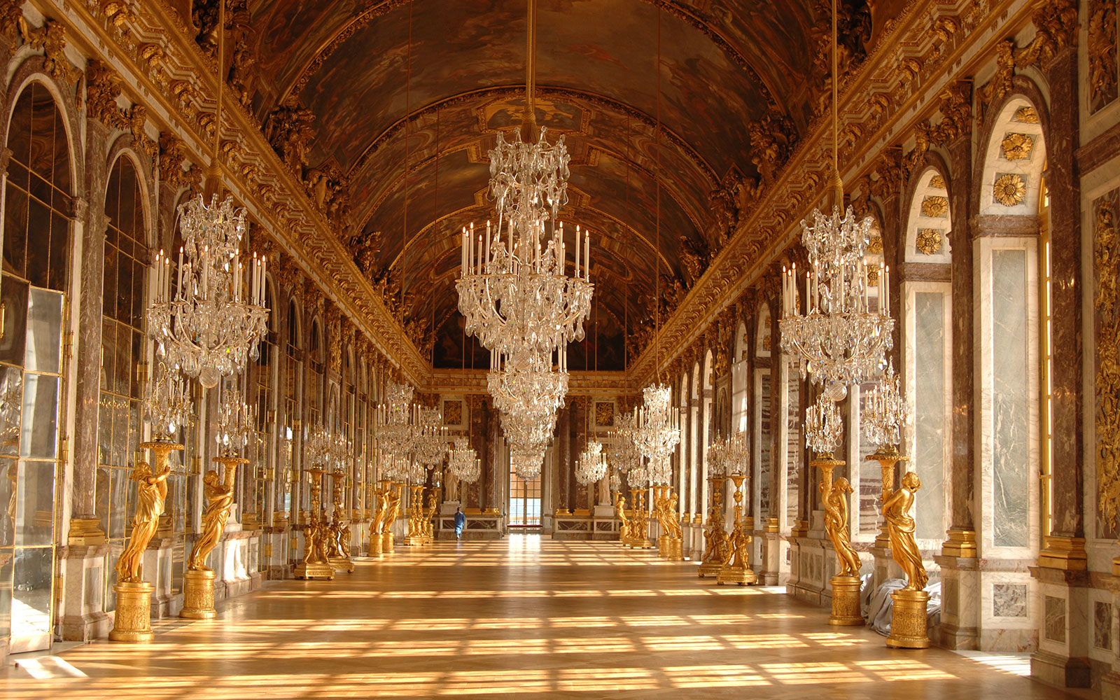
One of the key defining features of Rococo art and architecture are the colours. The palletes used in Rococo art often used many pastel colours, golds and whites which paired well with the themes of the art: love, romance, playfulness, and childish innocence. Rococo colours were far different from those of the Baroque period that came before as Baroque had a strong focus of heavy chiaroscuro and deep dark colours.

Architecture

Rococo architecture is an offshoot of Baroque that emerged in the 18th century. This style is categorized by its ornate decorations and asymmetrical stylings. Much like Rococo art, bright pastel colours and a more playful approach were synonymous with the architectural style. This style was a response to the much harsher, far less decorative Baroque architecture and intended to bring a bit more cheerful feel back into buildings. Buildings from this era often had an abundance of curves, arches, and floral reliefs and gold accents that gave rooms and buildings a sense of wonder and draw the eyes in.

Citations

“Rococo and the Elegant Designs of the Late Baroque Period.” ThoughtCo, 2019, www.thoughtco.com/rococo-art-architecture-4147980.

“Rococo.” Encyclopedia Brittanica, 2019, www.britannica.com/art/Rococo.

Mood board

My mood board experience

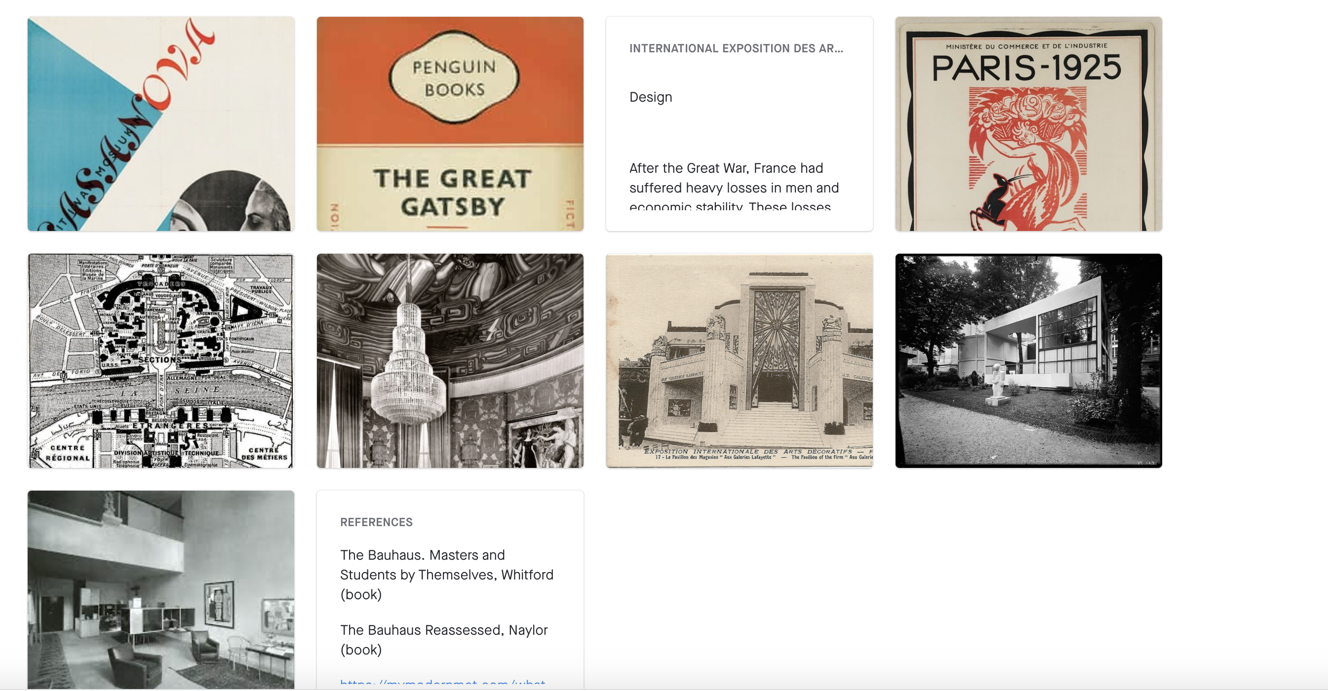
for my mood board, I was tasked with writing about events from 1925-1930 so I chose- the Bauhaus, Jan Tshichold, and the Exposition des arts decoratifs. I decided on these topics as they all were largely influential to the design and art world and also influenced people and things outside their scope. This project I found rather difficult as Invision didn’t cooperate a lot of the time and work would be lost sometimes when I closed or refreshed the page. I also found moving images around to be crazy frustrating as it wouldn’t do as expected and instead would scramble all the ones you weren’t trying to move. Overall I feel I tried my best and spent a long time on this project so I would give myself a 7.5/10