by Ethan Woronko | Sep 26, 2020 | IDEA 121
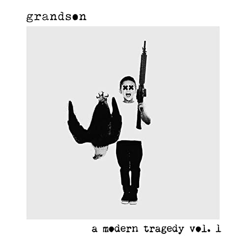
matt Meiners- grandson a modern tragedy vol.1
I chose this album cover for closure as the child in the piece doesnt have a torso but yet you still know where his shirt is and where it ends. I chose this image over others from teh same designer as the break in the element was rather large and yet still worked very effectively.
by Ethan Woronko | Sep 26, 2020 | IDEA 121
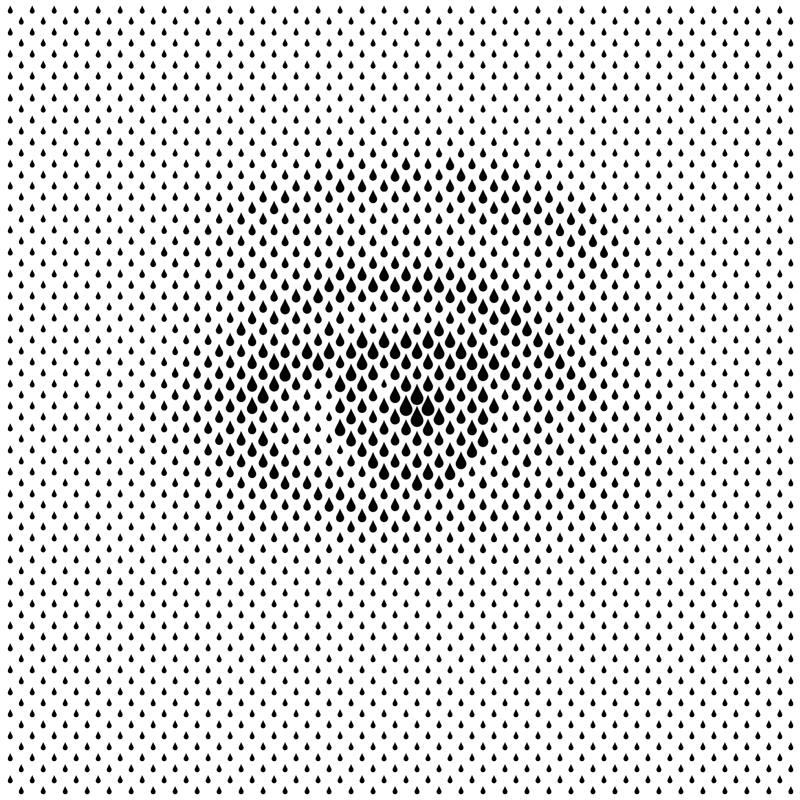
Sergi Delgado- The Eye
I feel this piece is a great example of the principle of proximity as the whole image is just made out of teardrop shapes of varying sizes but if looked at from a distance or when squinting looks like an eye. The grouping of the teardrop elements creates a whole new image just by making the illusion that pasrt are darker than others
by Ethan Woronko | Sep 18, 2020 | IDEA 121
Concepcion Studios- The Shining, 2018
I chose this piece as my example for size as the small barely noticeable characters make the maze that takes up most of the image feel vast and desolate.
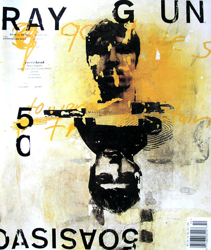
David Carson- Ray Gun issue 50. 1997
I feel this piece is a great example of texture as you look at it and can imagine exactly how it feels if you were to touch it. The charcoal and pastel in the blackground gives a very gritty feel that adds to the scratchy letraset and faces to make a piece where no part is left untextured.
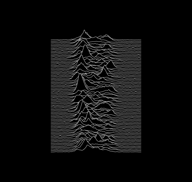
Peter Saville- Unknown Pleasures.1979
I chose this image for my example of the line element as its one of the most recognizable album covers of all time and its made using only a bunch of lines.

Recent Comments