by Ethan Woronko | Sep 26, 2020 | IDEA 121
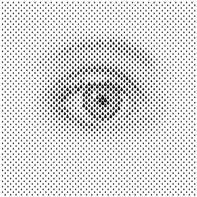
Sergi Delgado- The Eye
I feel this piece is a great example of the principle of proximity as the whole image is just made out of teardrop shapes of varying sizes but if looked at from a distance or when squinting looks like an eye. The grouping of the teardrop elements creates a whole new image just by making the illusion that pasrt are darker than others
by Ethan Woronko | Sep 23, 2020 | IDEA 141, Uncategorized

It took me quite a while to settle on an idea for my yearbook spread and my train of thought was all over the place but eventually it clicked! I was reading my book on RayGun magazine and realized that it was perfect for the project and if done well would perfectly capture who I am. I started researching Chris Ashworth, David Cardson and swiss grit as a whole and what guidelines I waould need to follow (turns out not very many) then I set to work designing a layout. I started by planning rough layouts and spreads on paper and figured out what photos I would need to take or use then once I had a plan I hopped on photoshop to comp together a more meticulously planned work. I spent quite a long time messing with where to place text and my pictures but once I got into the flow work went smoothly. I knew that the lettering on my hand drawn piece would be a bit tricky as Letraset is no longer sold so I went for a hand lettered approach using paint pens and Im pretty happy with the result. I think I would give myself a 9/10 as i fell i replicated the style i was going for to the best of my abilities and ended up with an end product that is recognisable as a Swiss grit inspired work.
by Ethan Woronko | Sep 18, 2020 | IDEA 121
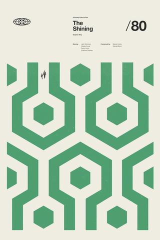
Concepcion Studios- The Shining, 2018
I chose this piece as my example for size as the small barely noticeable characters make the maze that takes up most of the image feel vast and desolate.
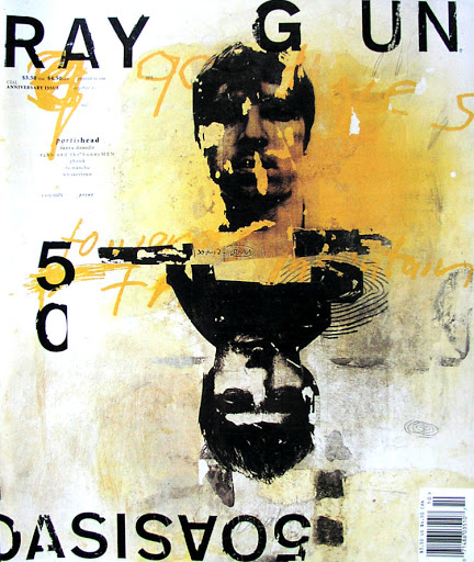
David Carson- Ray Gun issue 50. 1997
I feel this piece is a great example of texture as you look at it and can imagine exactly how it feels if you were to touch it. The charcoal and pastel in the blackground gives a very gritty feel that adds to the scratchy letraset and faces to make a piece where no part is left untextured.
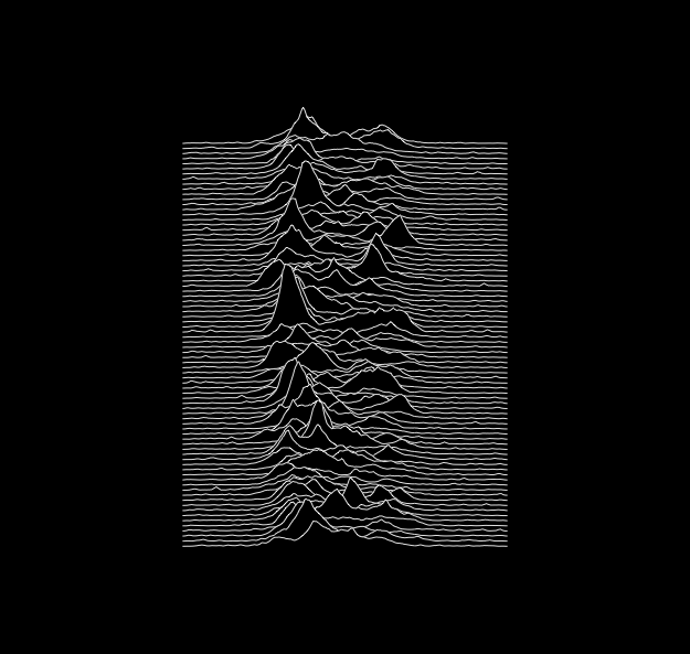
Peter Saville- Unknown Pleasures.1979
I chose this image for my example of the line element as its one of the most recognizable album covers of all time and its made using only a bunch of lines.


Recent Comments