Rationale
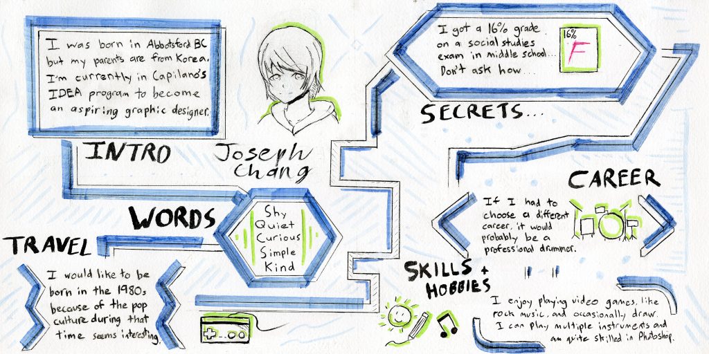
For my Yearbook Spread, I have decided to go for a minimalist and simplistic design. The reason why I chose this this design is because I don’t consider myself good at using watercolour or other types of paint. I like simple designs more and felt that having a simple layout would be better suited for my skills. Since I prefer to do designs digitally, I took inspiration from various infographic designs from Pinterest and applied what I saw onto paper. Out of all the sketches, I chose the design where the shapes are connected because it was easy and simple. Text is added into each shape and are divided into categories to make the spread organized. Small drawings are added next to the text to make the spread more appealing. The paper was entirely painted white since the paper had a yellowish tint and to make the colours stand out more. I used copic markers because their chisel tip made it easy to do lines with a ruler. The lines are offset from the boxes to give a more 3D look. The drawings are outlined with green to make it distinct from the blue. I chose blue since it worked well with the white and used few colours to achieve a minimalist look. Also, blue made the design look flowing like water. Light blue is also added to fill in the empty space so that the spread looks more full. I’m hoping that when people will see my work, people can understand me more and know what artistic skills I am capable of.
Personal Mark
If I had to give myself a mark for this project, I would give myself a 7 or 7.5 out of 10. The reason being is while I had a good idea in my head, I felt that I could’ve done the design better. I liked that the design looked clean and simple thanks to the geometric shapes, straight lines, and minimal use of colour. The organized layout make the spread easy to read and the lines can help the eye follow through each fact. But, I also felt that the blue colour didn’t look consistent since I made mistakes. The text I wrote looks sloppy at times and doesn’t look very professional. So while the design looks simple, organized, and looks appealing, there are some inconsistencies that could’ve been fixed to make the spread look better.
Leave a Reply