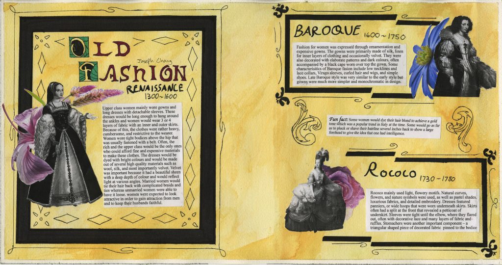
For this spread, I was given the role to design a spread about fashion throughout three time periods, Renaissance, Baroque, and Rococo. First, I used orang watercolor paint to fill the background in order to create an old aging paper effect like how most paper was like back in the day. I used black pen and marker to create the frames and other ornaments to create a classic Renaissance style feel to it in order to create a better mood and decoration and to emulate the ornament style that was used during that time period. For the frame on the right page, I created a splitting effect to give a more modern and appealing look while also looking classical. For the text, I used a black brush pen to give a calligraphy feel and for the title, I looked at old manuscripts and how text was done. I emulated the oldstyle font and the initials and filled them with colour that was appropriate for the time period and to make the text pop out. For the figures, I used a black and white photo and cut them out. I used flowers which are in colour to make the spread look more lively and less boring. Since I had to cover 3 time periods, I had to divide the right page into two so that I can use the Baroque and Rococo periods. Since I had room in the middle between the two periods on the right, I decided to fill the empty space in the middle with a fun fact and draw a floral motif on both sides of the text for decorative effect. I used a printer for the descriptions text and pasted them as I realized that hand lettering it would be too time consuming and risky. I used the font Times New Roman as the felt very appropriate since the Renaissance was the rebirth of ancient Greek and Roman culture and the font was very similar to Ancient Rome fonts.
Leave a Reply