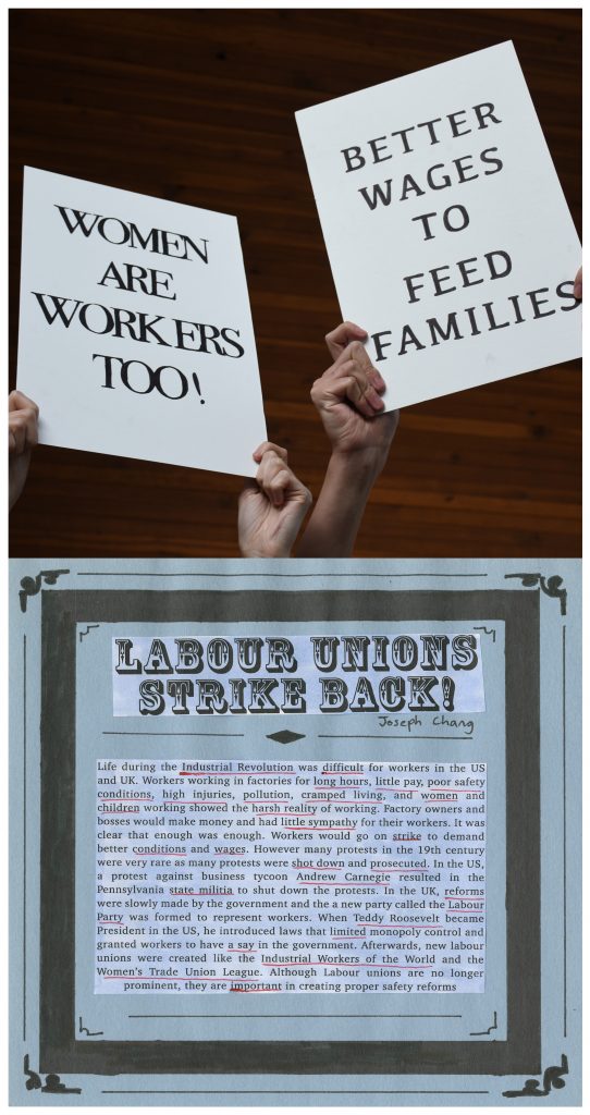
For this spread, I was given the task to do an artifact. Since the period we covered was a period where labour unions and women started to become more prominent in the work industry, my goal was to convey the emotion and struggles that a lot of poor workers and women had to go through in order to achieve workers’ rights. So for this project, I decided to do two picket protest signs similar to what workers back in late 19th to early 20th century would use to demand better working conditions. The process of making this was very simple, I used the No.27 hard press cardboard and cut it at the size 10″ x 15″. I wanted to make two, one that focused on workers’ rights and the other about women’s rights. I used Photoshop as a guide to help me which font and font size was suitable. I decided to use two bold serif classic looking fonts because I felt that they were the most appropriate for that time period and their boldness made them stand out and appealing to the eye. I printed the fonts out and traced them on tracing paper. After tracing on the tracing paper, I transfered the graphite onto the cardboard. Once the transfer was complete, I outlined and filled the texts and letter with black marker and erased any remaining pencil marks. So the picket signs are finally completed, now is the time to do the photo. I asked two of my classmates to help me and so we went outside at campus and used the forest and wood background. Since we weren’t in an industrial looking area, the best place that felt natural was the wooden backdrop and we also needed a dark background to make the signs stand out more. Also I decided to only take pictures of the hands holding the signs instead of a full body shot of them holding the signs. Because we were wearing modern clothes, it wouldn’t make sense and looked awkward as the spread was for an industrial setting. Also, I felt it was better to show the hands because not only did it make the image more focused on the signs but the hands gave the impression of power, strength, and something to fight for. For the other page of the spread, I wanted to create the feeling of an old time-y poster that would’ve been used back in the day. I used a light blue construction paper, cut it out, and drew a box and extra ornaments to create a more vintage effect. I went to photoshop to find a font for the title and found a font that looked rather decorative and fit perfectly well for the old industrial poster design I was looking for. I also typed out the description of the labour unions and protests that I researched for my blog post. I printed the font and the text, cut it out, and glued them onto the construction paper. I preferred to use type the text as opposed to hand lettering it because it would take to much time to write down all the information and I wanted to make the page look more like a poster. After glueing the texts, I took a red pen and underlined some of the most important details and information that was on the description. Since the description was too long, I felt that underlining it would make the important texts stand out more for the reader. Now that the photo and the page were done, I scanned the page and put the photo and page together on Photoshop. Unfortunately, I realized that when I was making the page, I accidentally used the wrong ratio and made the entire spread look off. Thankfully, I fixed that by simply going for a vertical alignment instead of a horizontal one which fixed the ratio and kept the details that I wanted. Thus, I was able to finish my spread.
Overall, I think the spread turned out better than I thought but felt that it could be better in some way. The alignment of the text on both the signs and the page are a bit off and could be centered more. I also felt that it would be better to take the photo at a more industrial looking setting since the signs are simply just white text and look rather boring(as that what a lot of the protest signs back in the day looked like), so having a better background could’ve made the photo look more interesting. But since I didn’t have the time, I just went for more of a natural setting instead. But overall, I was still satisfied with my work, the photo turned out really nice and the shadows and lighting still made the photo look powerful. While the page description could’ve been improved, I still think it looked nice and did what it accomplished. If I have to give myself a score, it would probably a 7.5/10
Leave a Reply