I actually chose to go with Kay Nielsen this time because of a comment you ended up making last February when I first came to the university, ha!
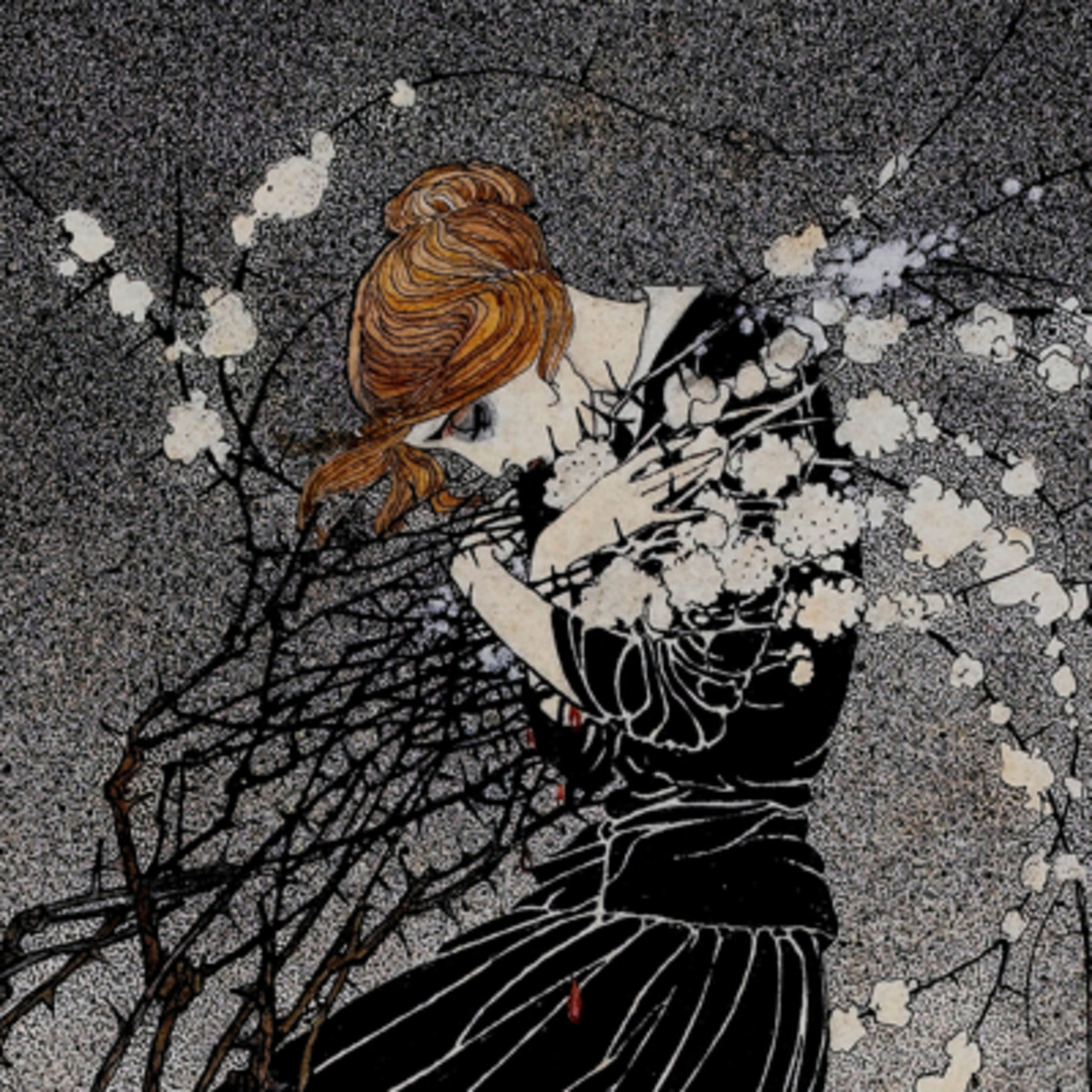
A portion of “A Story of a Mother”. This and “Fallen Leaves” (which I’ll put below) are great examples of something he pulls off that I just love. There’s a soft but heavy grey in the eye socket recesses that makes me feel this awful, exhausted sadness for the characters portrayed. It’s such a simple detail, but I find that at least for me, it’s very effective at showing emotion
“Fallen Leaves”, again showing this trait in his character art. So many of his character designs have this ethereal litheness to them, beautiful and elegant but somewhat vulnerable, almost brittle at times.
I had almost no artwork to my name because I’d only been drawing for the last two months and I brought my work in so I could get enough constructive criticism and guidance to hopefully make enough portfolio material that I could try for the 2019 admissions.
Instead I was given some lovely feedback from you, Carol, Ben, Shane and Pascal, something that really helped build me up at a time where I was struggling with a lot of things all at once, and doubting that it was worth trying to pick up drawing again after losing touch with it in high school. You ended up telling me that a couple of pieces reminded you of Nielsen, and I ended up diving into his body of work afterwards, delighted to find such an interesting style that at the time, was absolutely alien to me. Diving back into his catalogue as a student is a funny feeling, but a nice one to be sure!
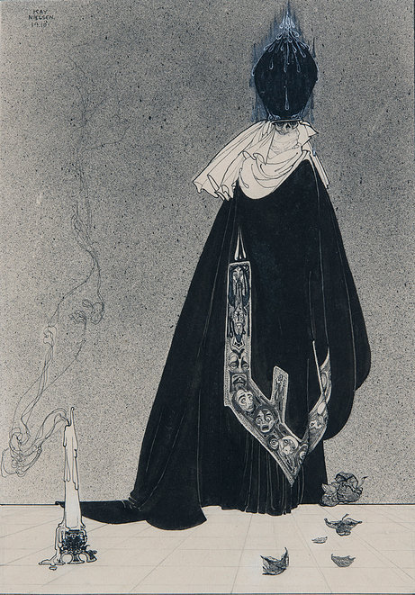
A plate from 1913’s “The Book of Death”. I found this an unusual (but not unwelcome) surprise amidst the rest of his work, which usually is far brighter and outwardly elegant. There’s a beauty in this, albeit a cold and menacing one, but I just love the costuming sensibilities of this particular piece. The cloth around the neck is beautifully rendered, and mixed with the elongated proportions of the figure it creates a silhouette I’m quite taken with.
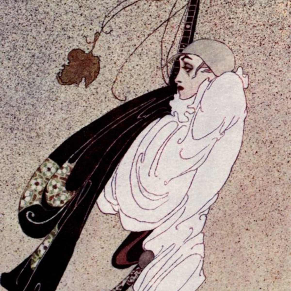
Somewhat akin to Aubrey Beardsley and Ivan Bilibin, Kay Nielsen’s flair for dress and costume is something I’m consistently gobsmacked by. His work with patterns, ornament and texture create this beautiful and nearly alien depiction of human beauty. There’s touches of this in his environments as well, there’s a piece I’ll post below that exemplifies this and almost reminds me of the way Gustav Klimt did his textures, particularly in the robes and clothing.
Just an absolutely lovely, rich bit of detail in stark contrast with the night. This arch and the costumes in some of the more heroic fairy tales are the ones that make me think of Klimt, lovely and dense textures with a supreme elegance to them.
From “East of the Sun and West of the Moon”, 1914. His depiction of the troll (or ettin) is very traditional, but counterbalanced by the ethereal mists and this onyx podium with the figure in white, it’s just a lovely piece to me. His depictions of people have this idealized wisp-like quality to them, like they could fade away at any moment. I love the contrast between the coarseness of the foreground figure and the woman, particularly with the splash of colour from her headpiece.
John,
Once again I’m amazed at your depth of feeling and commitment when writing about the artists you choose. You don’t necessarily fill your blog with historical information on the individuals (info that’s out there anyhow), but on your personal insights and feelings and how that has been an influence on you. I would much sooner read that from these blogs than stuff I already know about these individuals. Very much look forward to your weekly contributions and keep up your stellar work.
Jeff
Thanks Jeff, I appreciate that and I’m glad the posts are going over well. I also figured at this point you’ve heard just about everything there is to hear on the artists lives (as you said), so I didn’t want to just spit up another paraphrased biography. I’ll continue on the same track, thank you for the kind words!


January 27, 2019 at 2:40 pm
John,
Once again I’m amazed at your depth of feeling and commitment when writing about the artists you choose. You don’t necessarily fill your blog with historical information on the individuals (info that’s out there anyhow), but on your personal insights and feelings and how that has been an influence on you. I would much sooner read that from these blogs than stuff I already know about these individuals. Very much look forward to your weekly contributions and keep up your stellar work.
Jeff
January 29, 2019 at 11:53 am
Thanks Jeff, I appreciate that and I’m glad the posts are going over well. I also figured at this point you’ve heard just about everything there is to hear on the artists lives (as you said), so I didn’t want to just spit up another paraphrased biography. I’ll continue on the same track, thank you for the kind words!
February 8, 2019 at 12:37 pm
John,
Just checked in for more posts but looks like you haven’t got to them yet. I’ll look for them in a day or so.
Jeff
February 9, 2019 at 3:23 pm
Jeff,
I apologize for the delay, both have been correctly published and sorted now.
John